
Floodlight Personal concept, November 2026 Concept
ProblemPrices that change with the size of the bar, on a site moving to dark mode BuiltOne token-based system that serves light and dark, from primitives to components
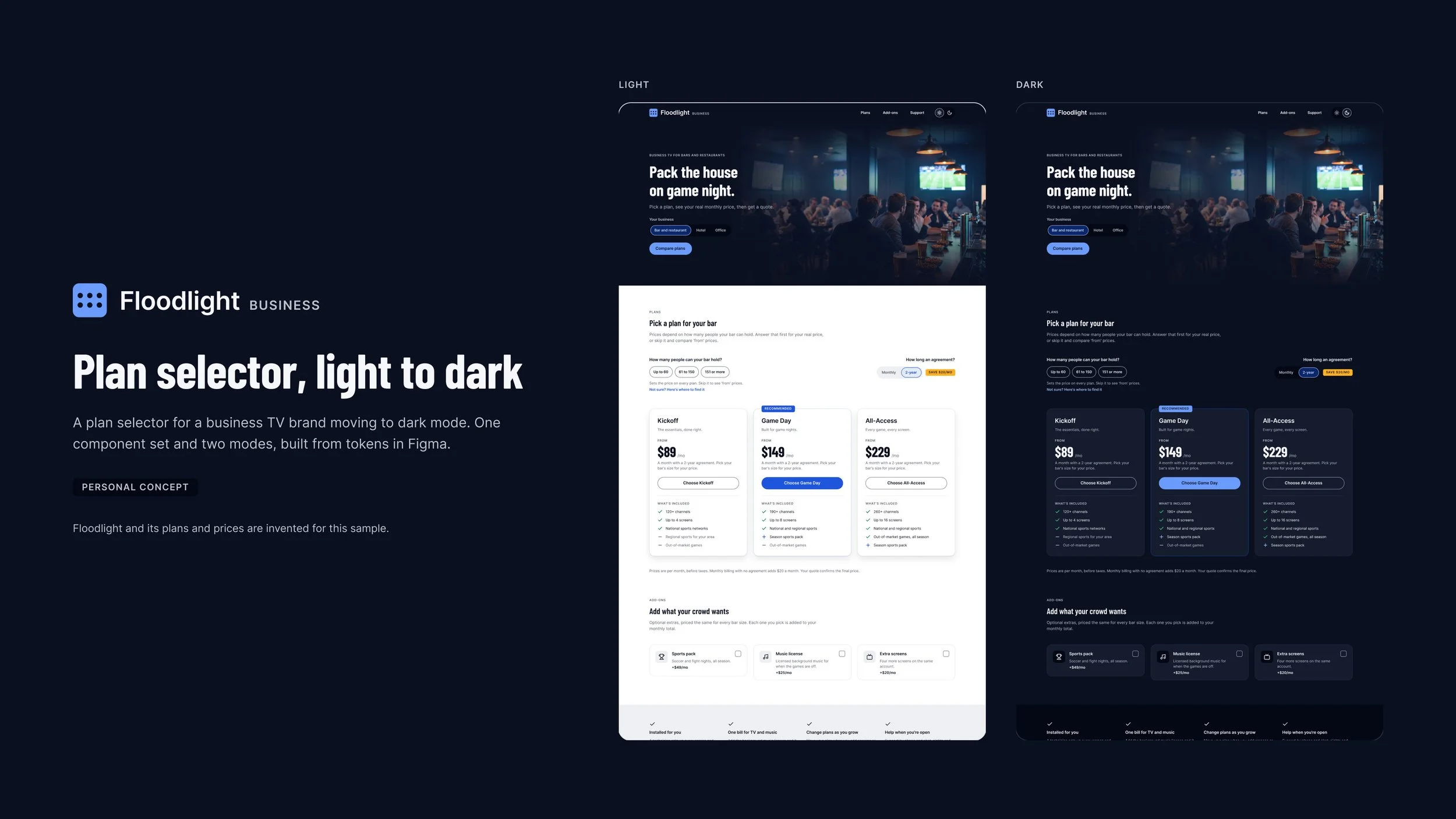
Floodlight is a design system for a plan selector, made for a business TV brand moving its site to dark mode. I built a light system first, then evolved it into dark instead of starting over: three layers of variables, 27 theme tokens named by role, and 11 components that switch theme by mode alone, published as a library and prototyped on desktop and mobile. A personal concept: Floodlight, its plans and its prices are invented.
Why
One page, two themes, and a price that moves with every choice.
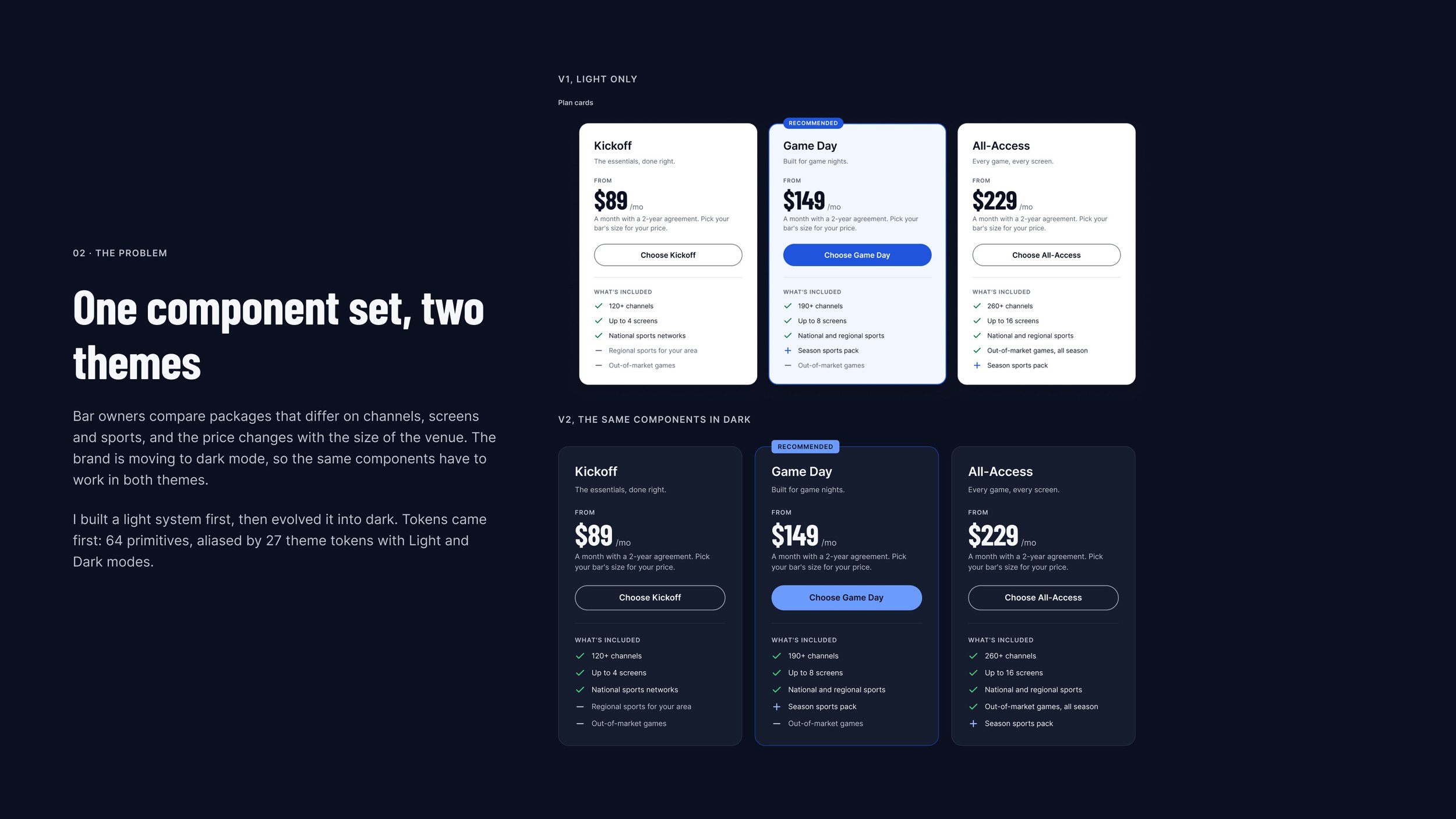
Bar owners compare packages that differ on channels, screens and sports, and the price changes with the size of the venue.
The brand in this concept is moving its site to dark mode, so the same components have to work in both themes without being designed twice. The plan selector is where the two meet: prices that change with each choice, cards that have to show what’s chosen, and a total that follows the visitor down the page.
How a price comes together
- 1Pick the bar’s size.Up to 60, 61 to 150, or 151 or more. Not sure? An explainer says where to find it.
- 2Pick the agreement.Monthly billing adds $20 a month; a 2-year agreement saves it.
- 3Compare three plans.Kickoff, Game Day and All-Access, priced for that bar.
- 4Add what the crowd wants.A sports pack, a music license, extra screens.
- 5Watch the total.A summary bar keeps the plan and the monthly price in view.
- 6Get a quote.The plan, the bar size, the add-ons and the total carry over.
The system
One set of tokens, two themes, every component.
I built a light system first, then evolved it into dark instead of starting over. Tokens came first, and every component points at them, so one component set serves both themes and a page switches in one action.
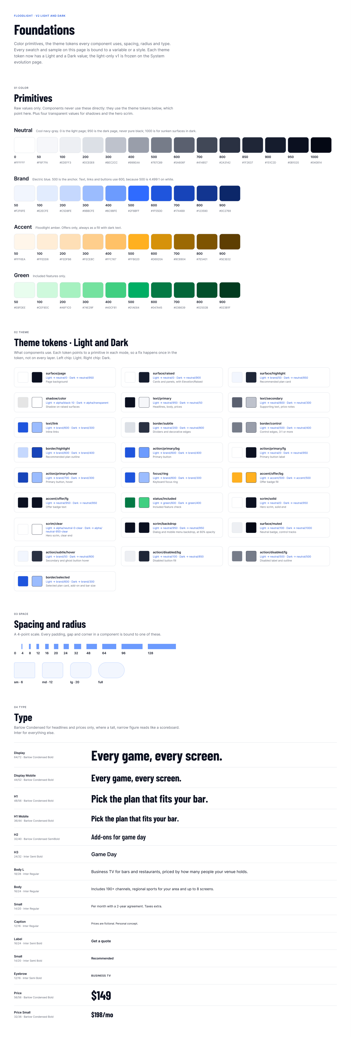
- 64 primitivesRaw values only: four color ramps and four transparent values, 12 spacing steps and 4 radii.
- 27 theme tokensNamed by role, each with a Light and a Dark value. Components use nothing else.
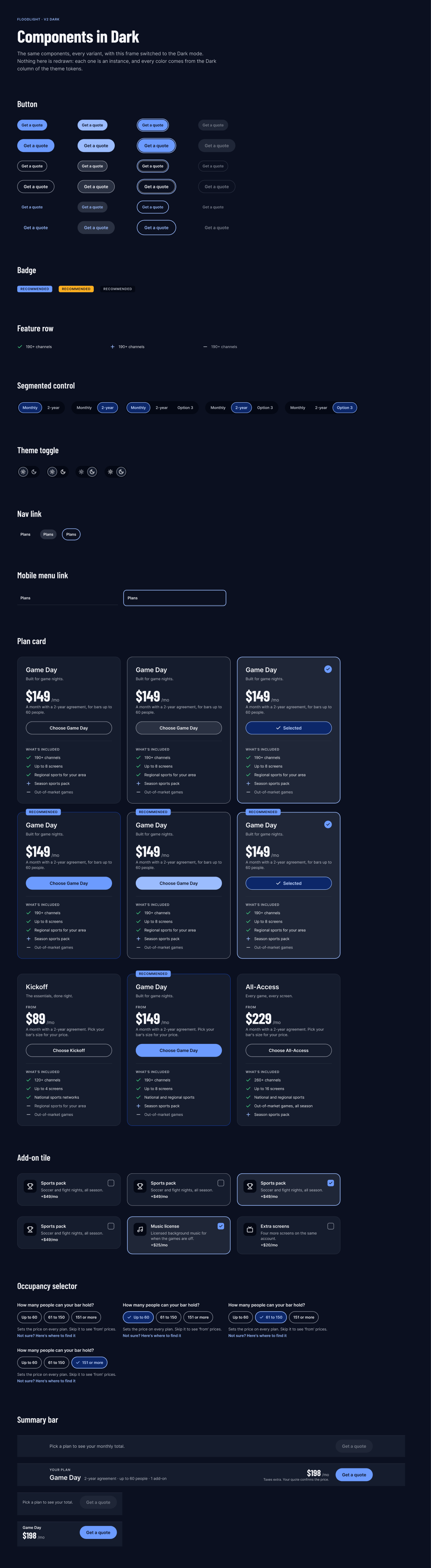
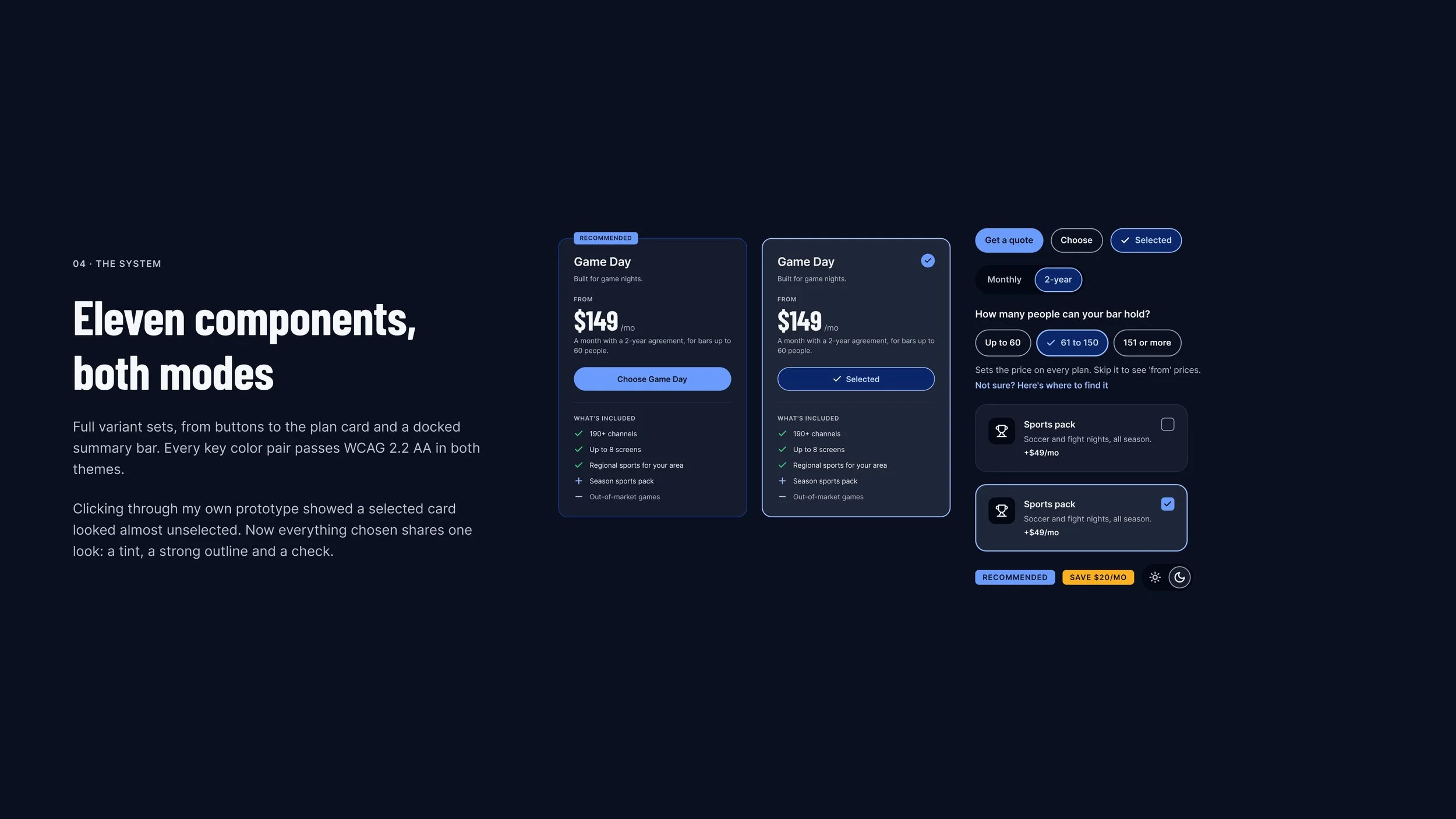
- 11 components69 variants, from buttons to the plan card and the docked summary bar, all in both modes.
- 2 modesLight and Dark. The theme toggle switches the page’s mode, so the visitor’s choices stay put.
How it’s organized
Three layers, named by role, ready for code.
Raw values, the jobs they do, and the prototype’s own state live in separate layers, so each can change without touching the others.
Primitives hold the raw values. Theme tokens give each one a job and a value for each mode, and components use only the theme tokens: the color primitives have no scope, so they never show up in a color picker. A third layer of 30 variables runs the prototype, from the chosen plan to the totals, and stays out of the published library.
One color, from primitive to button
- 1Primitives.brand 600, #1F55DD, for Light, and brand 400, #6C9BFE, for Dark.
- 2Theme token.action/primary/bg points at brand 600 in Light and brand 400 in Dark.
- 3Component.The primary button uses only action/primary/bg, so one variant serves both themes.
- 4Code.Every token carries its CSS name for developers: surface/page is var(--surface-page).
- 5The page, the same way.neutral 0, #FFFFFF, and neutral 950, #0B1020, meet in surface/page.
- 1Three layers. Primitives (64), theme tokens (27, with Light and Dark) and the prototype’s state (30), each in its own collection.
- 2Named by role, not by color. surface, text, border, action, focus, accent, status, scrim and shadow, so a name still fits when its value changes.
- 3Scoped. Spacing is offered only for gaps and radii only for corners, so the right variable is the only one on offer.
- 4Bound, not typed in. 15 text styles and 2 effect styles, and every color, padding and gap in a component is bound to a variable: nothing is unbound.
- 5Ready for code. All 64 primitives and all 27 theme tokens carry their CSS variable names for Dev Mode.
- 6Written down. The file runs in system order, from Foundations to Handoff, and every decision is logged with the options that lost, the trade-off and the evidence.
Foundations and components
Every token and every variant, then the library in another file.
Two pages of the Figma file, each scrolling inside its window: the foundations, and every component in Dark. Below them, a second file built only from the published library.
The real test of a library is another file. In this one, every plan card and the summary bar come from the published library.
Nothing in the second file is local. Its colors come from the library’s theme tokens, so the same instances switch between Light and Dark by mode alone, and a fix made once in the library reaches every file that uses it.
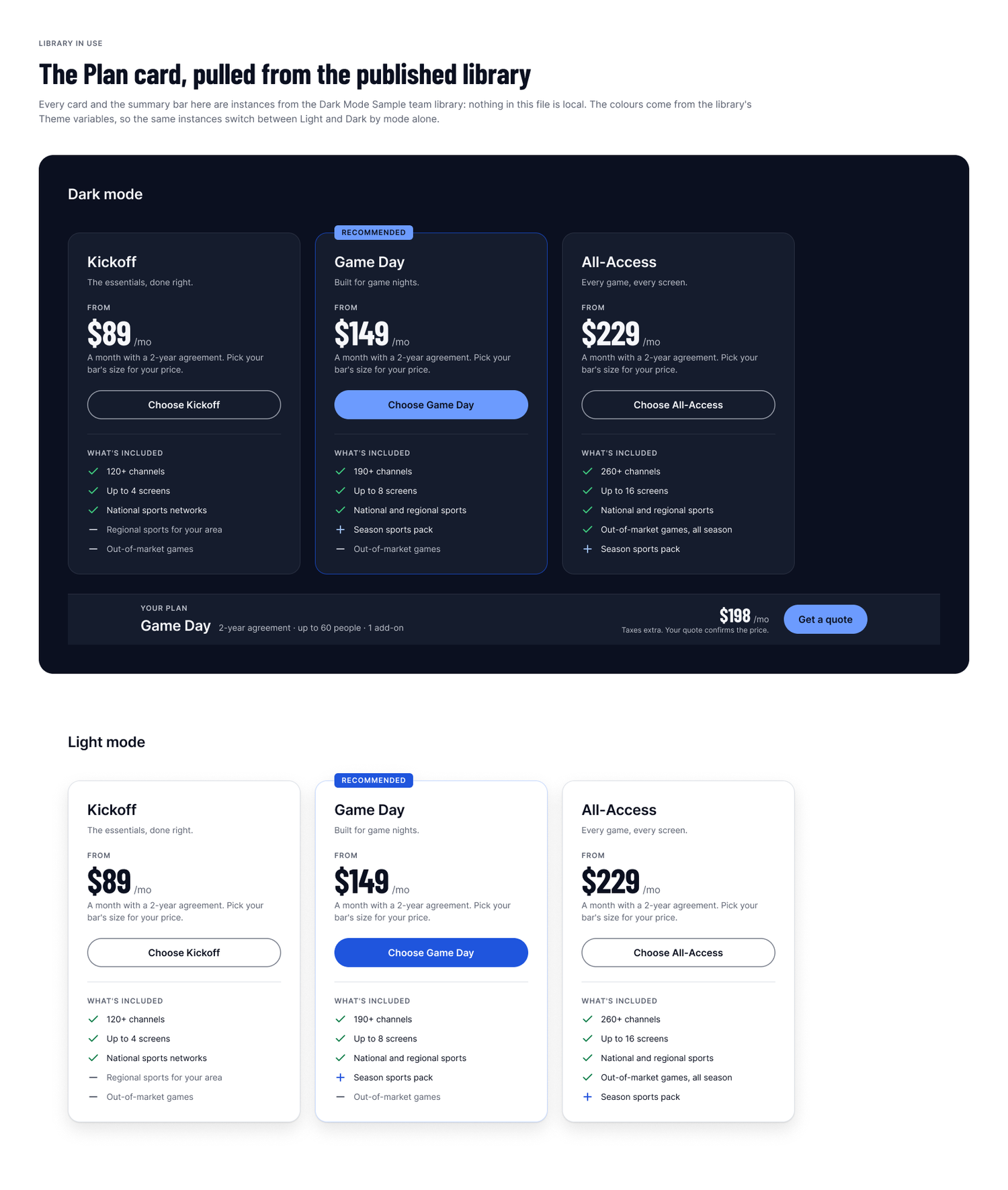
Pulled from the published library into another file: the same instances, switched to Dark by mode alone.
Into dark
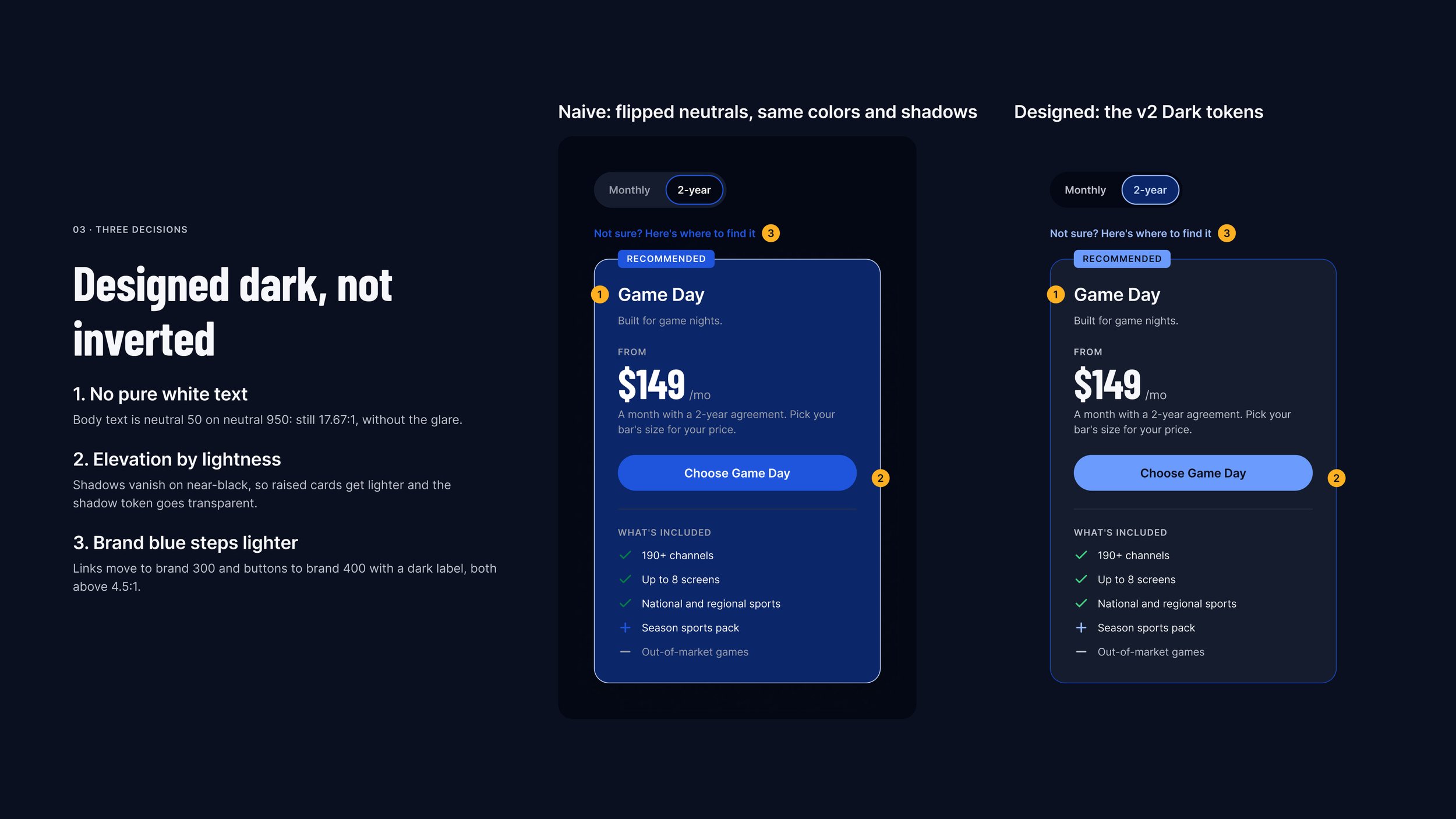
Designed dark, not inverted.
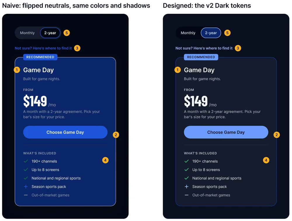
The first version was light only. The dark version keeps the same components and changes only the values their tokens point at. Below, the shortcut most teams try first, flipped neutrals with every other color and shadow kept, sits beside the dark tokens.
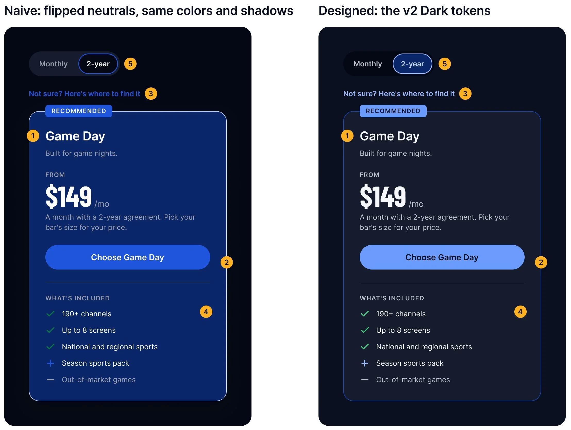
- 1No pure white text. Flipped, it’s white on near-black at 20:1, bright enough to glare. The dark tokens use neutral 50 on neutral 950: still 17.67:1.
- 2Elevation by lightness. Flipped, cards turn as dark as the page and the shadow is black on black. Raised surfaces get lighter instead, and the shadow token goes transparent.
- 3Brand blue steps lighter. The light-mode blue fails on dark, at 3.24:1. Links move to brand 300 (9.93:1), and buttons to brand 400 with a dark label (6.99:1).
- 4No glowing navy. Flipped, the Recommended card’s pale tint turns a saturated navy that pulls the green check down to 2.57:1. A neutral lift instead keeps the check at 7.52:1.
- 5A sunken switch. Flipped, the agreement switch’s track turns lighter than the page, so the control looks raised. Its track goes darker than the page instead, so the selected side sits on top.
Built to be checked
Six days, checked from inside and out.
Claude did the production work in Figma, and I made the calls. Some options I chose myself; the rest began as Claude’s recommendations, which I reviewed and approved at three checkpoints, with a second Claude auditing from outside. All 62 decisions are logged with the options that lost.
- 17.67:1body text on the pageNeutral 50 on neutral 950: far above AA, without the glare of pure white.
- 9.69:1selected textThe label on a selected card, against its dark tint (6.89:1 in light).
- 8.92:1focus ring on a cardKeyboard focus stays visible on every surface (6.17:1 in light).
- IThe briefNov 5. My first calls: a bar as the venue, prices set by the bar’s size, the palette, the typefaces, and what each plan includes.
- IIA light system firstTokens, components and pages in light, saved as a named version, then checked by an outside reviewer, a second Claude.
- IIIEvolved into darkThe dark theme, the accessibility checks and the prototype, all from the same components.
- IVMy first click testSelected cards were too hard to tell apart, and the theme toggle did nothing. Both fixed and re-tested the same day.
- VImagery and handoffHero photos from my own Gemini prompts, edited in Photoshop, under a token-bound overlay in Figma. Then the developer handoff and a test plan.
- VIA library, and an auditNov 6 to 9. The components published as a team library. A second click-through and an outside audit found five issues; all fixed.
- VIIThe recordingNov 10. The prototype recorded, and the case study frames exported.
Handoff
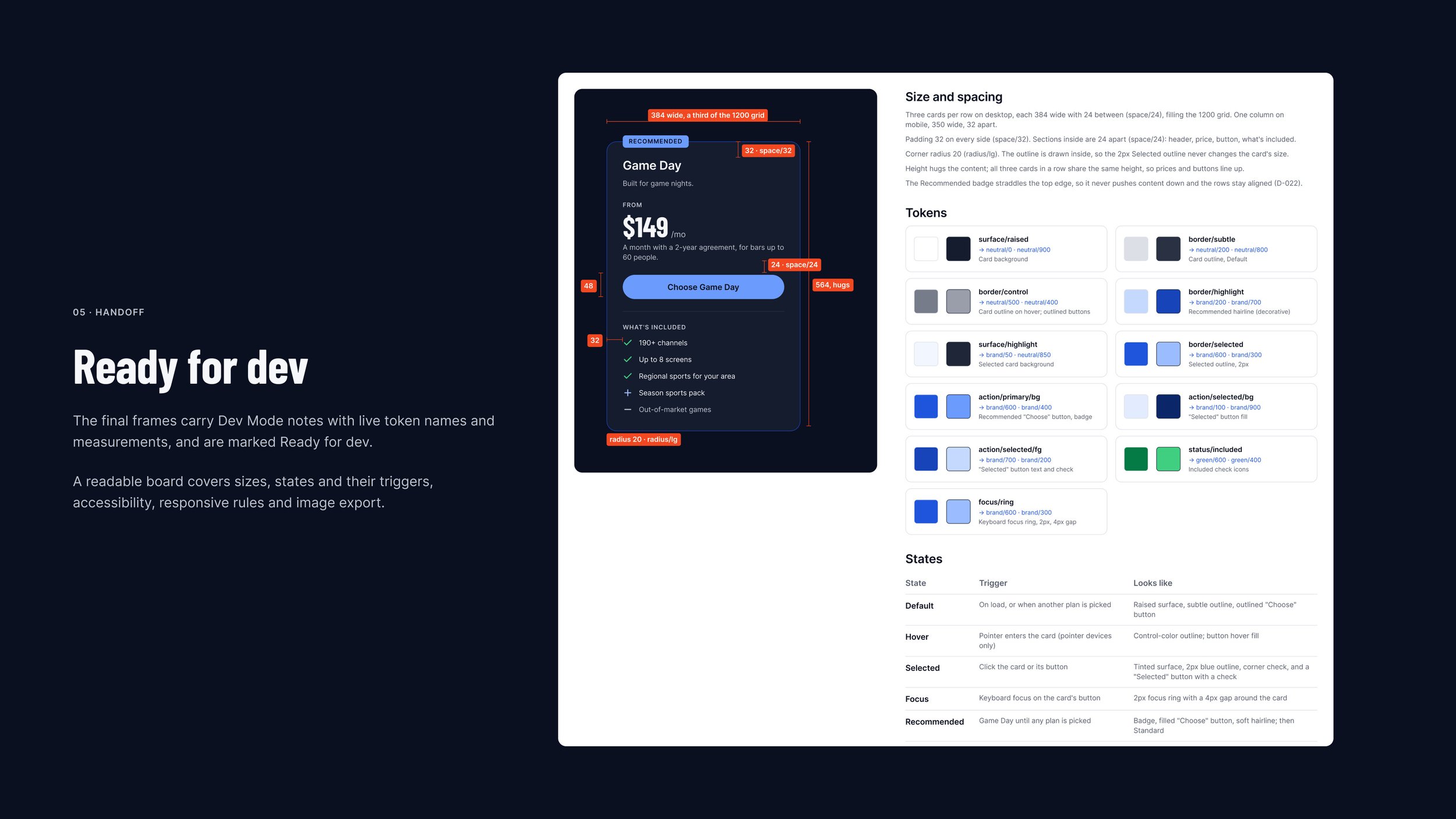
Measured, annotated and marked Ready for dev.
Every key color pair passes WCAG 2.2 AA in both themes. The final frames carry Dev Mode notes with live token names and measurements. The plan card spec gives every size, the token for each part in Light and Dark, and a table of states and what triggers them. Scroll padding keeps the sticky summary bar from covering a focused element, and the components are published as a team library that a second file already uses.
The system in use
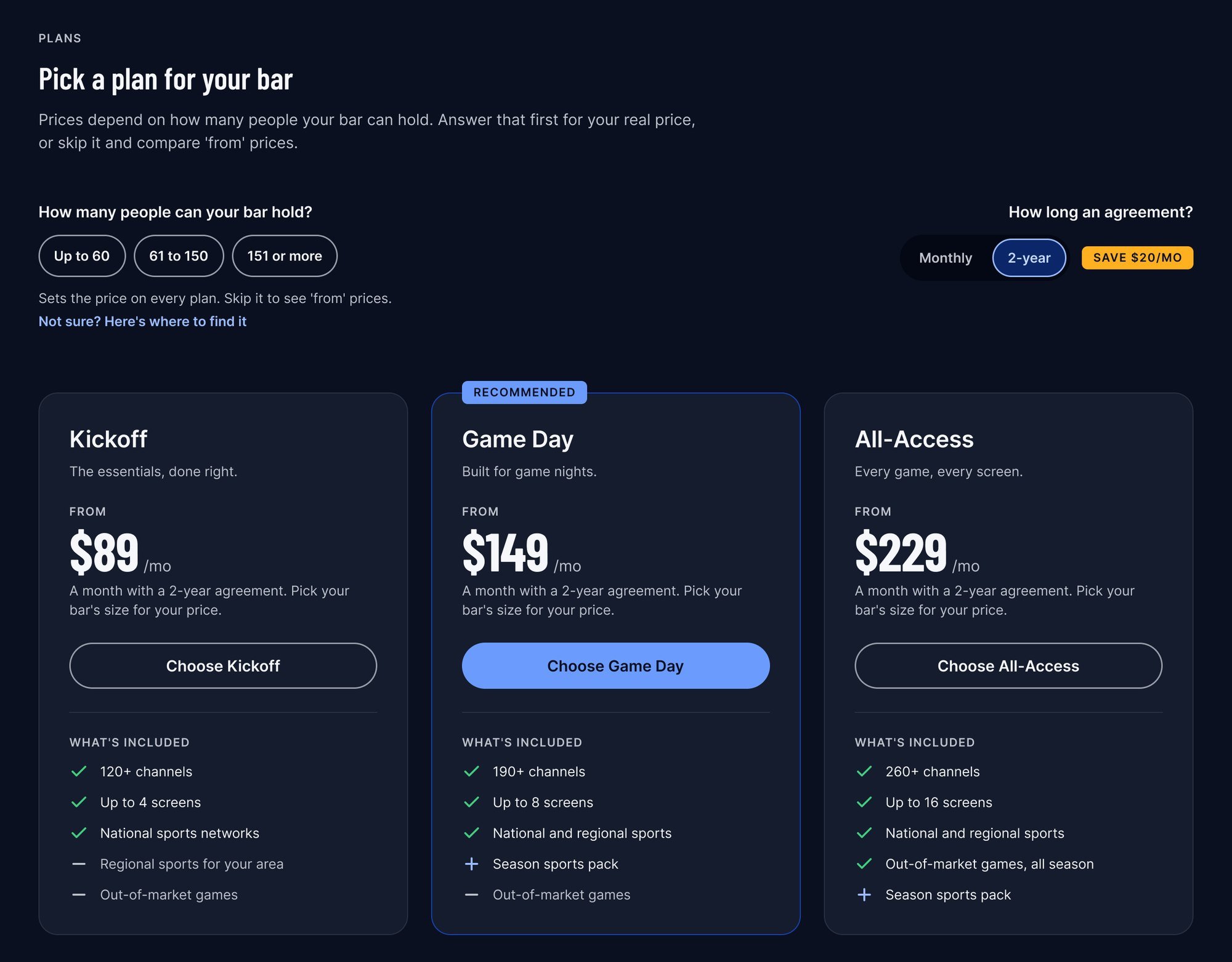
Pick a size, pick a plan, see the total.
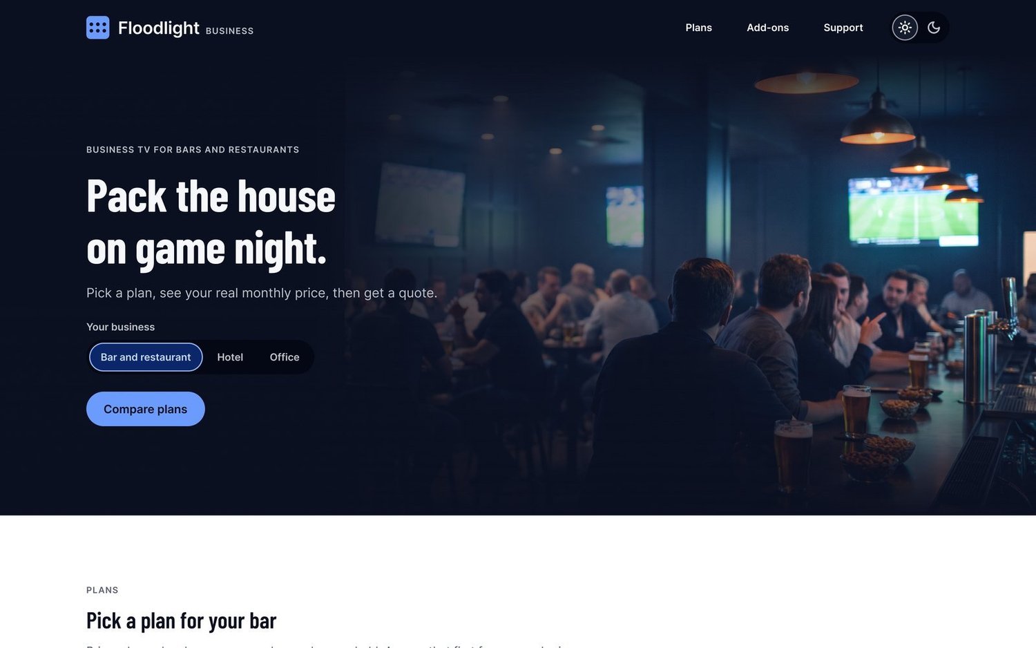
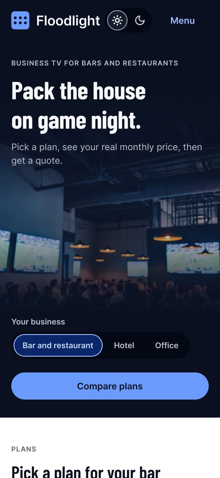
The components at work: a frame from the Figma file, stills from the prototype recording, and the page on a phone.
 1
2
3
4
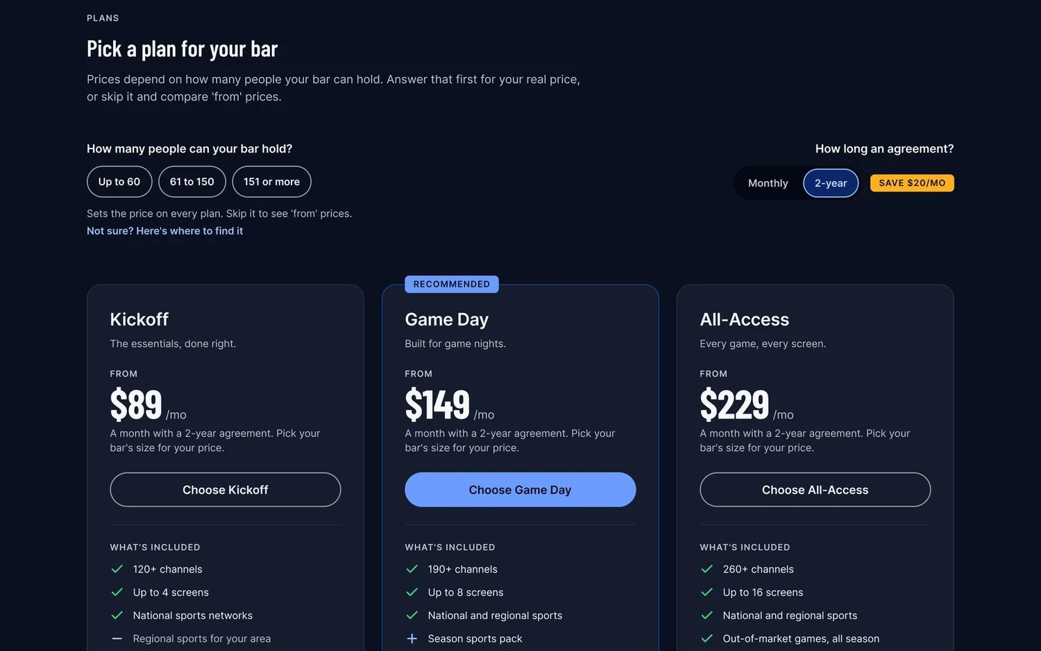
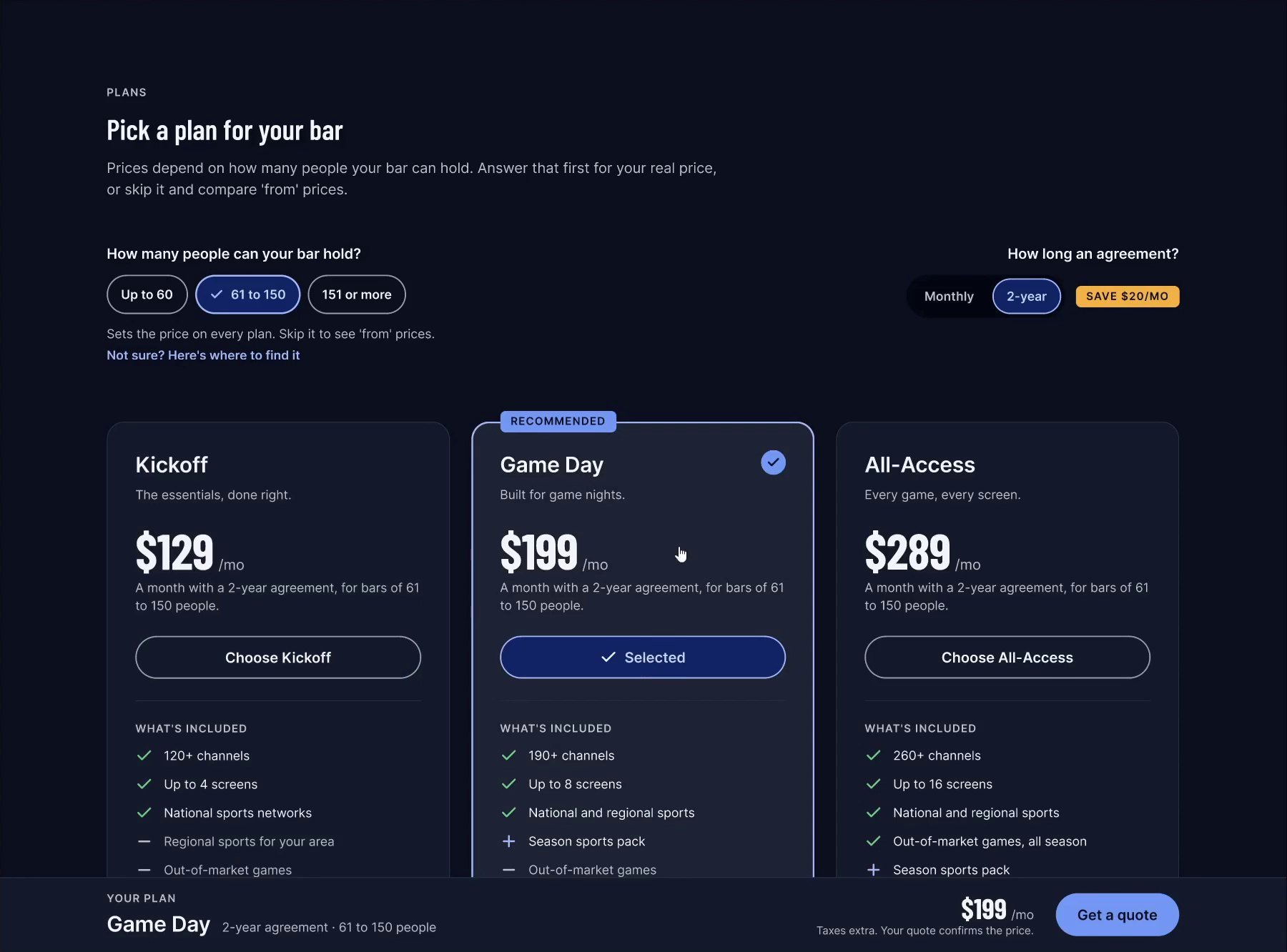
01The price starts with the bar.
- 1Three bar sizes, because the price follows how many people the bar can hold. Picking one sets the price on every plan.
- 2Not sure? opens a short explainer: the size is the maximum occupancy on the fire department certificate, usually posted near the entrance.
- 3Monthly or a 2-year agreement. Monthly billing adds $20 a month, so the 2-year side says Save $20/mo.
- 4Until a size is picked, each card shows its “from” price: Kickoff $89, Game Day $149, All-Access $229.
 1
2
3
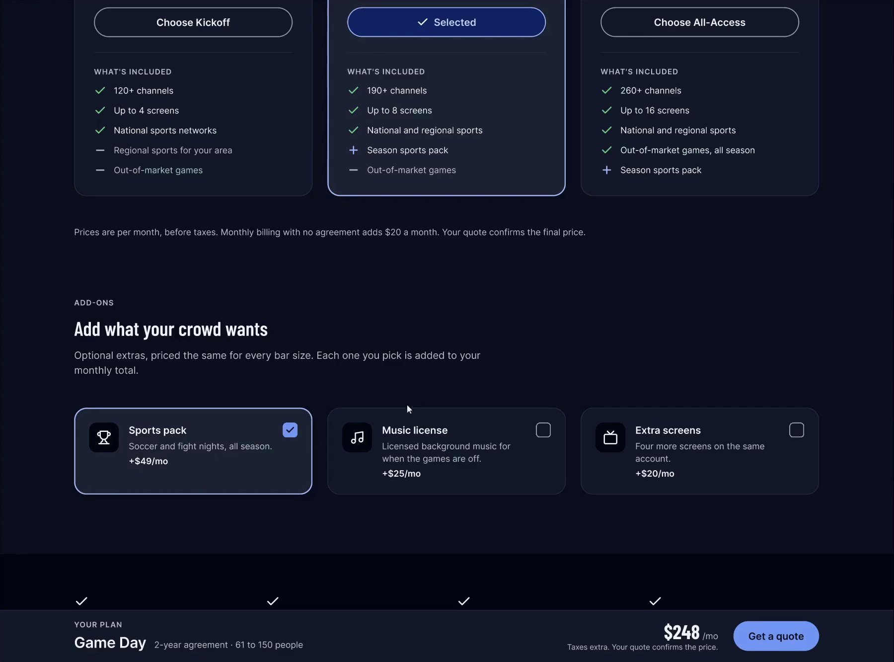
02Everything chosen looks chosen.
- 1A check in the corner, a tint and a strong outline. Since my first click test, every selected thing on the page shares this one look.
- 2The button turns into Selected with a check, so the state is in words as well as color. When Game Day isn’t chosen, its Recommended badge stays and the outline goes.
- 3The summary bar keeps the choice in view down the page: the plan, the agreement, the bar size and the monthly total.
 1
2
3
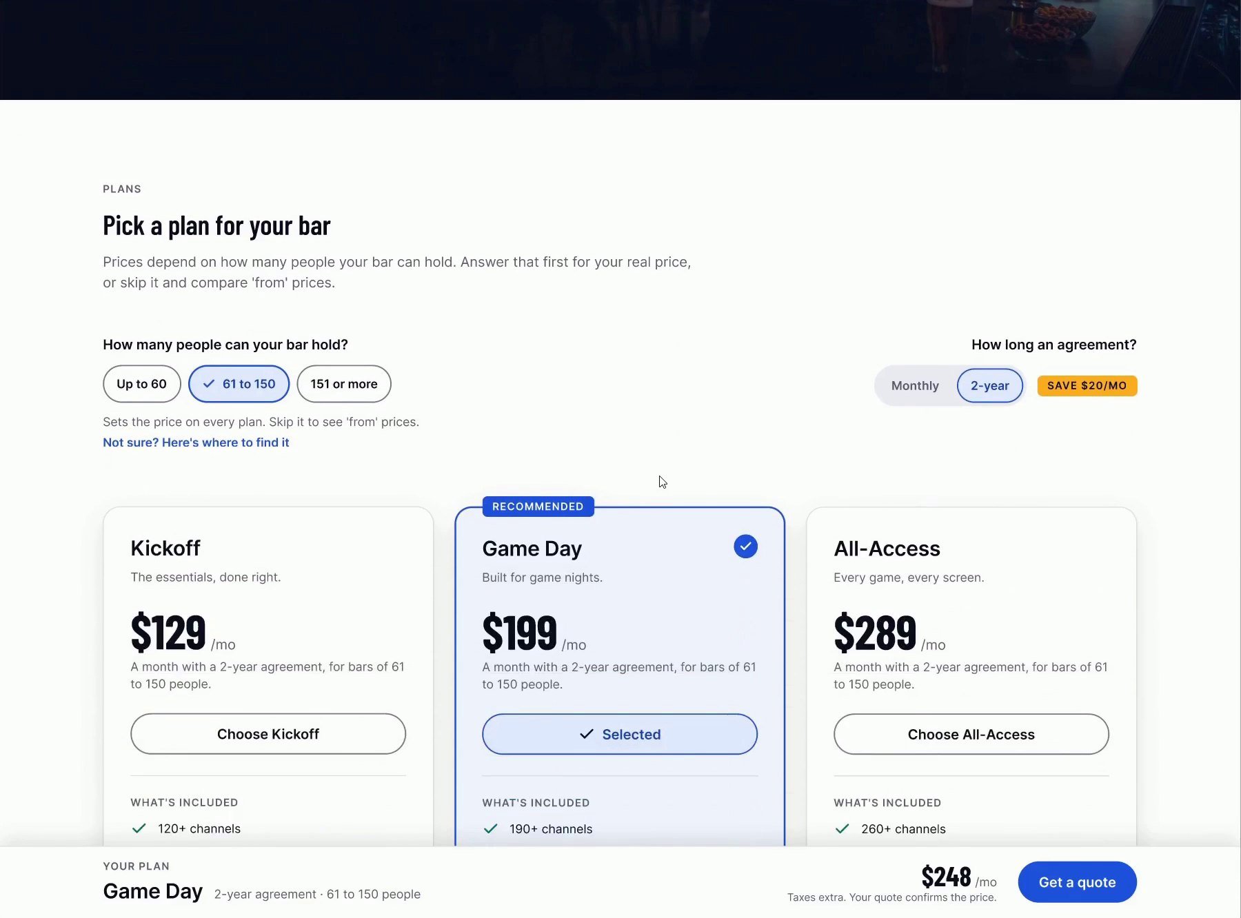
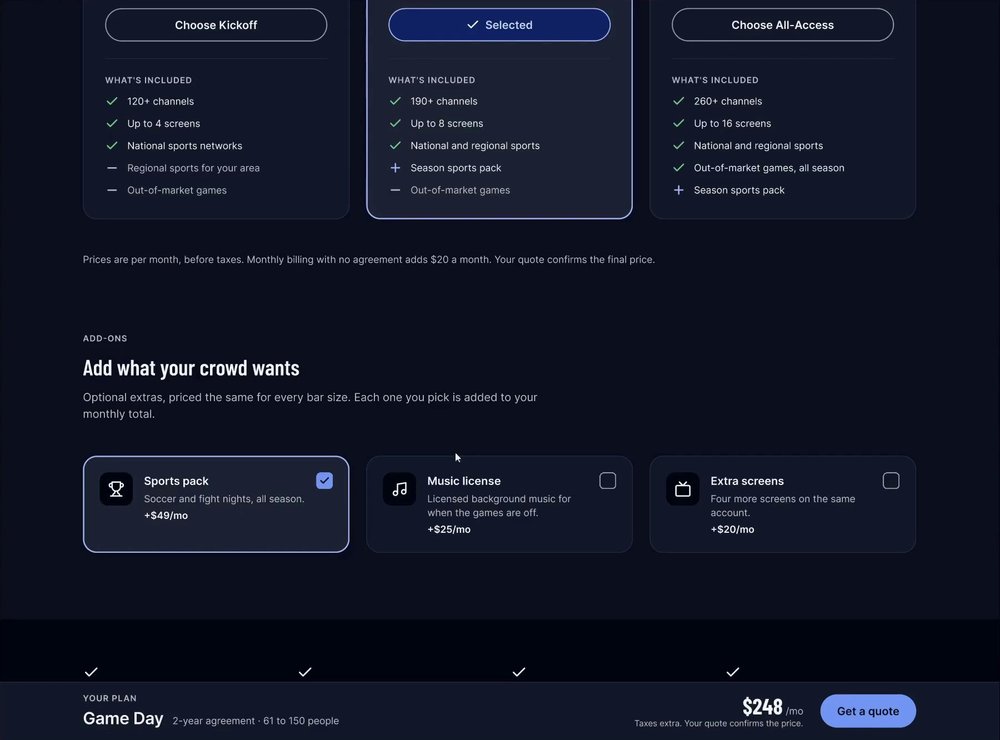
03Add-ons go straight into the total.
- 1Three extras, priced the same for every bar size: the Sports pack, a music license and extra screens.
- 2A picked add-on gets the same chosen look as a plan: the tint, the outline and the check.
- 3The summary bar adds it right away, from $199 to $248. Unticking takes it back out, which my second click-through found it didn’t do at first.
 1
2
3
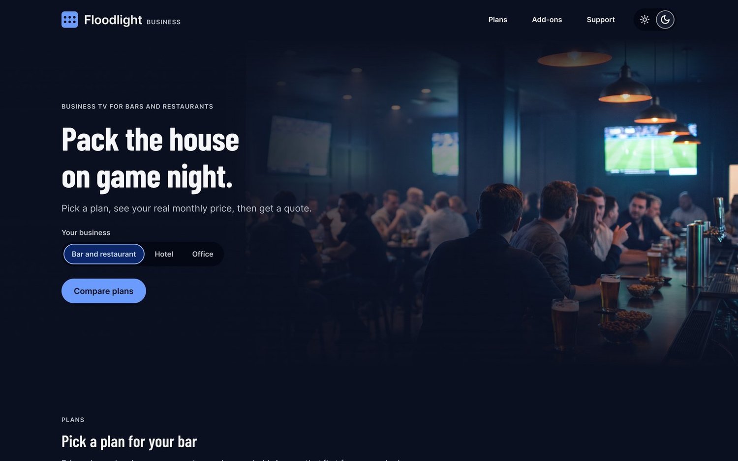
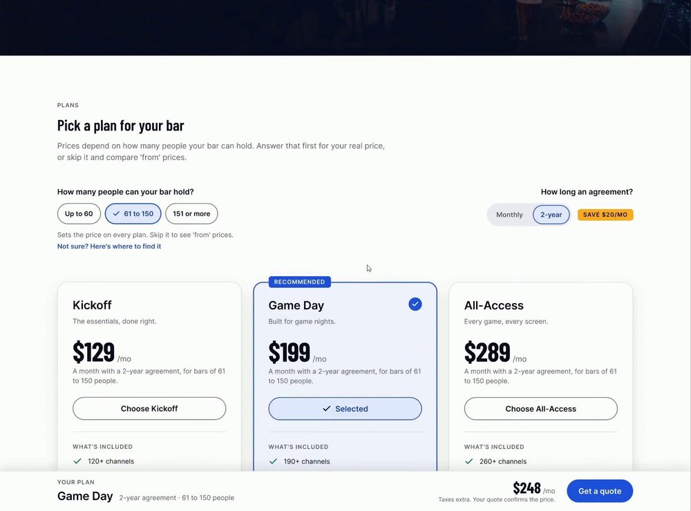
04Switch the theme, keep the choices.
- 1The same page after the theme toggle in the header: the bar size is still 61 to 150, and the agreement still 2-year.
- 2Game Day is still selected, with the same check, tint and outline, now drawn from the Light tokens.
- 3The Sports pack and the $248 total carry over too. It’s one page switching its mode, not two prototypes, so nothing the visitor picked is lost.
 1
2
3
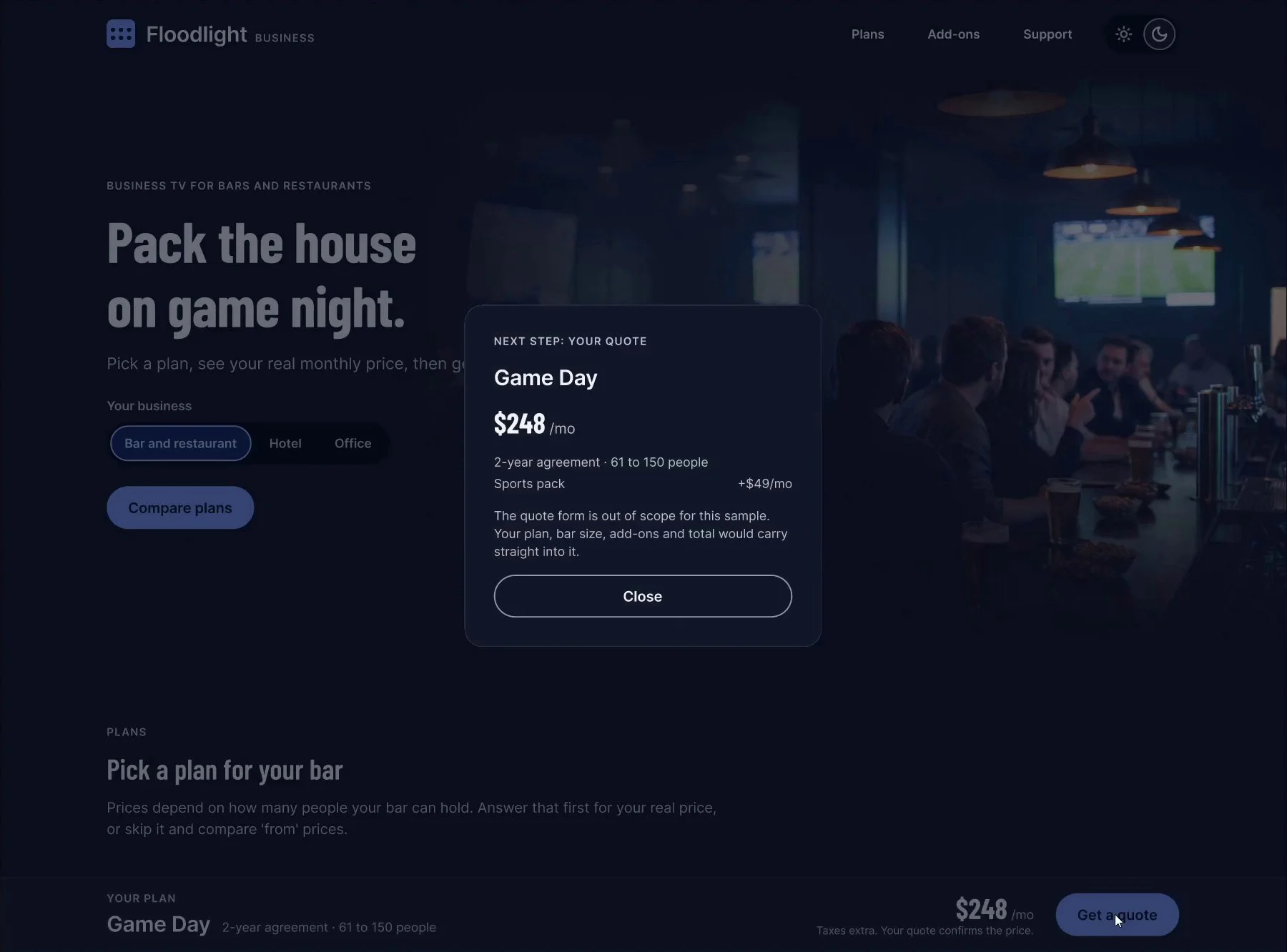
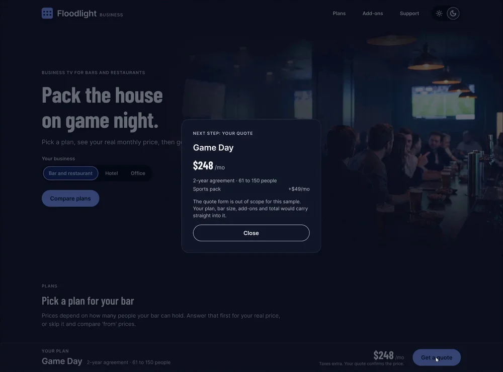
05The next step carries the plan.
- 1Get a quote opens the next step with the plan and the monthly total already in it.
- 2Each add-on gets its own line, so the quote matches what was picked. Before my second click-through, the lines didn’t follow the add-ons.
- 3The quote form itself is out of scope, and the card says so. Close it, or click anywhere on the dimmed page: every overlay closes both ways.
 1
2
3
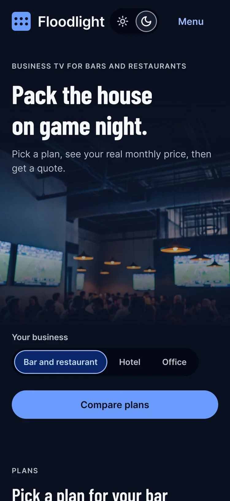
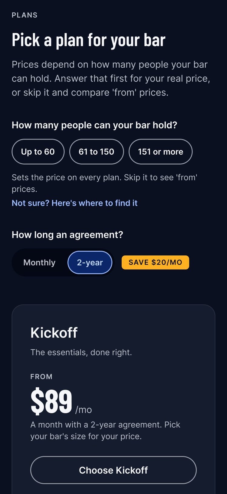
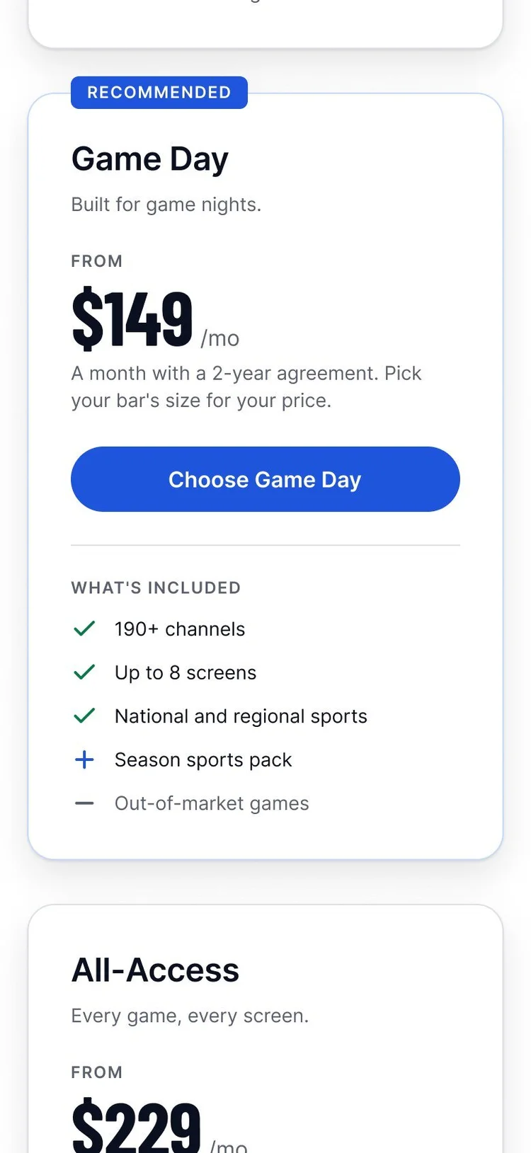
06The same choices on a phone.
- 1On a phone the three bar sizes still fit one row, with the explainer link under them.
- 2The agreement switch and its Save $20/mo badge get their own line.
- 3The cards stack, one to a row, here in light. The header’s Menu opens a sheet with the same links, another fix from the second click-through.
The prototype
48 seconds through the dark prototype.
Pick a bar size, a plan and an add-on, switch to light and back, then open a quote.
Recorded from the Figma prototype on Nov 10, with no sound. The same flows also run on mobile, in both themes.
- 0:06 The bar size explainer, over a dimmed page.
- 0:13 Prices update when the agreement changes.
- 0:21 Game Day chosen: Selected, with a check.
- 0:27 The Sports pack takes the total from $199 to $248.
- 0:33 Light and back, with every choice kept.
- 0:41 The quote, with the Sports pack on its own line.
What I’d test next
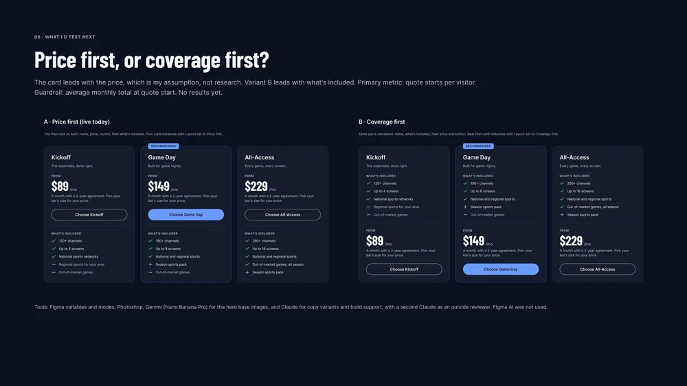
Price first, or what’s included first?
The card leads with the price. That’s my assumption, not research, so the next step is a test, built from the same plan card with its layout switched.
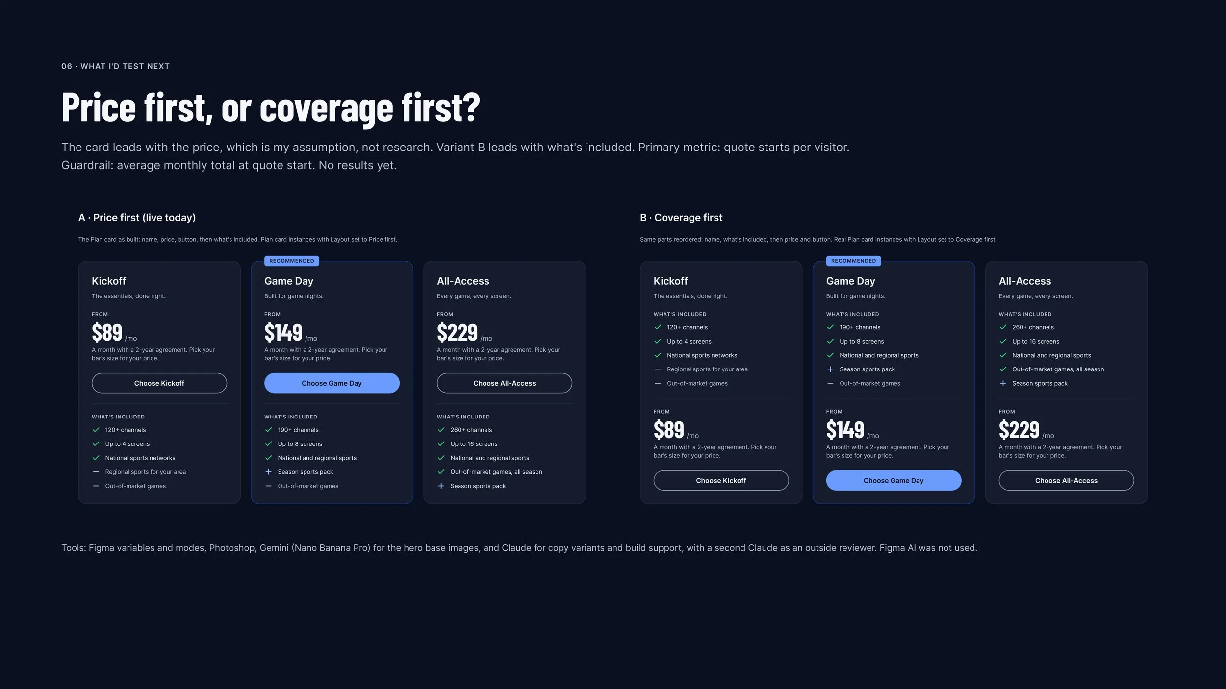
- 1A, price first. The card as it is: the name, the price and the button, then what’s included.
- 2B, what’s included first. The same parts reordered, as real plan card instances with their layout set to coverage first.
- 3Primary metric: quote starts per visitor.
- 4Guardrail: the average monthly total at quote start, watched alongside. No results yet: this is the plan, not a finding.
The whole collection
Every page and frame, at full size.
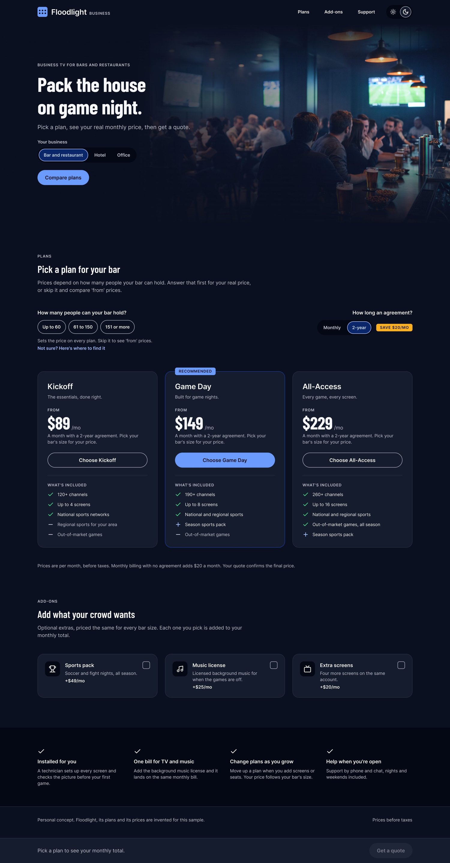
The full desktop pages first: each one scrolls inside its window. Then a strip of the two boards, the phone pages, the recording stills and the case study frames; scroll it sideways, and each opens at full size in a new tab.
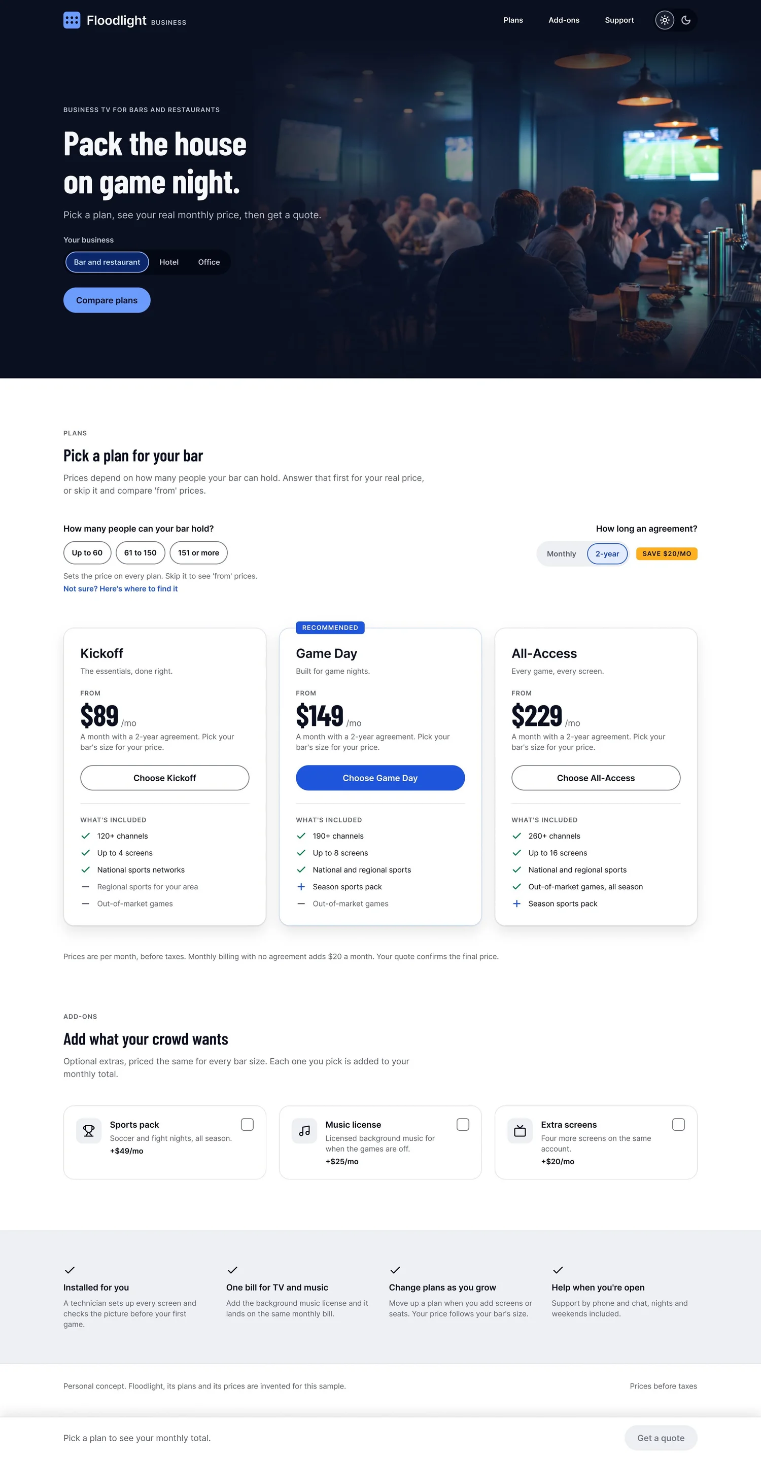
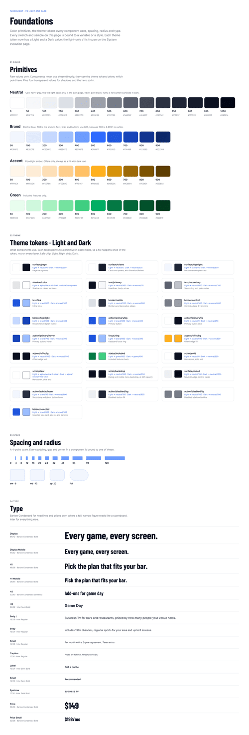 Board Foundations
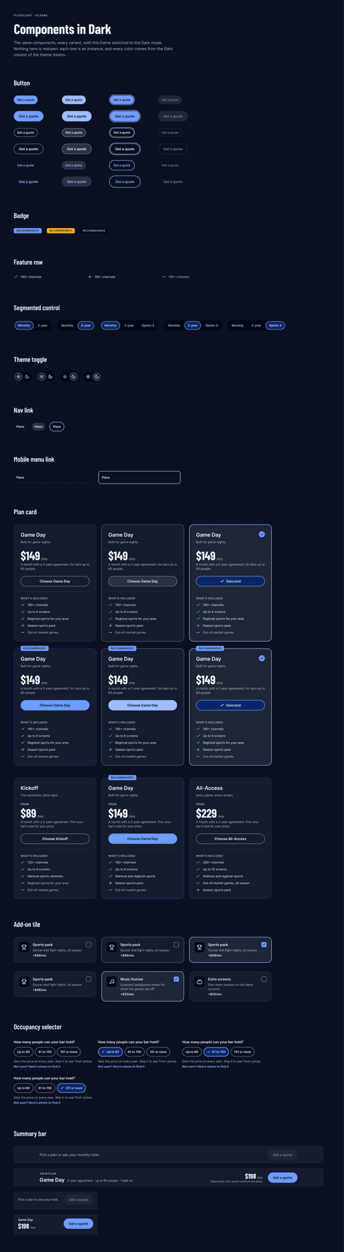 Board Components in Dark
 Phone, dark The whole page
 Phone, light The whole page
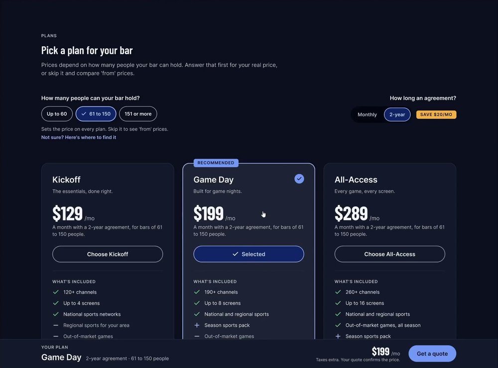 Recording Game Day selected
 Recording The Sports pack added
 Recording Switched to light
 Recording The quote
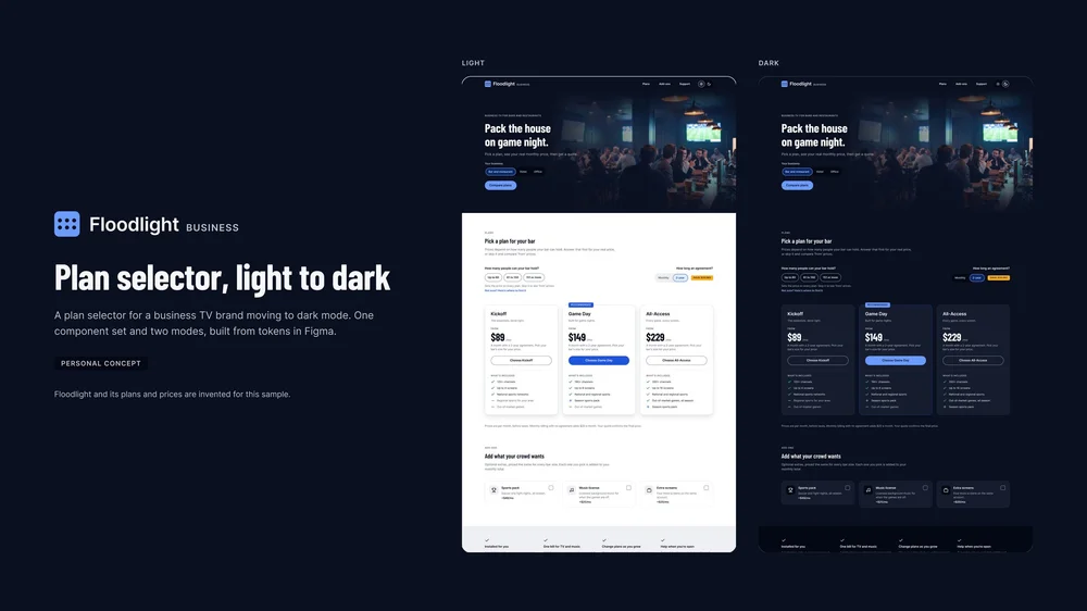 Frame 01 Cover
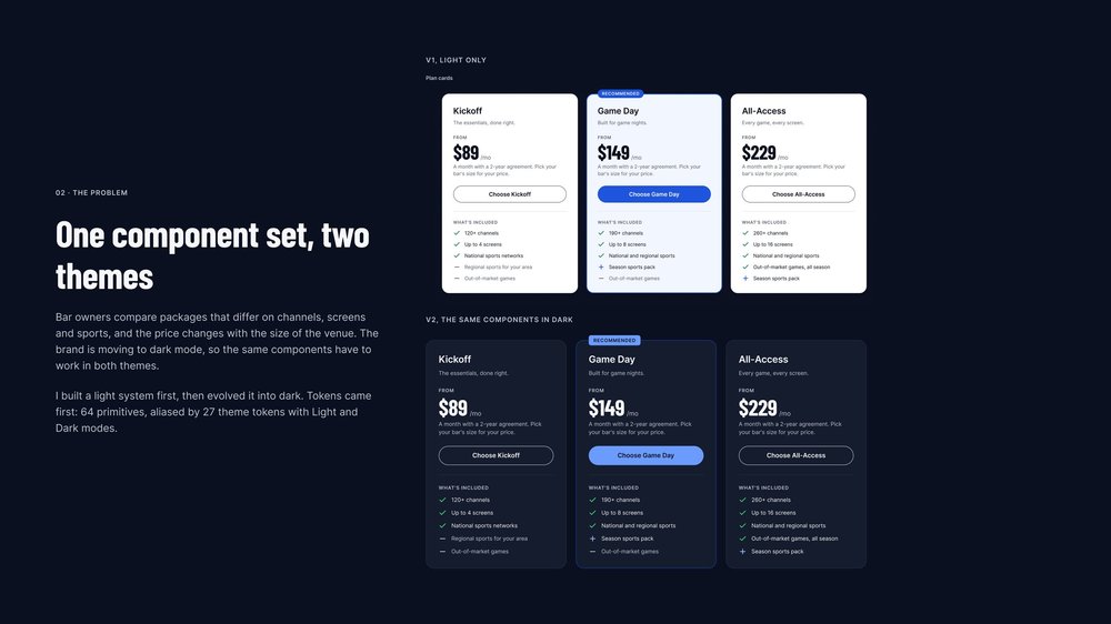 Frame 02 The problem
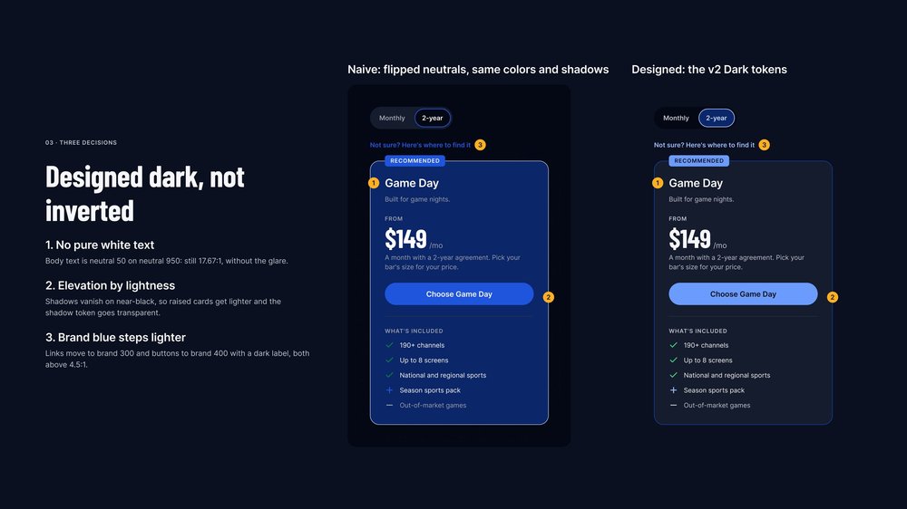 Frame 03 Three decisions
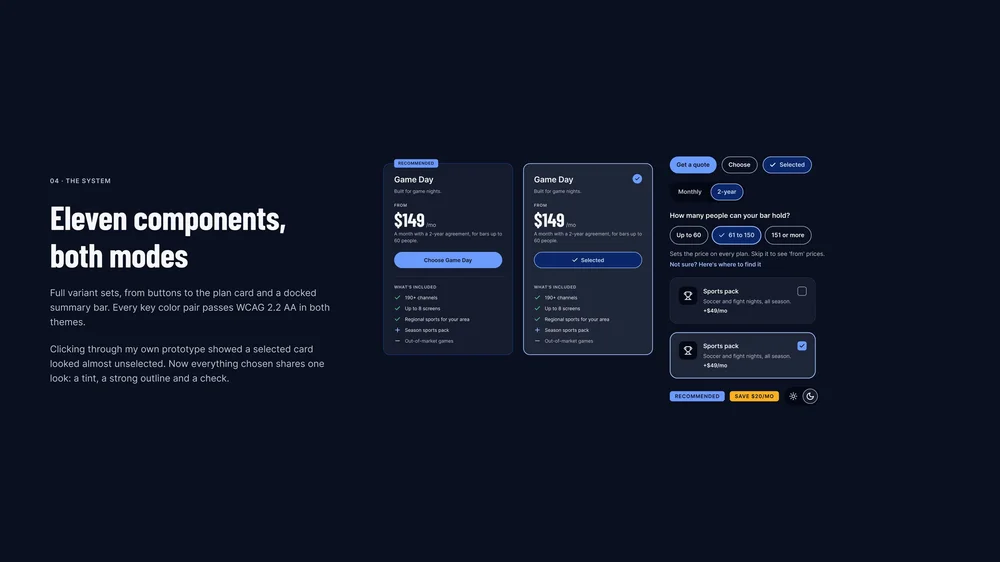 Frame 04 The system
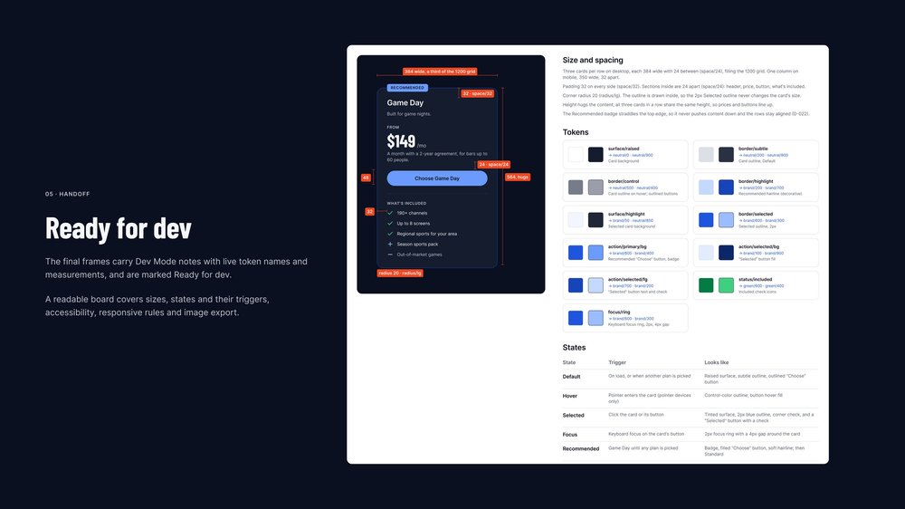 Frame 05 Handoff
 Frame 06 What I’d test next
 Board Flipped beside designed


What I learned
Design the tokens once, and dark mode follows.
- Tokens before components. Because every component points at a theme token, dark mode was a second set of values, not a second set of screens.
- Name by role, not by color. action/primary/bg still makes sense when its value changes from brand 600 to brand 400. A name like blue-600 would not.
- Dark isn’t inverted. Shadows, the brand blue and pure white each needed their own answer, and the flipped version shows why.
- A library is real once another file uses it. The second file proved the components work outside the file that made them.
- Click through your own work. My first click test found a selected card that looked almost unselected. No static frame showed it.
- Name the assumption. Price first is a guess, so the page ends on how I’d test it, not on a claim.
Floodlight argues that dark mode is a system decision, not a coat of paint: build the tokens once, and one set of components serves both themes.