-
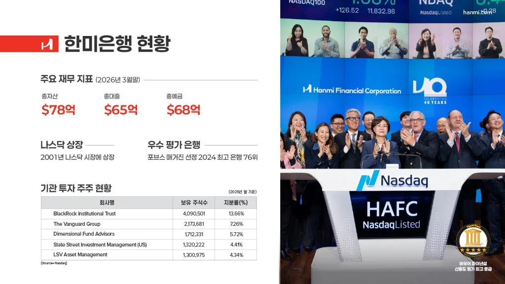
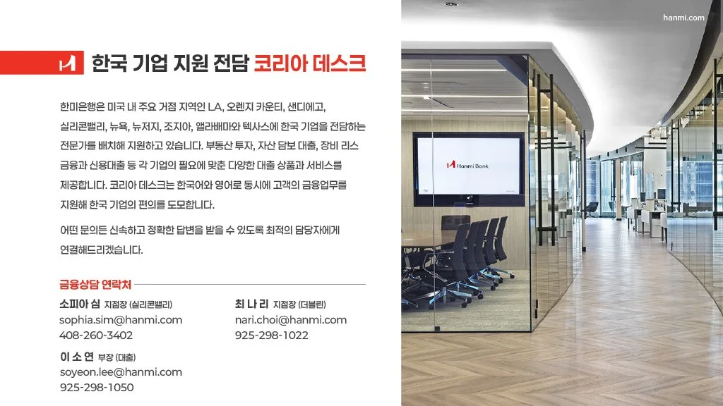
Hanmi Bank serves Korean businesses operating in the United States. This project was a Korean-language guide to U.S. corporate finance — 한국 기업을 위한 미국 금융 가이드 — aimed at companies entering or expanding into the American market.
The audience made this harder than a standard finance deck. The reader is a decision-maker who is fluent in business but unfamiliar with the U.S. financial system, reading in Korean about products, partnerships, and regulatory structures that were designed and named in English. Terminology that translates literally often doesn't translate usefully, and a layout built for English reading rhythm doesn't hold when the same content is set in Korean.
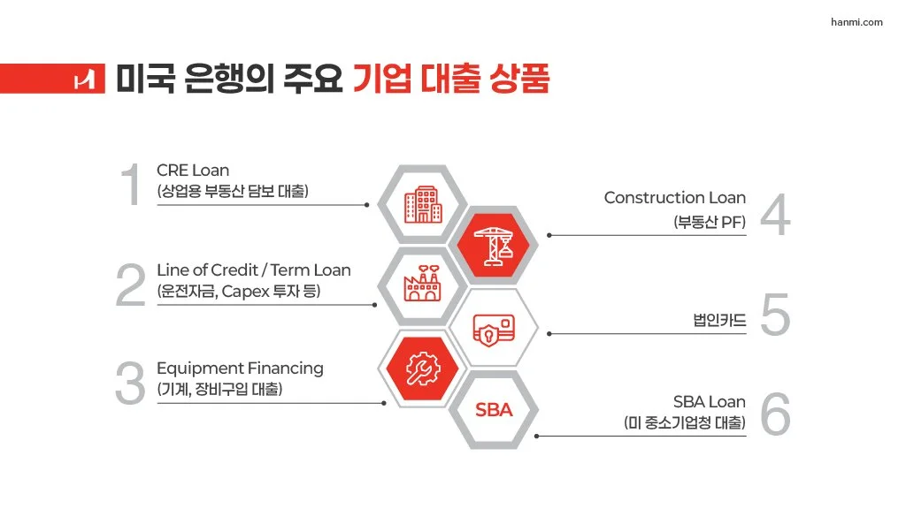
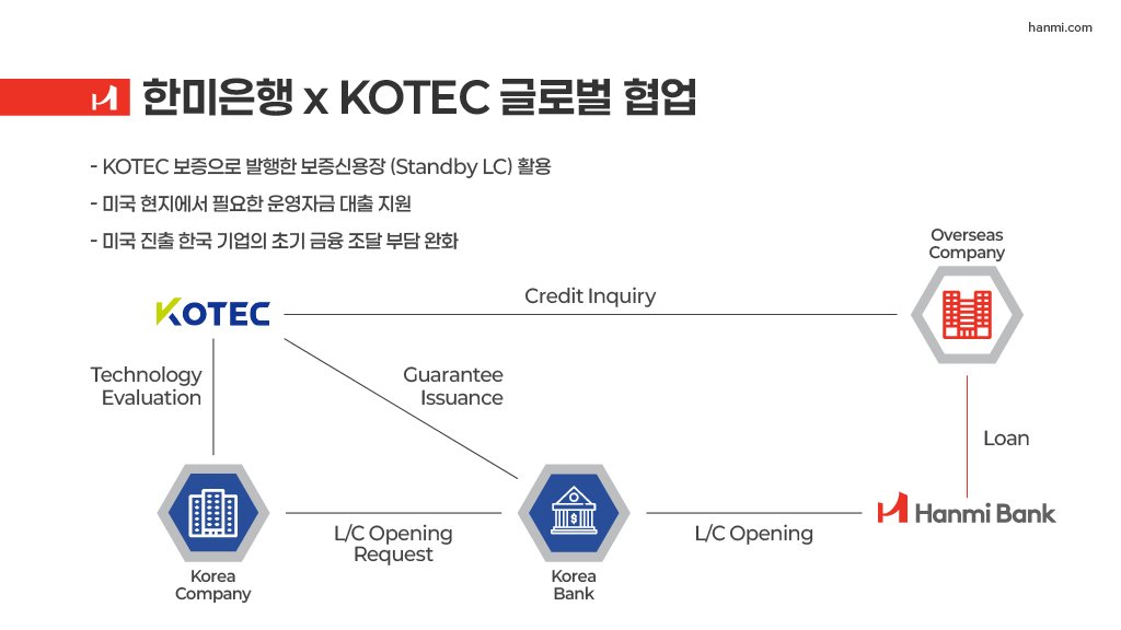
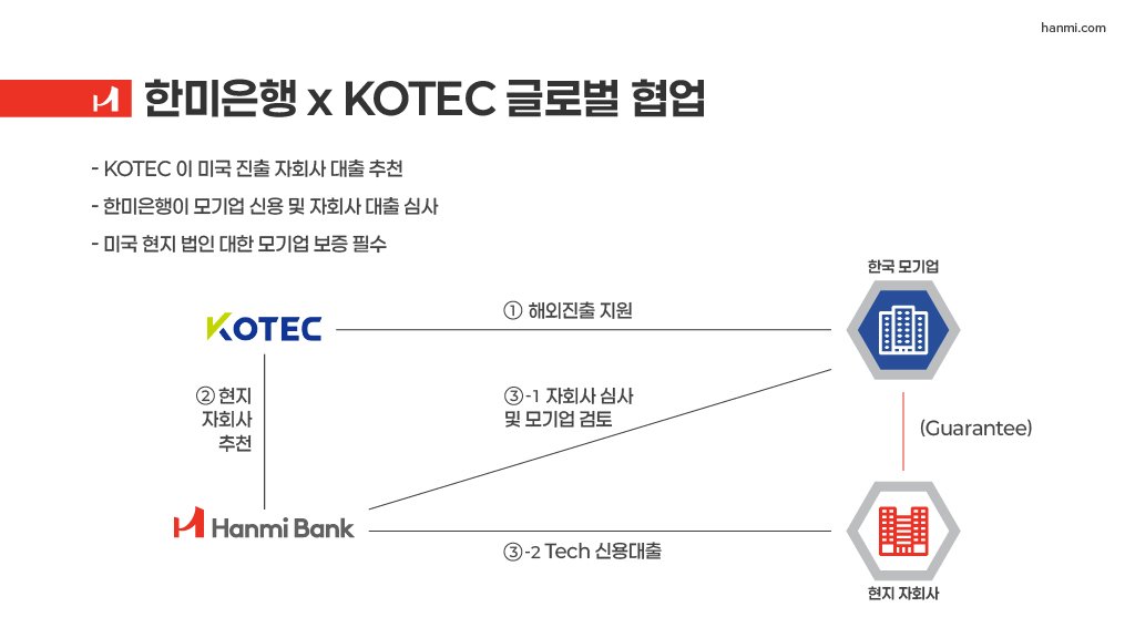
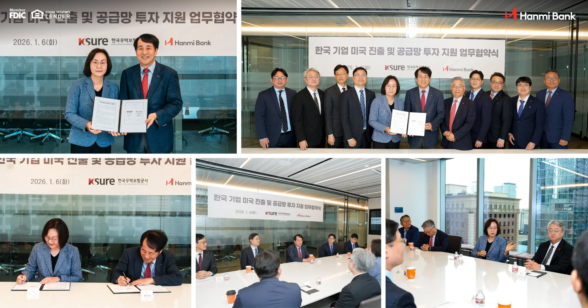
I worked bilingually through the whole document, which let me treat language and layout as one problem rather than designing a container and pouring a translation into it. The content moves from market context, to Hanmi's U.S. footprint, to the specific products available, to cross-border partnership structures such as the KOTEC relationship. The most complex material — how a Korean company actually reaches a U.S. financing product, and who sits between them — I moved out of prose and into flow diagrams, so the reader can trace the path rather than reconstruct it from paragraphs.
Hanmi Bank
-
Designed a multi-section bilingual guide for Korean-speaking business readers in the U.S. market
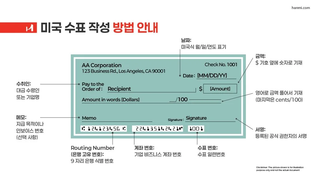
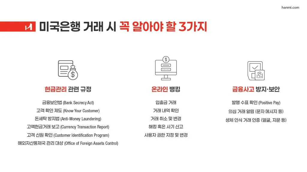
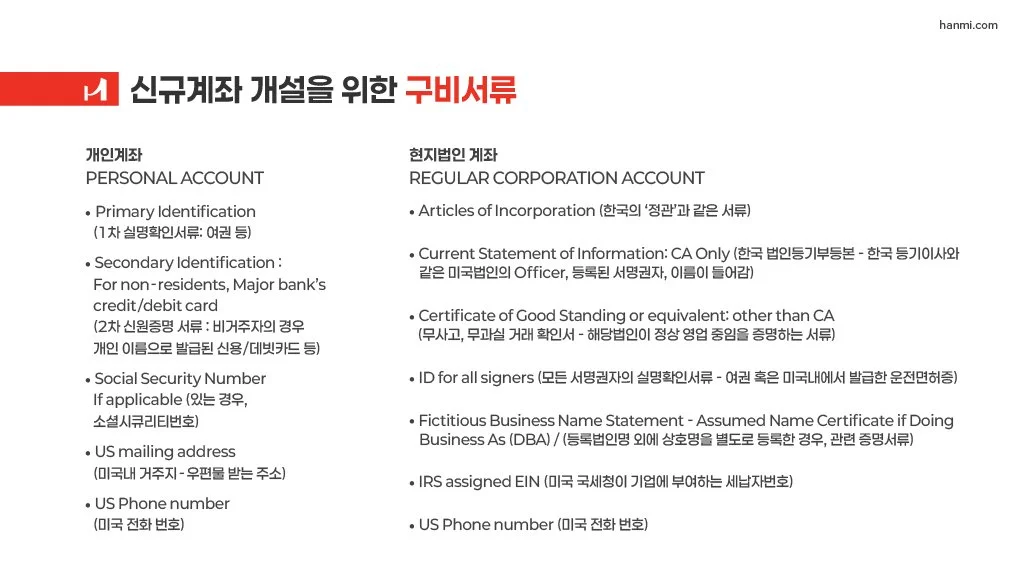
Set Korean typography for hierarchy and reading comfort rather than treating it as substituted English text
Built diagram systems for cross-border financial relationships, including the KOTEC partnership structure
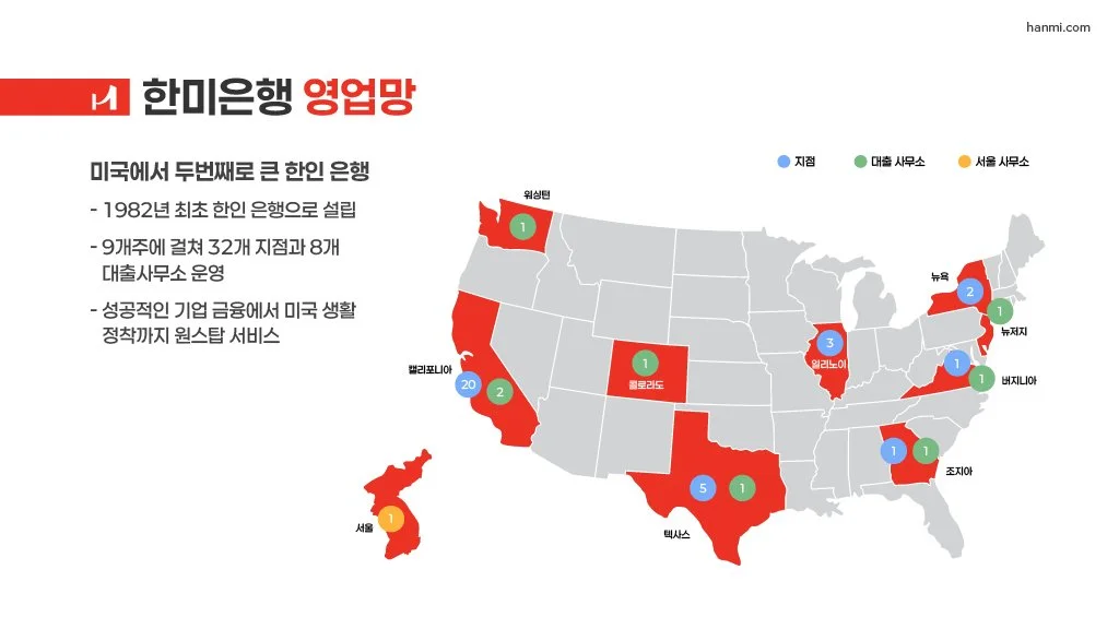
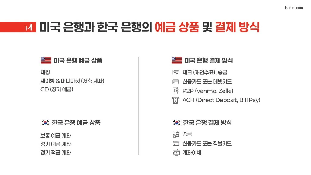
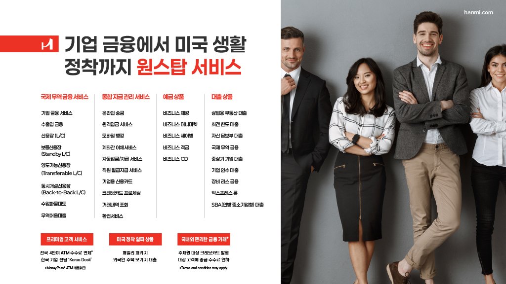
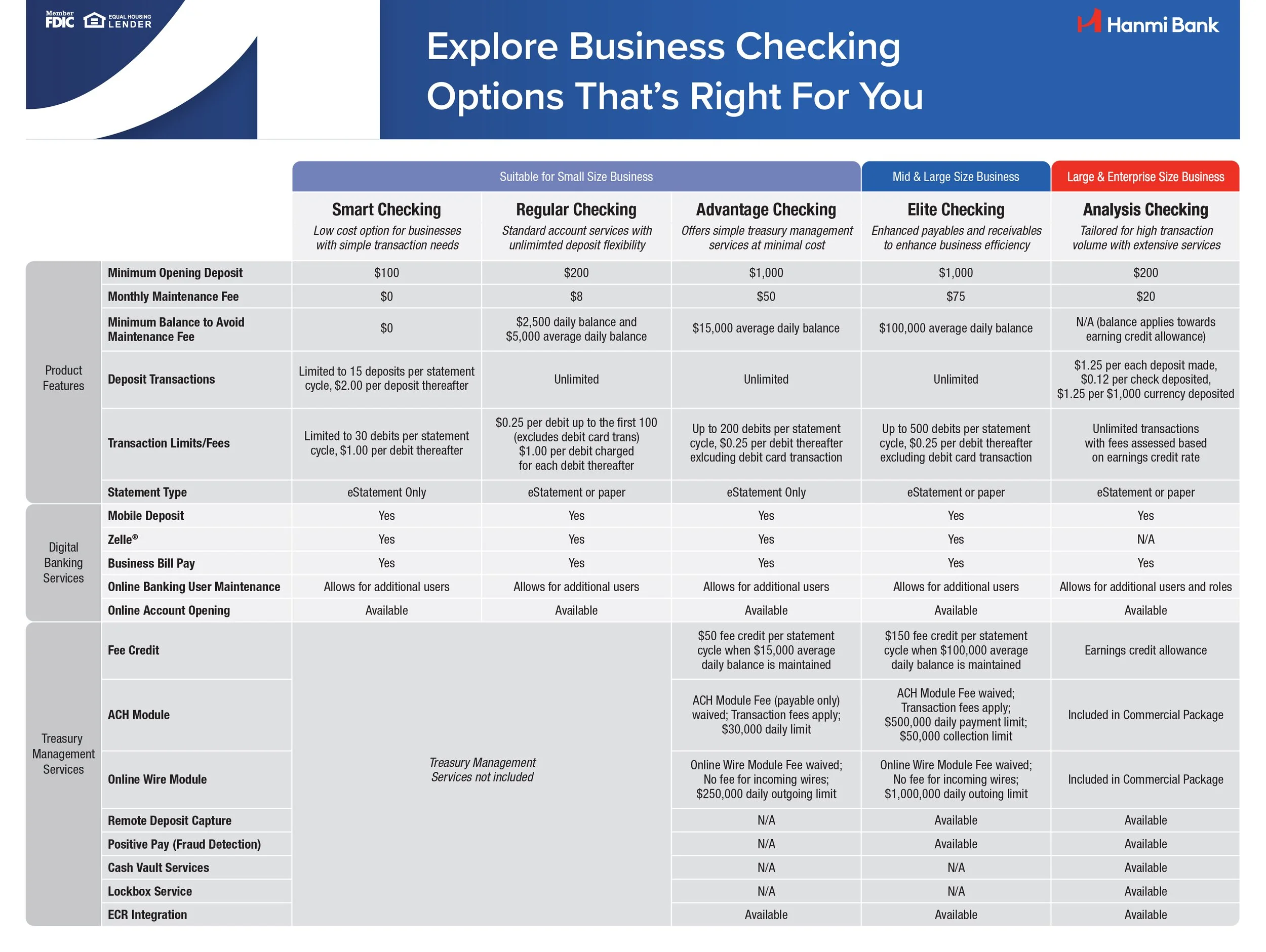
Designed the U.S. network map and the product comparison views
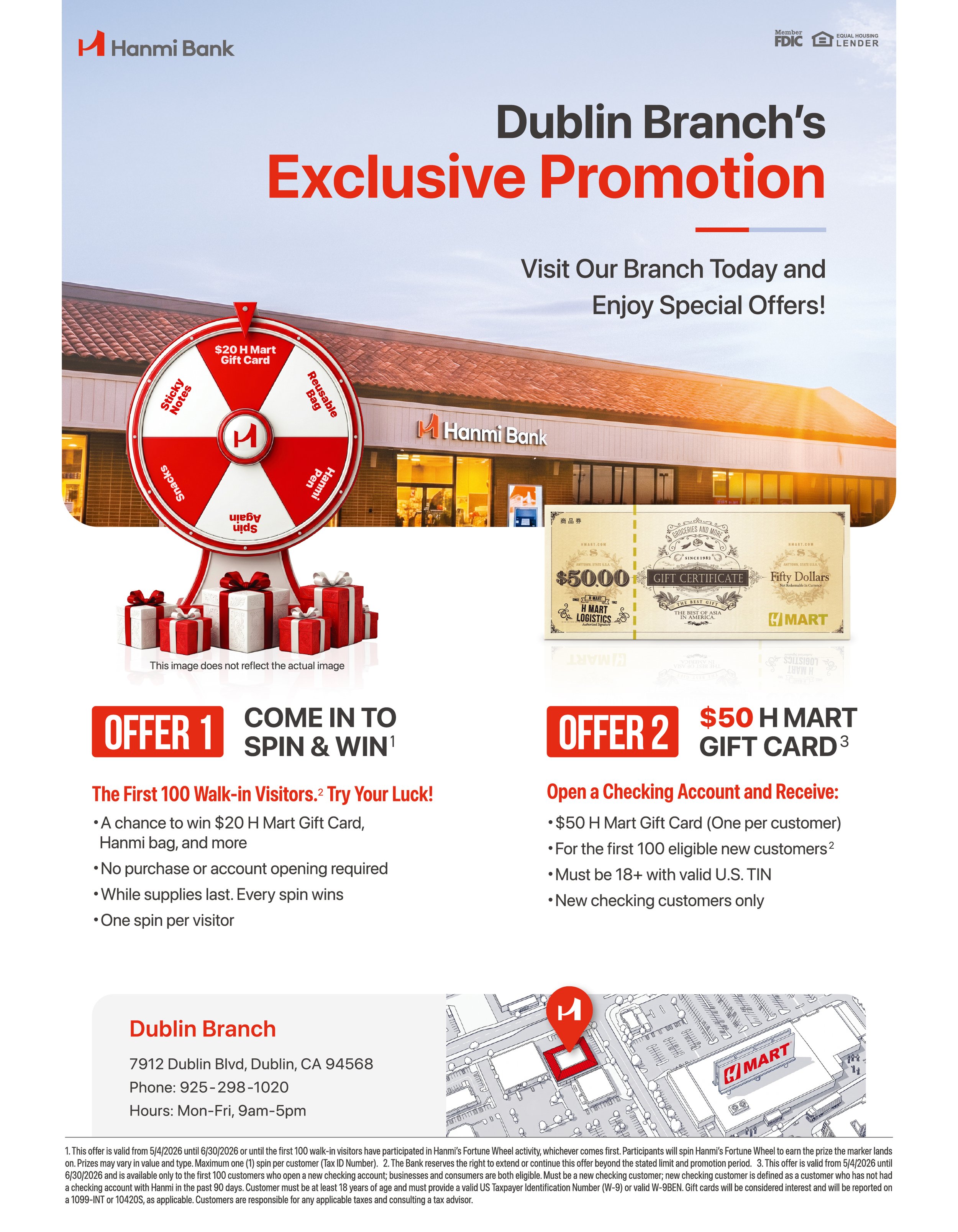
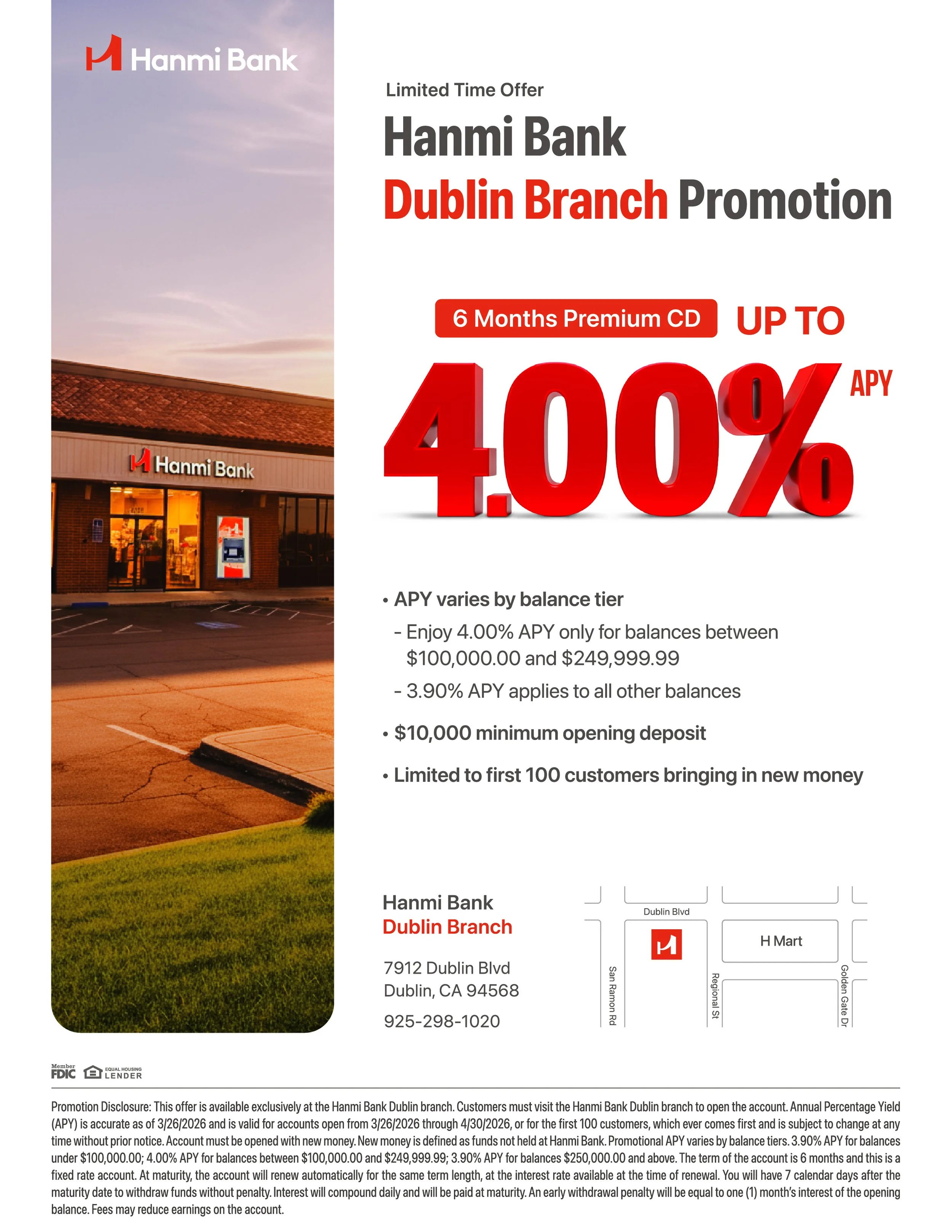
Maintained Hanmi's brand system across the document while keeping dense financial content scannable
-
Designing for an audience whose context you have to hold in two languages at once — and choosing diagrams over prose when a relationship is easier to trace than to read. Localization is a product problem far more often than teams treat it as one.