
rom&nd Freelance client work Campaign graphics
ArrivedA one-page brief and a soft, romantic mood MadeCampaign scenes built around the real products
rom&nd is a Korean color cosmetics brand that sells lip tints, cheeks and mascaras on Instagram, TikTok Live Shop and its own Shopify store. A shopper there can’t try a shade before buying, so the picture has to do it: the color, the finish, the size of the tube in a hand. Each request arrived as a page of text and an image or two for mood. If the product in the picture isn’t the product in the box, the sale doesn’t hold.
What arrived
One page of text, and a shade nobody can try on.
Each request came from the marketing team as a one-page Word document: the campaign, what it had to say, and one or two images with a similar mood. Romhouse came with words only. Product and model photos lived in rom&nd’s shared drive, and digging out the right shade, angle and resolution was part of every job. There was no formal spec, but the brand’s mood was fixed (soft, romantic and playful), and a review could send a piece back to the start when the mood was off.
So one rule held across all six: the scene can be generated, the product can’t. Wherever a product appears, it is one of rom&nd’s own photos, placed one by one and matched to the scene’s tone.
What I made
Pretty enough to stop a scroll, accurate enough to buy from.
 1
2
3
4
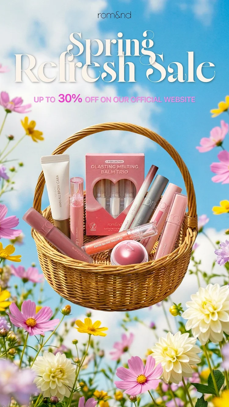
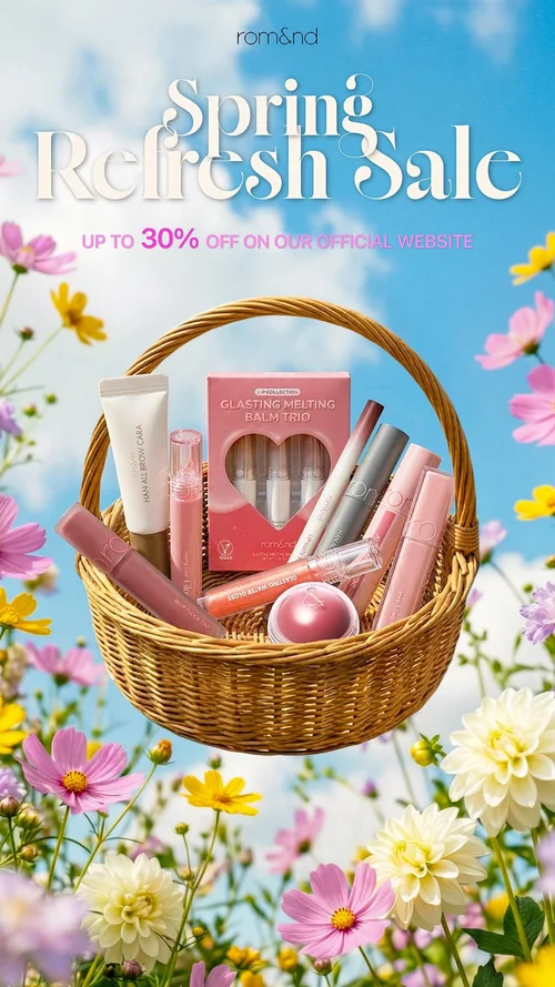
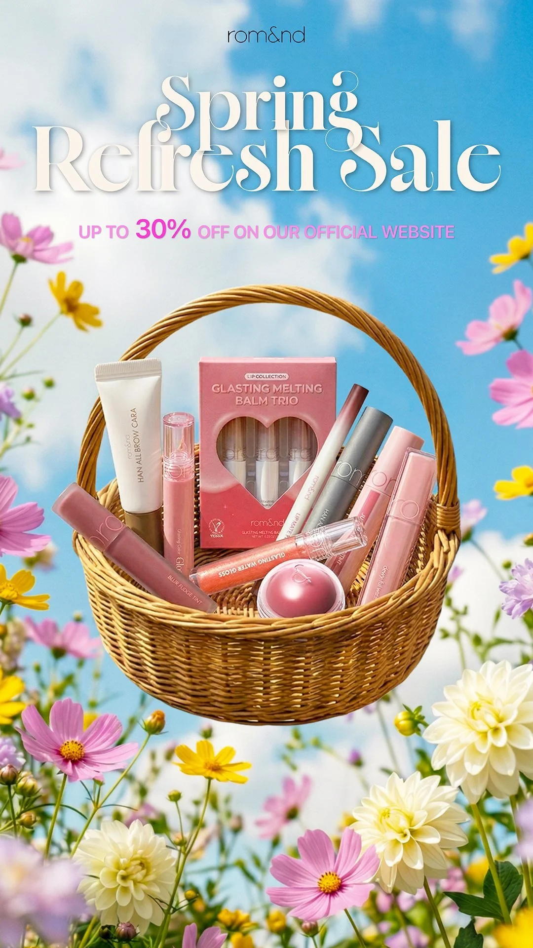
The sale story. A basket that fills, so the offer has something to show.
- 1“Spring Refresh Sale” in a large display serif, set where the sky leaves room for it, so the season and the sale read as one line.
- 2The discount is the only number in the frame and the only line in brand pink, so it is read right after the headline.
- 3Every product is one of rom&nd’s own product photos from the brand’s drive, cut out and scaled against the others, so the basket shows what the sale actually covers.
- 4The field and the basket were generated in Gemini and composited in Photoshop, then graded together for clarity, vibrance and contrast, so the products sit in the scene’s spring light. It ran as an 11-frame GIF and a short video in which the basket fills one product at a time.
 1
2
3
4
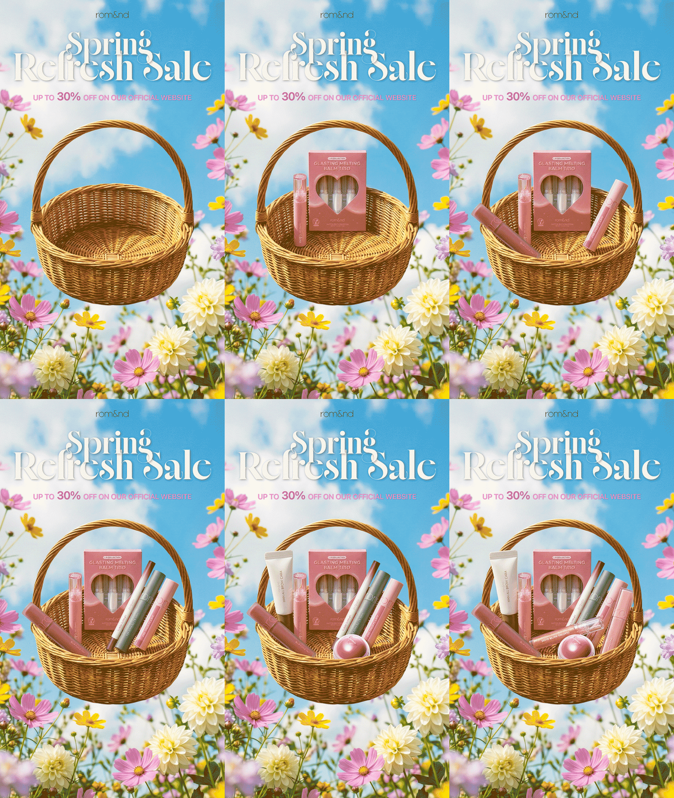
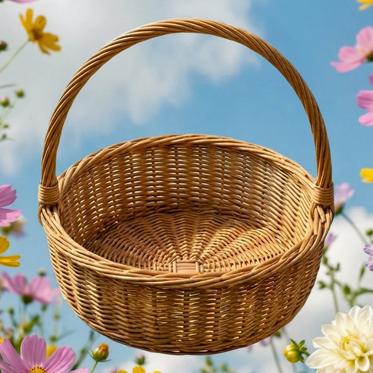
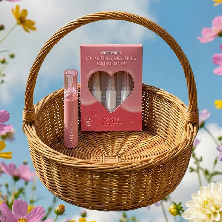
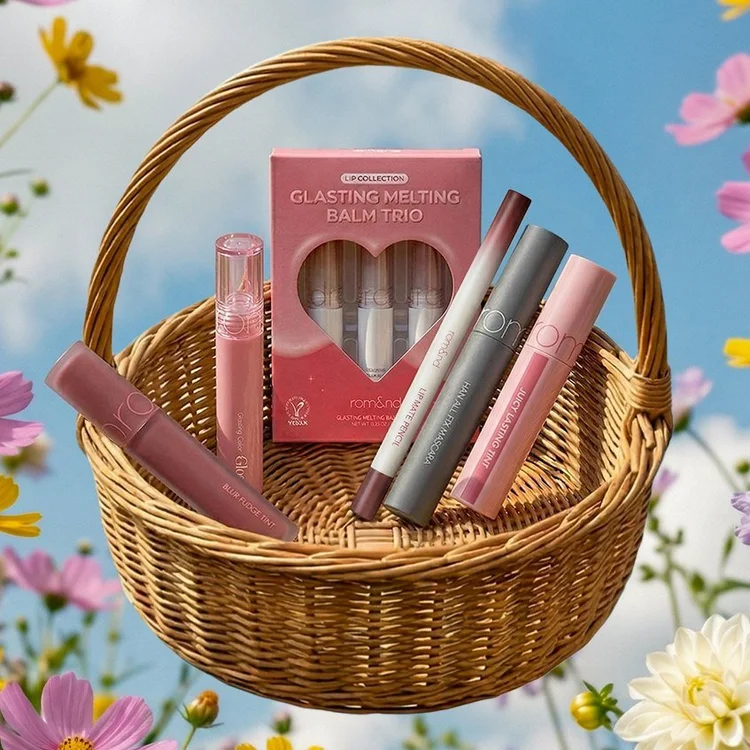
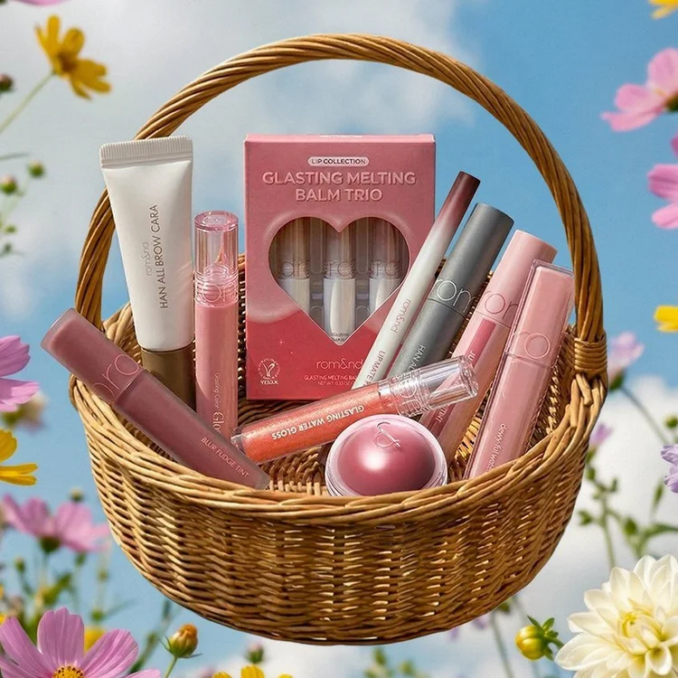
The build. One product at a time, one frame each.
- 1The first frame: the generated basket, empty, in its field.
- 2Each product goes in on its own layer, so it can be moved or swapped without touching the rest.
- 3The large pieces stand at the back and the small ones lie in front, so every product stays visible as the basket fills.
- 4The last frame. The headline, the offer and the logo sit over every frame unchanged, so in the GIF only the basket moves.
 1
2
3
4
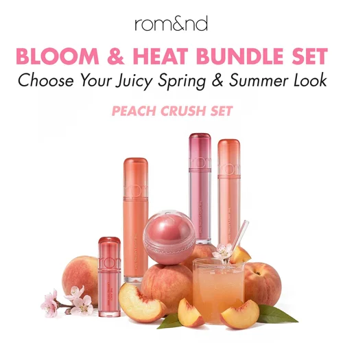
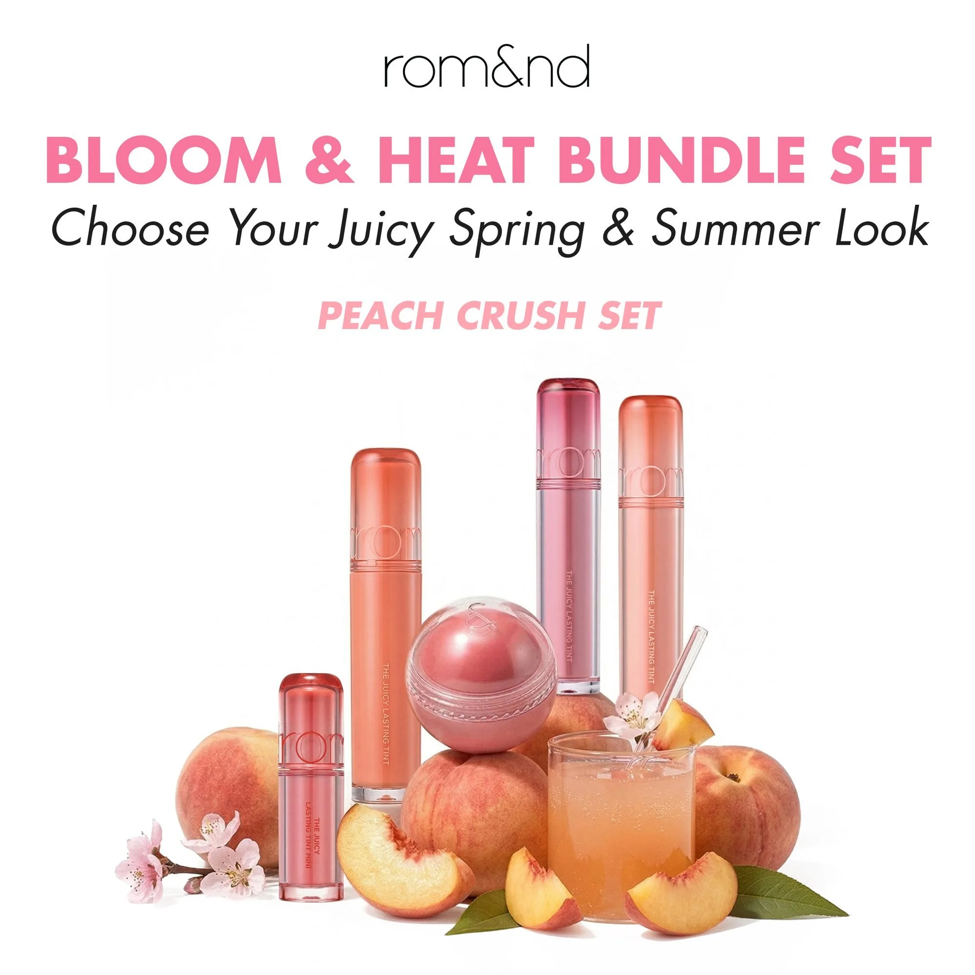
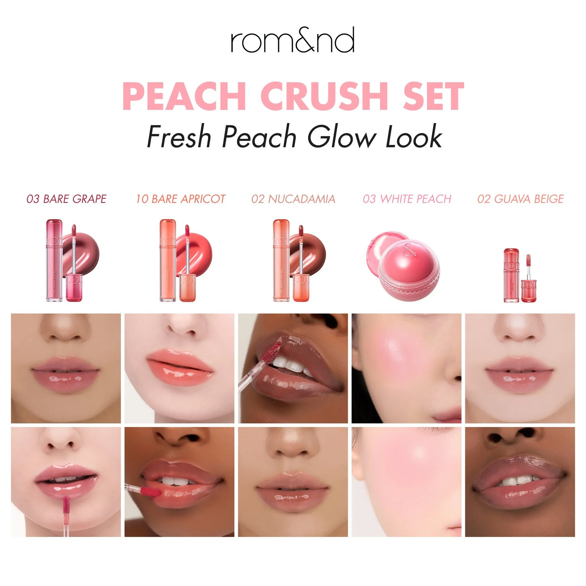
The bundle carousels. Two sets side by side, so choosing one is the whole post.
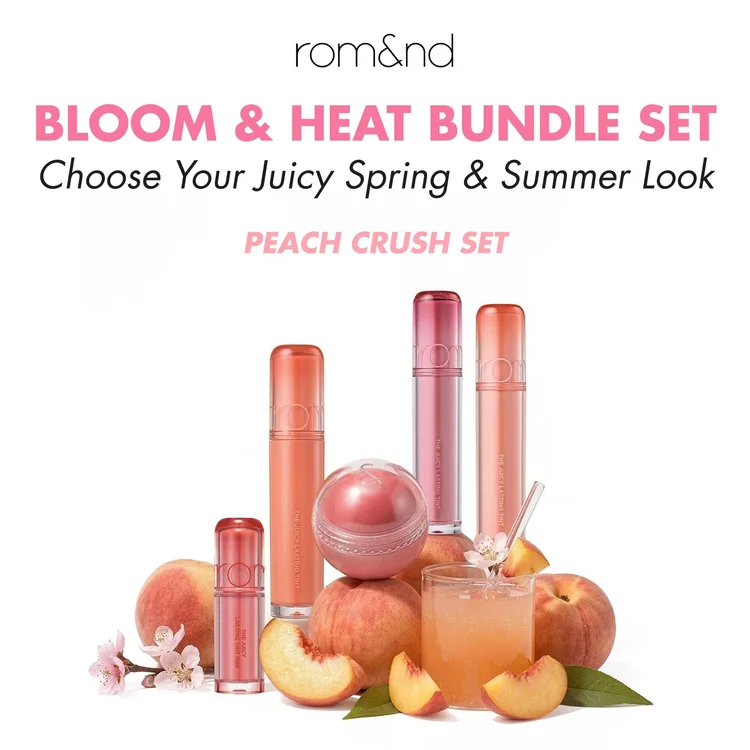
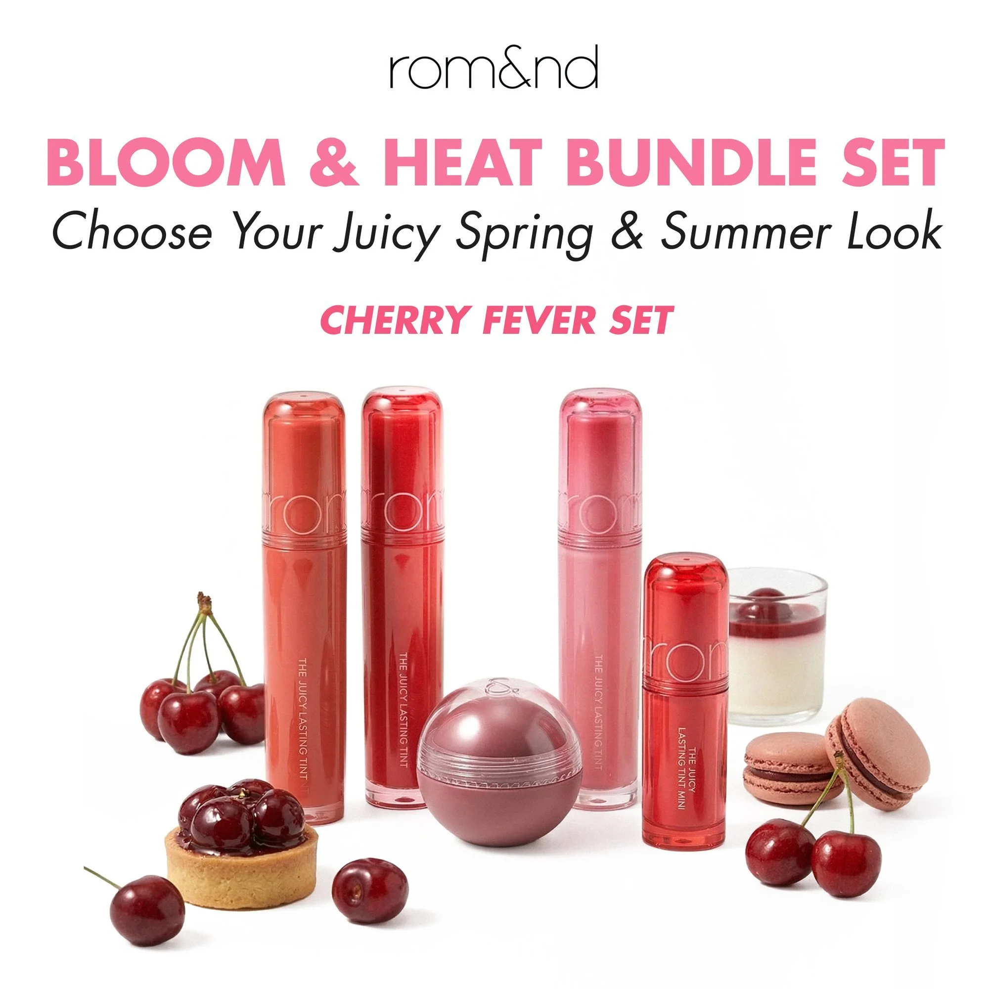
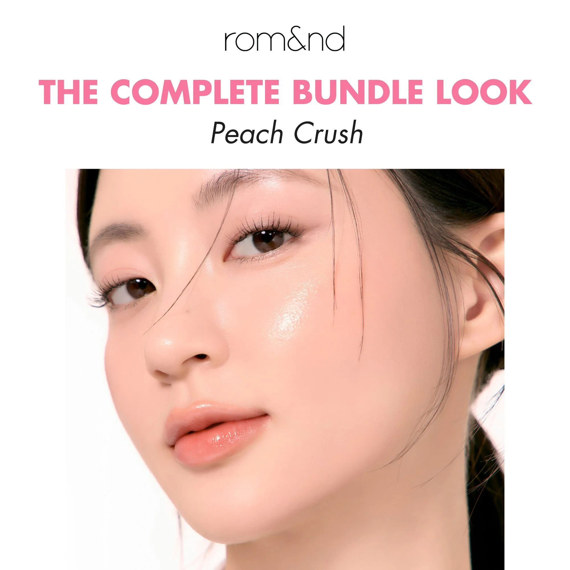
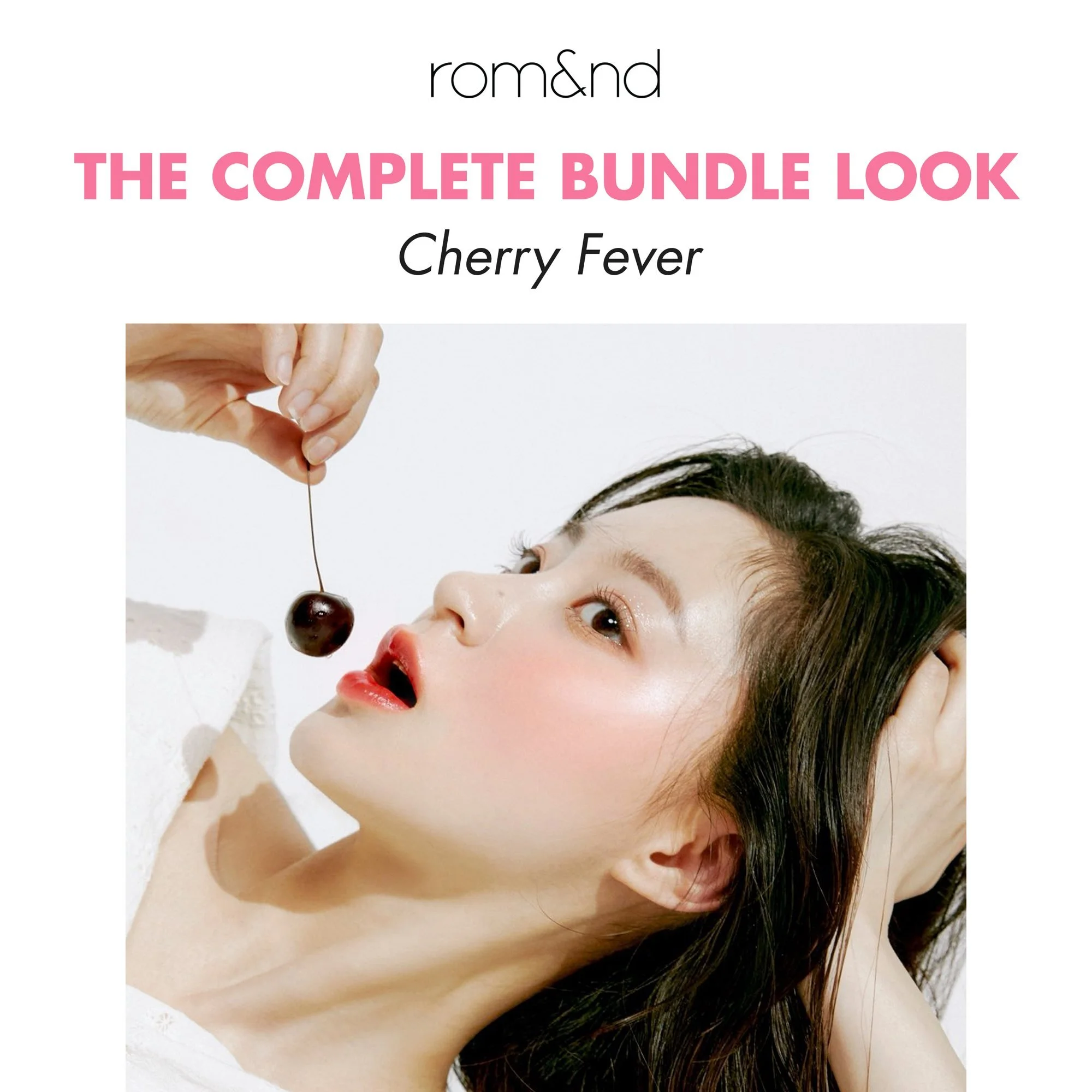
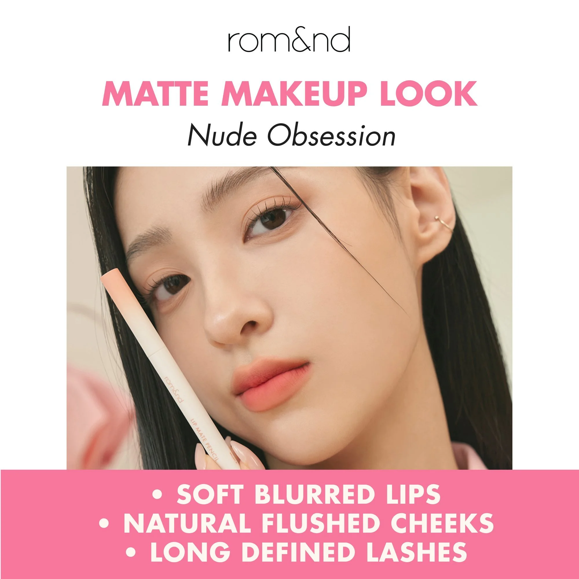
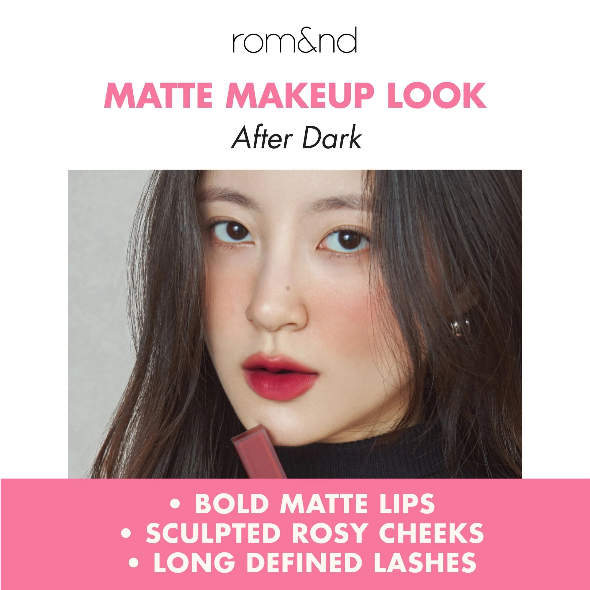
- 1The cover names the bundle and stands the set’s products in a scene of what it is named for: peaches for Peach Crush, cherries for Cherry Fever.
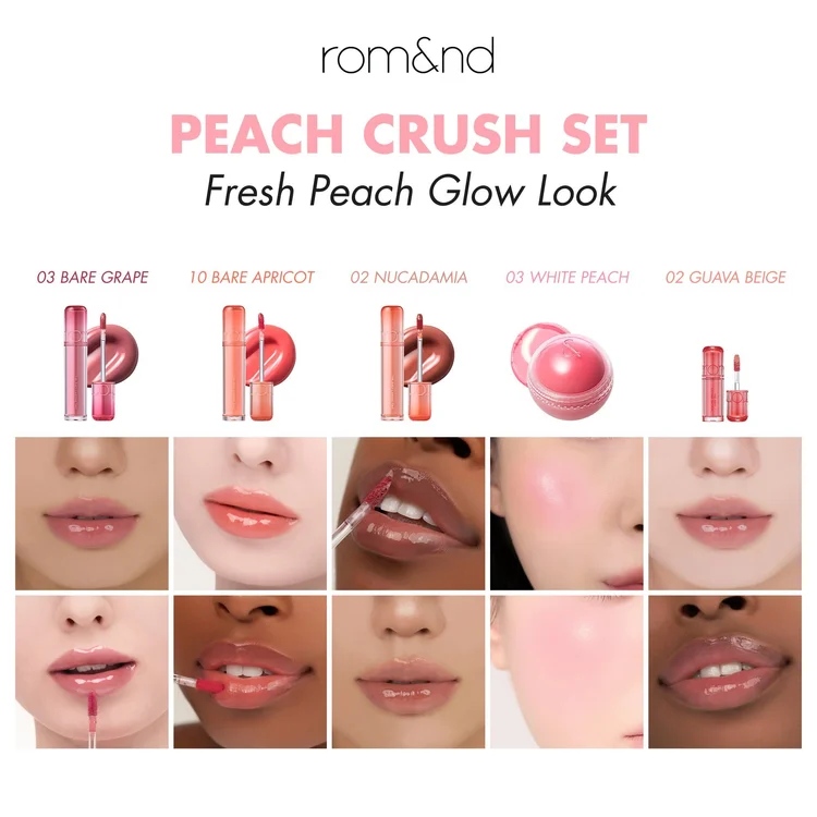
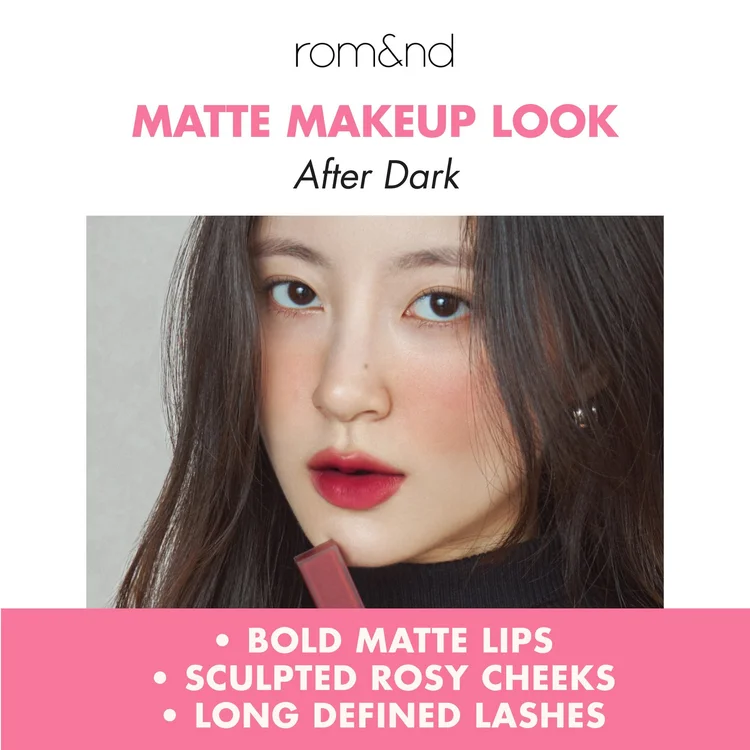
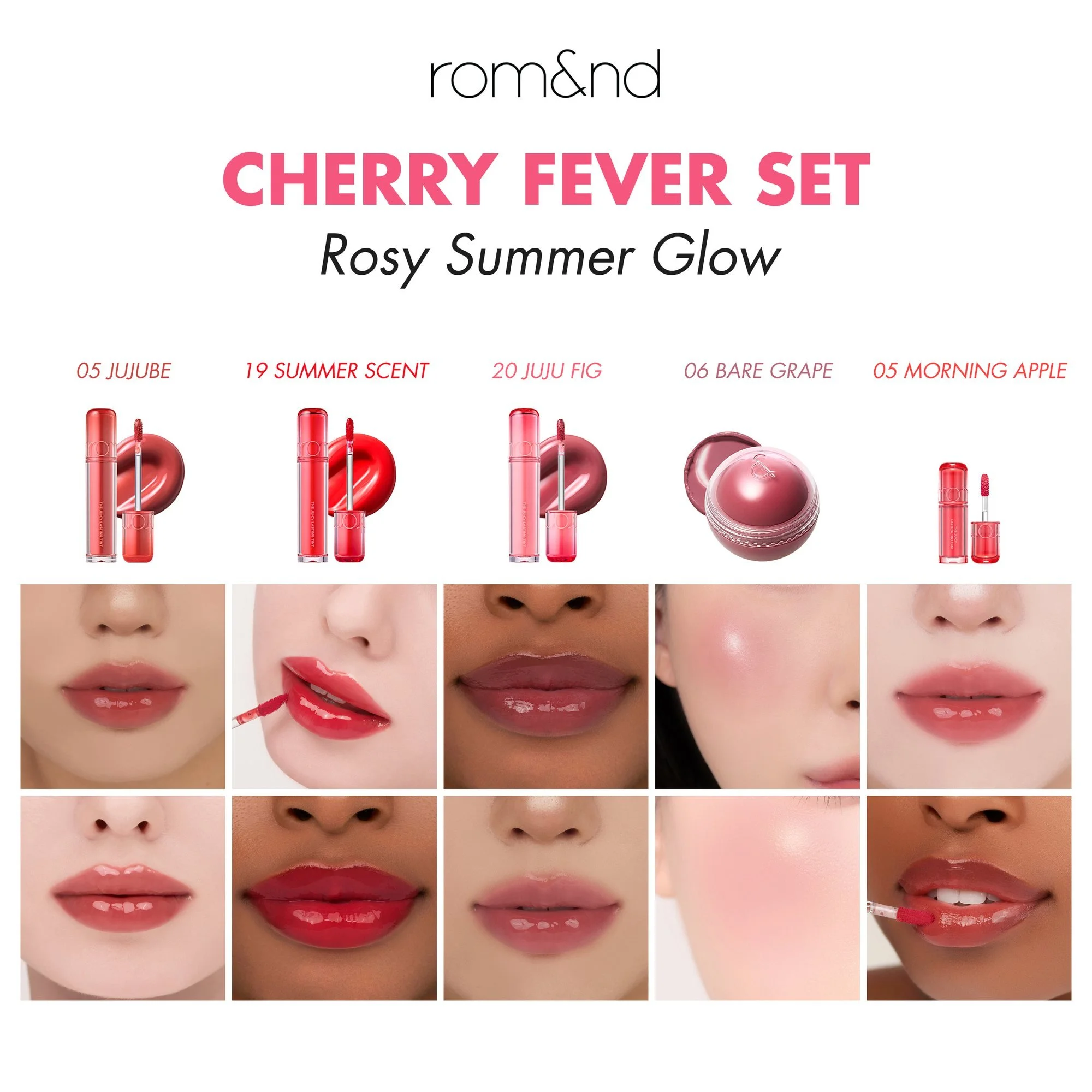
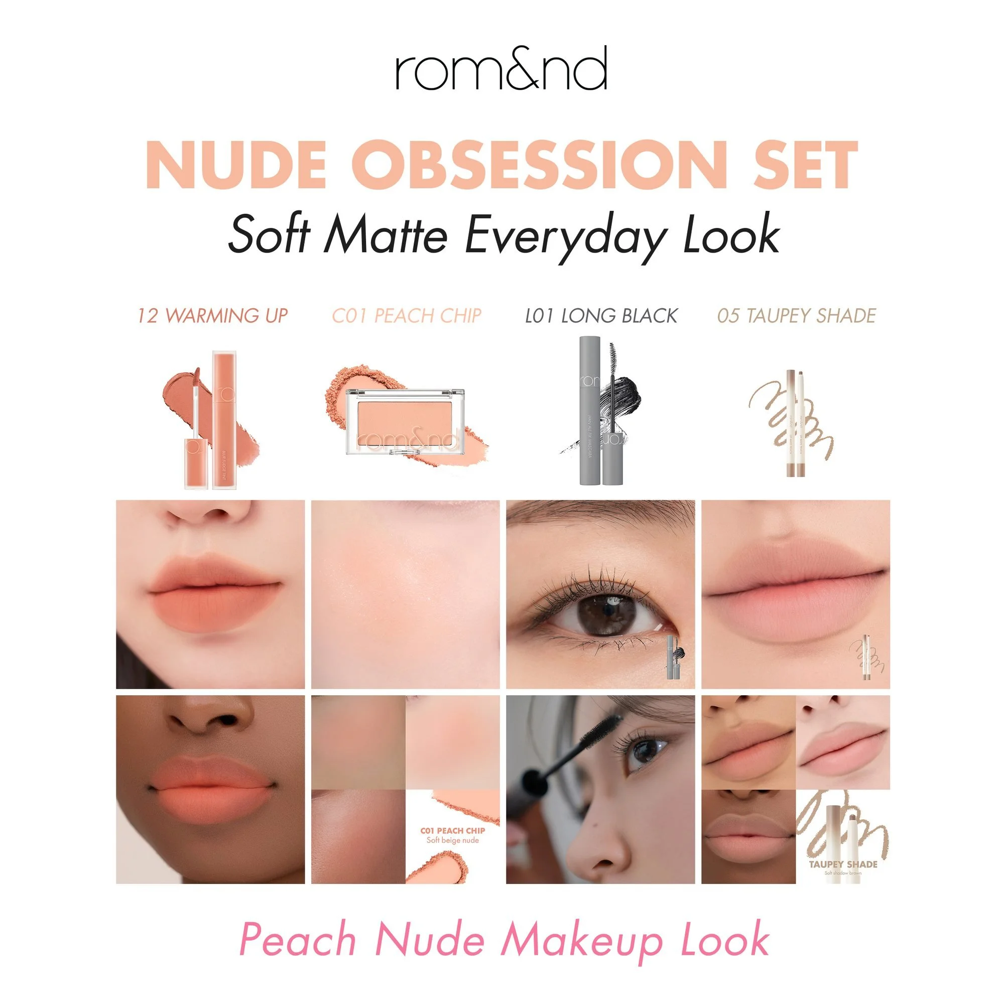
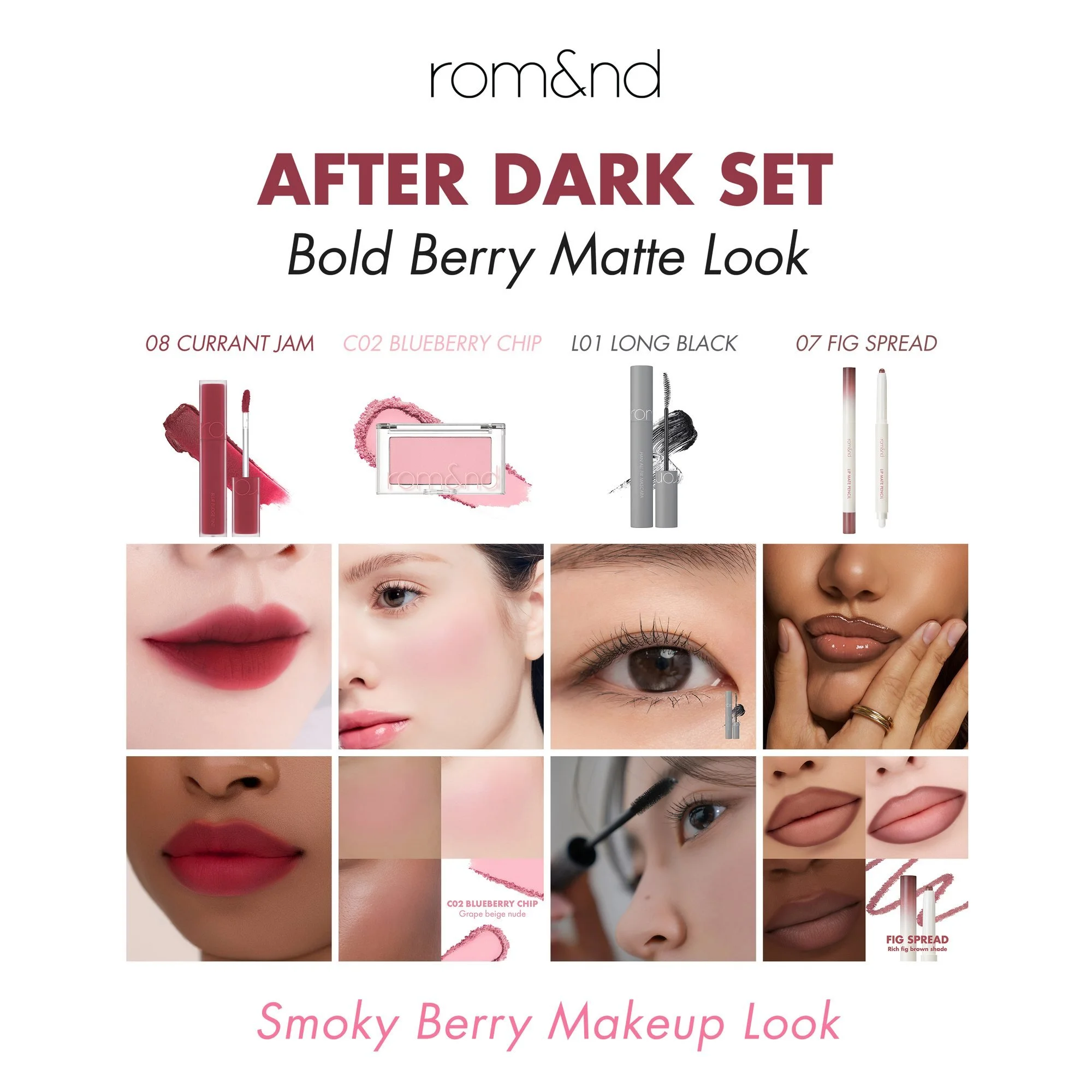
- 2Each shade is shown on lips and cheeks across several skin tones, under its shade name, so a shopper can see the color on skin like their own before the live sale starts.
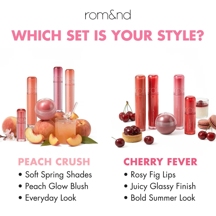
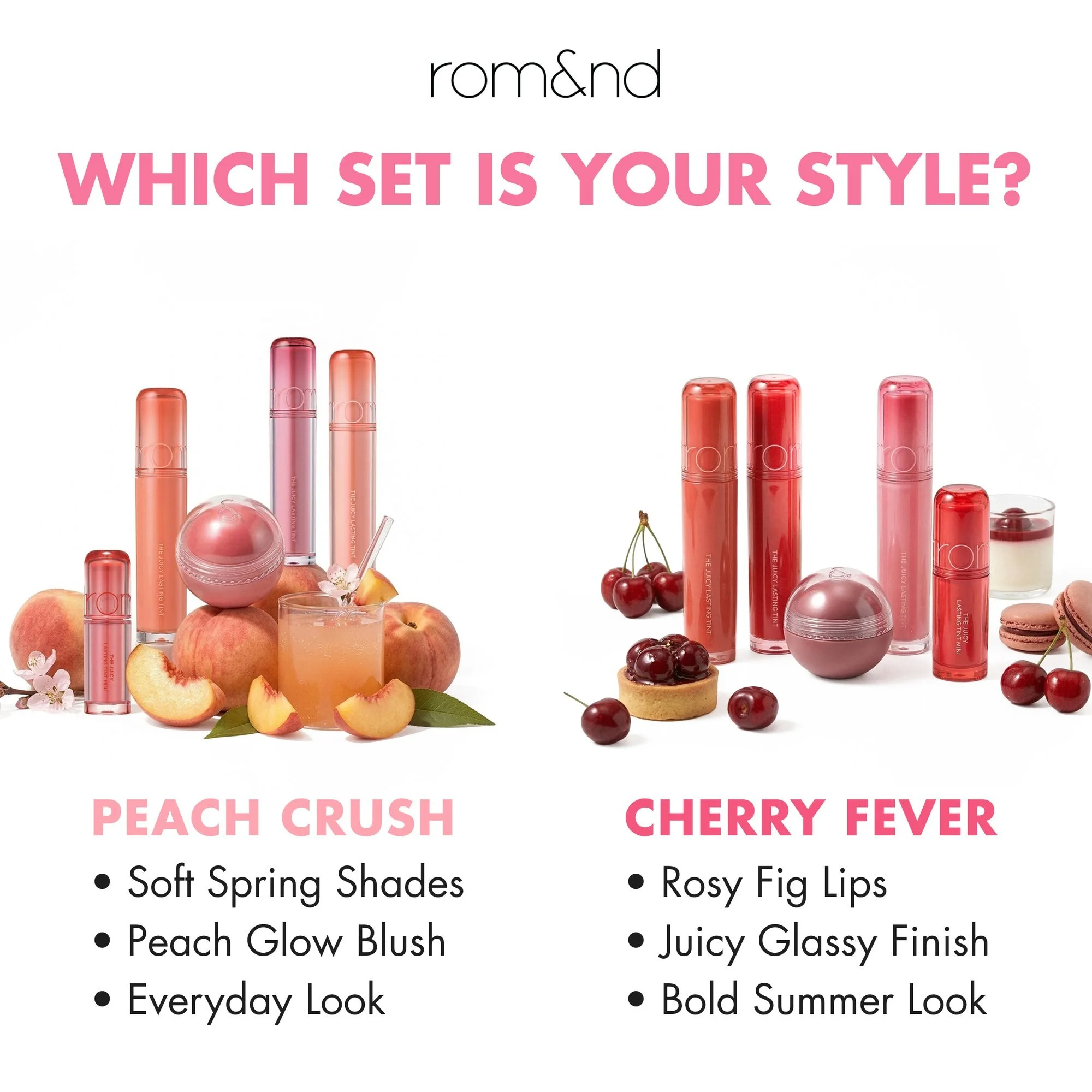
- 3“Which set is your style?” puts the two sets side by side with three short lines each, so the choice is between two looks rather than ten products.
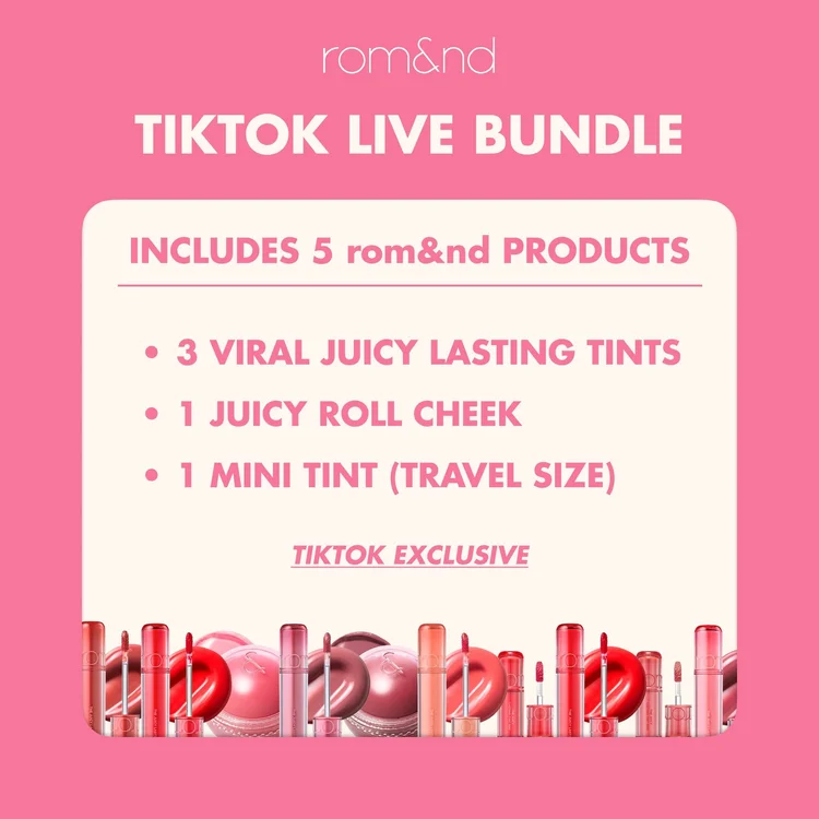
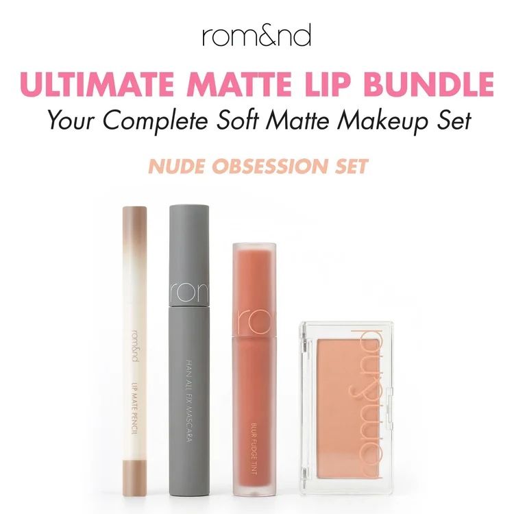
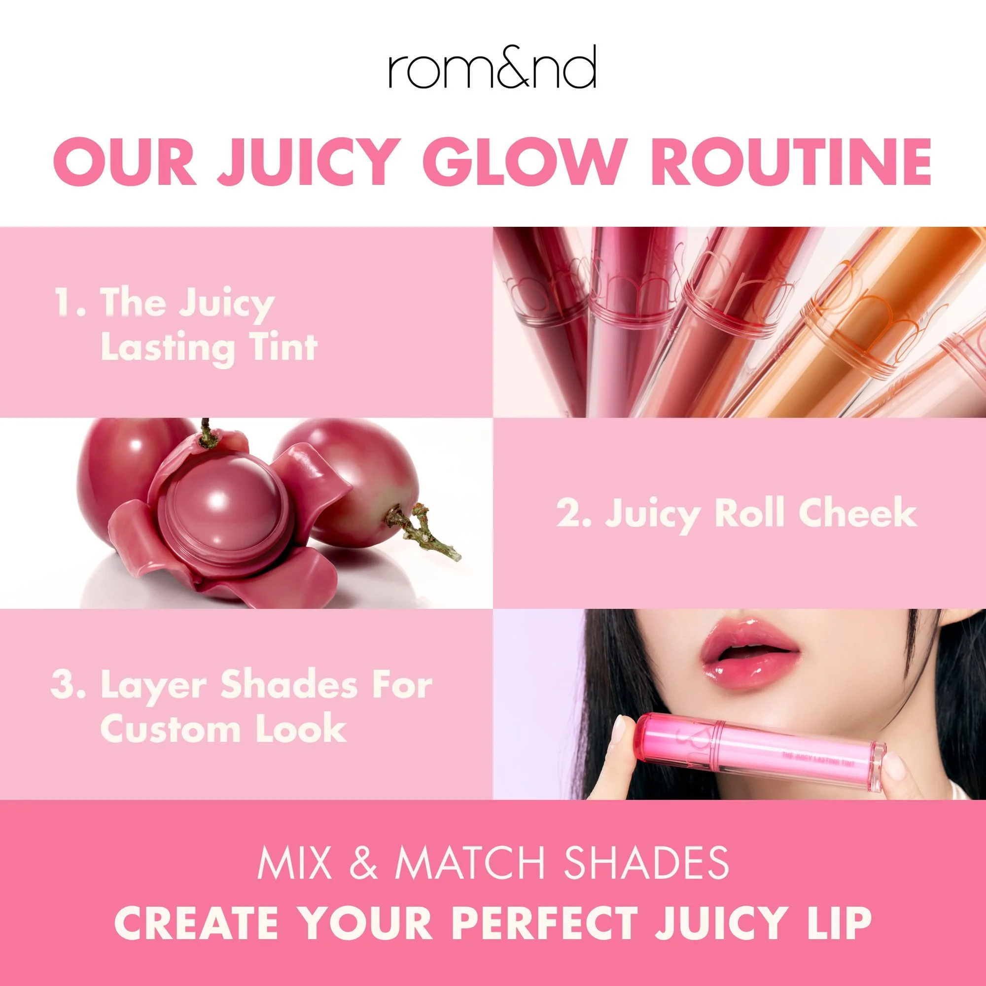
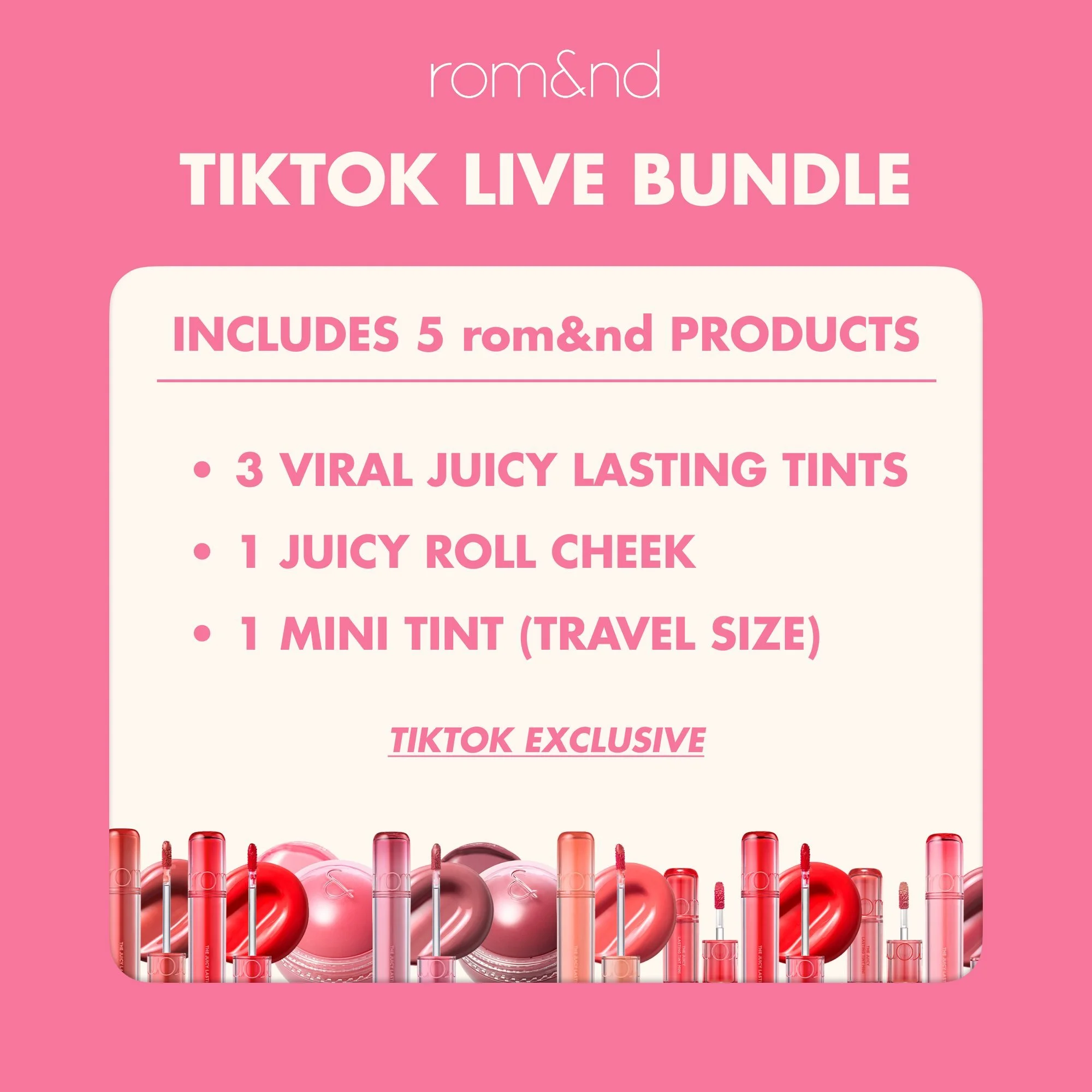
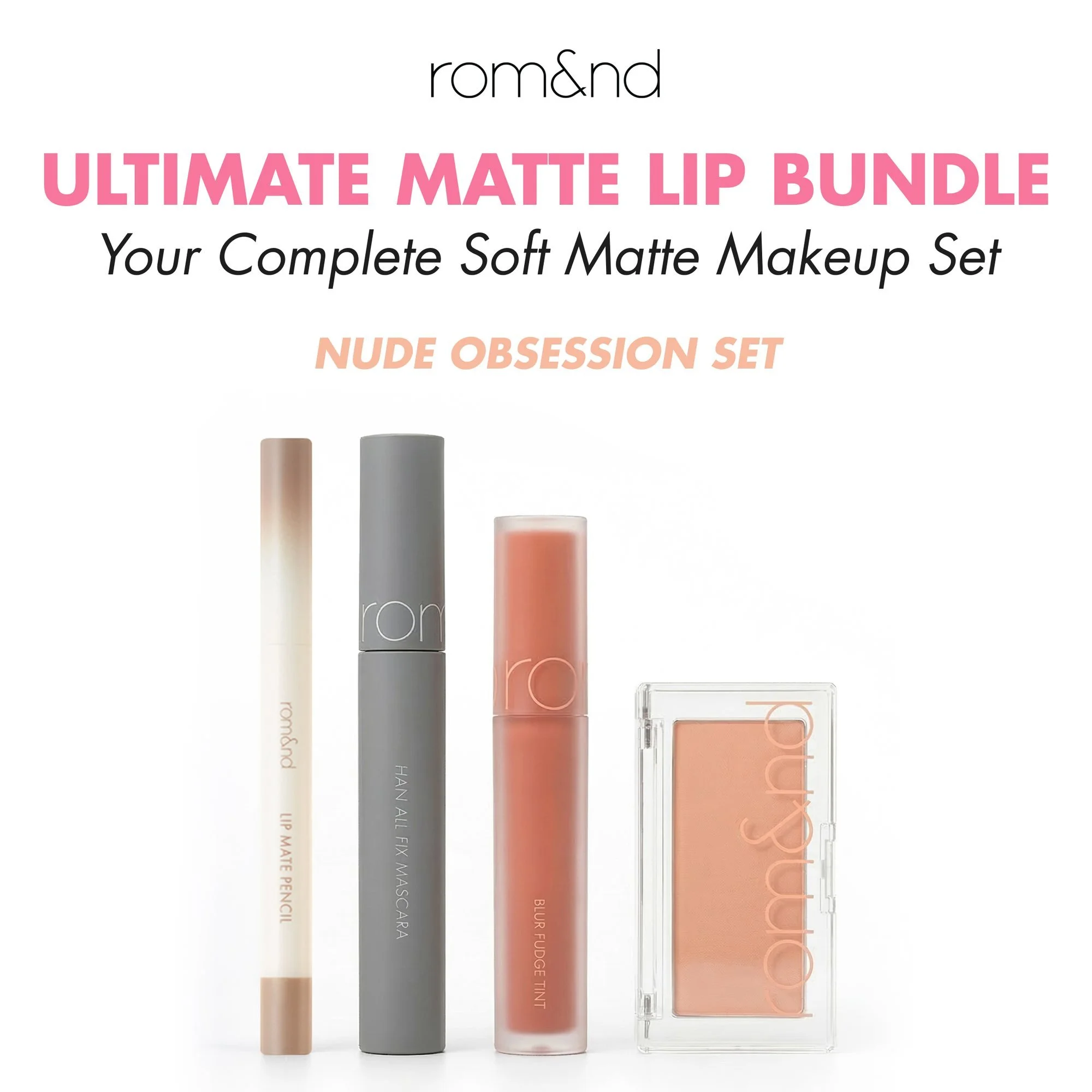
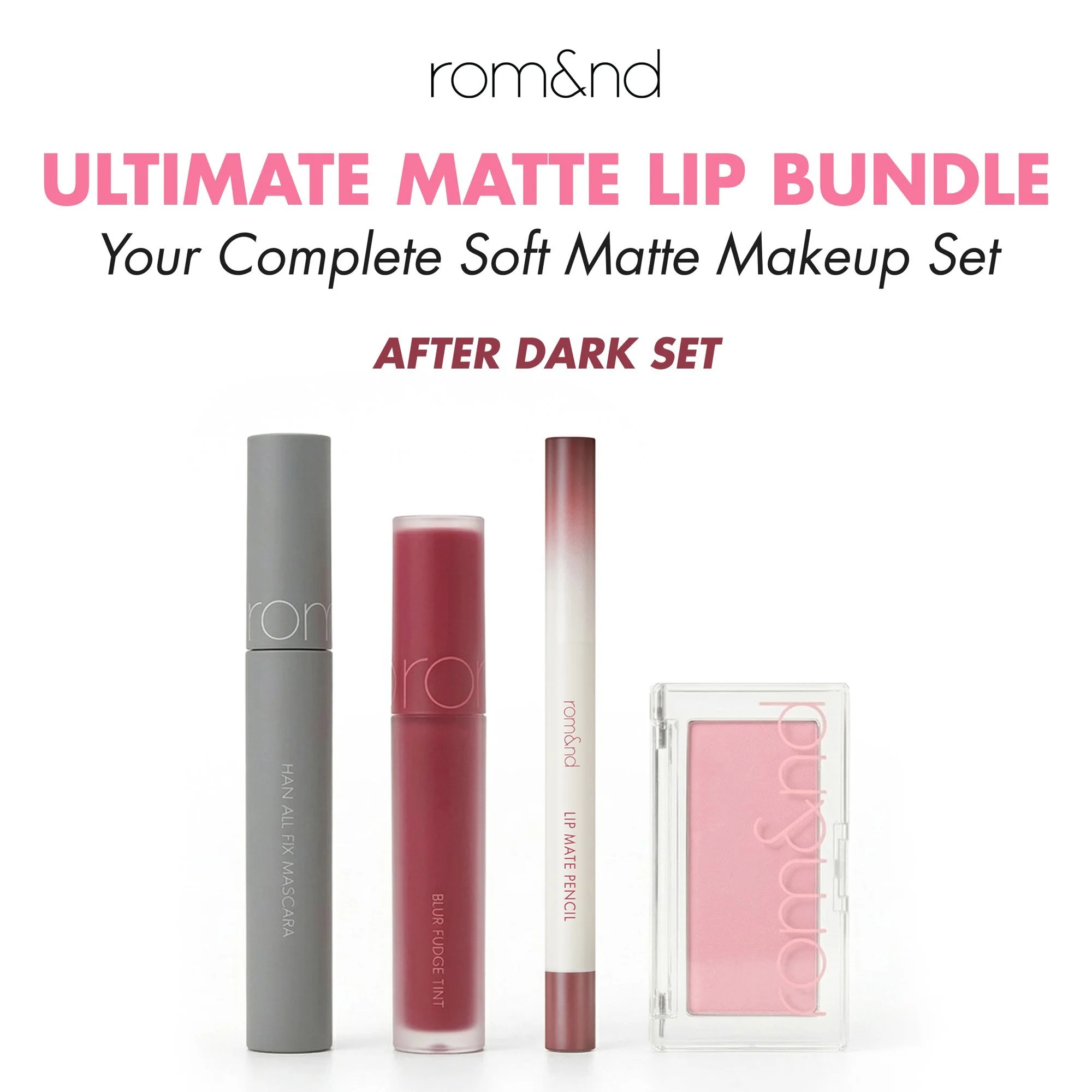
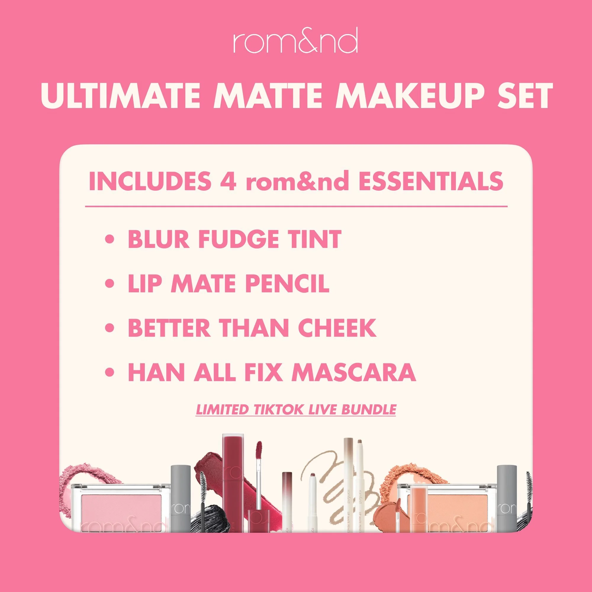
- 4The last slide lists exactly what’s in the box and marks it TikTok exclusive. The model photos came from the brand’s drive, retouched to match the products’ tone and the carousel’s colors; the second bundle, Ultimate Matte Lip, follows the same structure in its own palette.
 1
2
3
4
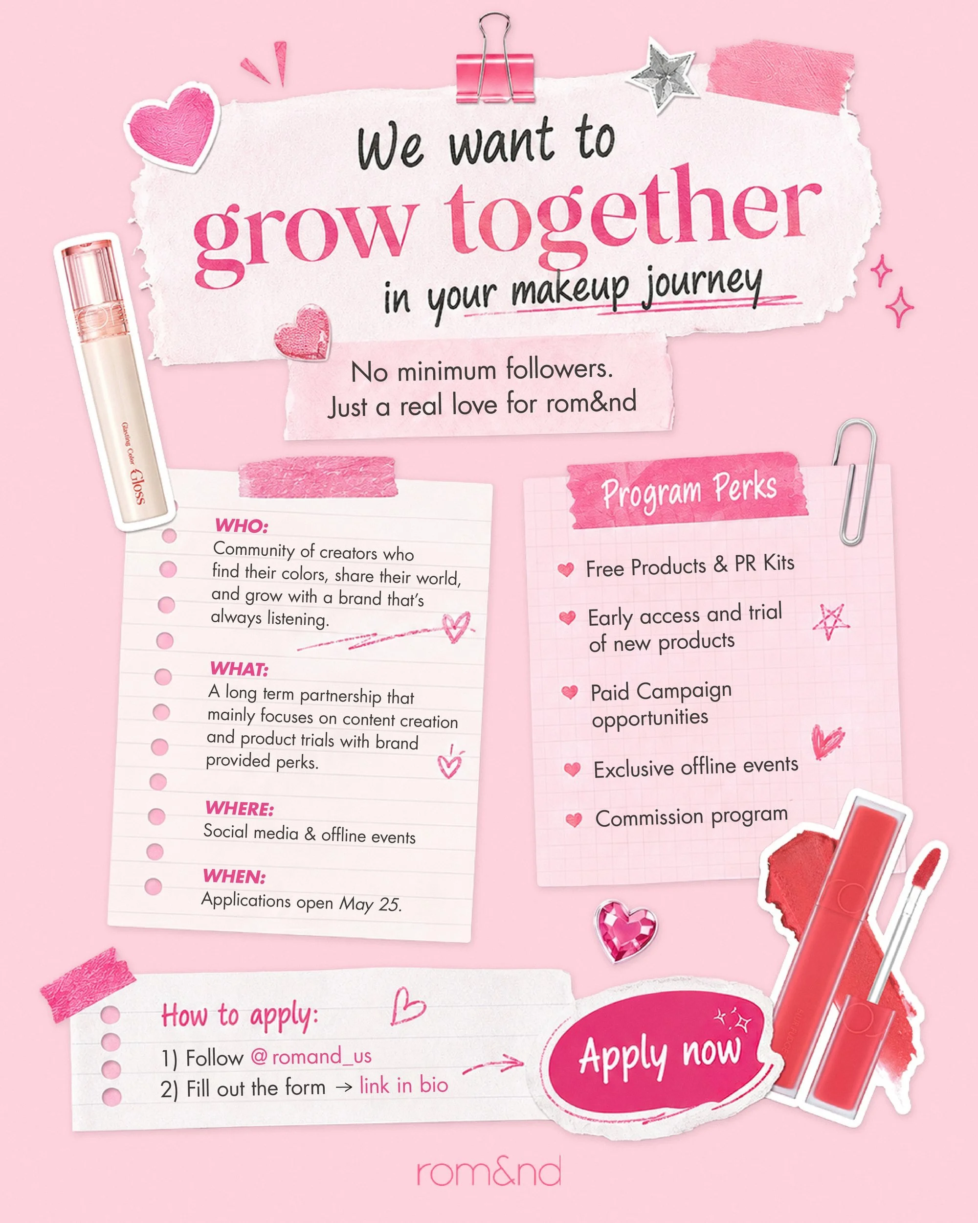
The creator call. A busy scrapbook that still reads in order.
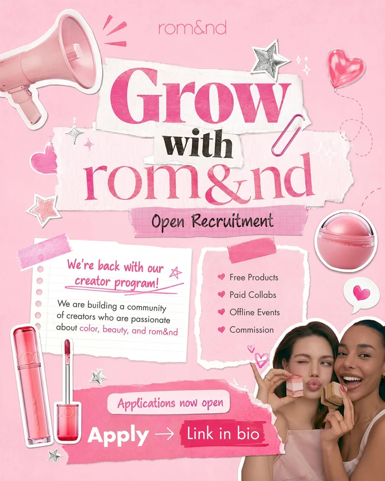
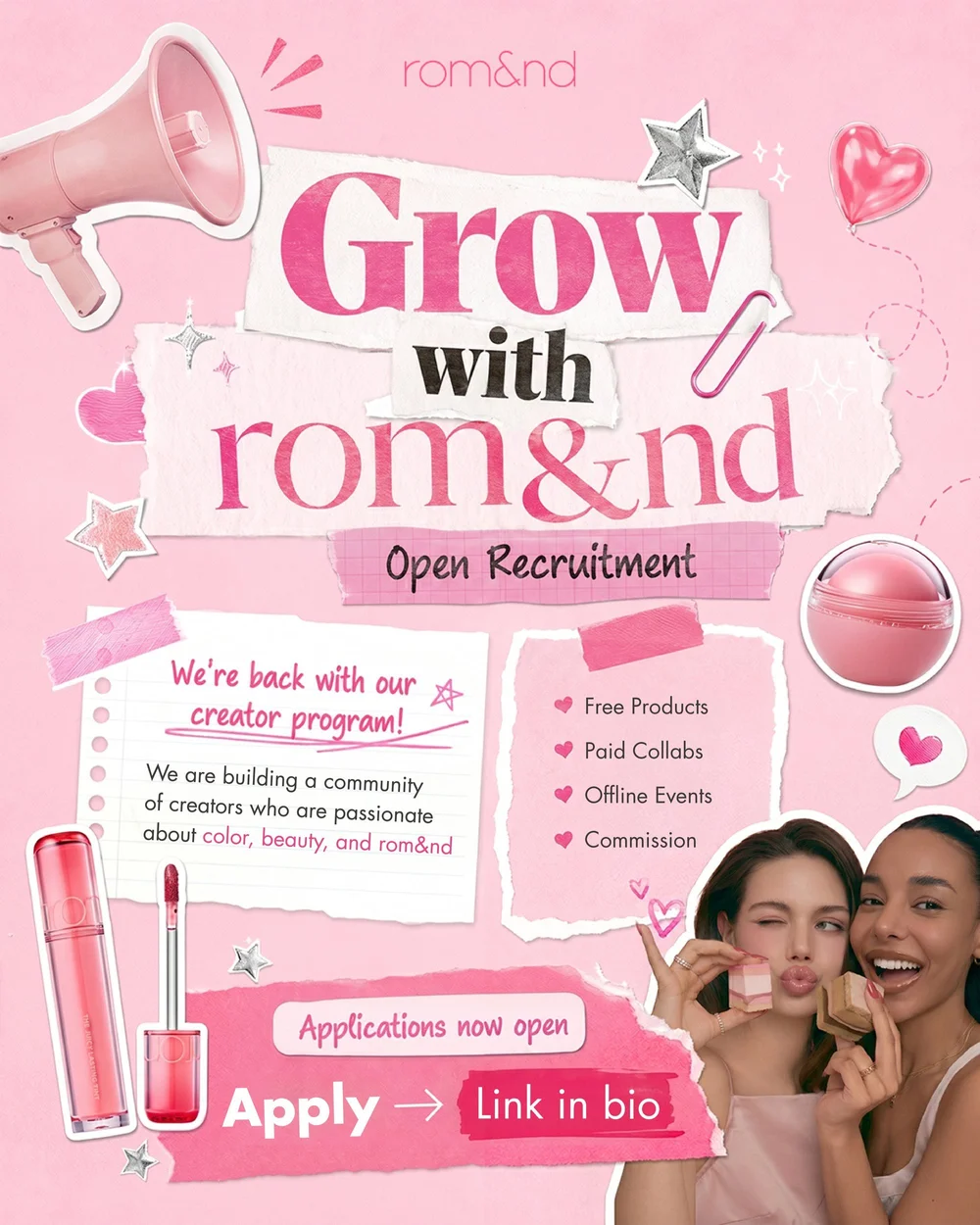
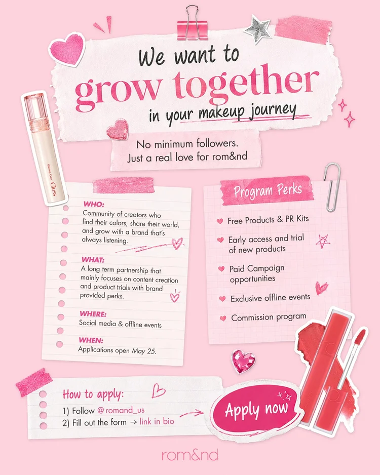
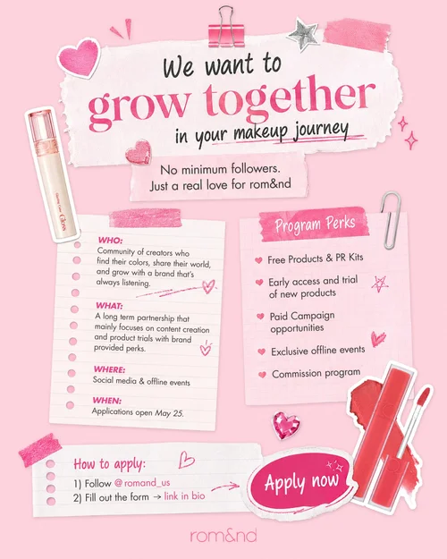
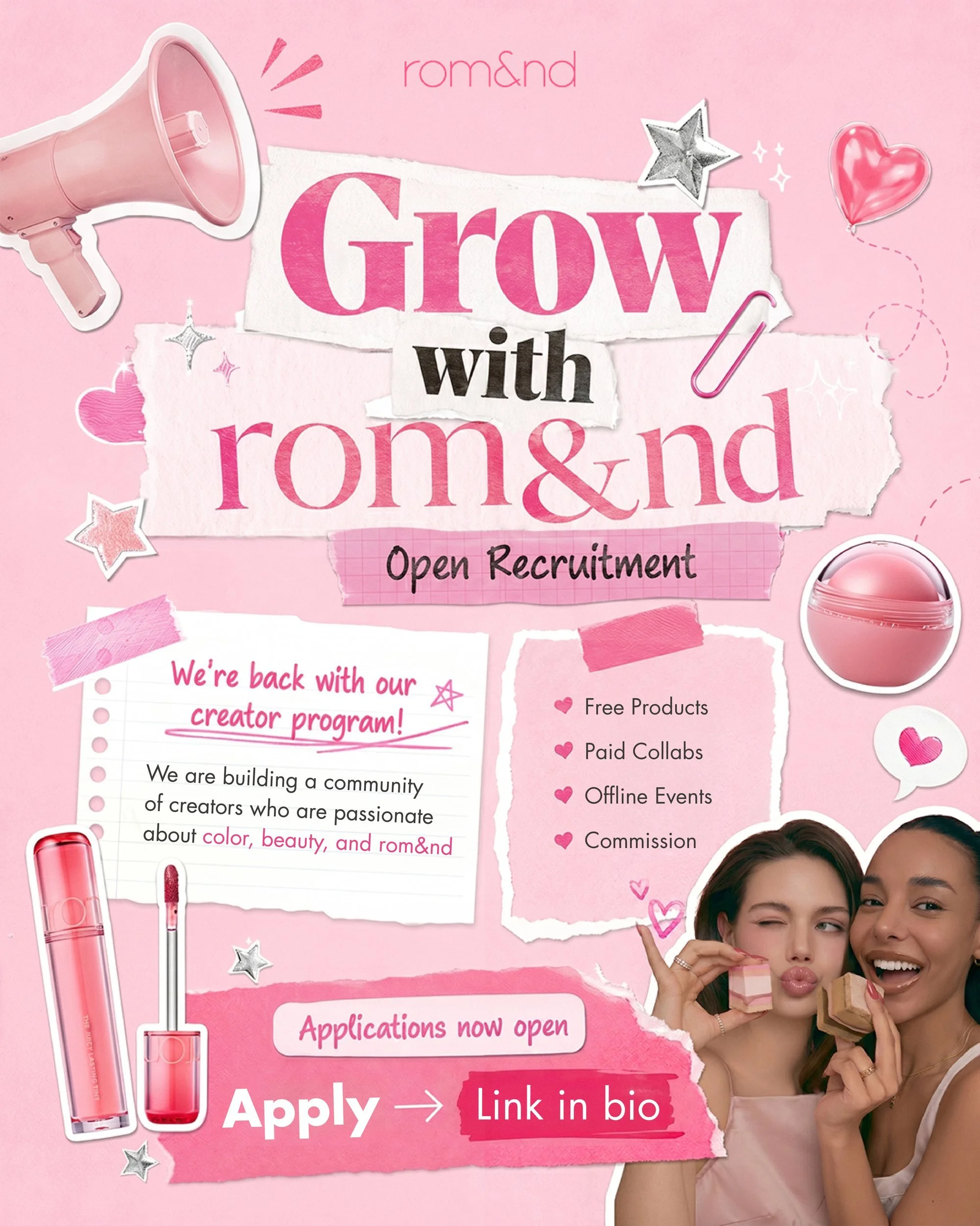
- 1Torn paper, tape, stickers and a megaphone: the brand’s soft, playful mood, made from the materials of a creator’s own scrapbook posts.
- 2Under the headline, one card says what this is in a sentence, so the collage never has to explain itself.
- 3The perks are a four-line list, the part a creator scans for first.
- 4“Apply → Link in bio” is the largest pink shape on the page, at the bottom, where the eye ends. The second page answers who, what, where, when and how to apply, in the same paper style.
 1
2
3
4
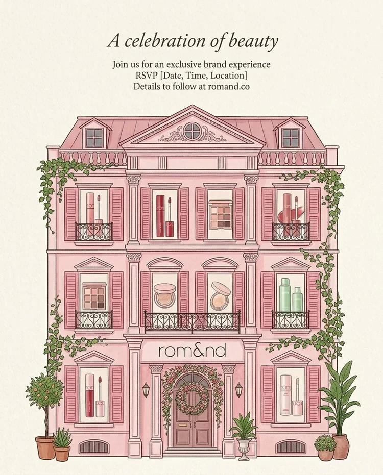
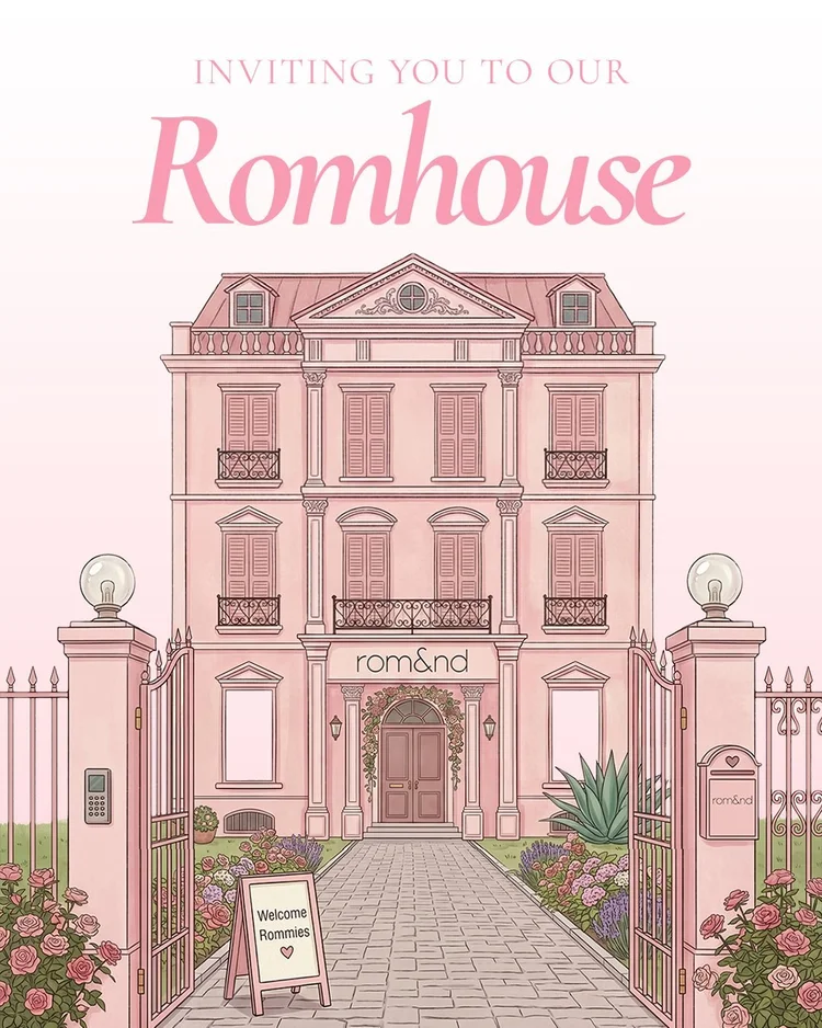
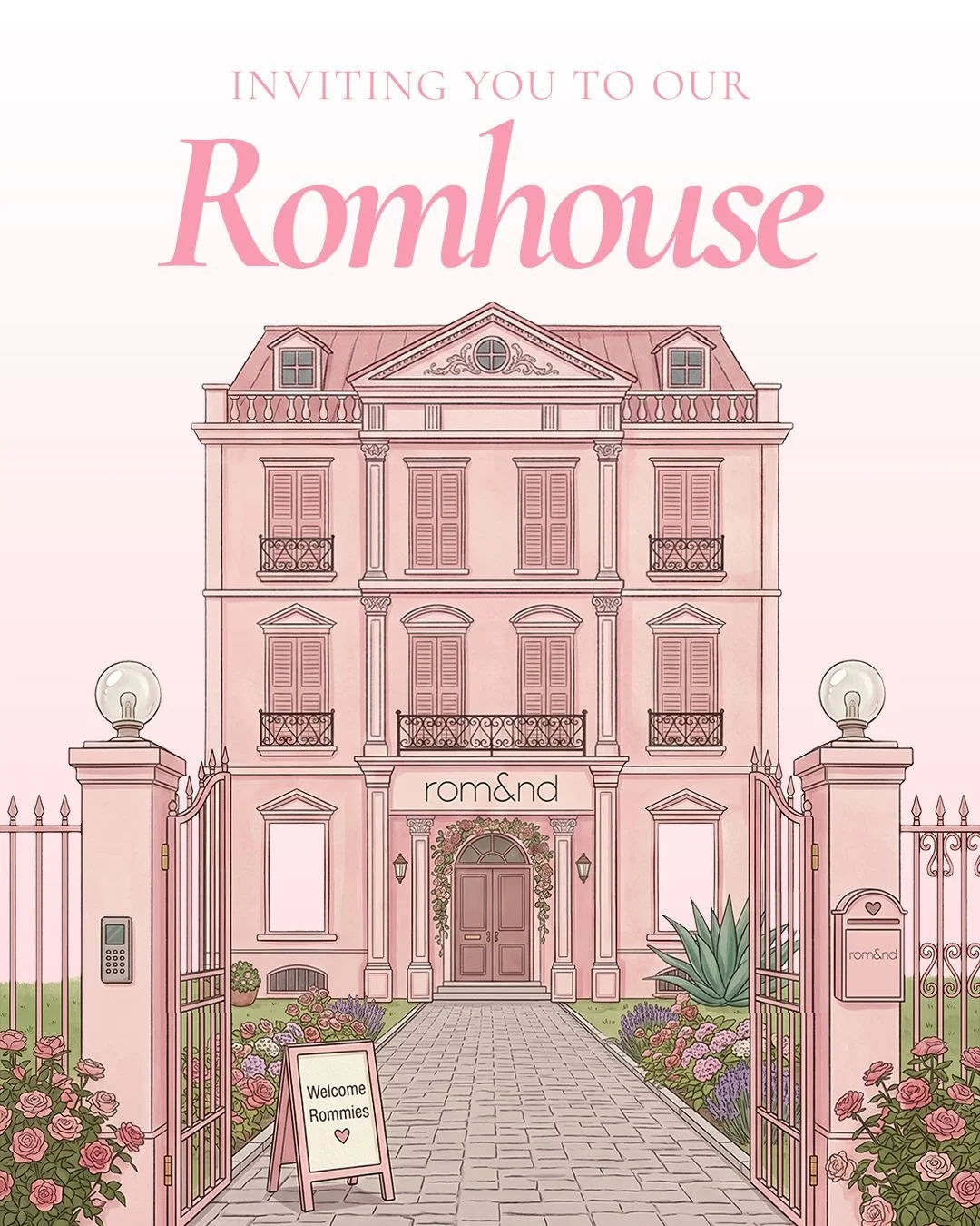
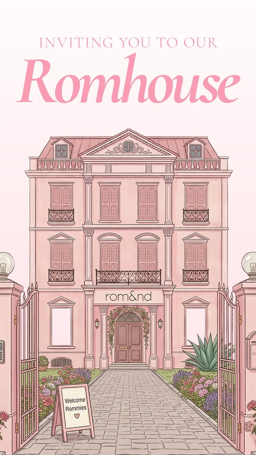
The Romhouse invitation. A generated house, reworked until it read as an invitation.
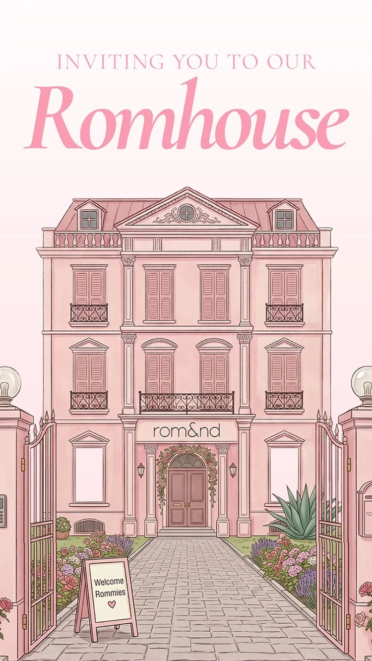
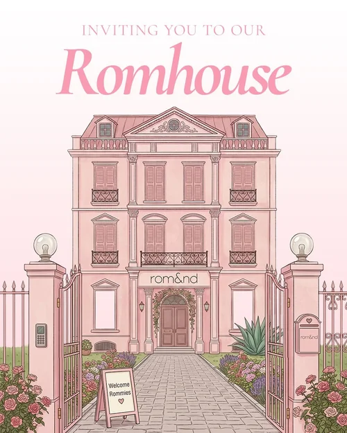
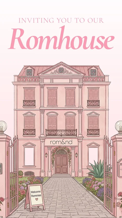
- 1The first generated house was covered in vines, and its windows opened onto products.
- 2The vines came off and the windows were simplified, so the pink facade and the rom&nd sign read first, as one place rather than a shelf.
- 3A gate and a garden were added in front, so the entrance looks like it is expecting a guest.
- 4Many smaller fixes after that, then the title in a soft pink serif. The brief was text only, with no reference images, and the invitation ran in a feed size and a story size.
 1
2
3
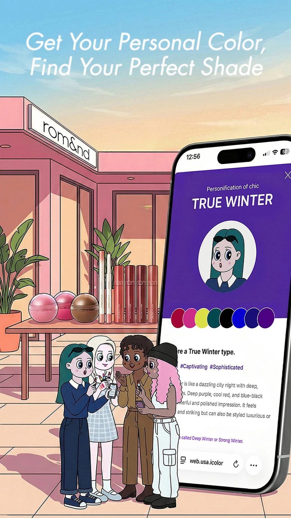
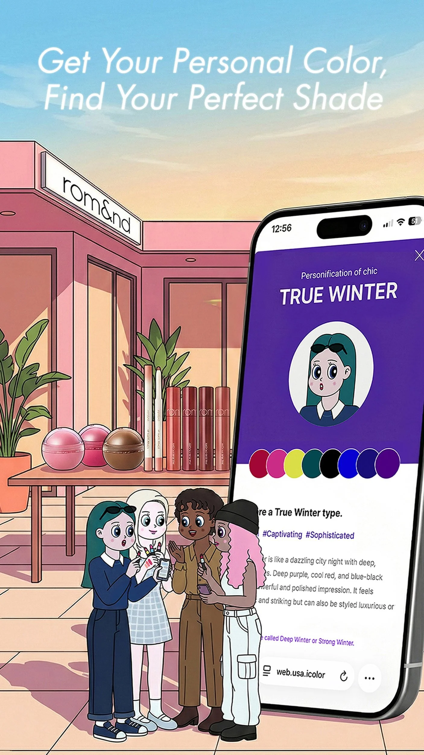
The shade finder. The site’s characters, drawn in full and set in motion.
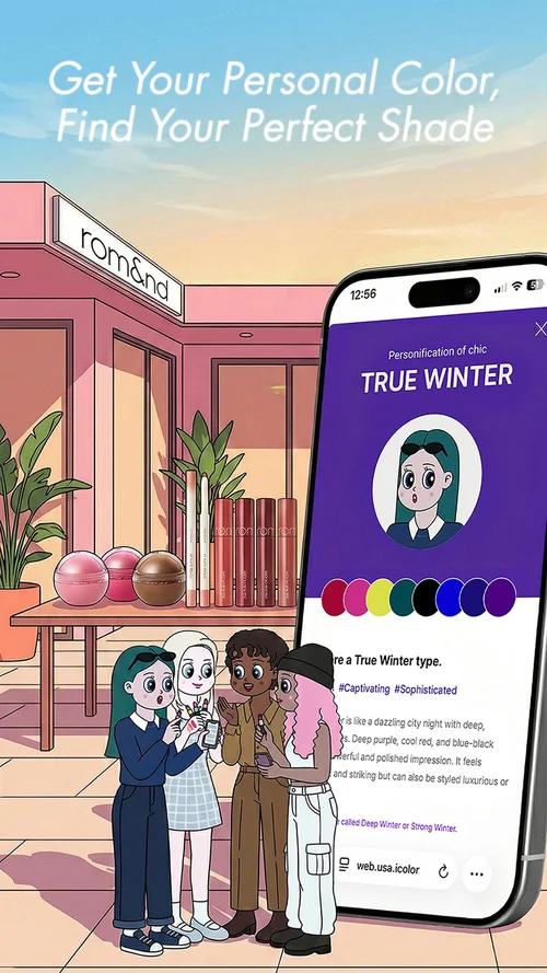
- 1The headline names the benefit in the shopper’s own terms: your color, then your shade.
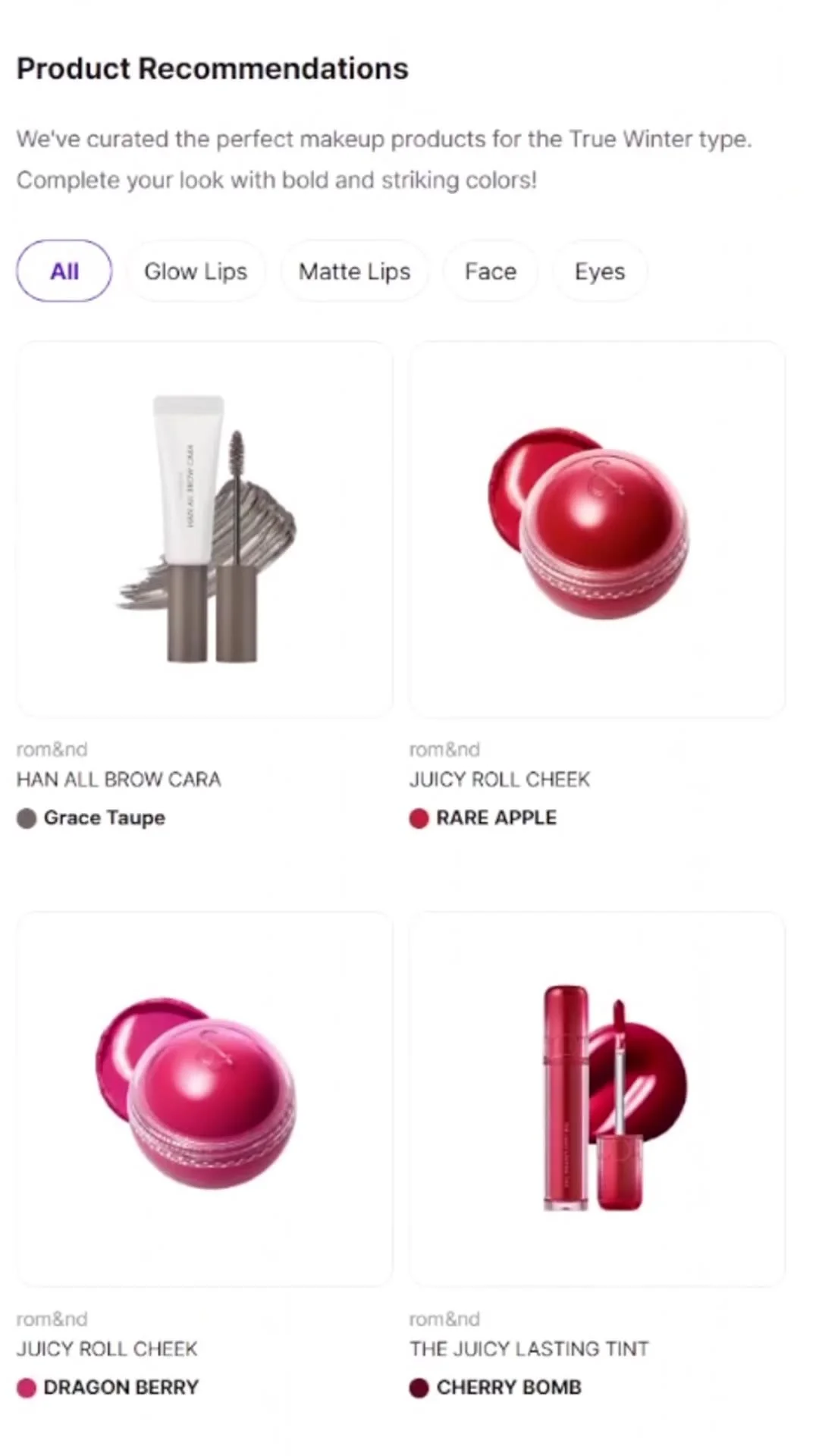
- 2The phone shows a personal color result, “True Winter”, with its palette, so the tool is seen working, not just named.
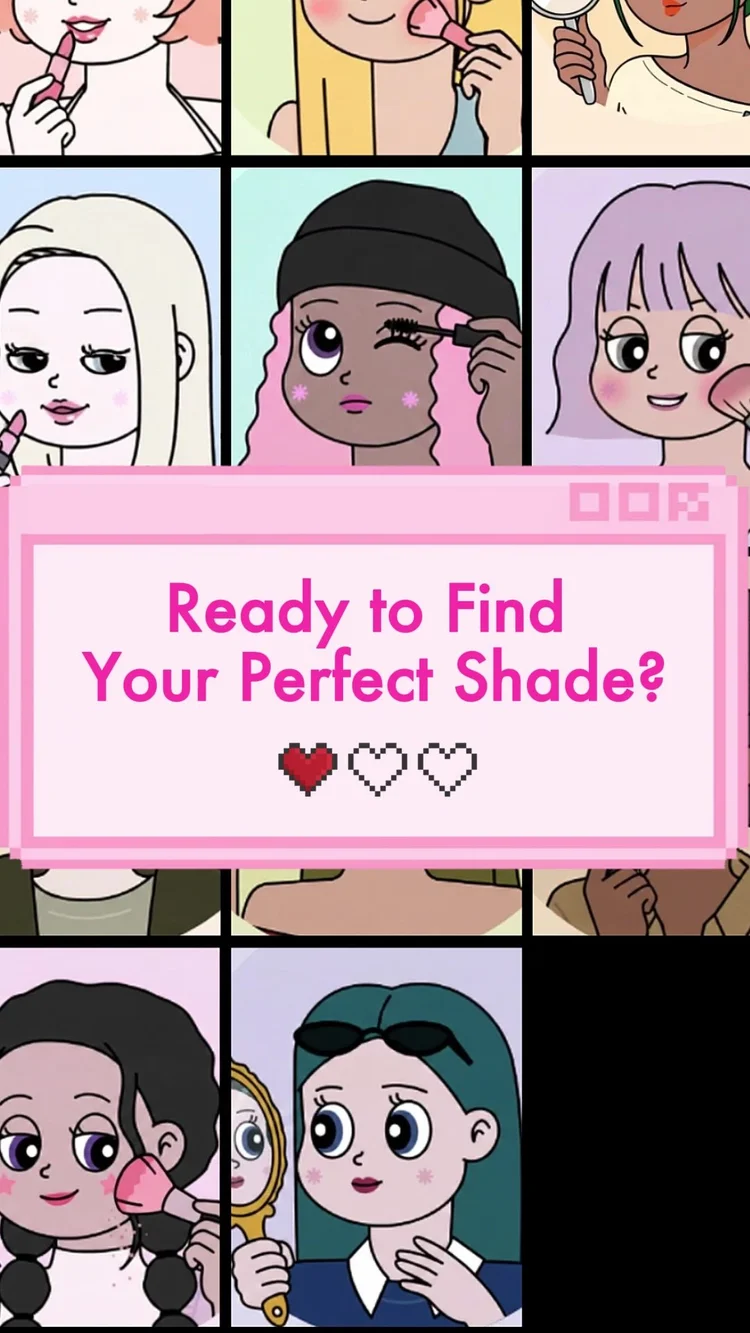
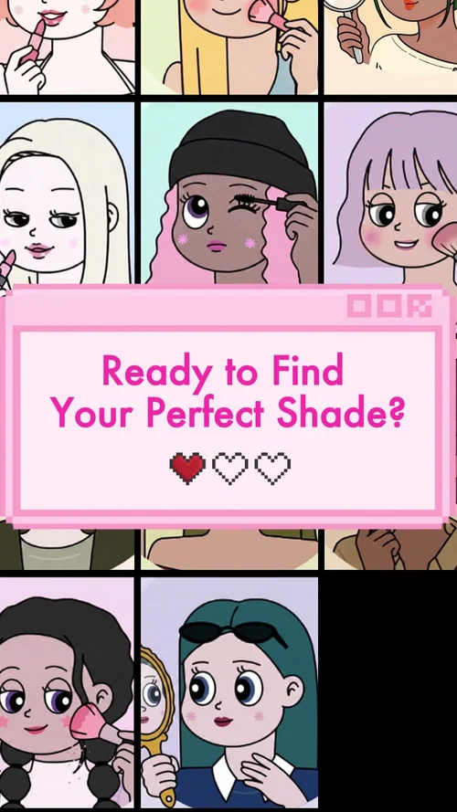
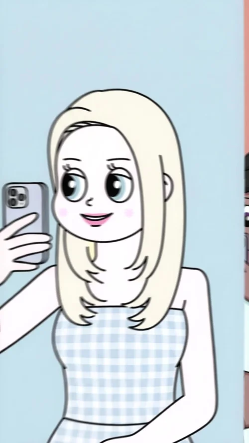
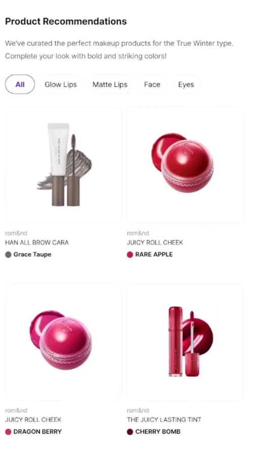
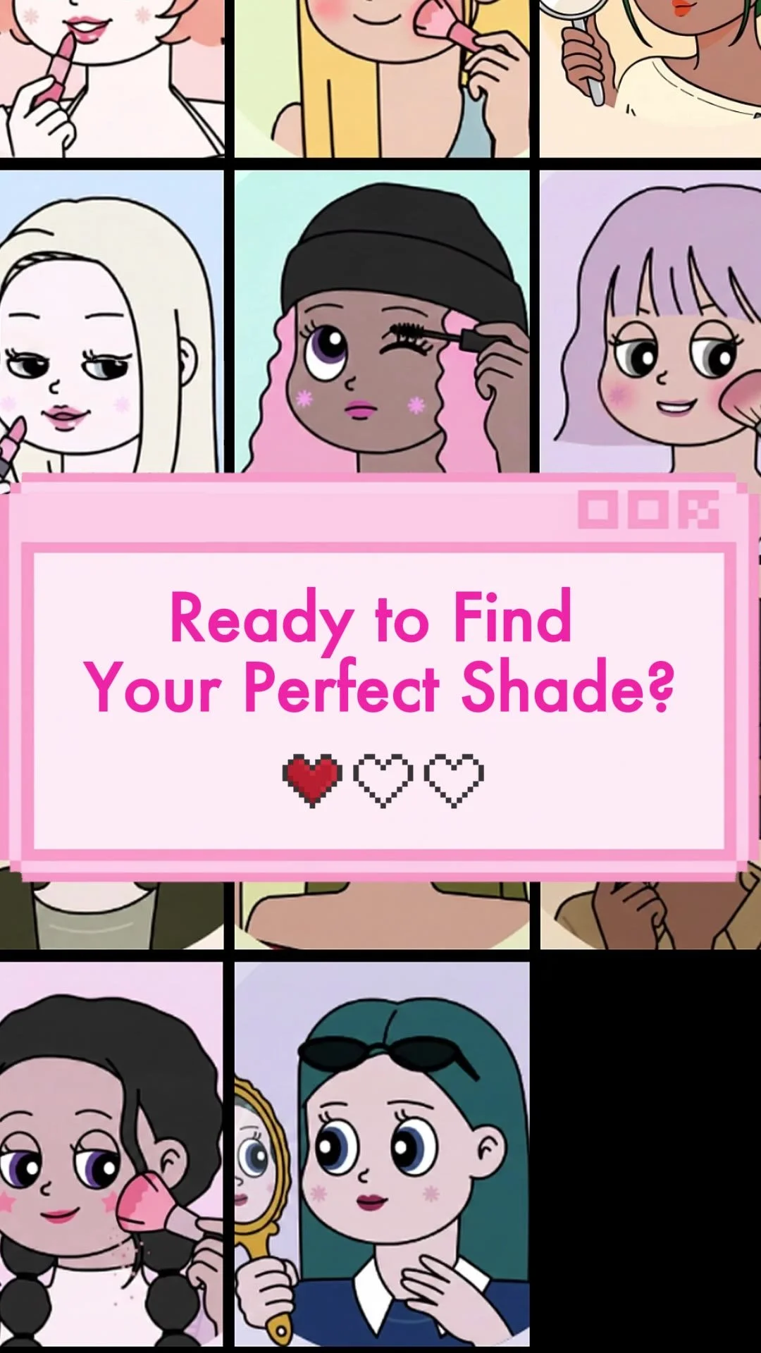
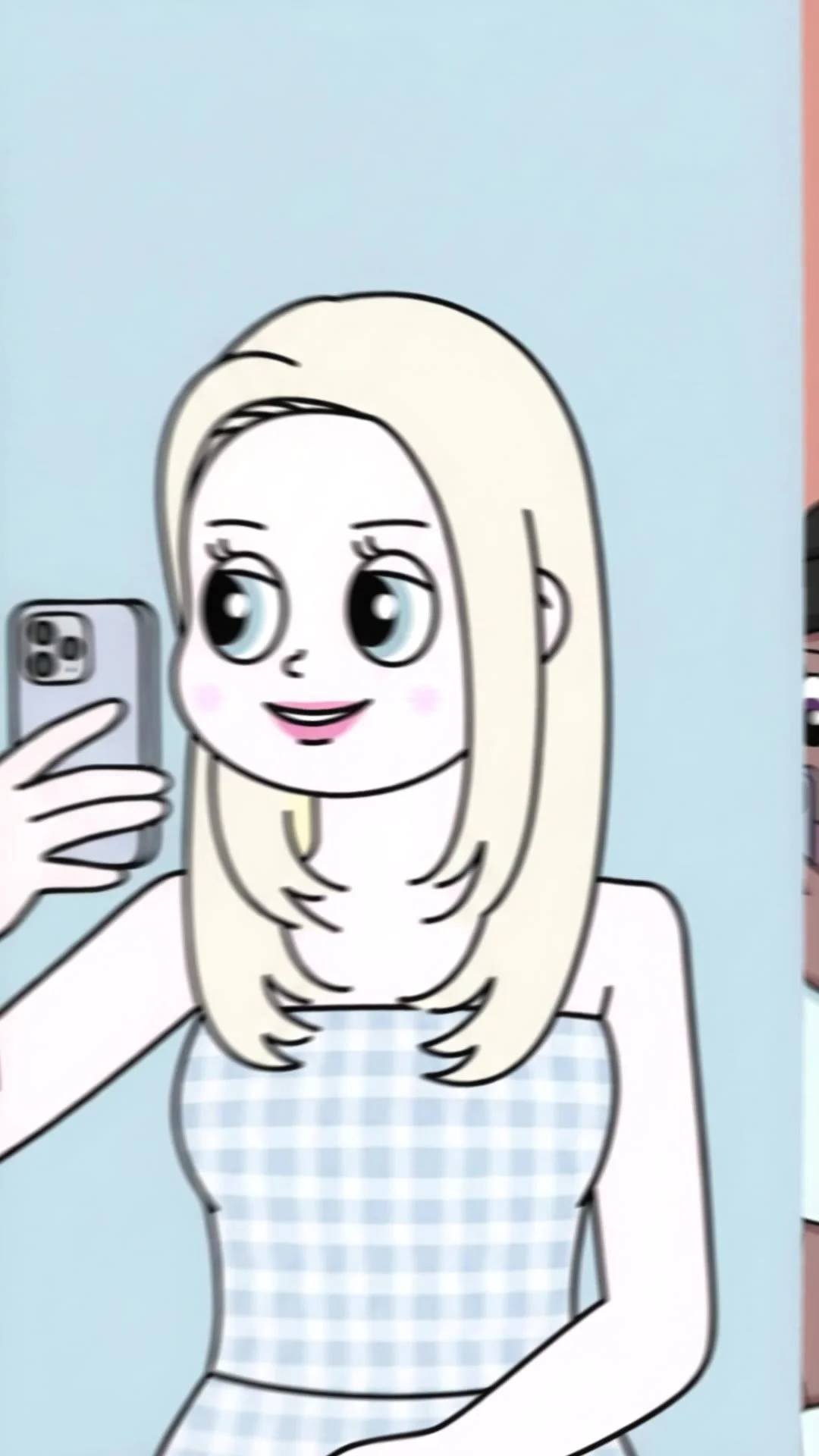
- 3The characters’ faces already existed on the iColor site. I extended them into full figures with AI and animated them in Kling for an 18-second video: the characters at their mirrors, “Ready to find your perfect shade?”, a selfie, then product picks for the color type.
 1
2
3
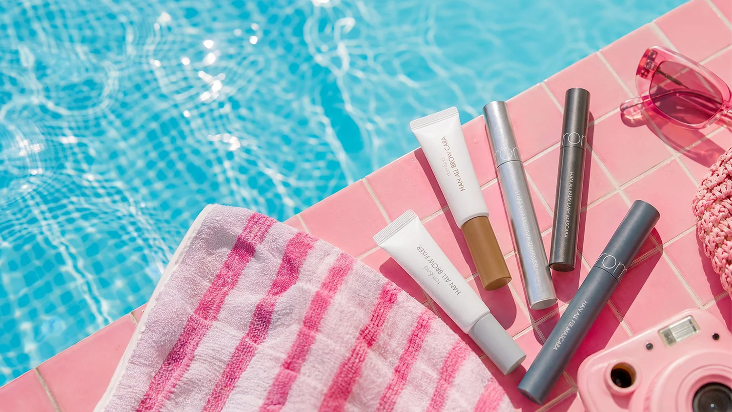
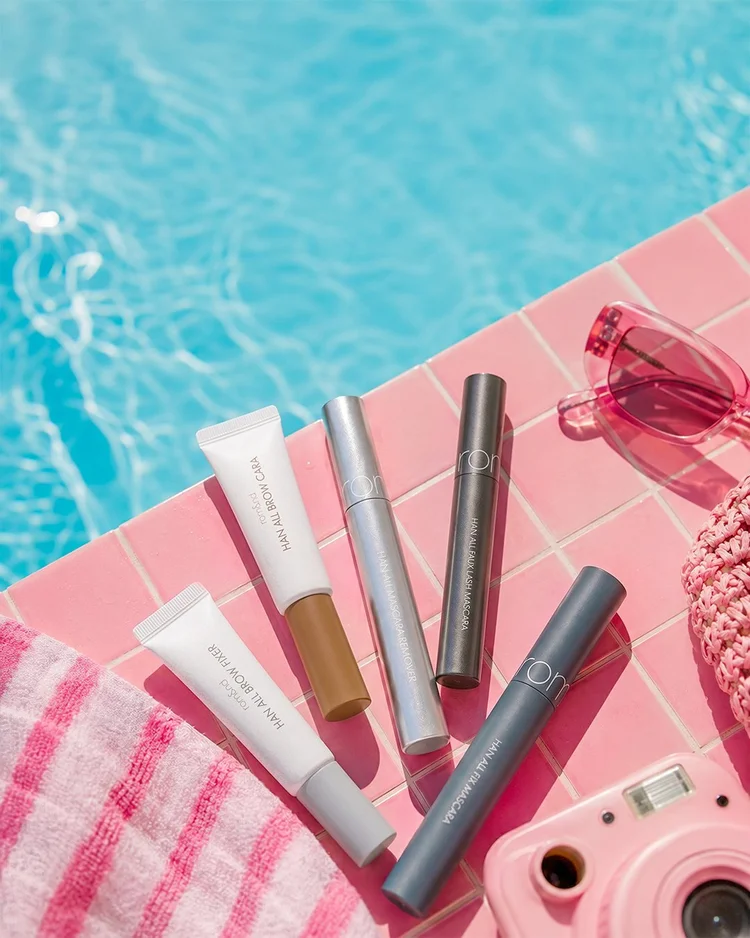
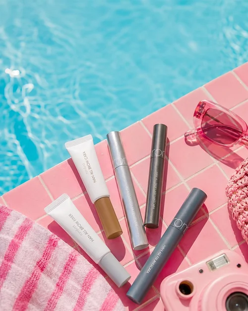
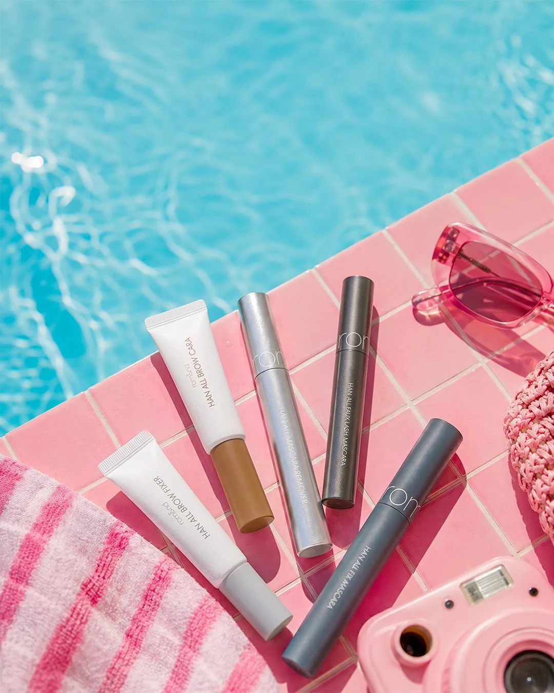
The summer banner. A base image, left open for the store’s own type.
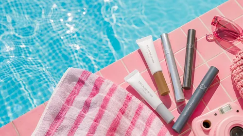
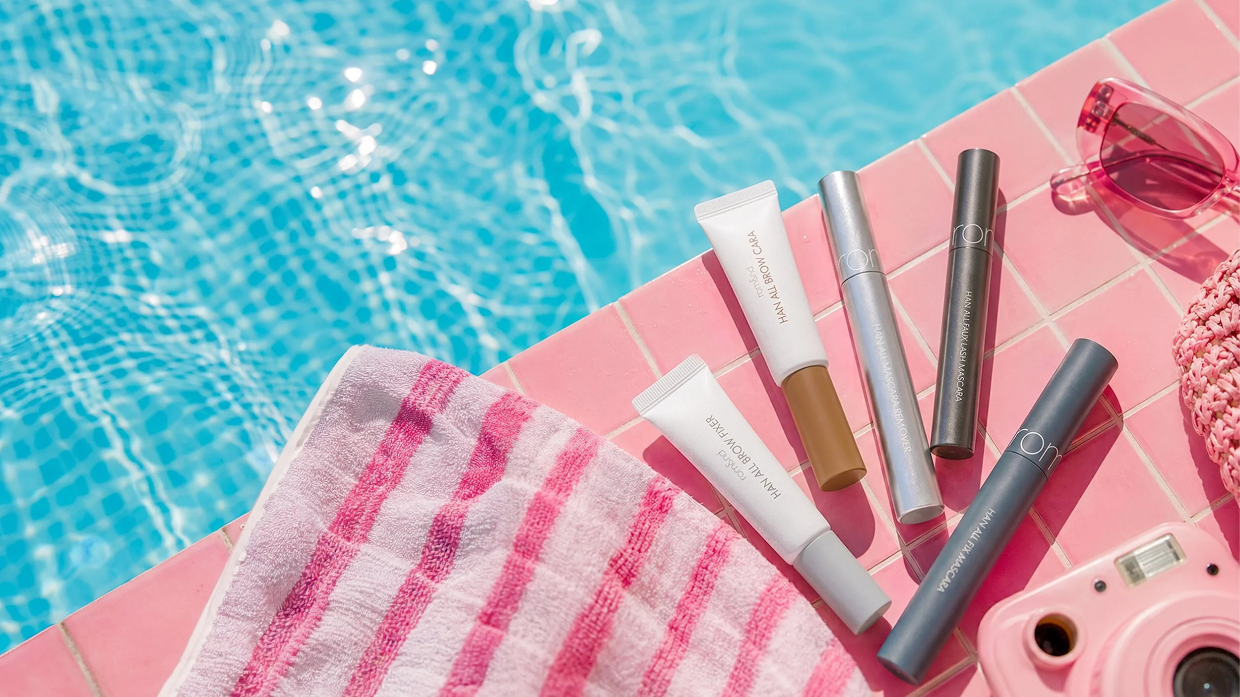
- 1rom&nd asked for the base image only. The open water on the left is the space their headline was set into.
- 2Generated in Gemini, then every product replaced one by one with rom&nd’s own product image, so each shows its true size and finish.
- 3Pink tiles, towel, sunglasses and camera carry the brand color, so the products can keep their own grays and whites. It went through several rounds and ships in two sizes, 2880 by 1620 for the desktop banner and 1080 by 1350 for the feed.
Each piece ran in a live campaign, and the campaigns brought in sales and social attention for the products they featured.
Also for rom&nd
The other pages and sizes.
The creator call’s second page, the second bundle, and pieces in their other formats.
The whole set
Every final, at full size.
Scroll sideways. Each piece opens at full size in a new tab.
 01 Spring sale story
 02 Bloom & Heat: Cover
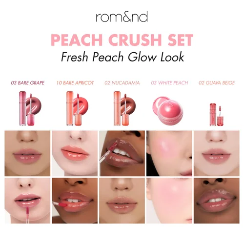 03 Bloom & Heat: Peach Crush shades
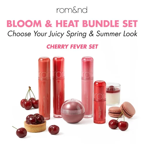 04 Bloom & Heat: Cherry Fever cover
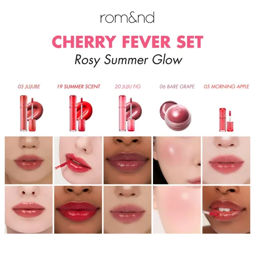 05 Bloom & Heat: Cherry Fever shades
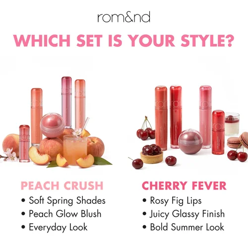 06 Bloom & Heat: Which set is your style?
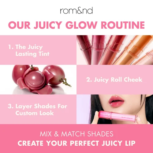 07 Bloom & Heat: The juicy glow routine
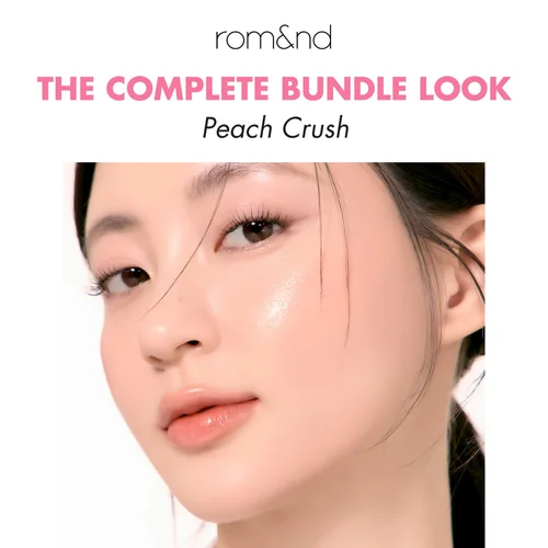 08 Bloom & Heat: Peach Crush look
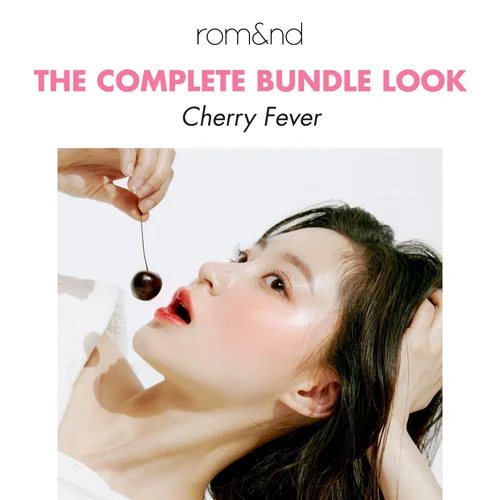 09 Bloom & Heat: Cherry Fever look
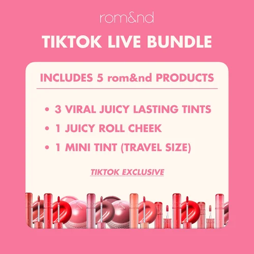 10 Bloom & Heat: What’s included
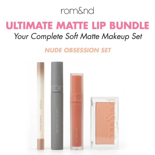 11 Ultimate Matte: Cover
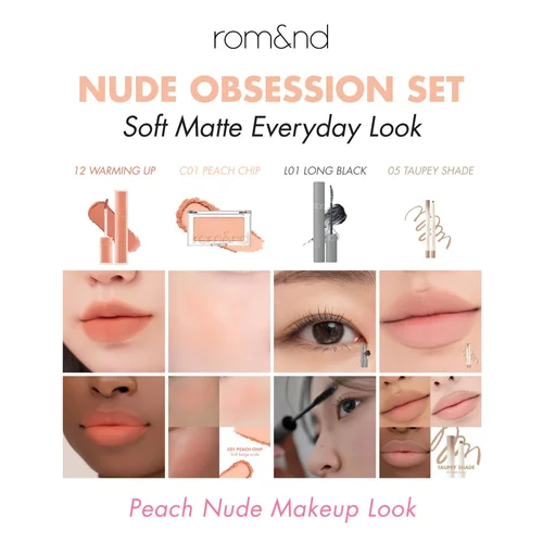 12 Ultimate Matte: Nude Obsession shades
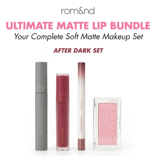 13 Ultimate Matte: After Dark cover
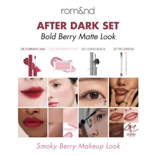 14 Ultimate Matte: After Dark shades
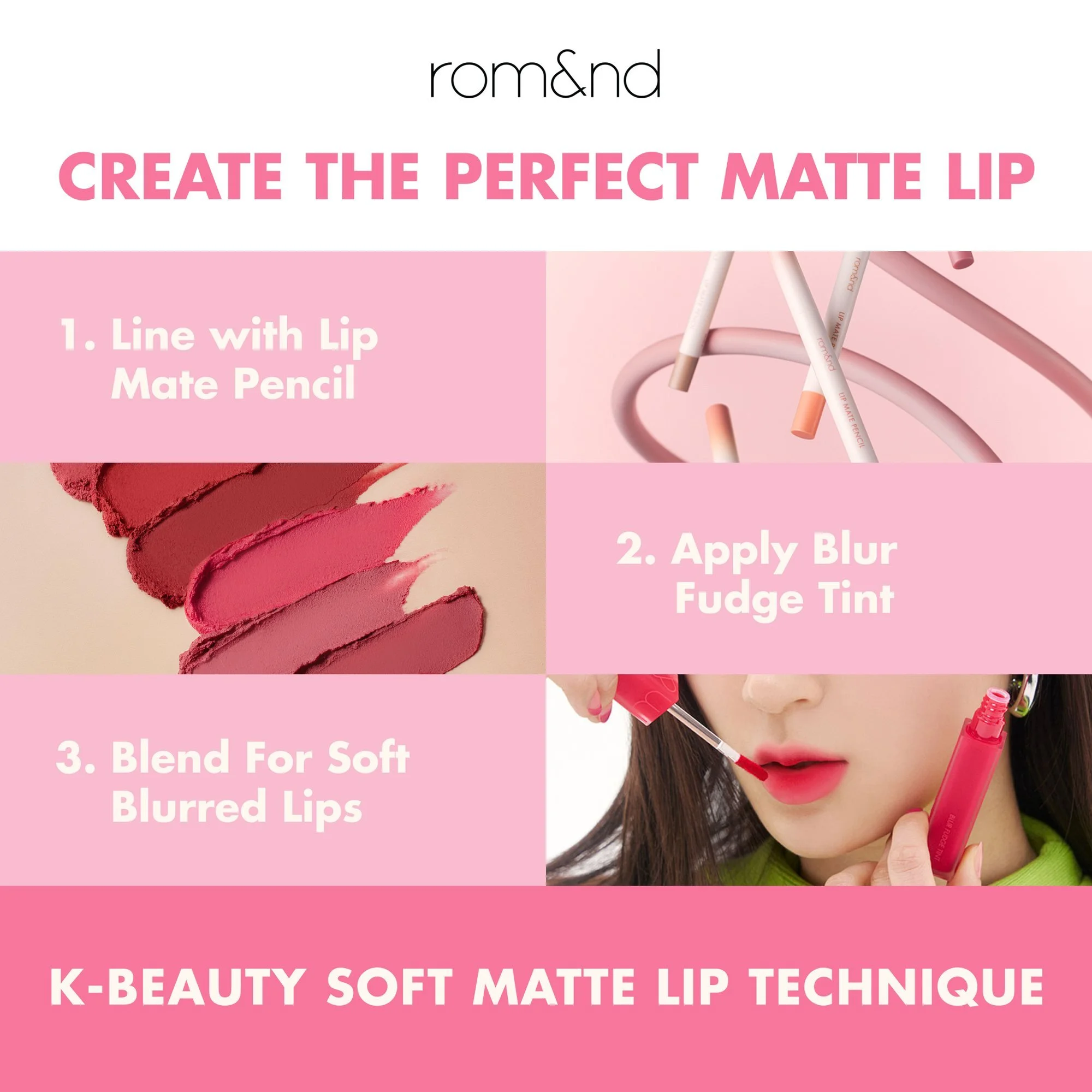
 15 Ultimate Matte: The perfect matte lip
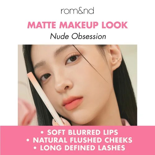 16 Ultimate Matte: Nude Obsession look
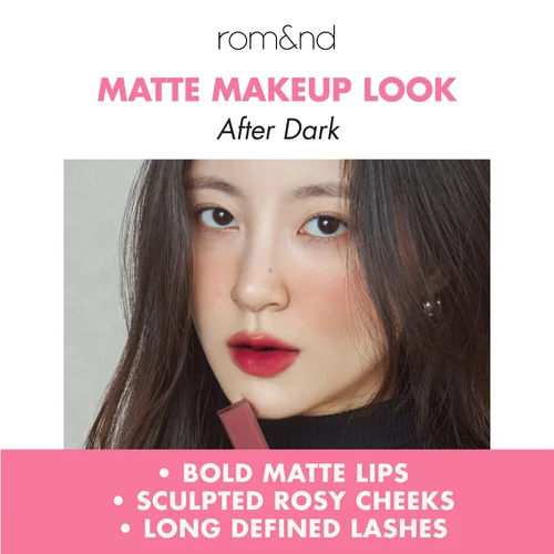 17 Ultimate Matte: After Dark look
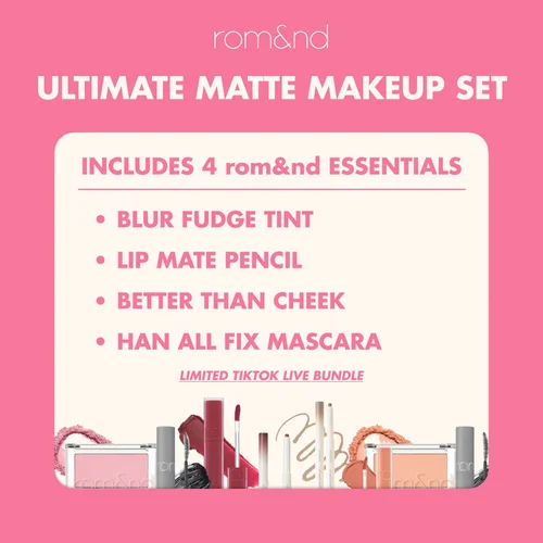 18 Ultimate Matte: What’s included
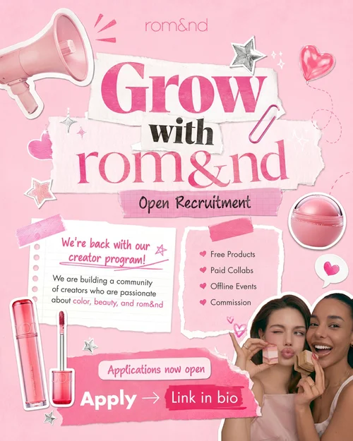 19 Creator call, page one
 20 Creator call, page two
 21 Romhouse, feed
 22 Romhouse, story
 23 Shade finder story
 24 Shade finder video: the question
 25 Shade finder video: the selfie
 26 Shade finder video: the picks
 27 Summer banner, desktop
 28 Summer banner, feed
What this demonstrates
Real products in invented scenes, in the brand’s own mood.
- Comparison built into the post. The bundle carousels turn a product list into a choice between two looks, with each shade shown on several skin tones.
- Generated scenes, real products. Gemini for the world, Photoshop for the rest: rom&nd’s own product photos, placed one by one and matched to the scene.
- One mood, every format. Stories, squares, 4:5 posts, a desktop banner and video, all in the same soft, romantic register, through three rounds of review.
- Art direction from words alone. Romhouse began as text. The house was reworked, element by element, until it read as an invitation.