Most of this work started as something unreadable — a compliance document, a twenty-year corporate history, a price list. My job at Advue Digital is to figure out who has to act on it, how much attention they'll actually give it, and what has to be true about the layout for that to work. The output happens to be a deck or a poster or a package. The problem underneath is the same one I solve in product: decide what someone needs to know first, and get everything else out of the way. Across these projects I've worked in English and Korean, across print, digital, packaging, and email, for clients in banking, asset management, food and beverage, & hospitality.



Brand & communication
Most of this work started as something unreadable: a compliance document, a twenty-year corporate history, a price list.
- Languages
- English and Korean
- Media
- Print, digital, packaging, and email
- Clients
- Banking, asset management, F&B and hospitality
Client work
My job at Advue Digital was to figure out who has to act on it, how much attention they’ll actually give it, and what has to be true about the layout for that to work. The output happens to be a deck or a poster or a package. The problem underneath is the same one I solve in product: decide what someone needs to know first, and get everything else out of the way.
BHC Chicken
In-store posters- Arrived
- Combos, prices and a lunch special
- Made
- Posters you can decide from in line
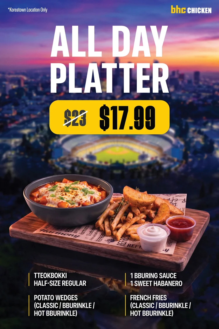
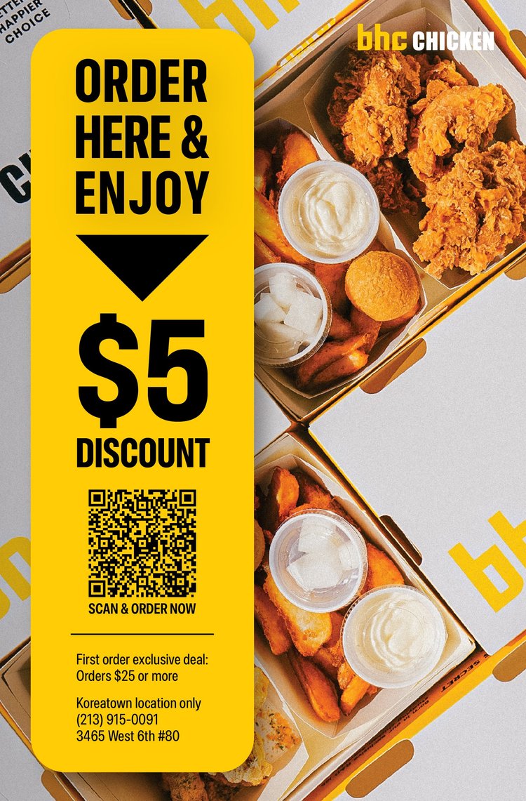
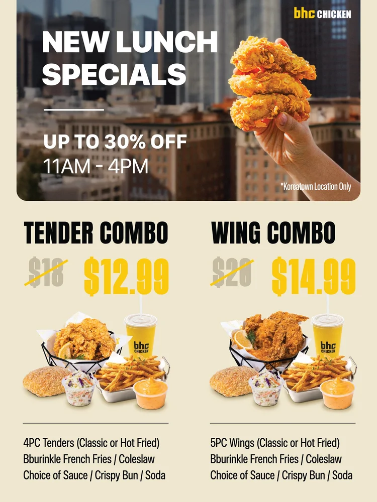
The reader is standing in a queue, hungry, deciding in a few seconds. So the platter leads with the offer and the crossed-out price beside it, the lunch combos sit in identical modules, and the counter piece carries one instruction and a QR code you can scan from arm’s length.
- Who acts on it
- A hungry customer in line, often holding a phone
- Pieces
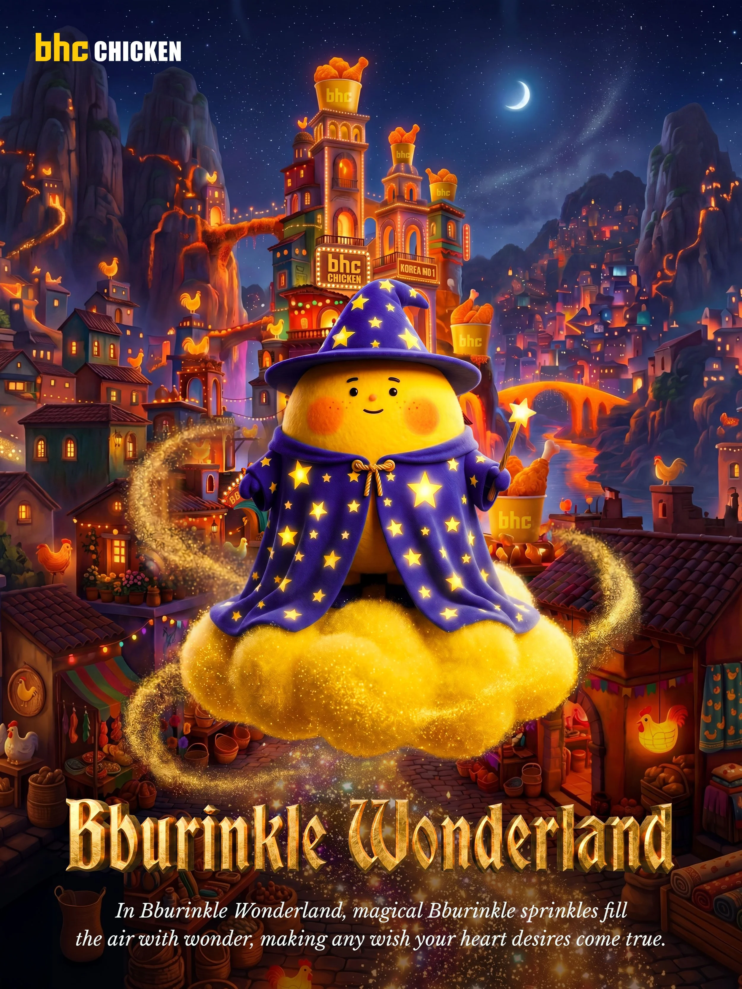
- Platter, lunch special and counter posters, a retention flyer, a campaign character
- Where
- BHC stores in the U.S. and Canada


CoPack Inc.
Photo library- Arrived
- Product photos that looked AI-made
- Made
- A photo library buyers believe
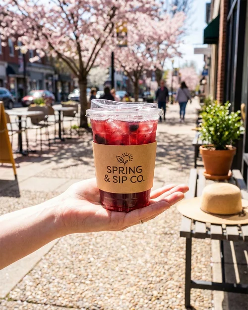
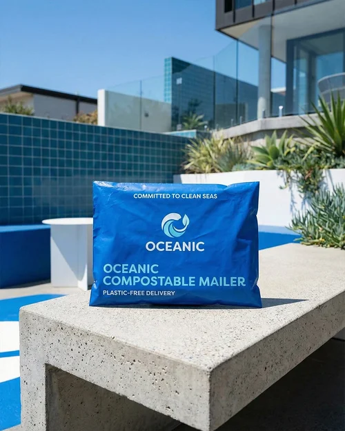
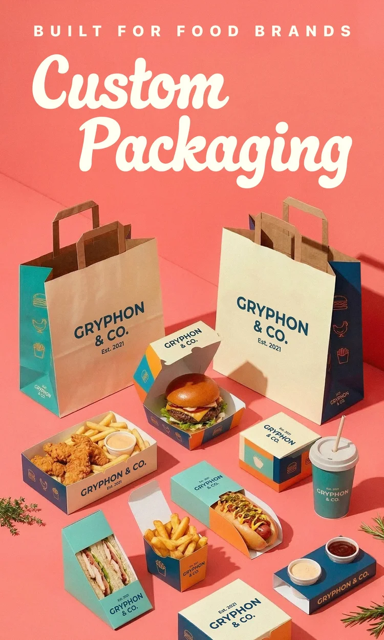
If the product shots look fake, a buyer has no reason to believe the manufacturing is real. I rebuilt the library for credibility, widened it from food service to every segment CoPack sells to, and helped reorganize the site around who’s buying. Every visual on copackinc.com is mine.
- Who acts on it
- Buyers in retail, food service, e-commerce and flexible packaging
- Pieces
- The site’s photo library, weekly Instagram and email, display banners in seven sizes
- Length
- One year
Hanmi Bank
Bilingual guide- Arrived
- U.S. banking, named in English
- Made
- A Korean guide with the paths drawn out
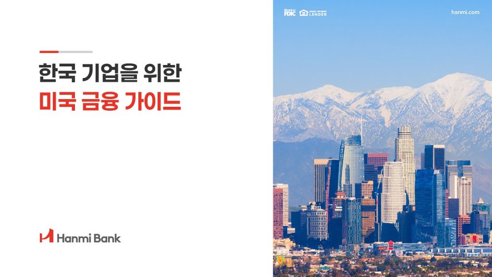
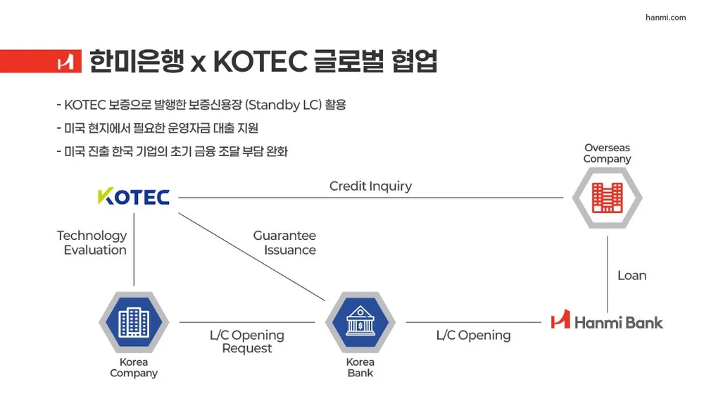
A guide to U.S. corporate finance for Korean companies entering the American market. I worked in both languages, set the Korean type for its own reading rhythm, and moved the hardest part, how a company reaches U.S. financing and who sits in between, out of paragraphs and into flow diagrams.
- Who acts on it
- Korean companies entering the U.S. market
- Pieces
- The guide, a U.S. network map, an account comparison page, press and social pieces
- Languages
- Korean and English

Newsletters
Several clients- Arrived
- A new brand and a new offer every send
- Made
- One skeleton, a different mood each time
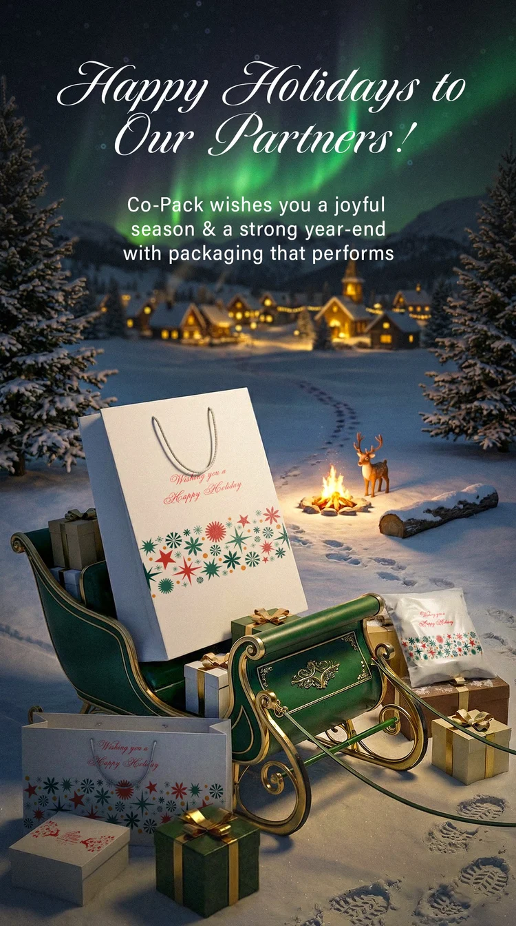
Every send went out for a different brand, on a schedule that didn’t move, into an inbox that gives it about a second. Each account got a fixed skeleton: one image, the offer stated once, one call to action and the same footer. The treatment carried the occasion.
- Who acts on it
- Someone glancing at a phone inbox
- Clients
- CoPack, Kabuki and It’s Bobatime, among others
- Pieces
- Seasonal promotions, launches, catering pushes, partner notes
AllMerits Asset
Brochure- Arrived
- Pages of regulated retirement-plan copy
- Made
- A brochure you can open at any page
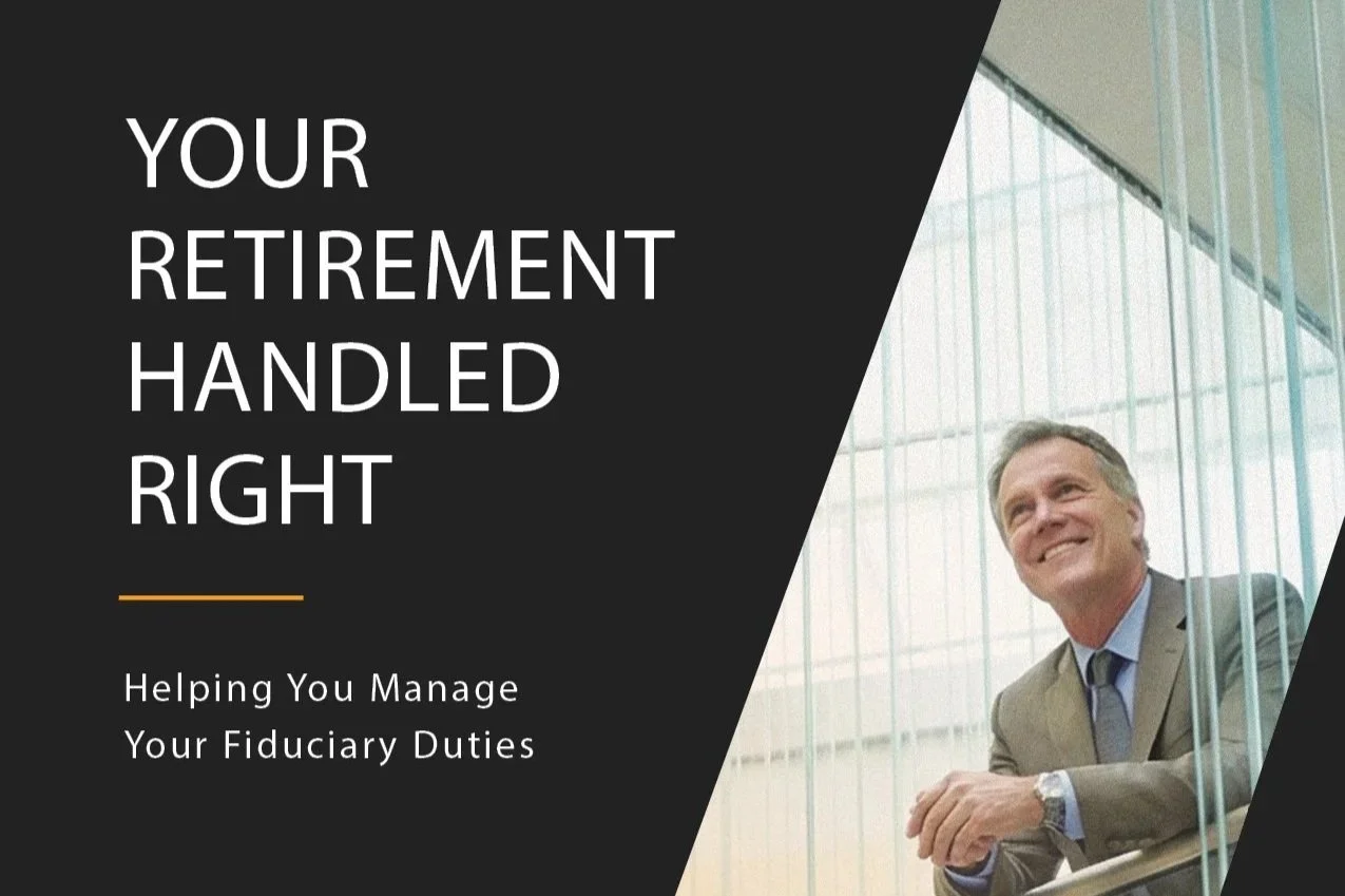
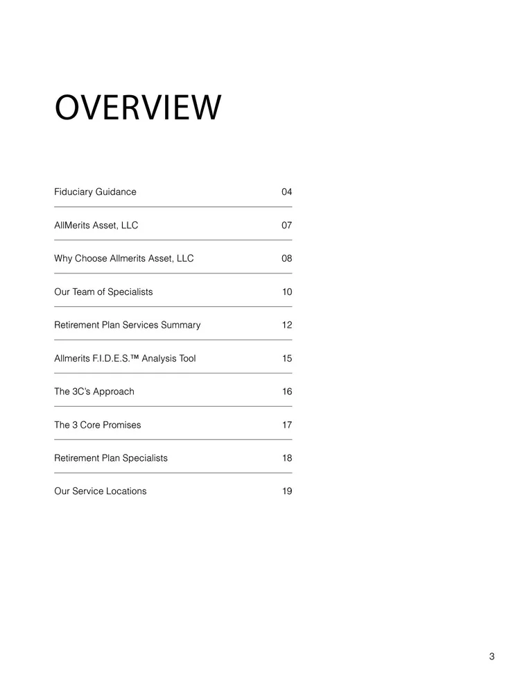
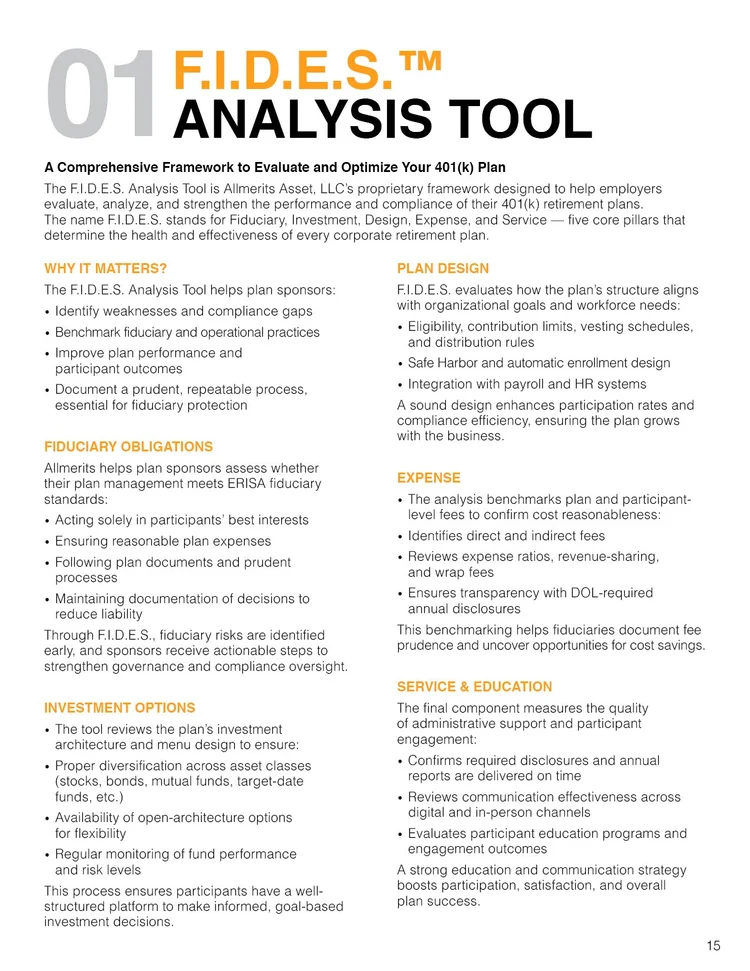
Long, regulated, and read by a business owner who didn’t choose to read it, usually for one answer. An overview page works as the map, every section opens the same way, and a strict type hierarchy gives a scanning reader a path through paragraphs they won’t read in full.
- Who acts on it
- A business owner who isn’t a finance professional
- Pieces
- A multi-page retirement services brochure, built for print
Open Bank
Story deck, rebrand- Arrived
- Twenty years of dates, branches and numbers
- Made
- One deck in four movements
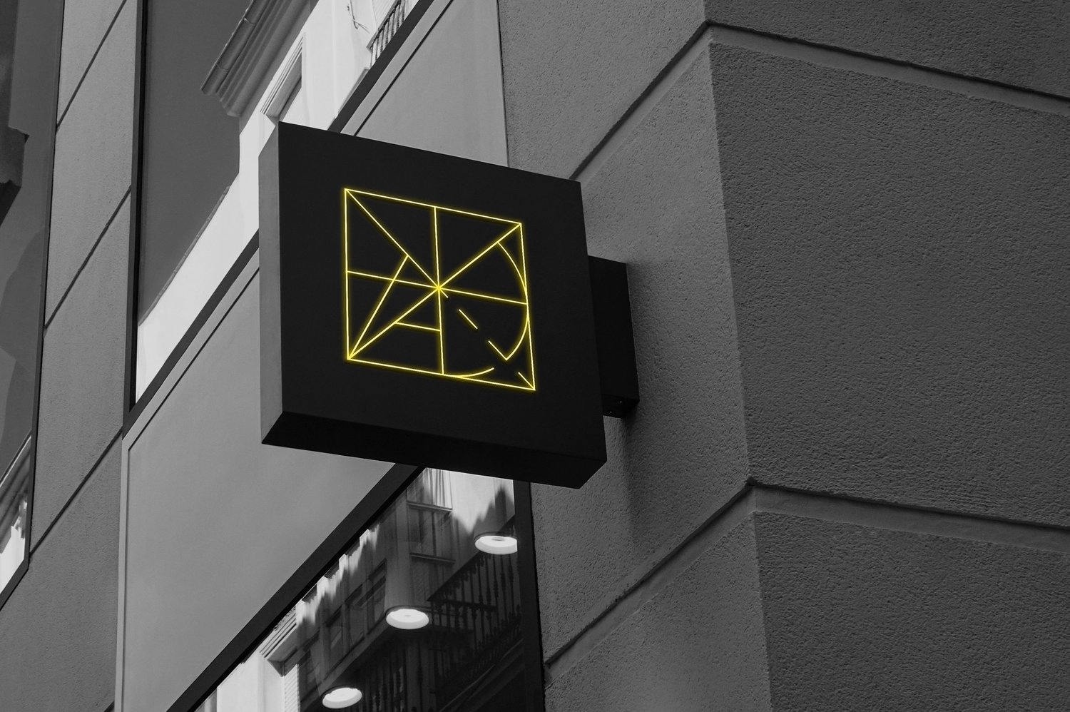
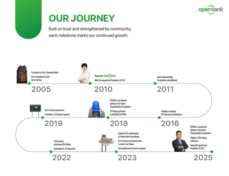
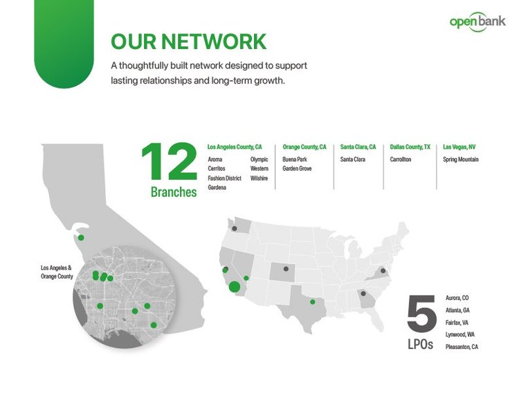
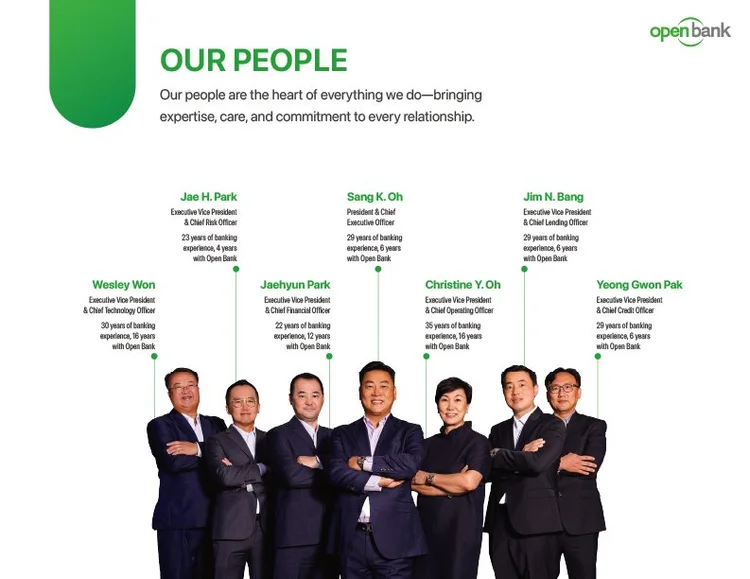
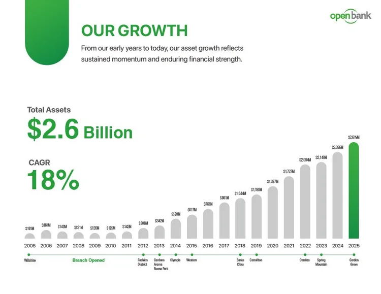
The material came as four unrelated kinds of information: a history back to 2005, branches across the U.S., growth figures, and people. Each got its own form (a timeline, a map, a growth view) under one header system. For the rebrand, I explored about a dozen names; the top four went through several rounds of comparisons, each mocked up on the bank’s own building.
- Who acts on it
- Investors, new staff and partners, from the same deck
- Pieces
- The story deck, product pages, about a dozen rebrand names narrowed to four, several rounds of comparisons