
Open Bank Client work at Advue Digital Community bank
ArrivedTwenty years of a bank, as four unrelated kinds of information MadeOne deck in four movements, and a naming study judged on the building
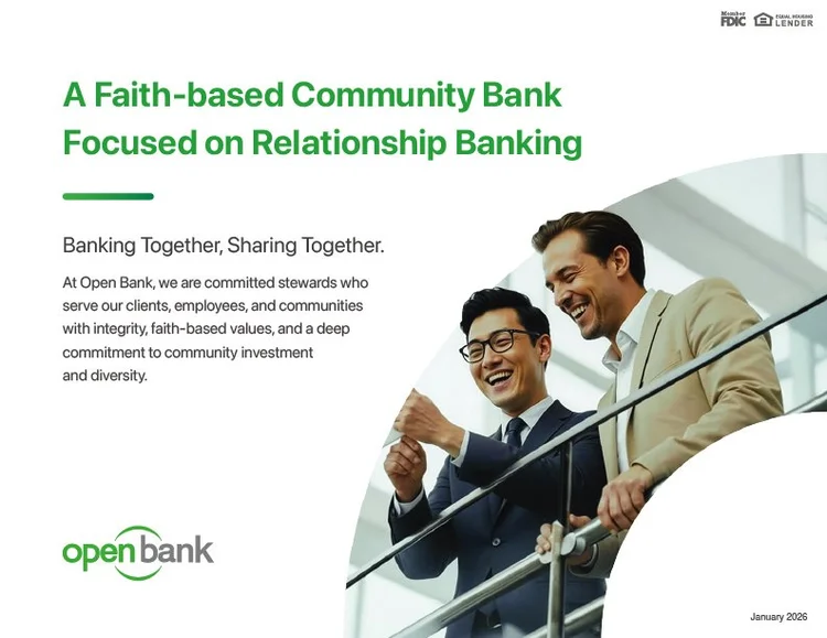
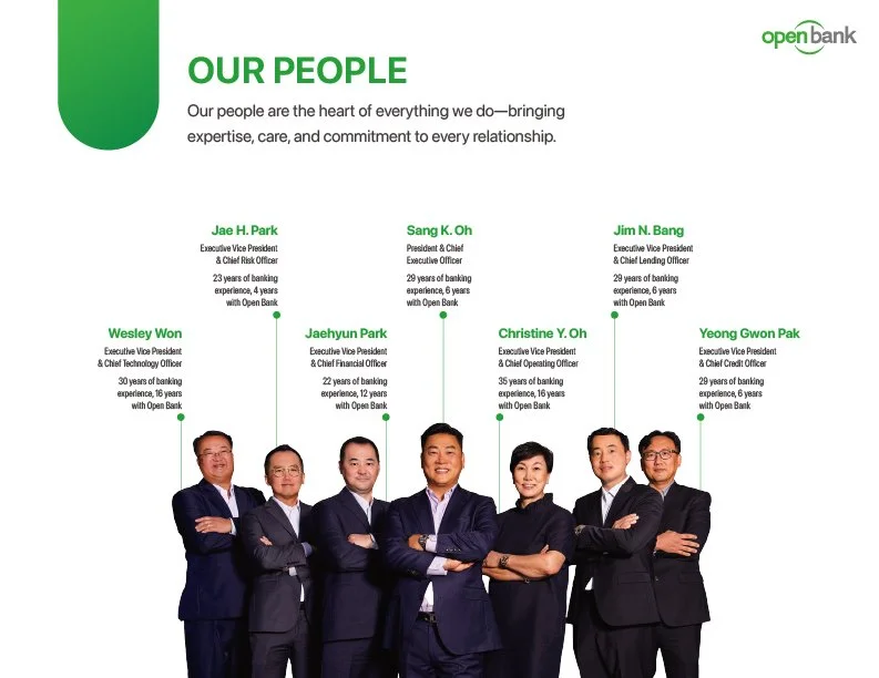
Open Bank is a faith-based community bank built on relationship banking. The brief was an institutional story deck: the document that has to work in an investor meeting, a branch onboarding and a partnership conversation without being rebuilt for each one. The difficulty in a deck like this is never the visuals. It is that the material arrives as four kinds of information that each want a different form, and presented as a uniform run of slides they flatten into noise.
What arrived
A chronology, a footprint, growth figures and a set of people, each wanting a different form.
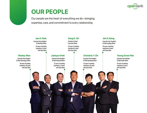
The source material was the bank’s own record of itself: milestones going back to 2005, branch and loan-office data across the United States, total assets and growth, and the people and community commitments behind the foundation. Treated as one list of slides, a reader who joined the room for one of the four would leave without it.
So the deck was structured as four movements, Our Journey, Our Network, Our People and Our Growth, and each was given the form its information actually needed.
What I made
Time as a line, place as a map, and one header system over all of it.
 1
2
3
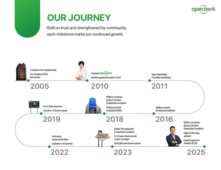
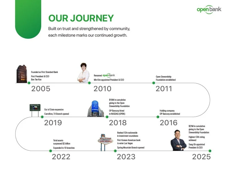
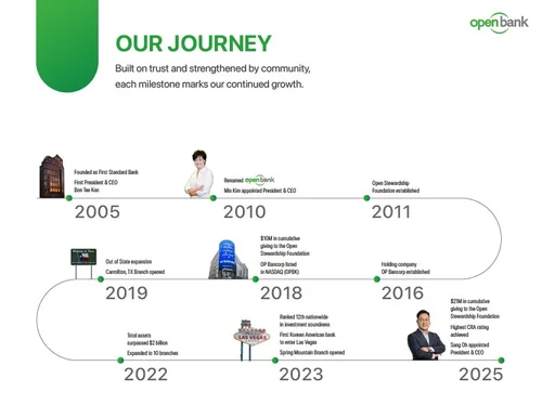
The journey. A chronology that reads as momentum, not a list of dates.
- 1It starts at the founding year and runs left to right, the way a reader expects time to go.
- 2The line turns back on itself, so twenty years fit one slide in reading order instead of a table.
- 3It ends at the present, lower right, where the eye finishes. The last point is the room the reader is sitting in.
 1
2
3
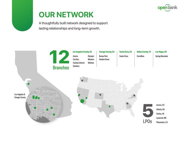
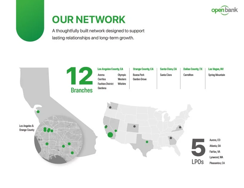
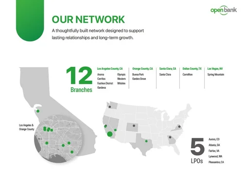
The network. A footprint you can see without looking anything up.
- 1The count first, at the largest size on the slide.
- 2Then the map, where the density of branches is visible at a glance rather than reconstructed from a table of addresses.
- 3The loan production offices as a second count, so the two kinds of presence stay distinct.
 1
2
3
4
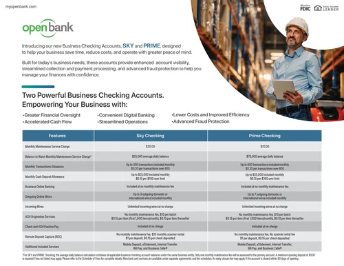
The system. The same header, rule and green, so a reader joining mid-deck knows where they are.
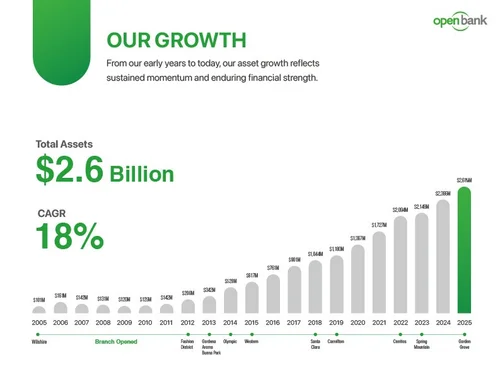
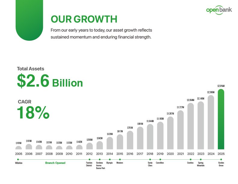
- 1Our Growth: the section name top left, a one-line summary beside it, the figures at display size, the chart below.
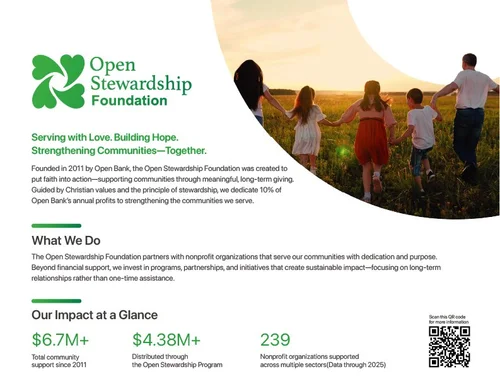
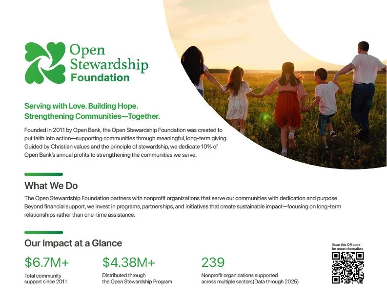
- 2The Foundation on the same system, so the community arm reads as part of the same institution.
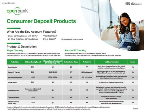
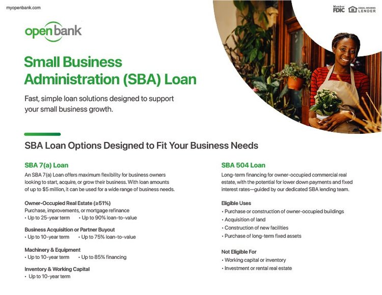
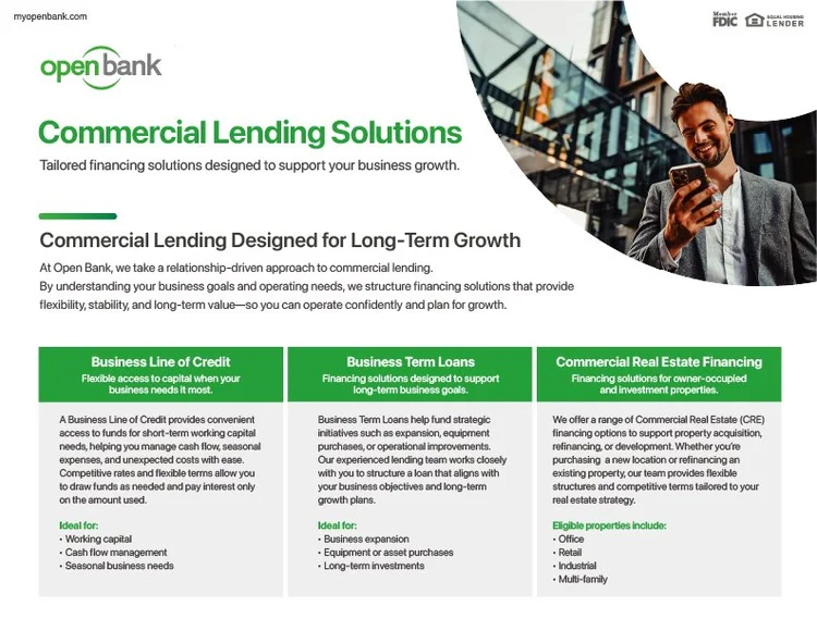
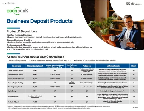
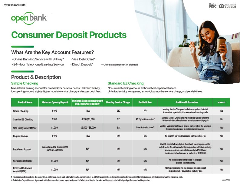
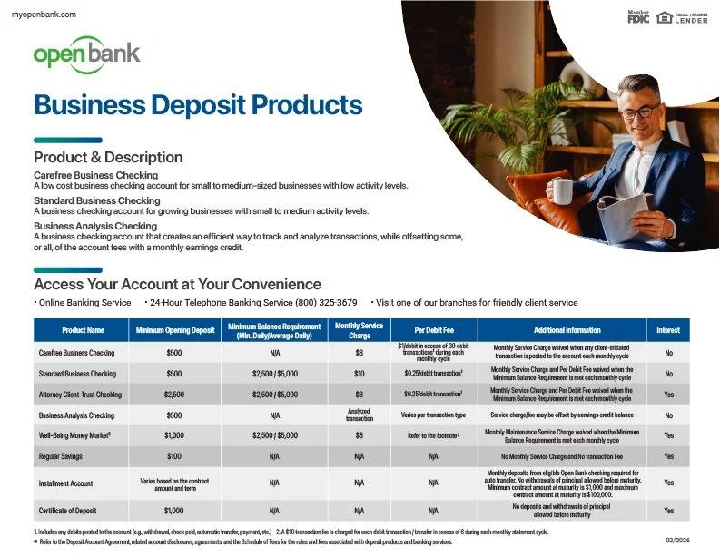
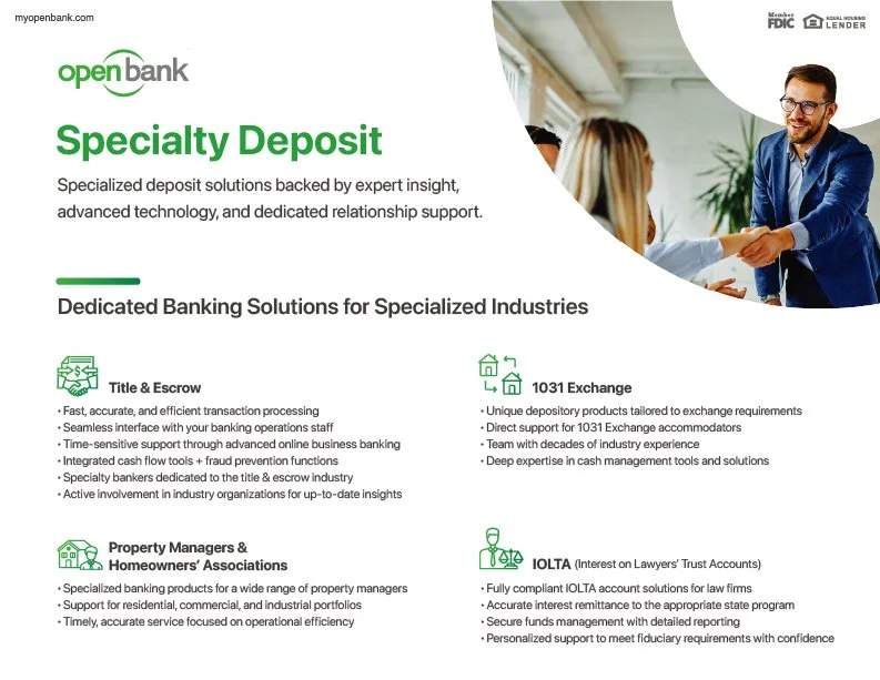
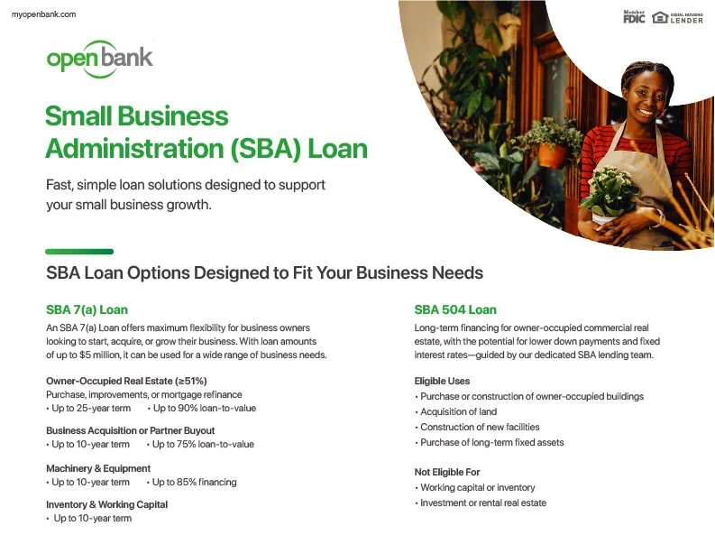
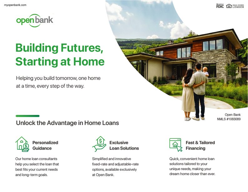
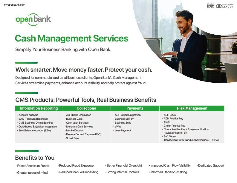
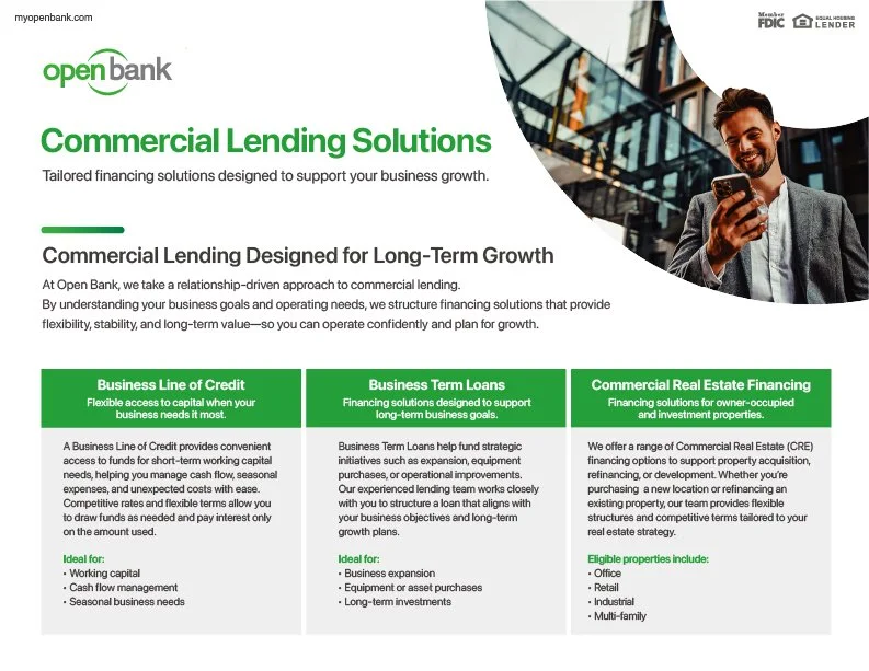
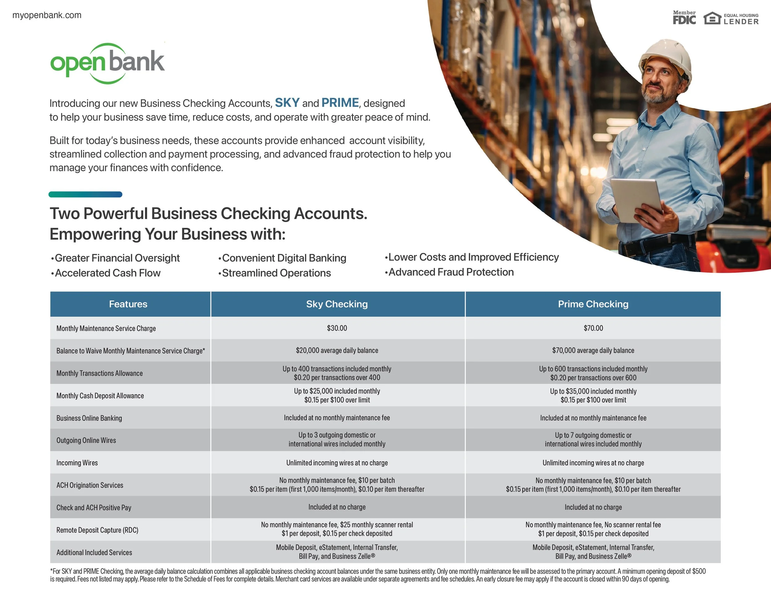
- 3The product one-pagers carry the header and the green into the branch.
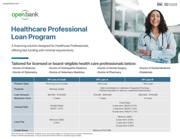
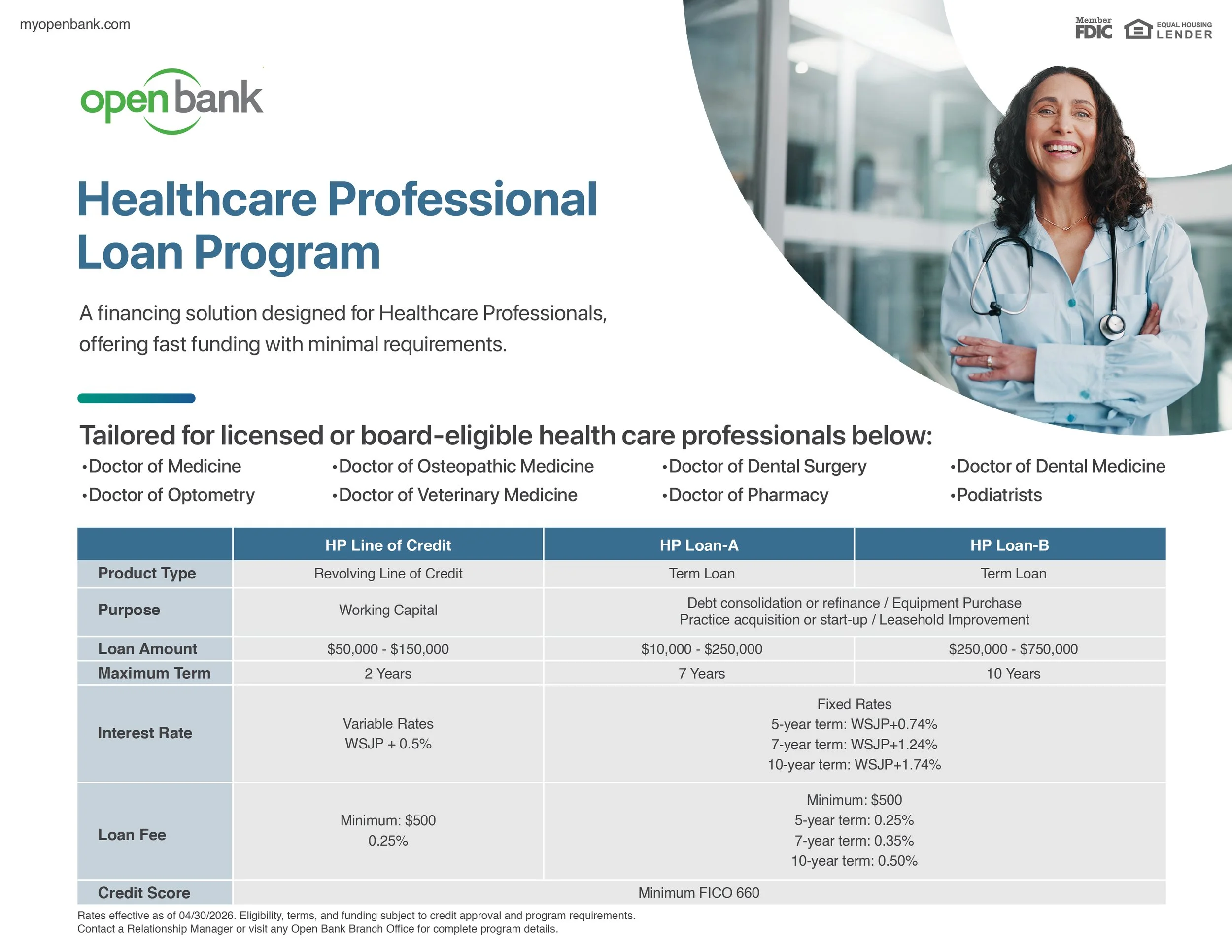
- 4The sales kit too. One set of parts, applied across dozens of pages.
 1
2
3
4
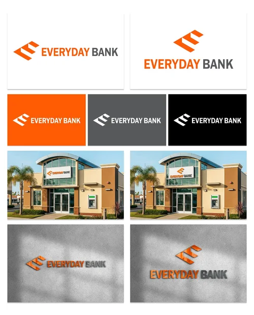
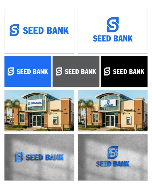
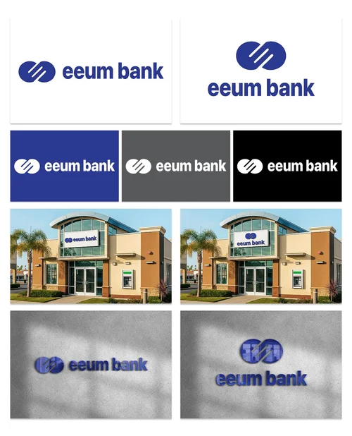
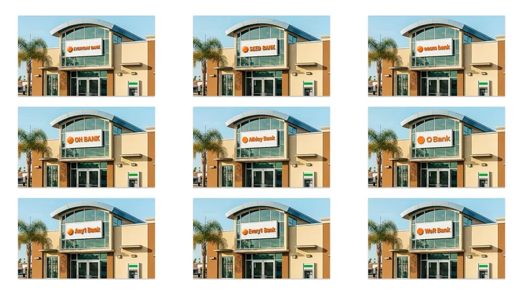
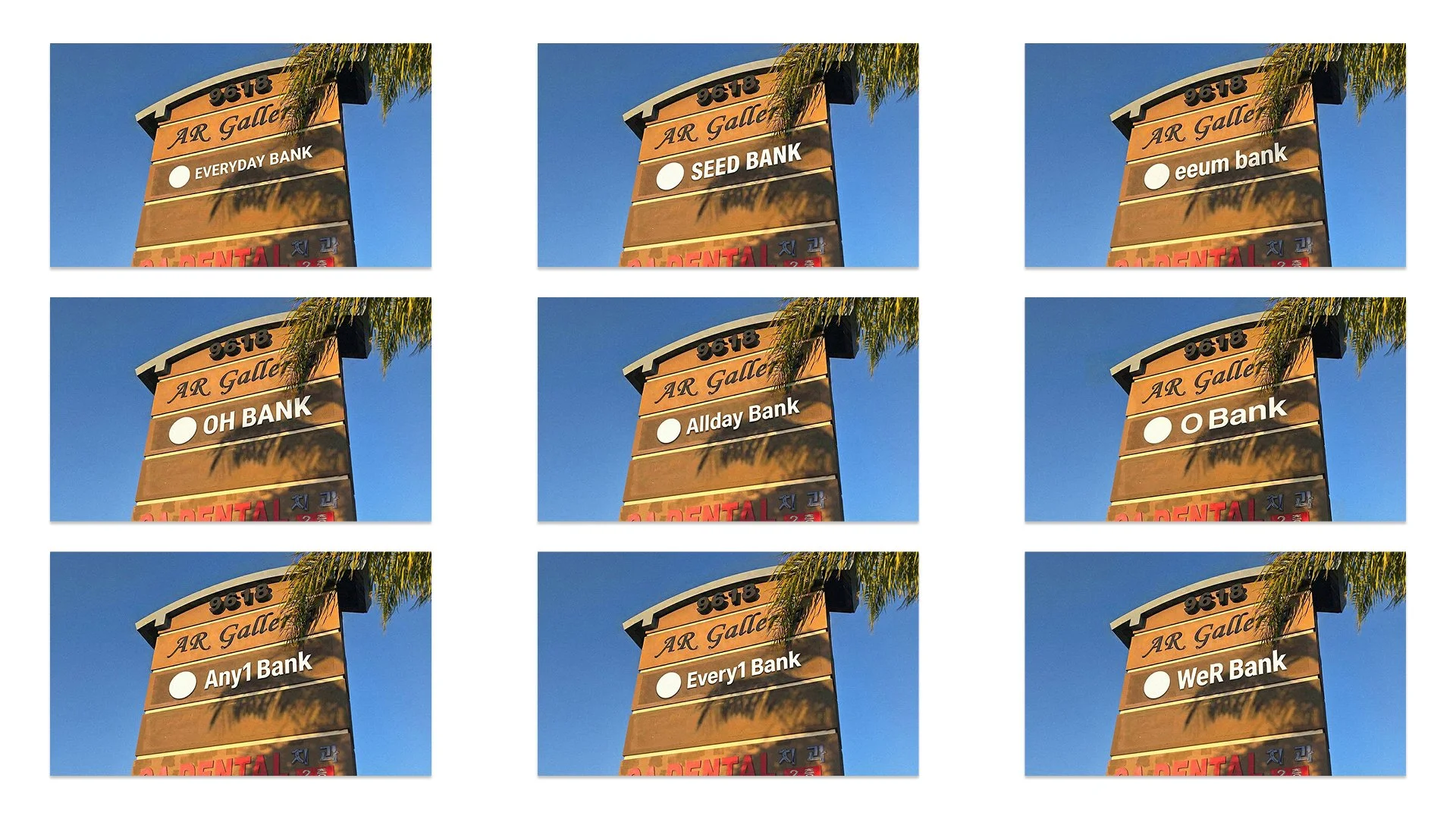
The naming study. About a dozen names, narrowed to four, judged on the building.
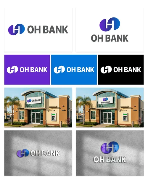
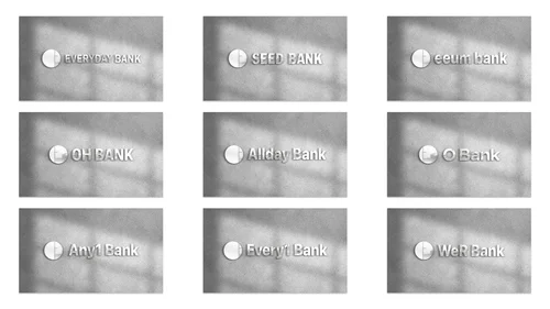
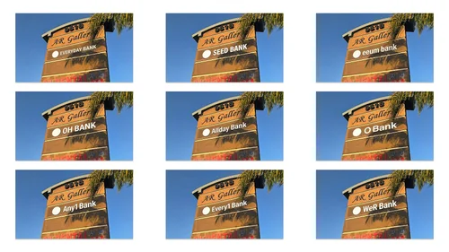
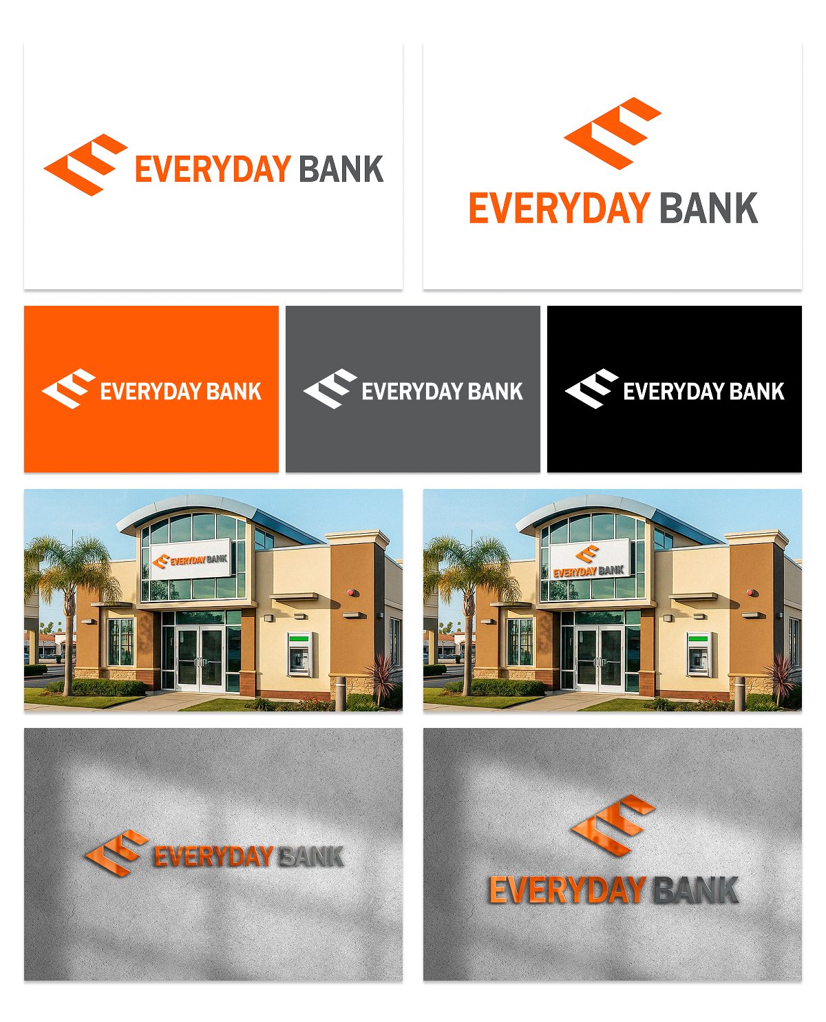
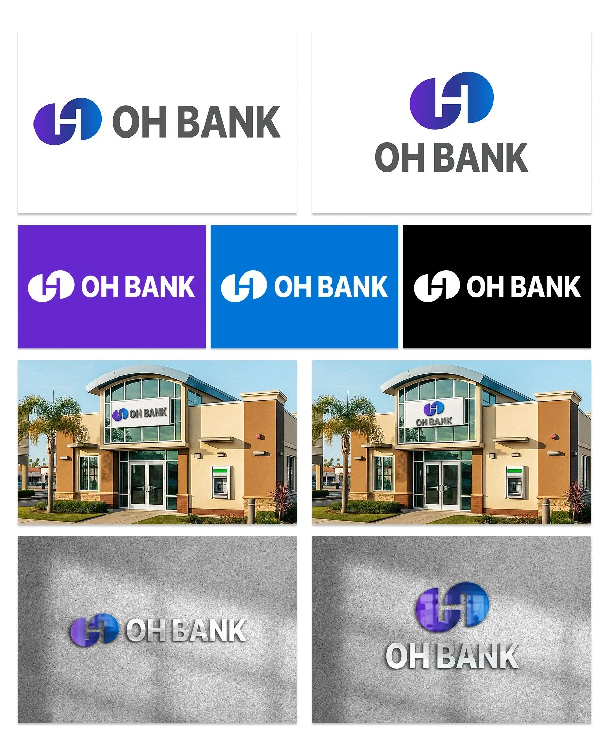
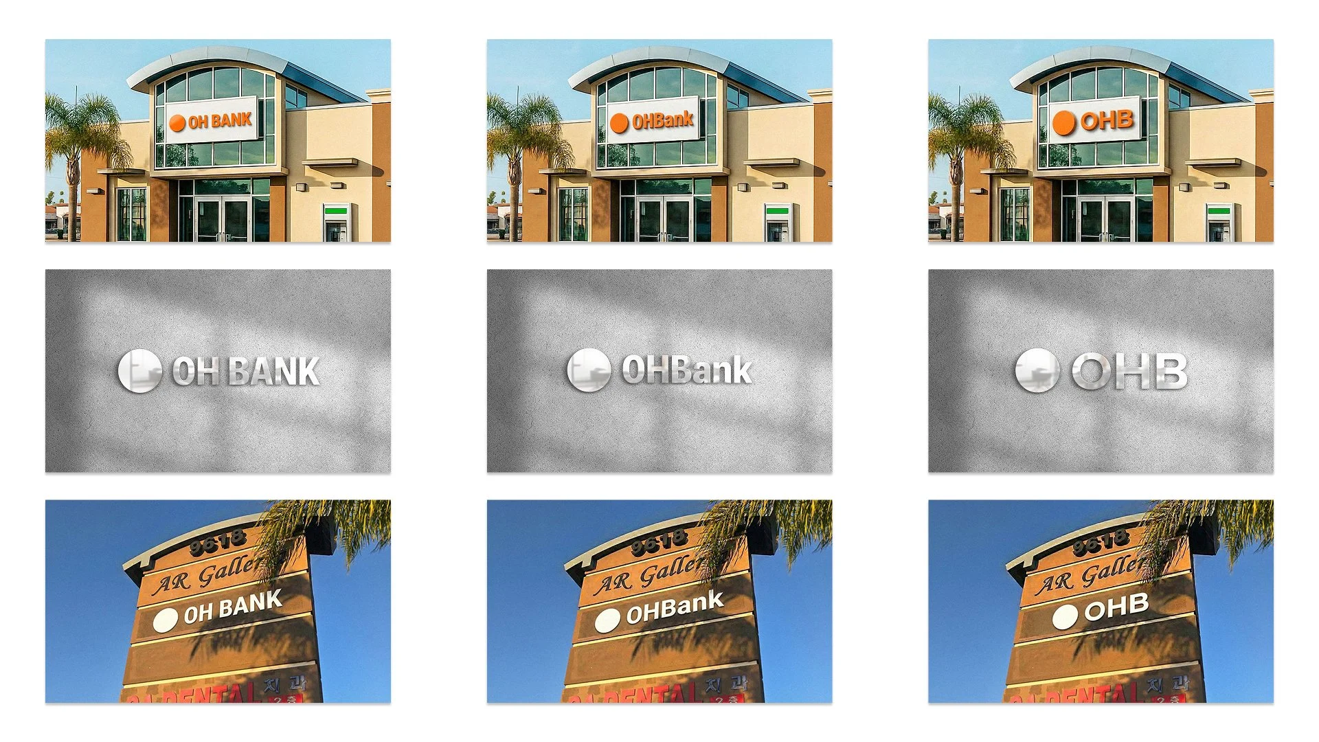
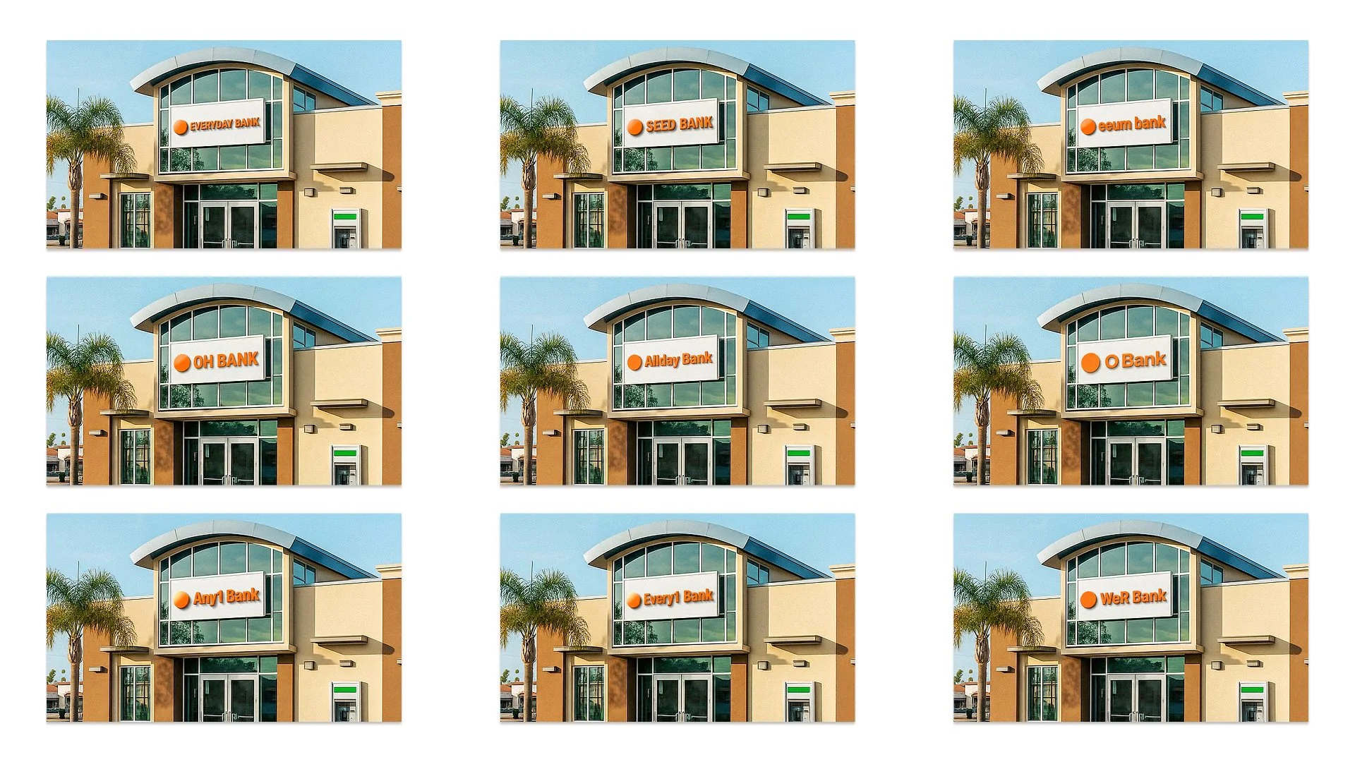
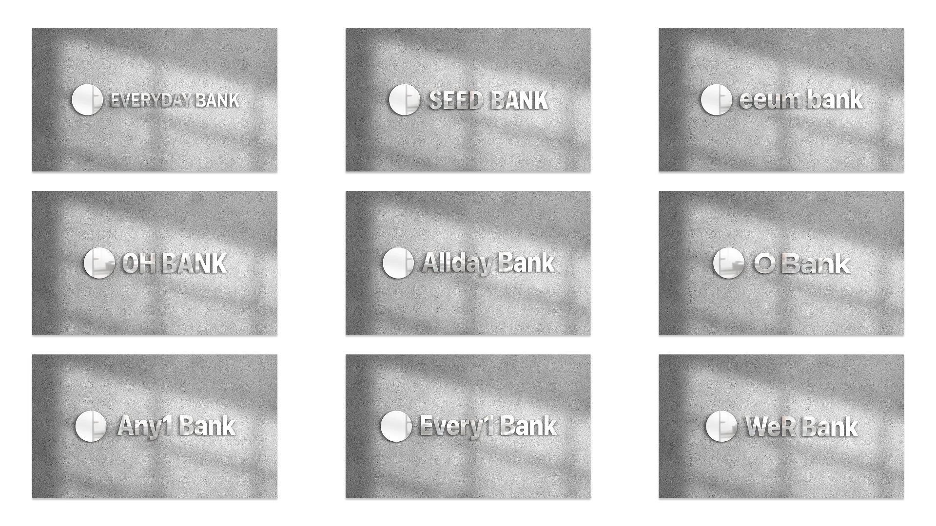
- 1Everyday Bank. Each candidate got the same sheet: the wordmark, its color variants, and the mark mocked up on the bank’s own building at real scale.
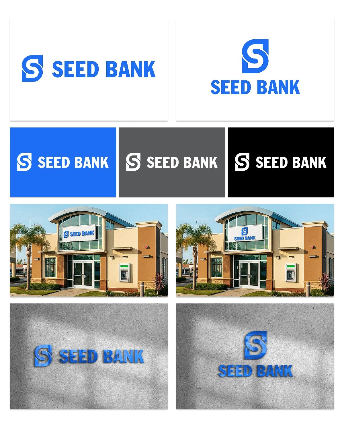
- 2Seed Bank. Judging a name on the building rather than a white artboard is what let the client compare them as a bank, not as a logo.
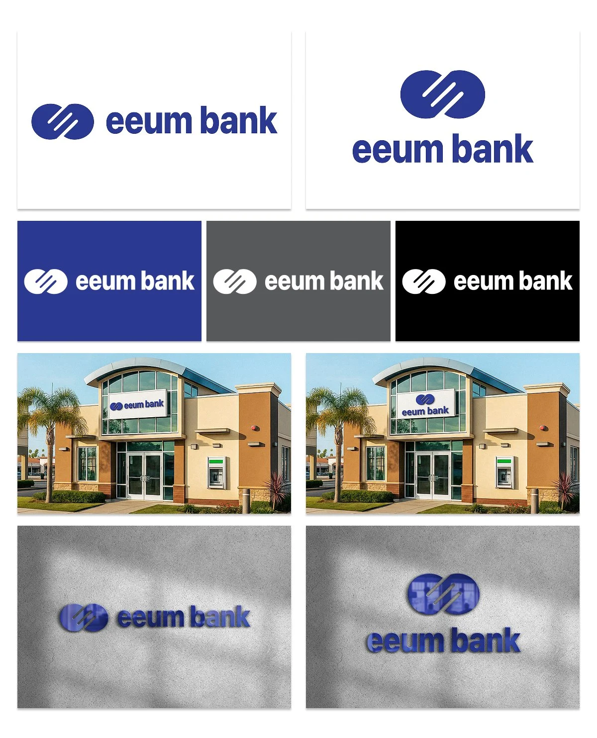
- 3Eeum Bank. The same sheet, so nothing in the presentation favored one option over another.
- 4OH Bank. The four went through several rounds of side-by-side comparison pages, built so non-designers could weigh them against each other instead of reacting one at a time.
Also for the bank
The one-pagers, a comparison round, and the posts.
The rest of the engagement, on the same green and the same header.
The whole collection
Everything made for the bank, in order.
The six slides of the deck, then the one-pagers, the sales kit, the naming study with its comparison rounds, and the posts. Scroll sideways; each piece opens at full size in a new tab.
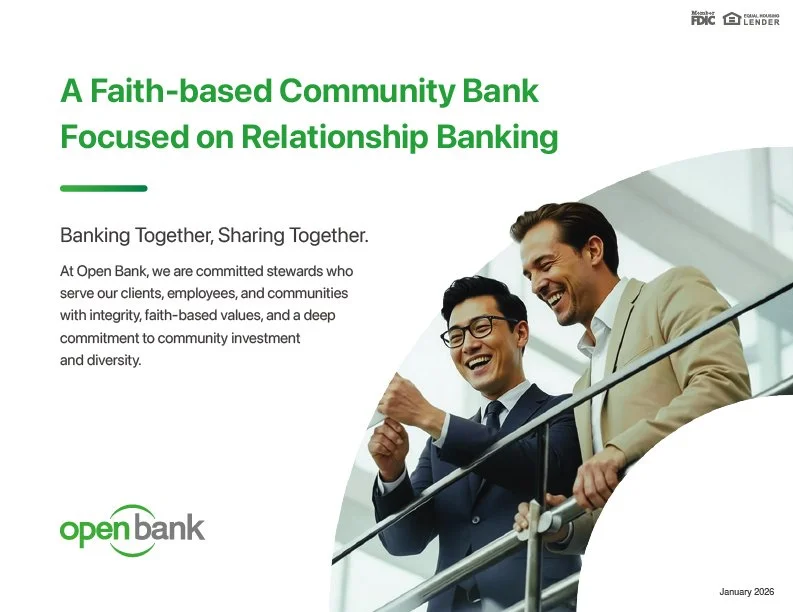
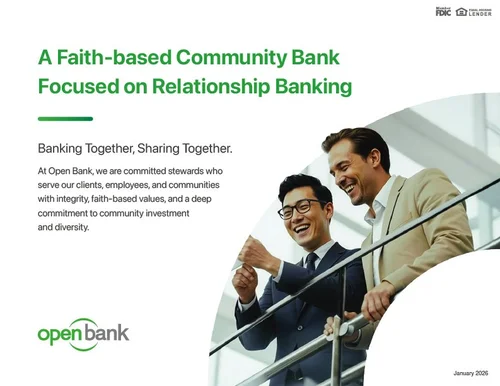 Deck Cover
 Deck Our Journey
 Deck Our Network
 Deck Our People
- Deck Our Growth
- Deck Open Stewardship Foundation
- One-pager Consumer deposits
 One-pager Business deposits
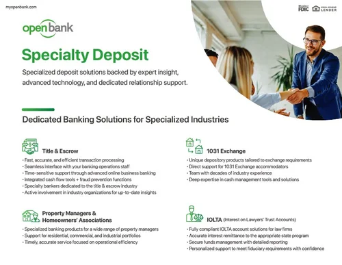 One-pager Specialty deposits
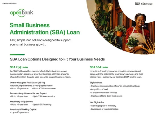 One-pager SBA loans
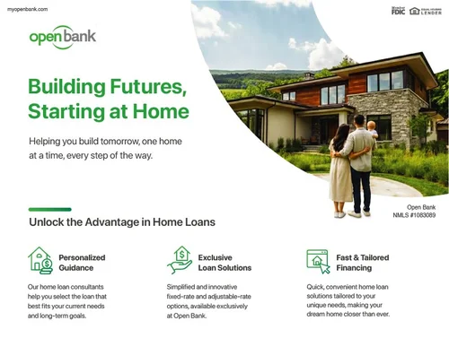 One-pager Home loans
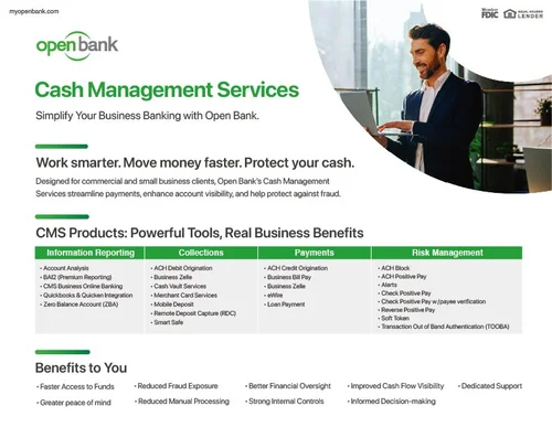 One-pager Cash management
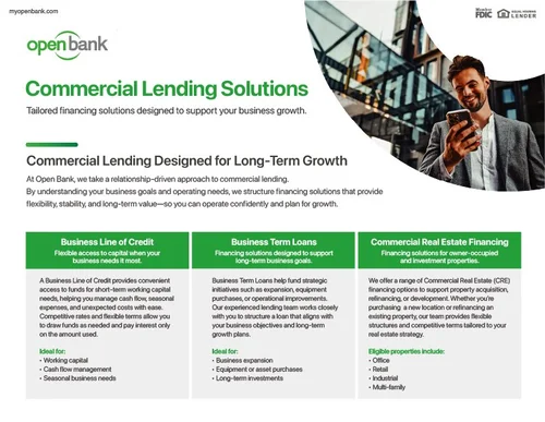 One-pager Commercial lending
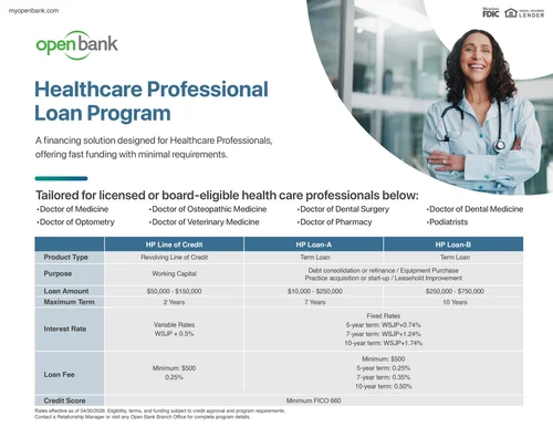 Sales kit Healthcare professional loans
- Sales kit Sky and Prime checking
- Naming Everyday Bank
- Naming Seed Bank
- Naming Eeum Bank
- Naming OH Bank
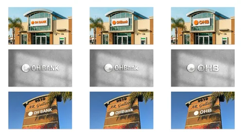 Naming Comparison round
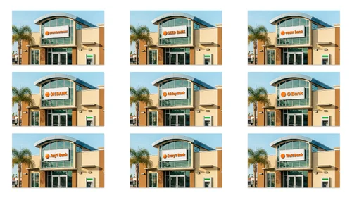 Naming Comparison round
 Naming Comparison round
 Naming Comparison round
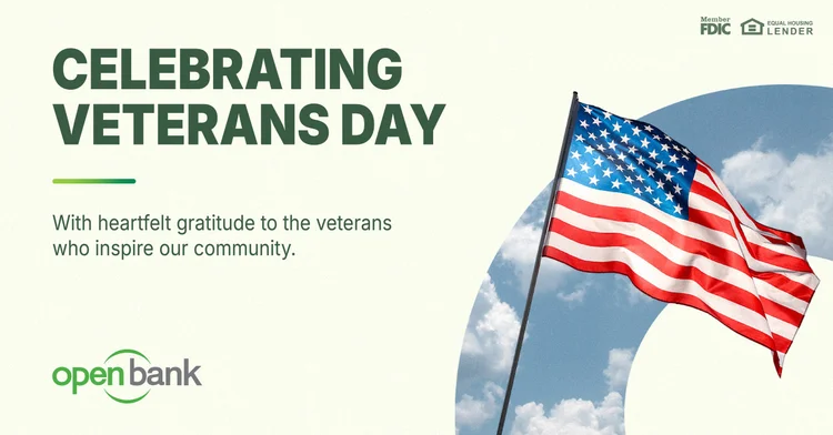
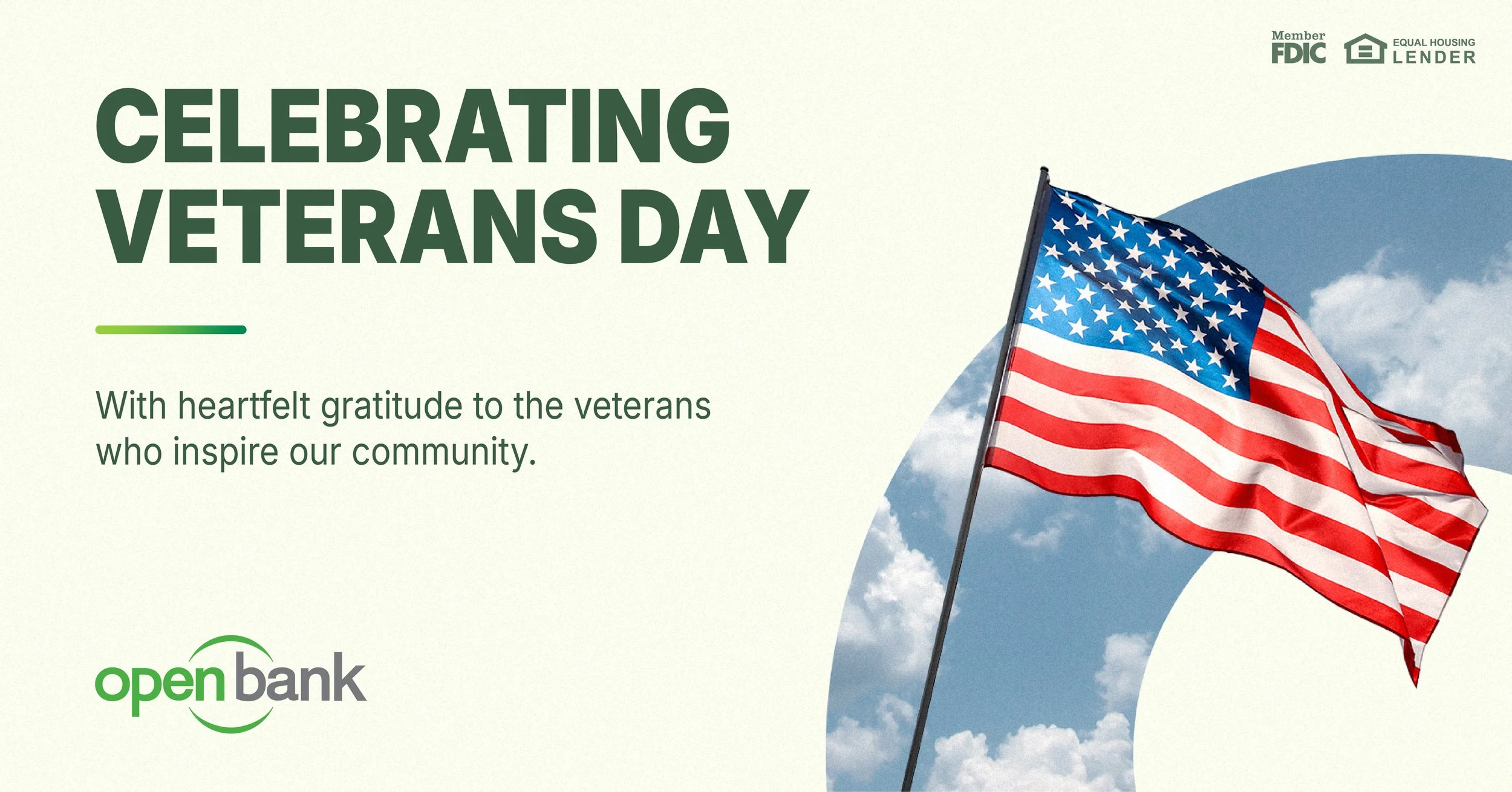
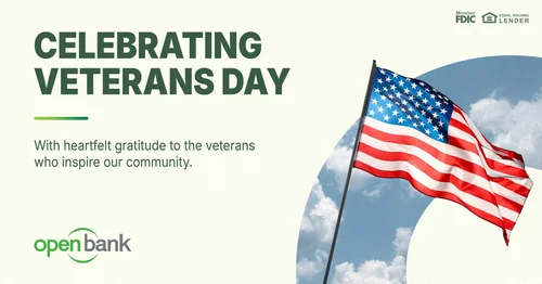 Post Veterans Day
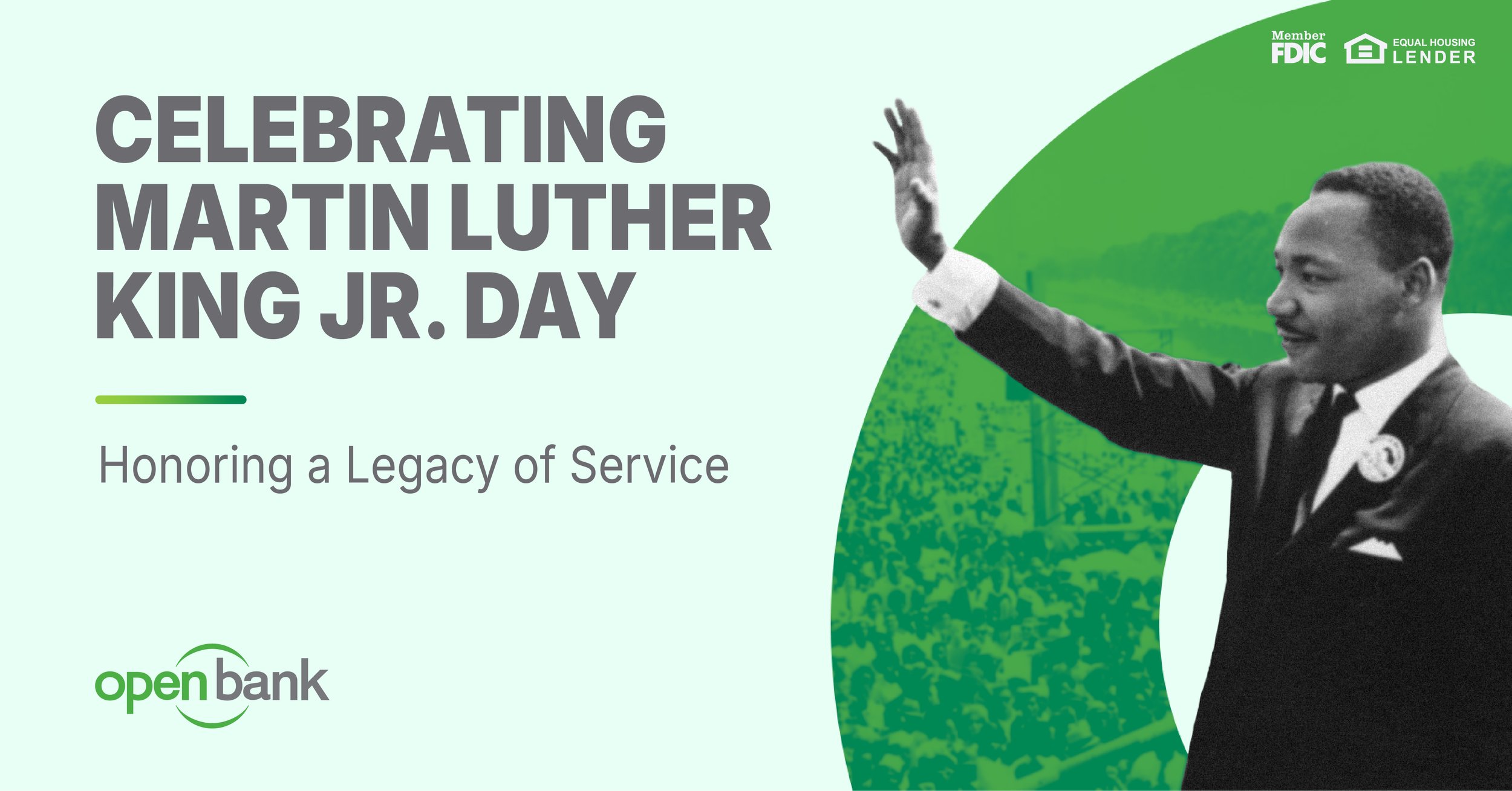
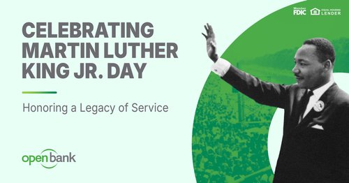 Post Martin Luther King Jr. Day
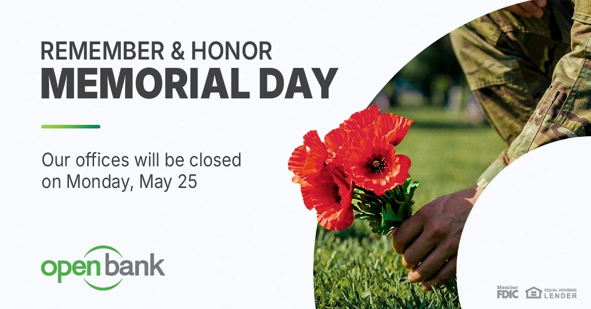
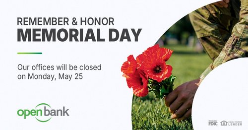 Post Memorial Day
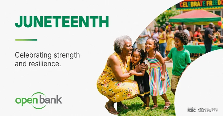
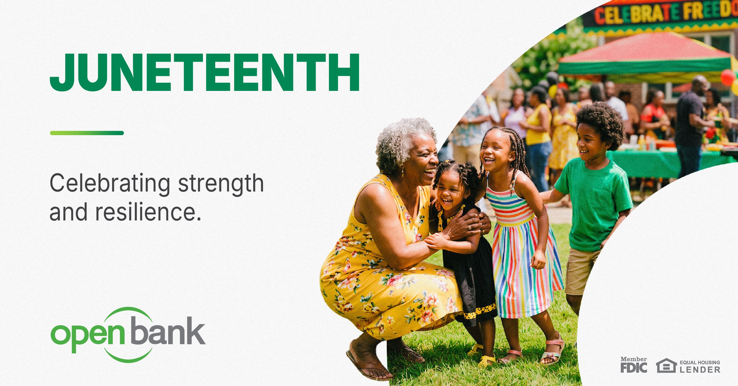
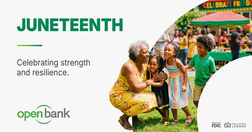 Post Juneteenth
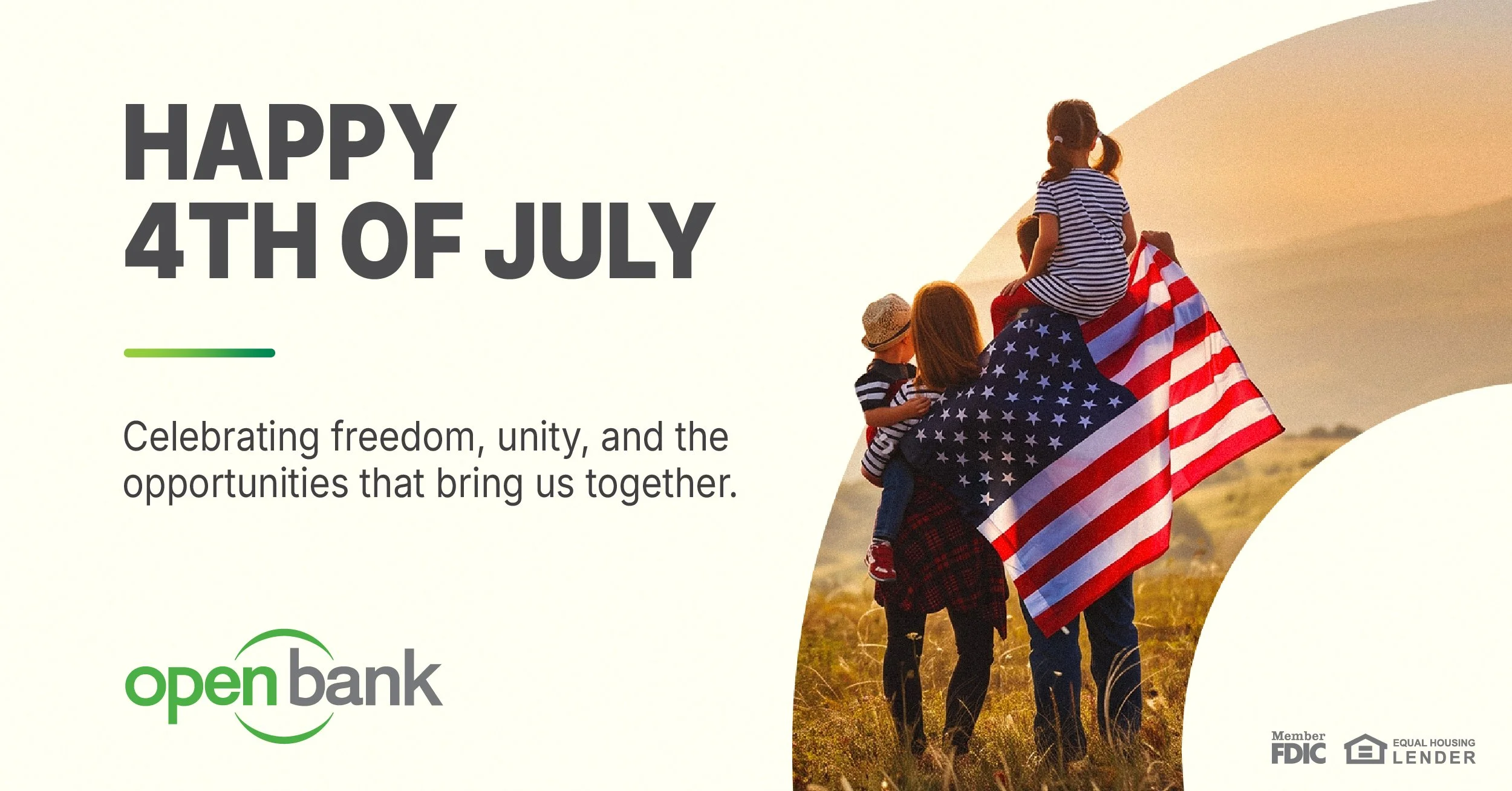
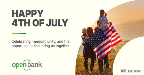 Post Fourth of July
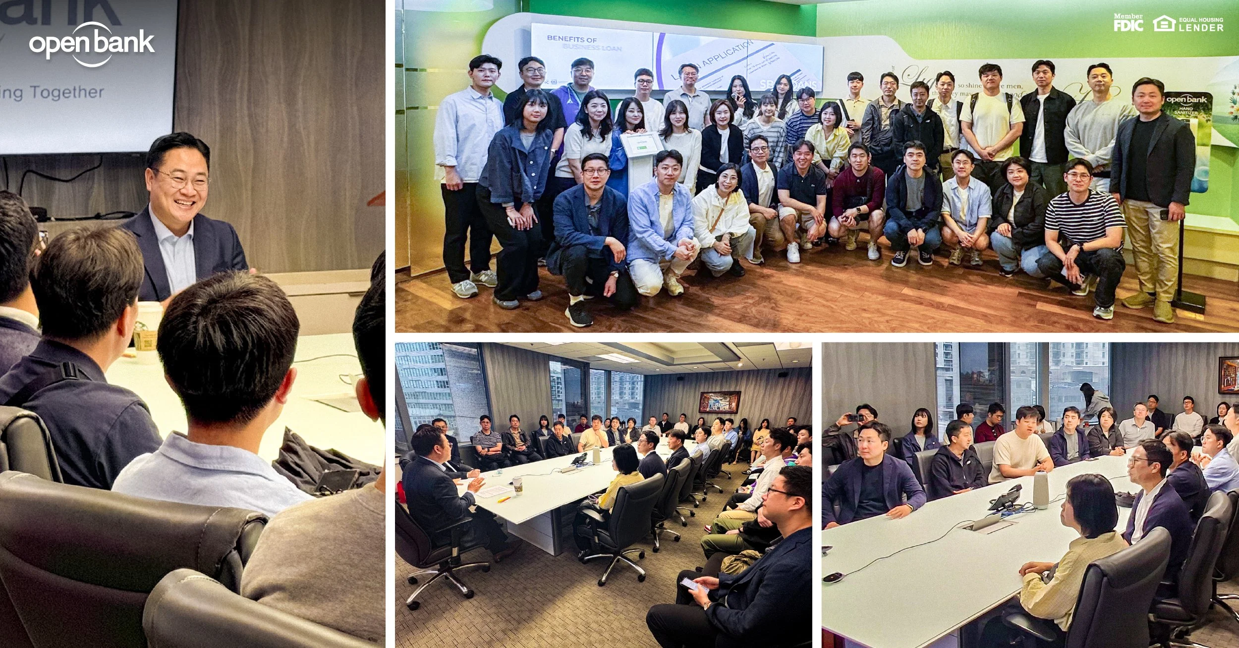
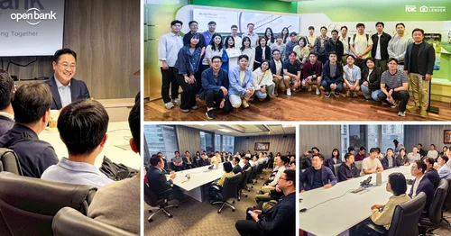 Post Community collage
What this demonstrates
Information architecture on a document instead of a screen.
- Deciding what the reader meets first. What can wait, and what has to be visual rather than verbal: time as a line, place as a map, growth as a chart.
- Enforcing that decision with a component system. One header, one rule, one green, across dozens of pages and into the one-pagers and the sales kit.
- Making options comparable. The naming study put every candidate on the same sheet and on the same building, so the client could choose rather than react.
- The same work as a multi-step flow. Order the parts for the person arriving mid-way, and the same failure mode if the order is wrong.
-
Open Bank is a faith-based community bank built on relationship banking. The brief was an institutional story deck — the kind of document that has to work in an investor meeting, a branch onboarding, and a partnership conversation without being rebuilt for each one.
The difficulty in a deck like this is never the visuals. It's that the source material arrives as four unrelated kinds of information: a chronology stretching back to 2005, a geographic footprint across the United States, growth figures, and a set of people and community commitments. Each one wants a different form. Presented as a uniform run of slides, they flatten into noise, and a reader who joined the room for one of the four leaves without it.
I structured the deck as four distinct movements — Our Journey, Our Network, Our People, Our Growth — and gave each one the form its information actually needed. The history became a horizontal timeline that reads as continuous momentum rather than a list of dates. The footprint became a US map where branch density is visible at a glance instead of requiring a table lookup. Growth and community work carried the same header system and green accent so the reader always knows where they are in the document, even joining mid-deck.
The engagement went beyond the deck. The bank was weighing a full rebrand, and I explored wordmark directions for four candidate names — Everyday Bank, Seed Bank, Eeum Bank, and OH Bank — each with its own moodboard, mocked up on the bank's own building so the client could judge them at real scale rather than on a white artboard. The work carried through three rounds of comparison pages, built so non-designers could weigh the options against each other instead of reacting to them one at a time.
Open Bank
-
Translated raw institutional material (milestones, branch data, growth figures, foundation activity) into a structured narrative sequence
Built a slide component system (headers, accent rule, color, type scale) applied consistently across the full deck
Designed the data views: the chronological timeline, the domestic network map, and the growth section
Art-directed photography selection and treatment to carry the relationship-banking positioning
Extended the system to the Open Stewardship Foundation section so the community arm read as part of the same institution
Explored wordmark and naming directions for four candidate identities, including moodboards and at-scale building mockups
-
Information architecture on a document instead of a screen. Deciding what a reader meets first, what can wait, and what has to be visual rather than verbal — then enforcing that decision across dozens of pages with a component system. That's the same work as structuring a multi-step flow, with the same failure mode if you get the order wrong.
