-
Co-Pack Inc. is a custom packaging manufacturer supplying retail, food service, e-commerce, and flexible packaging clients, with a low-minimum-order line for businesses too small to meet standard manufacturing runs. The work covers the visual content across their marketing and their live site, the recurring Instagram and email campaigns, and the sales collateral used to show prospective clients what their packaging looks like in a customer's hands.
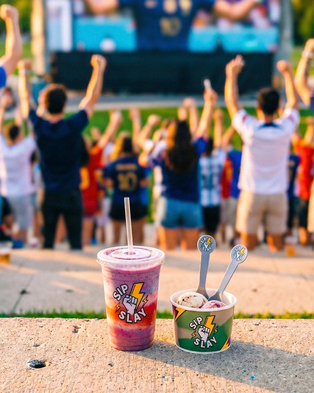
A packaging manufacturer sells a physical object, and what the buyer is actually evaluating is print fidelity, material weight, how a handle is set, whether a fold holds — qualities that exist only in the hand and have to survive being communicated entirely through a photograph. The existing site imagery was visibly AI-generated, which is a fatal flaw for this business in a way it wouldn't be for most: if the product shots don't look real, the buyer has no reason to believe the manufacturing is real either. The imagery was also too narrow, skewing heavily toward food and beverage while the company serves three other segments. A retail buyer landing on the homepage saw a business that appeared to serve restaurants, so the visuals were quietly shrinking the company's addressable market below what it actually sold.
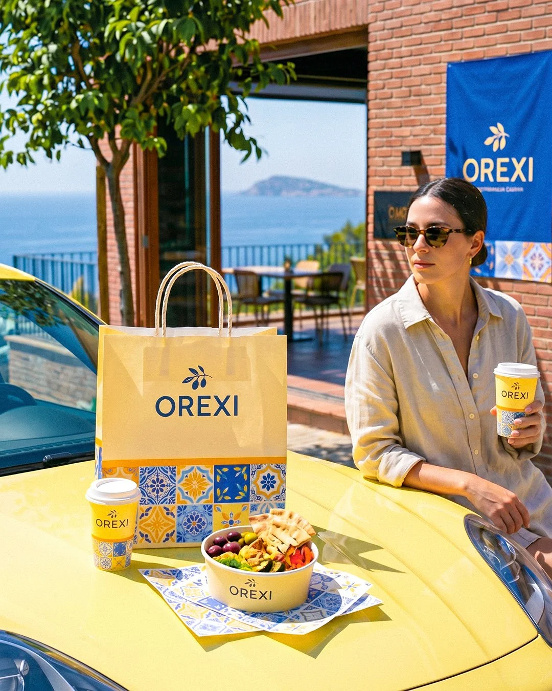
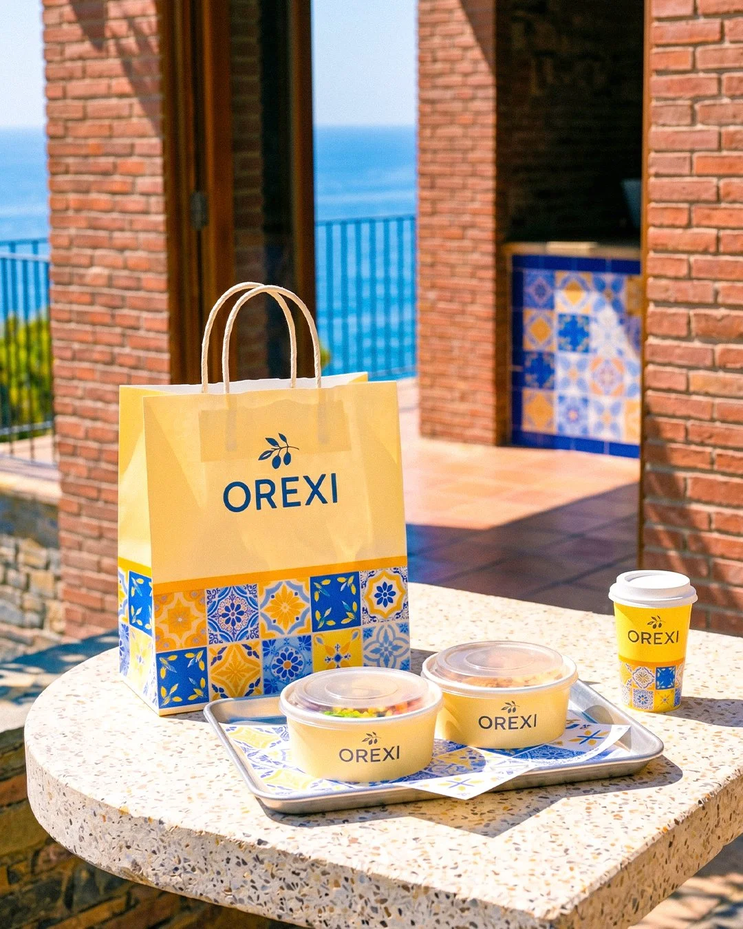
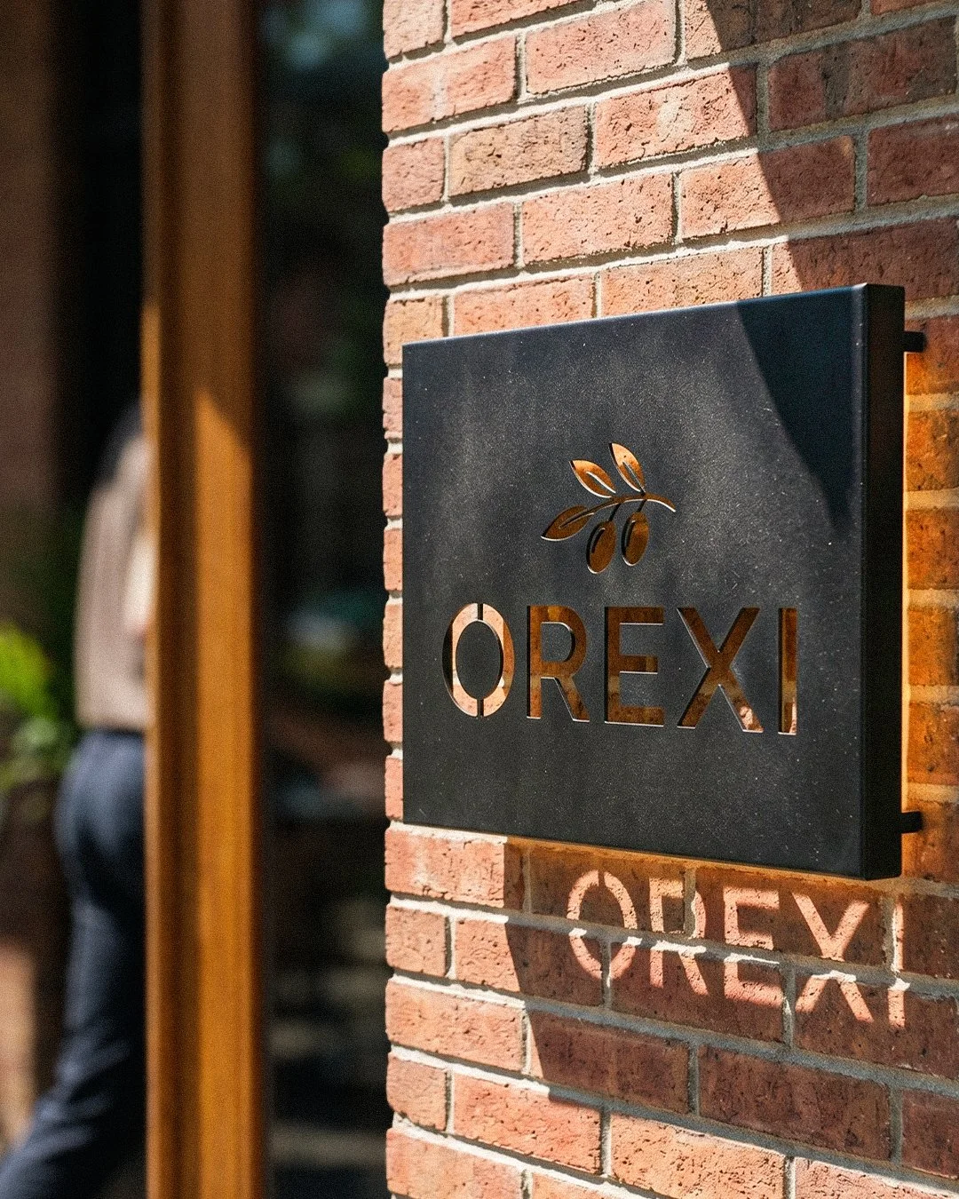
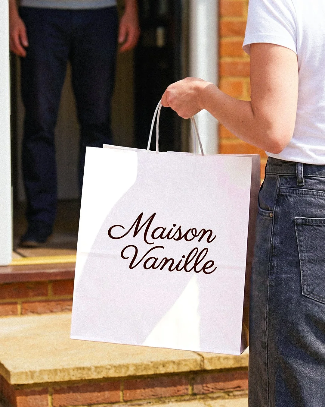
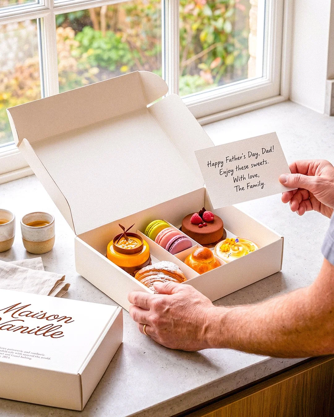
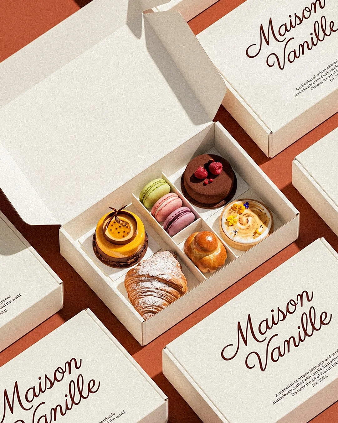
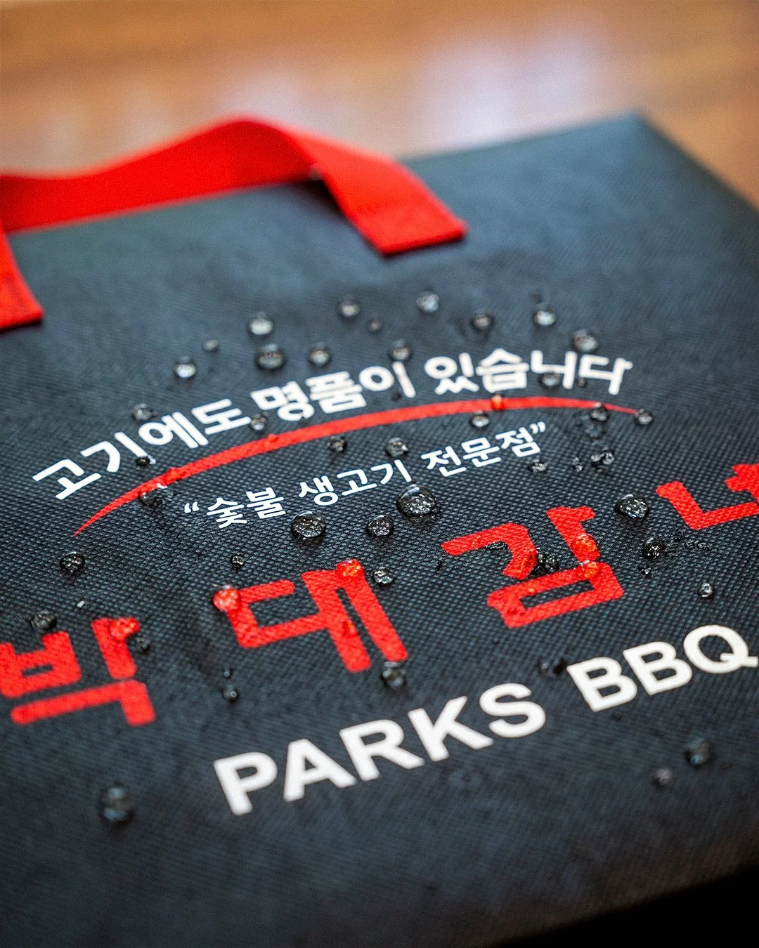
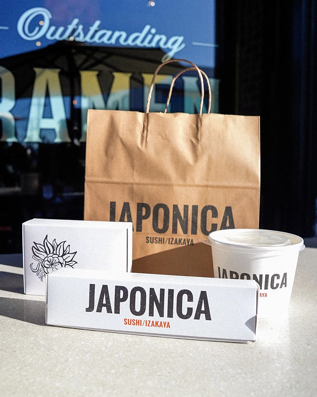
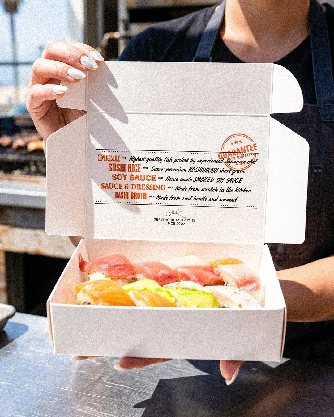
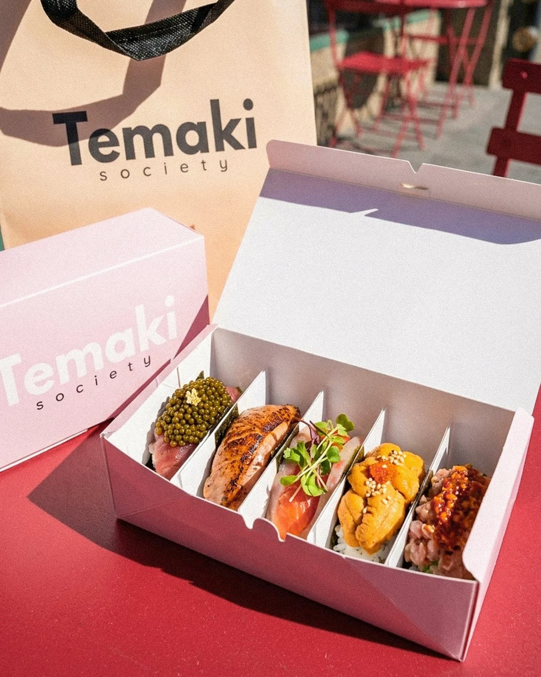
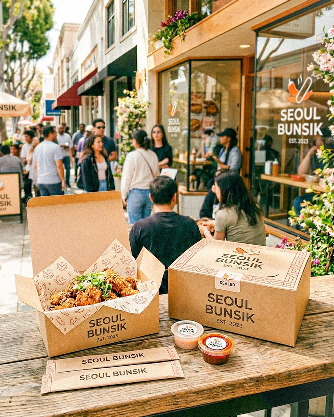
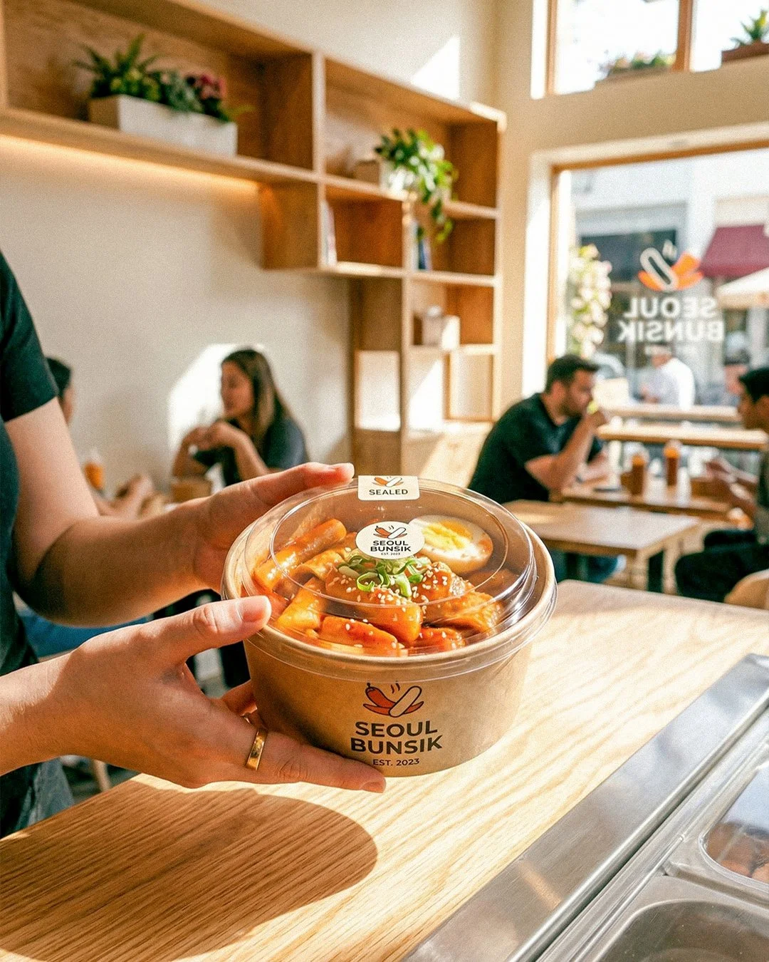
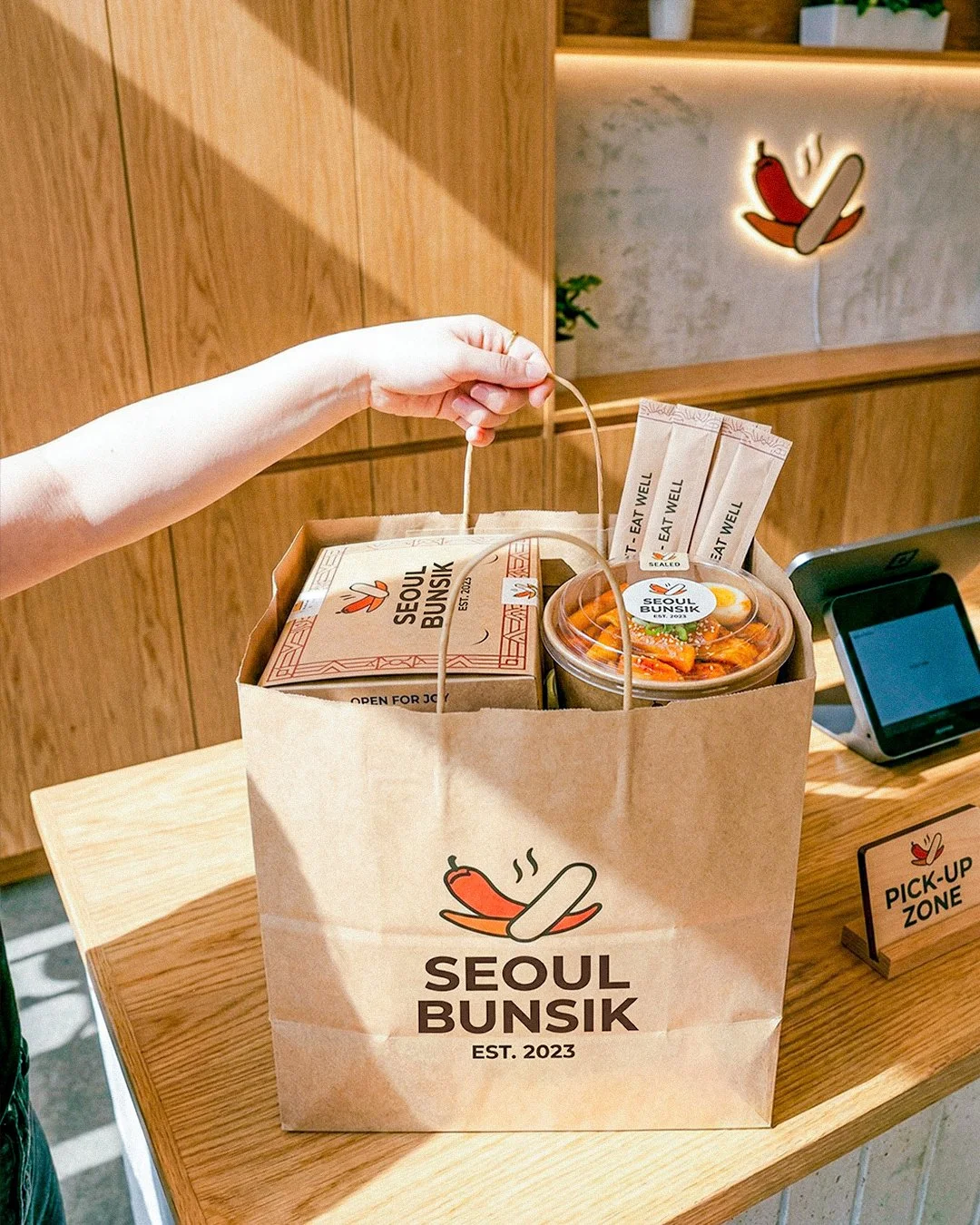
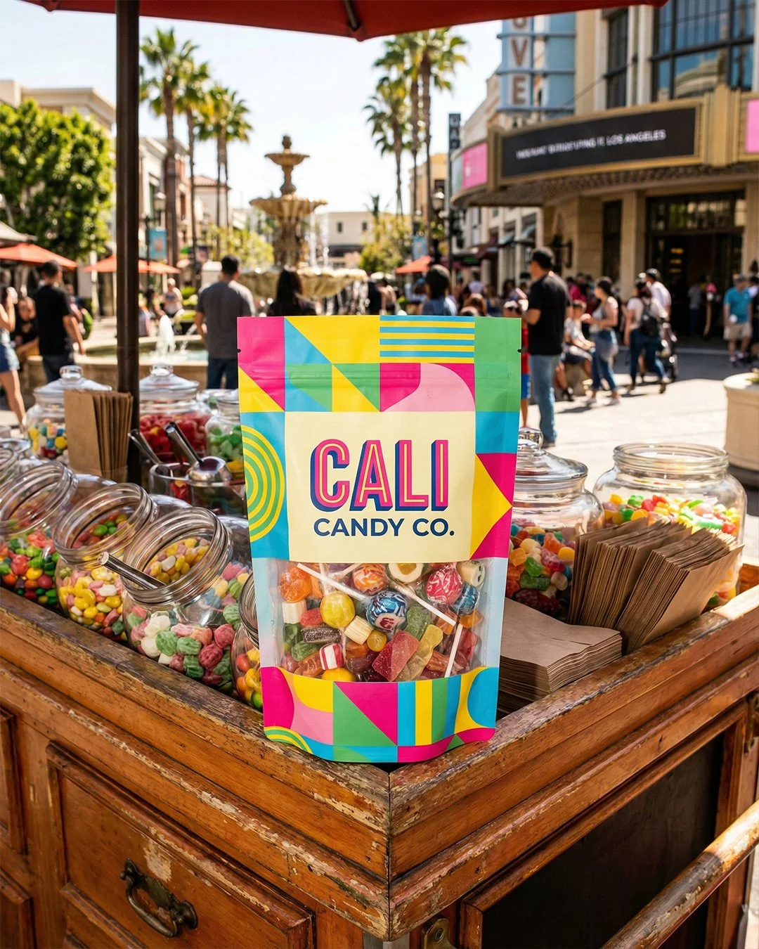
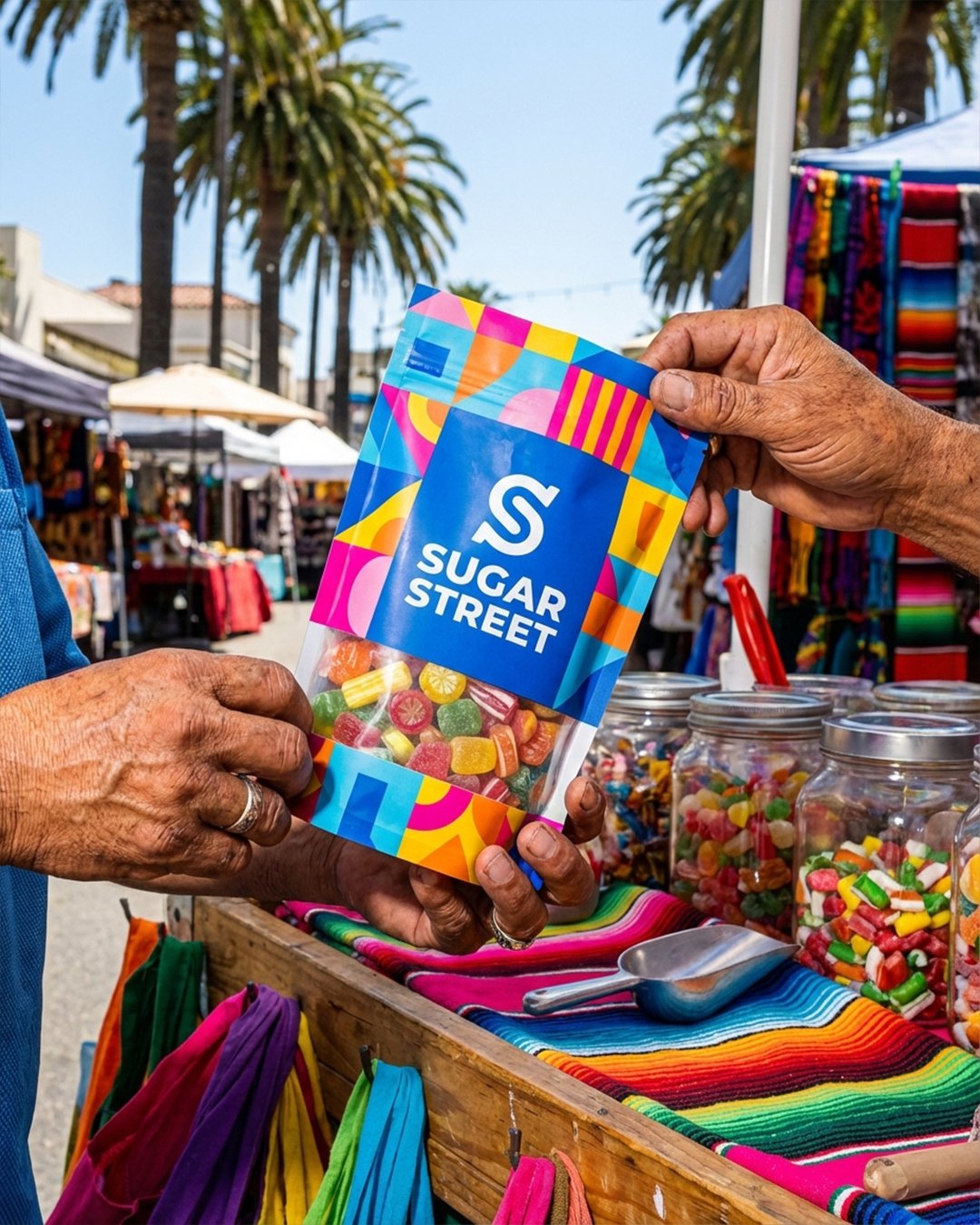
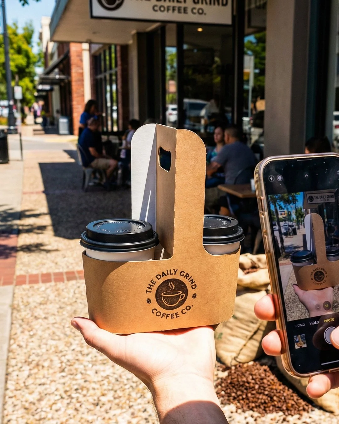
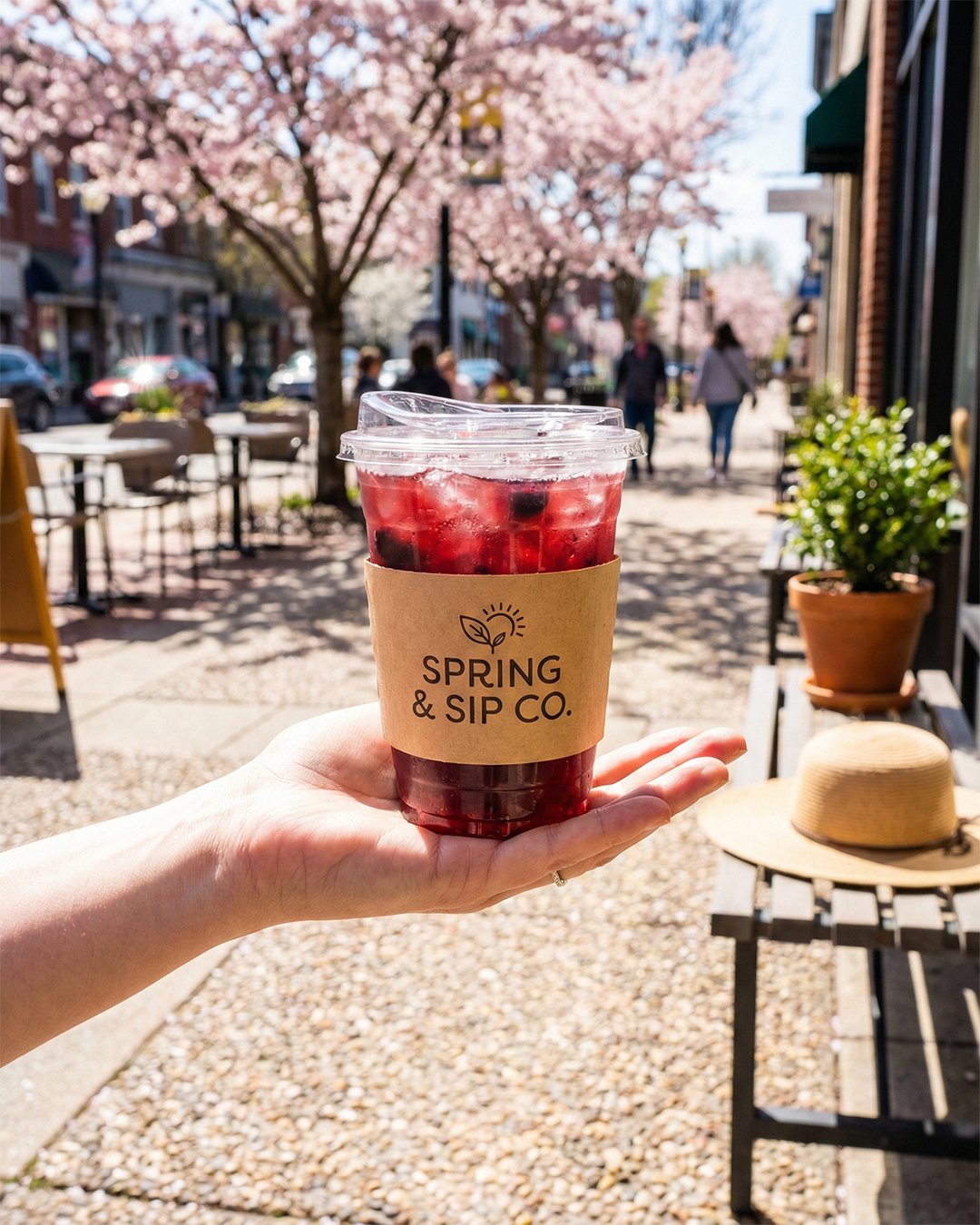
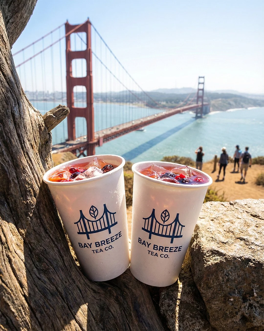
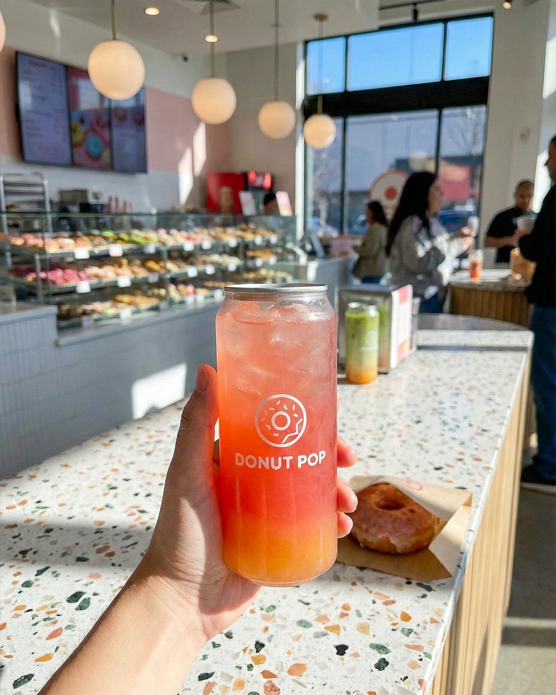
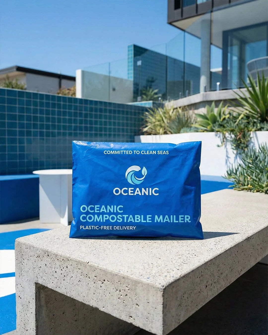
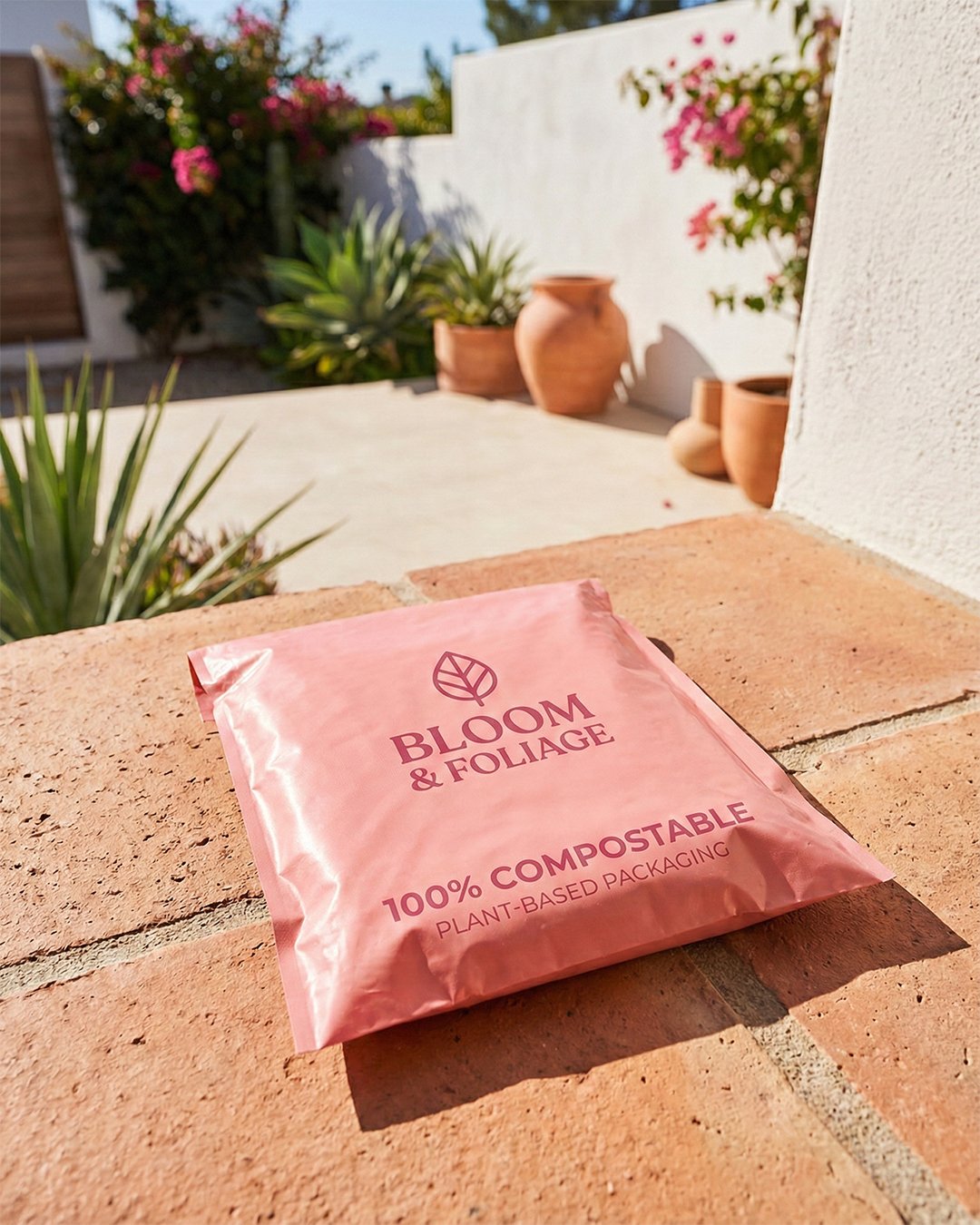
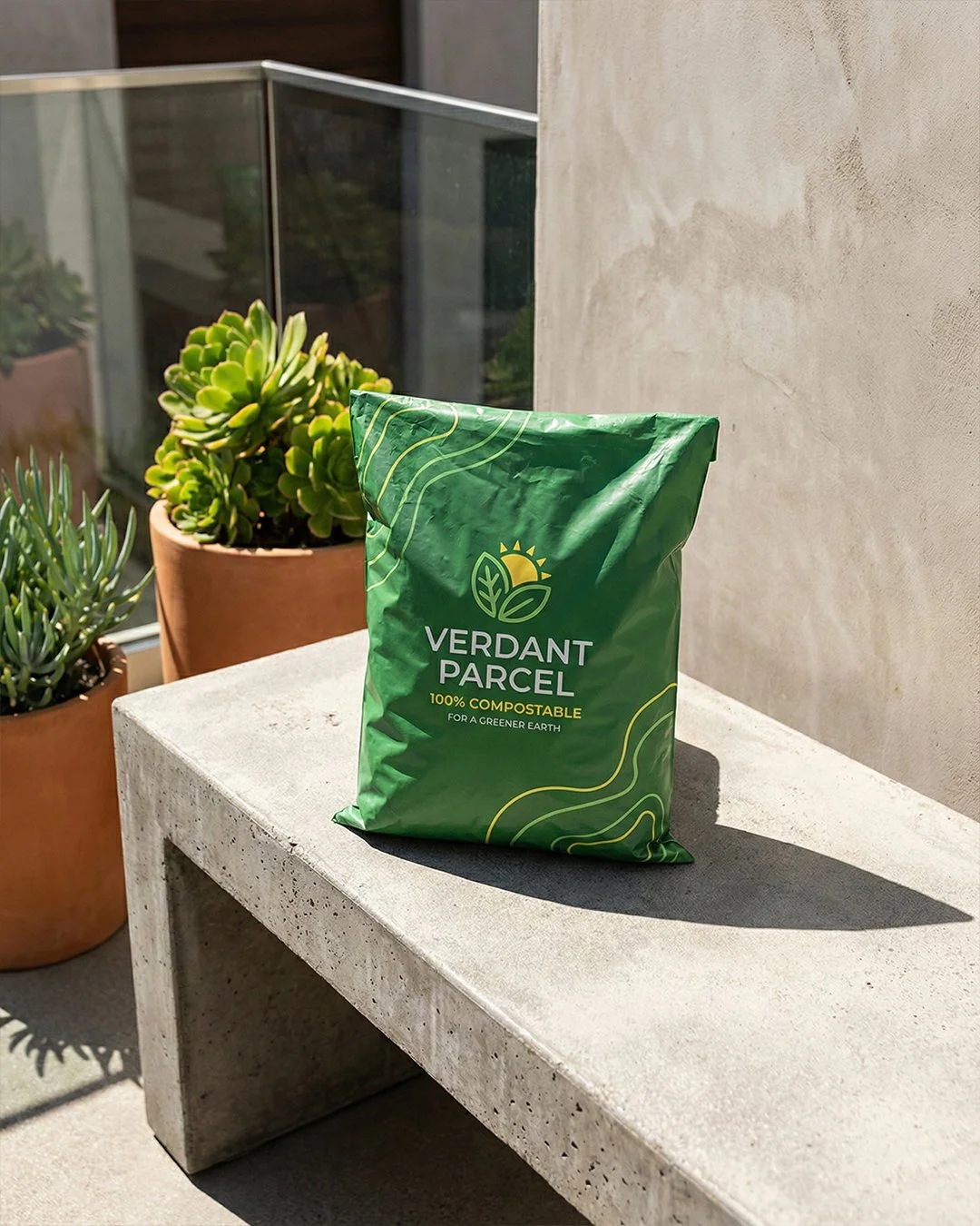
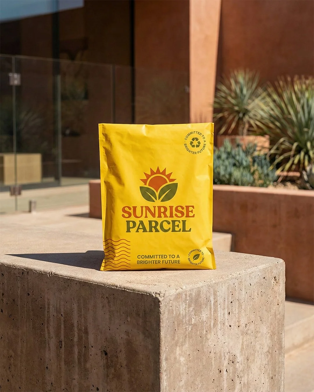
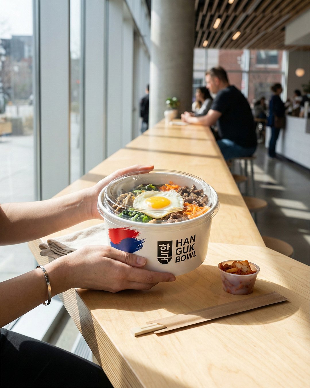
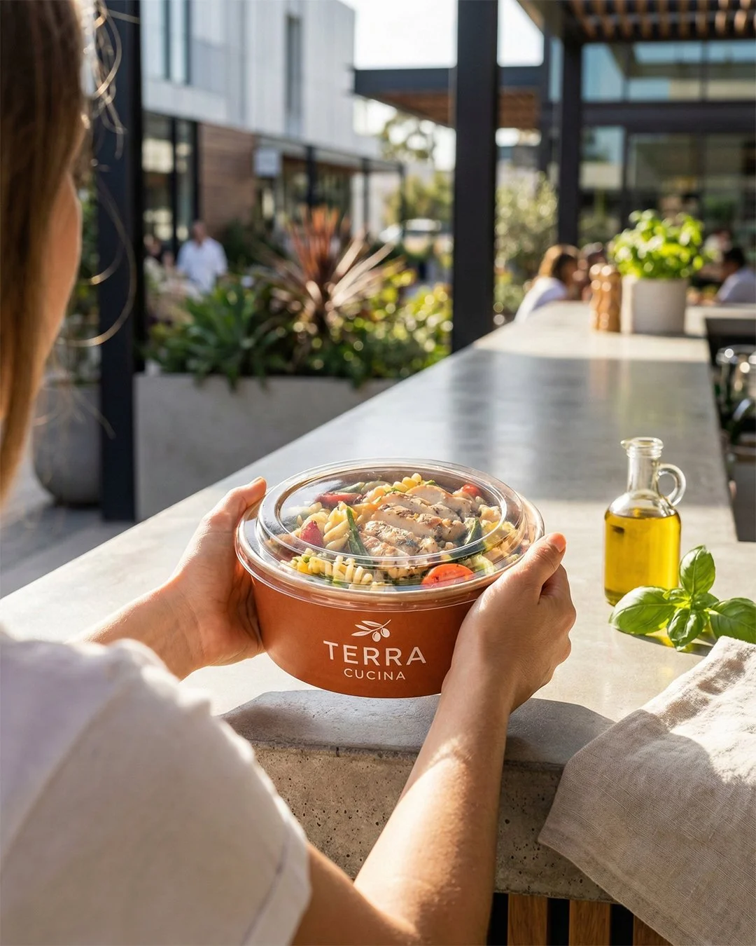
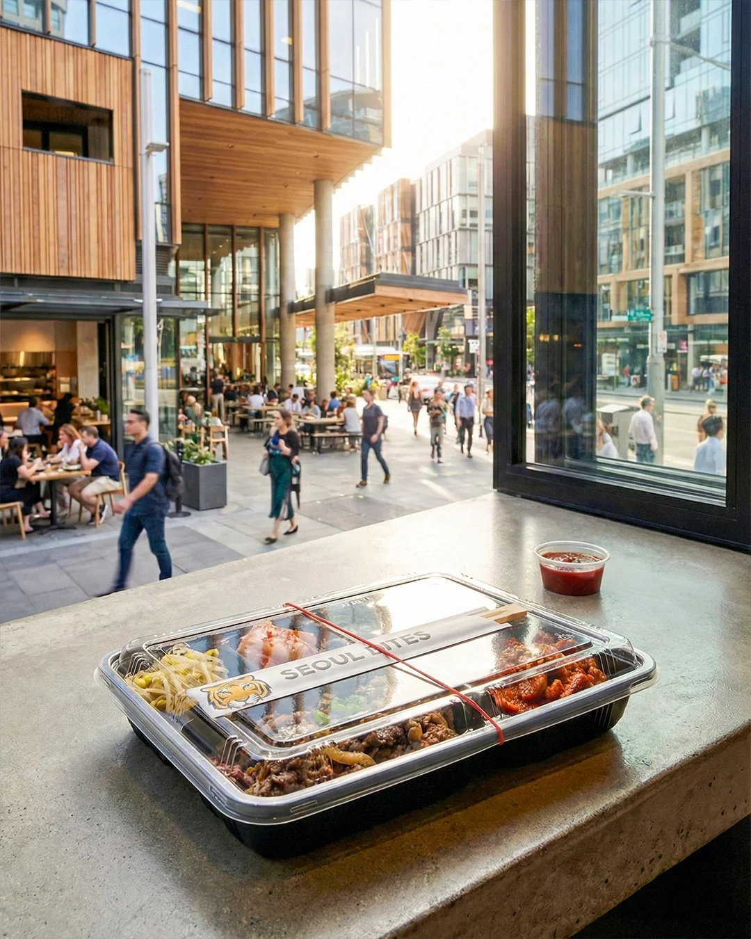
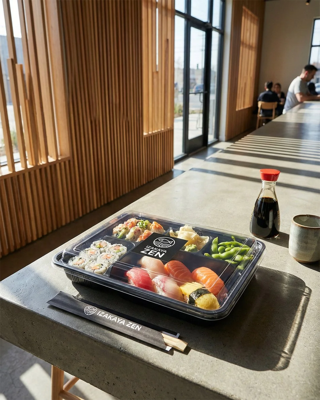
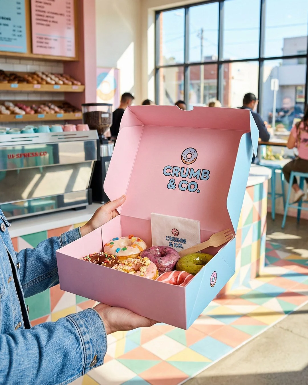
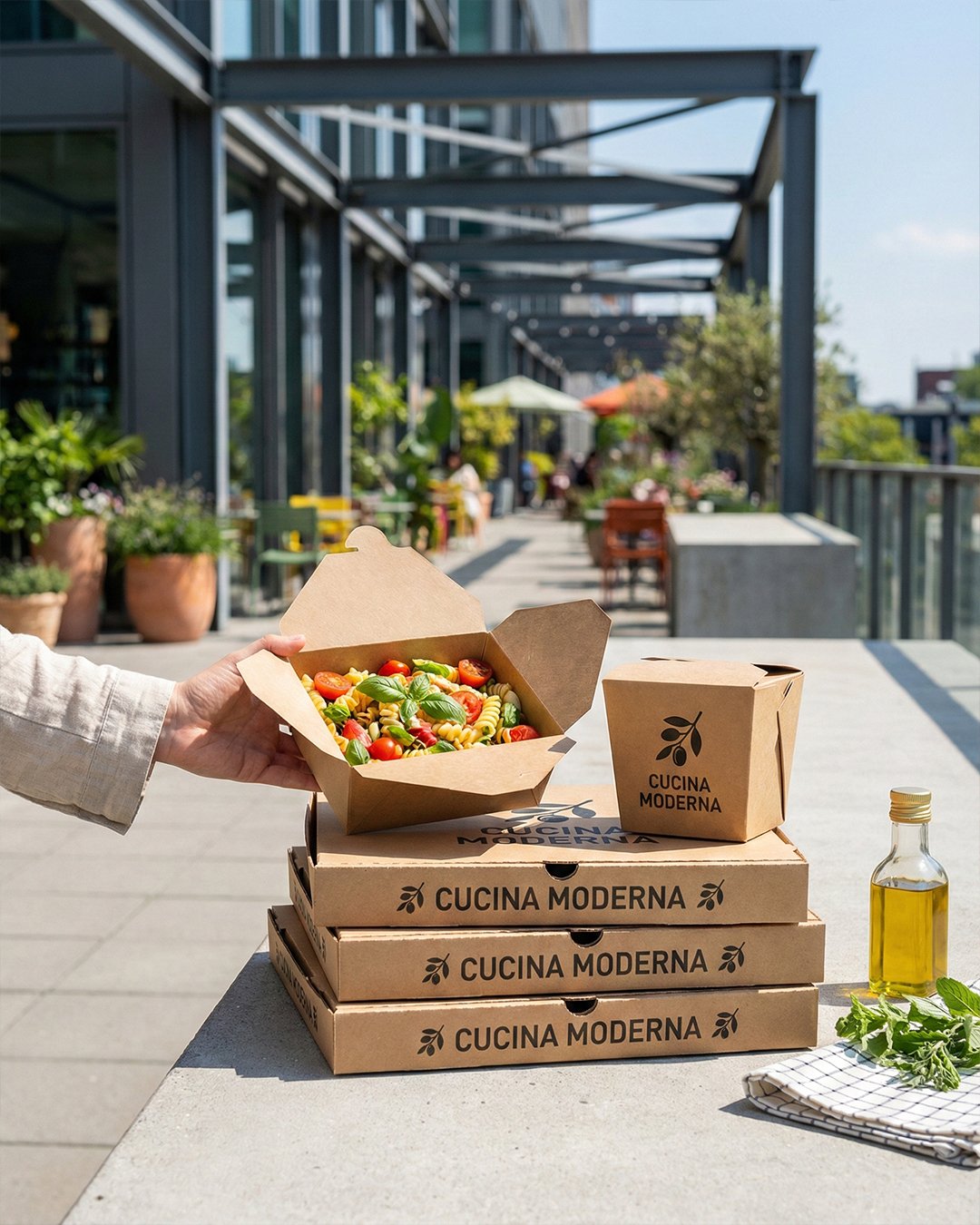
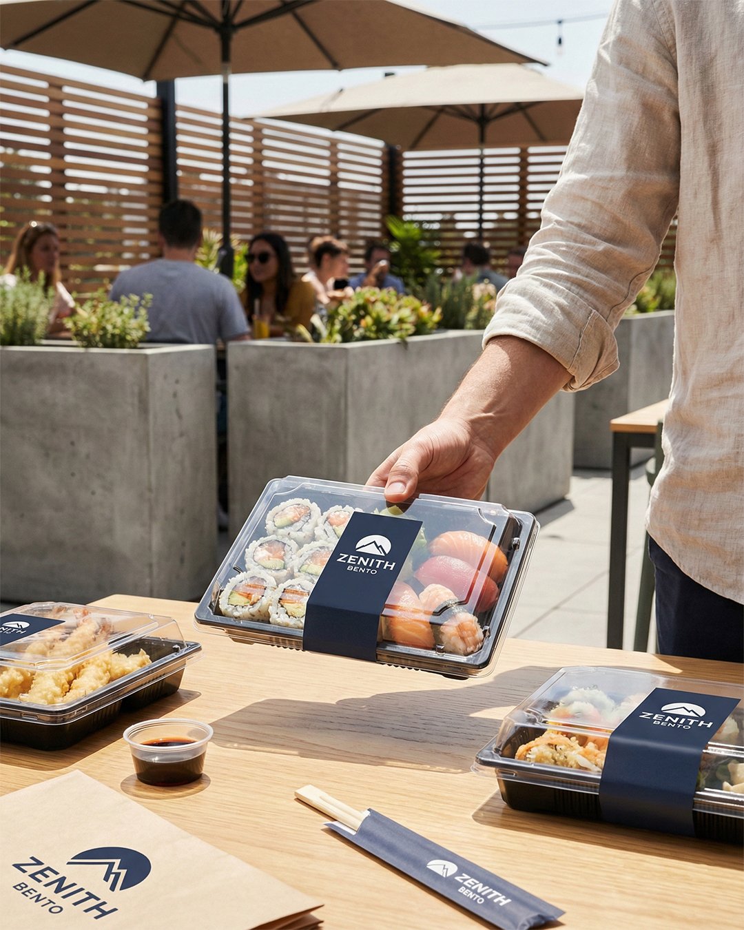
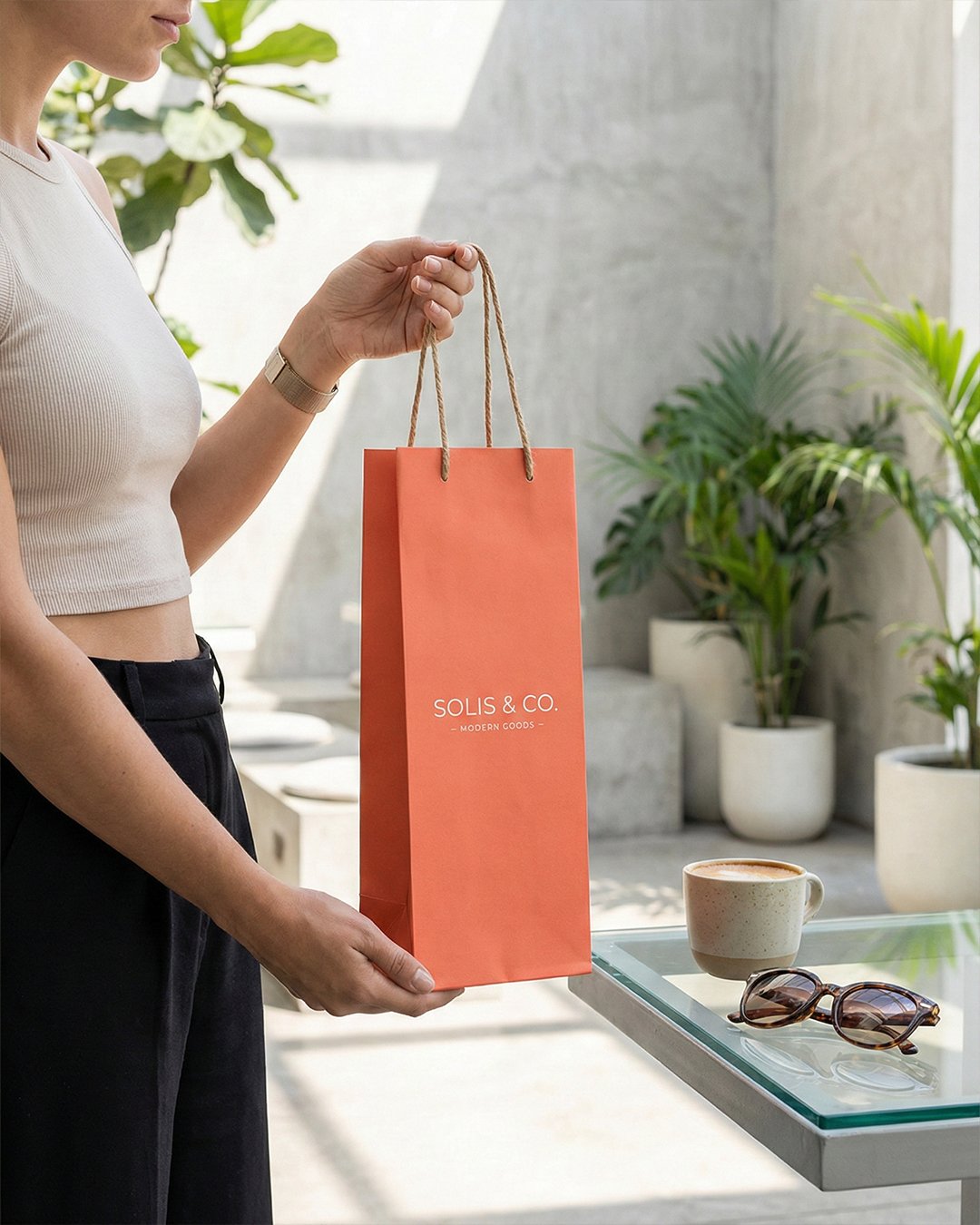
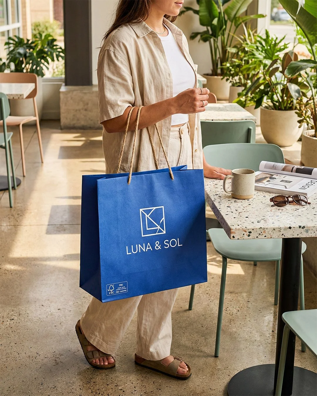
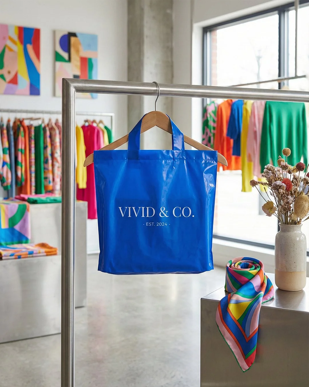
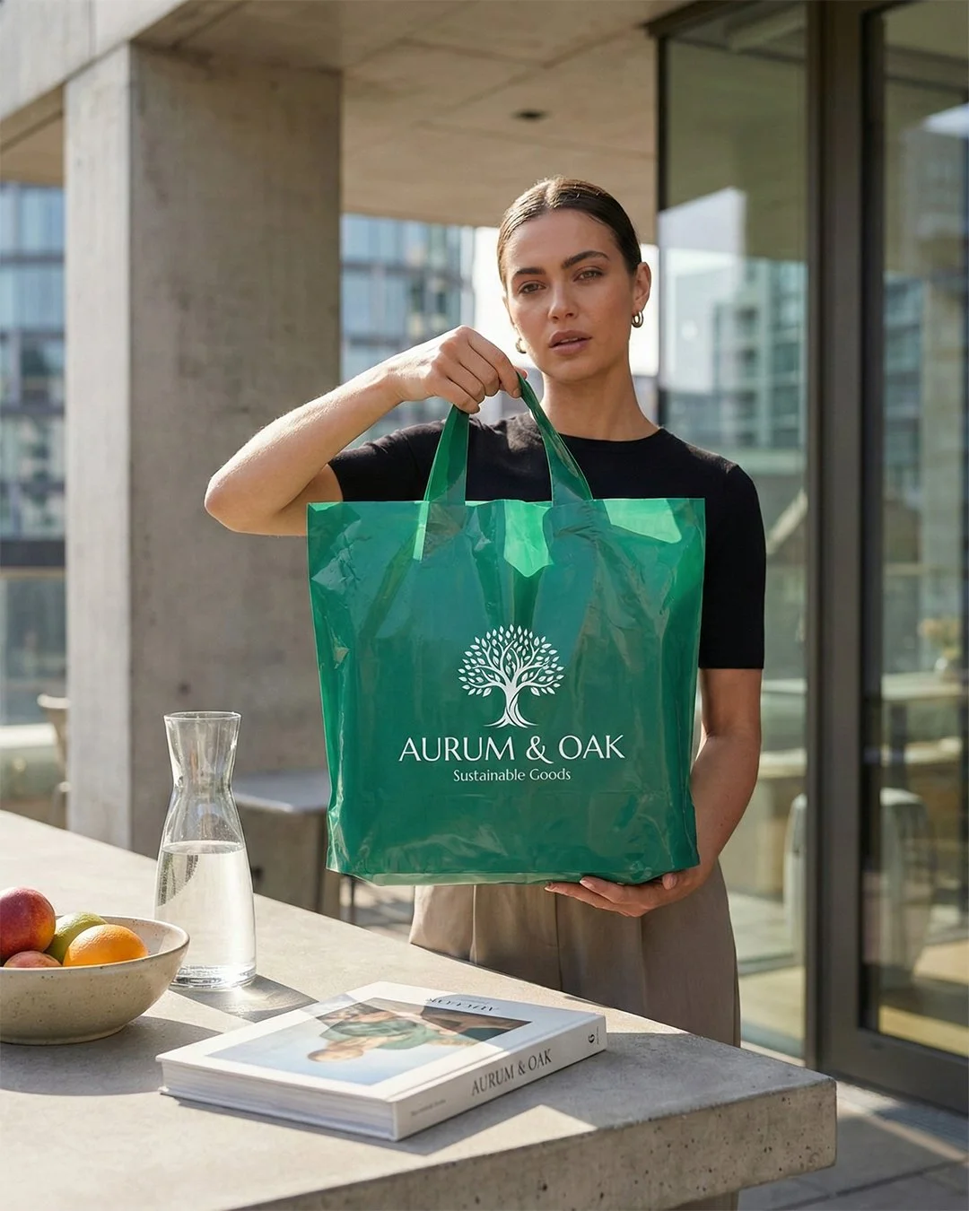
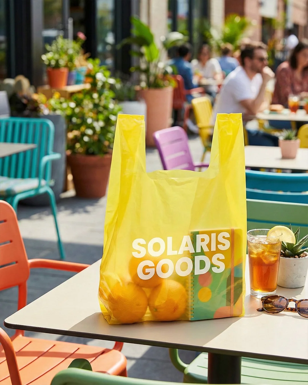
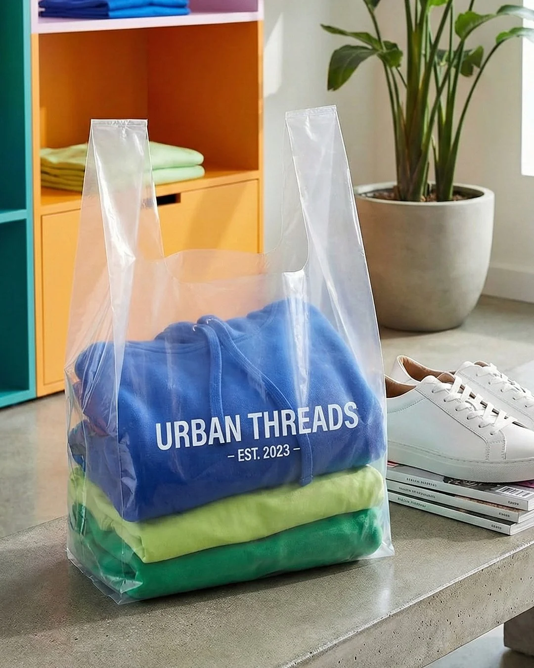
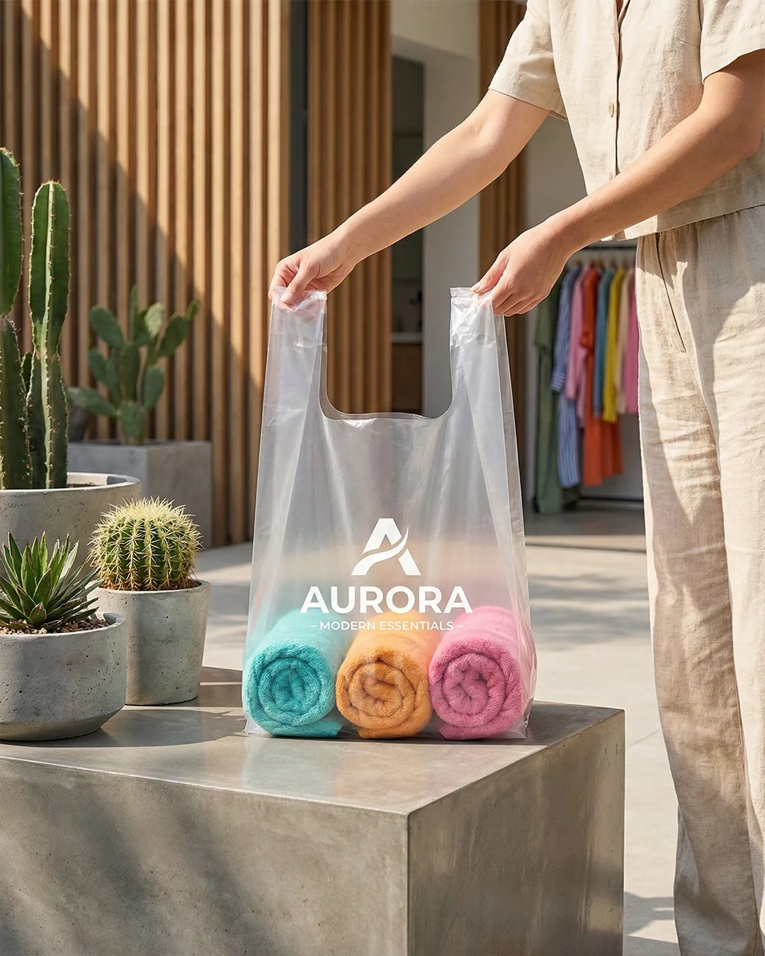
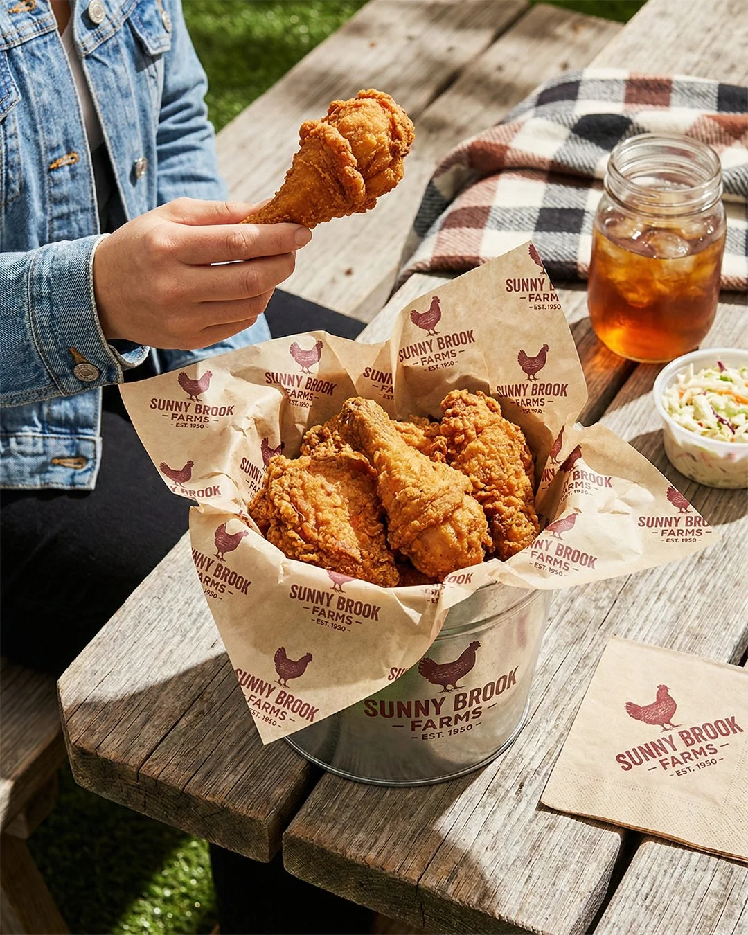
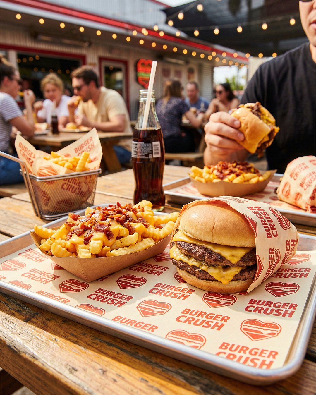
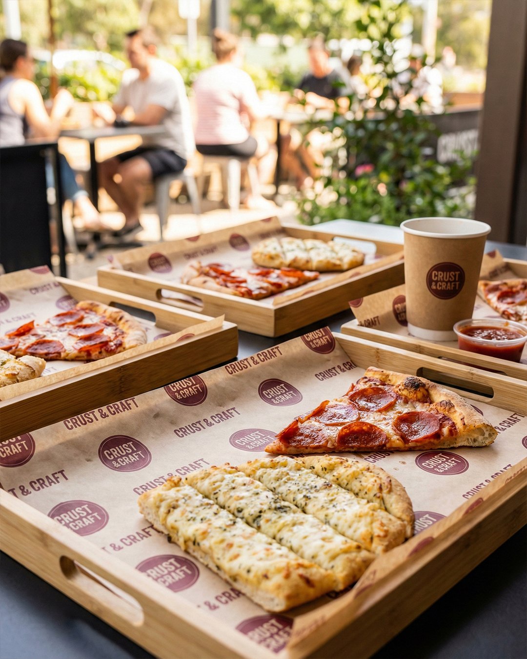
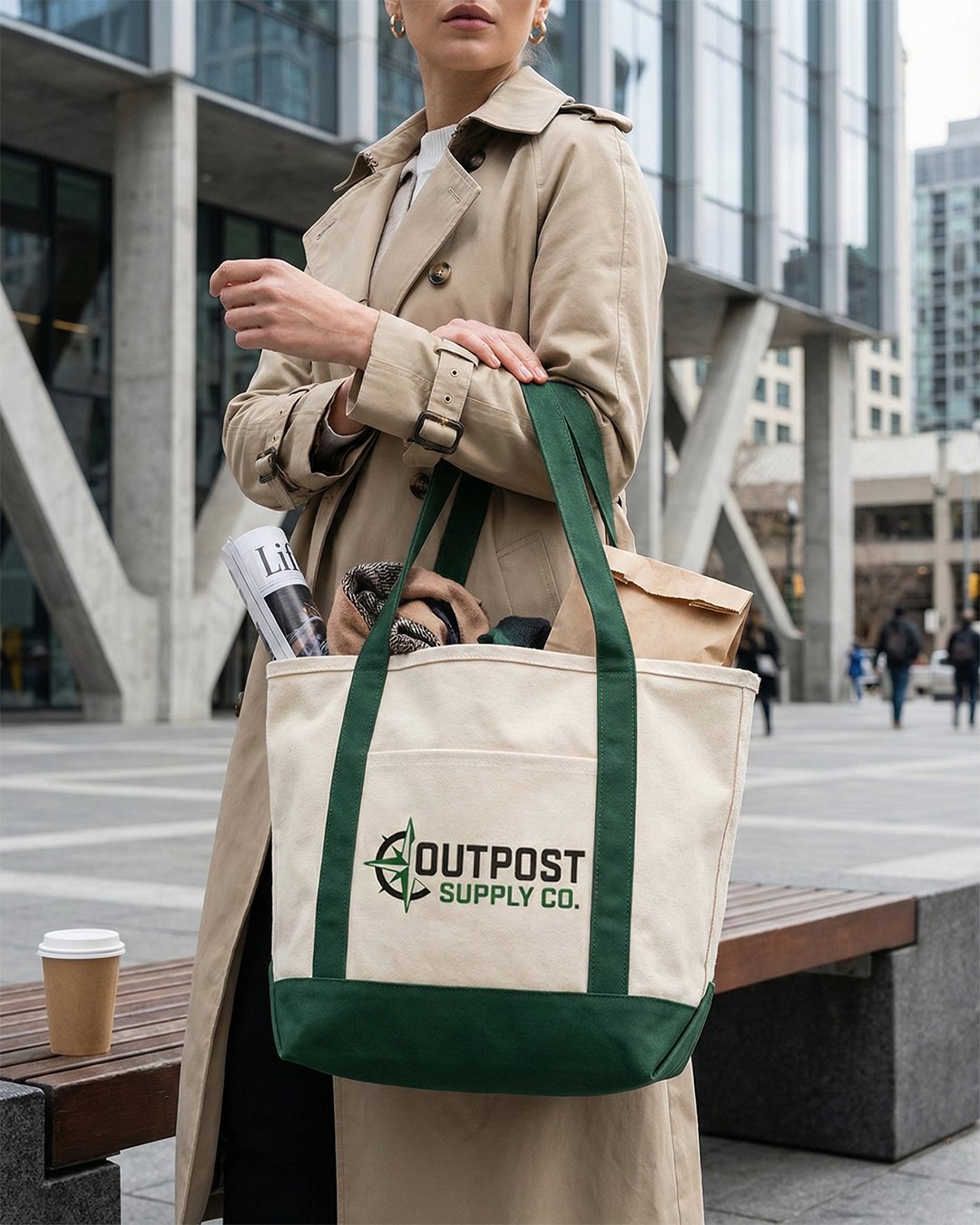
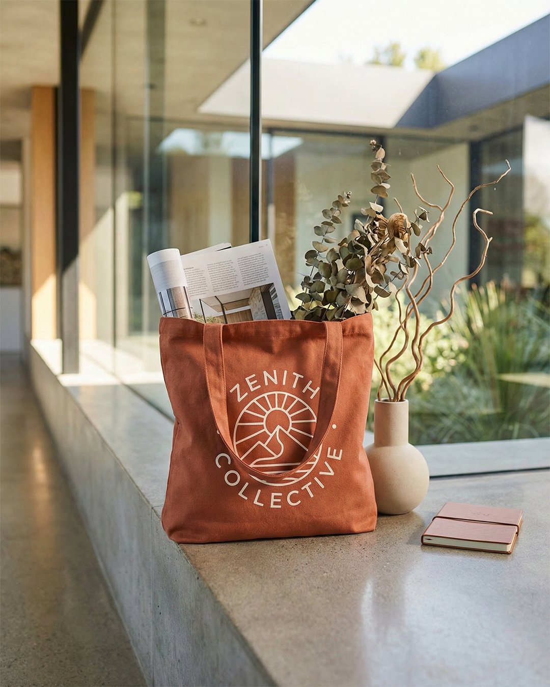
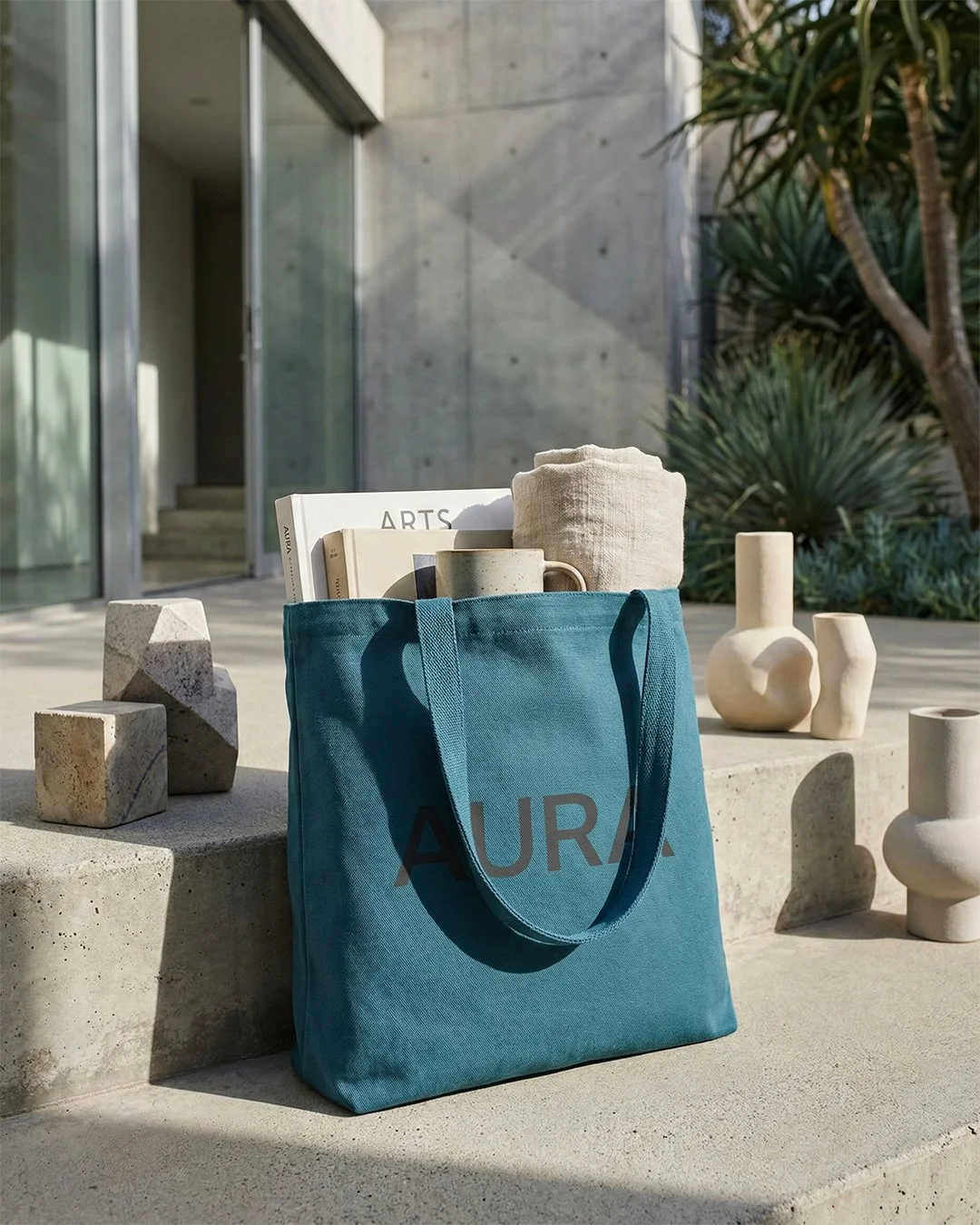
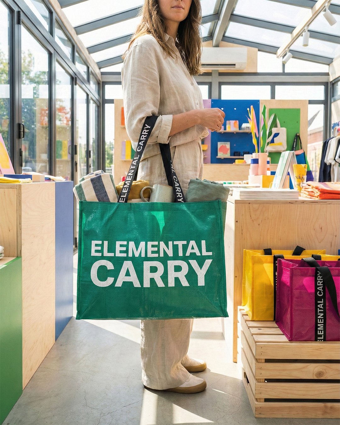
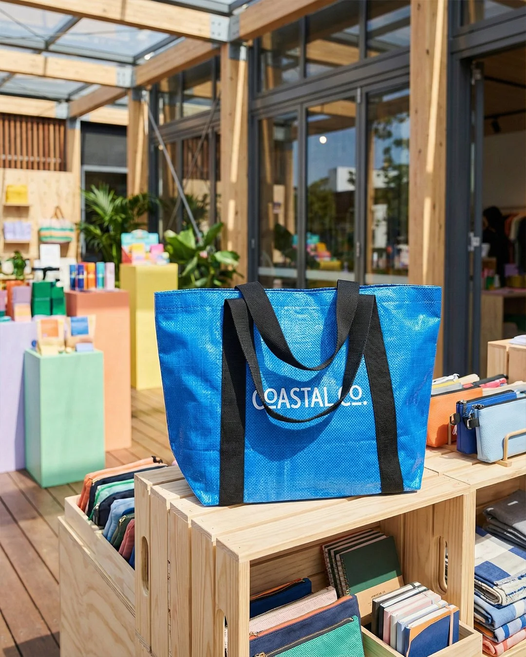
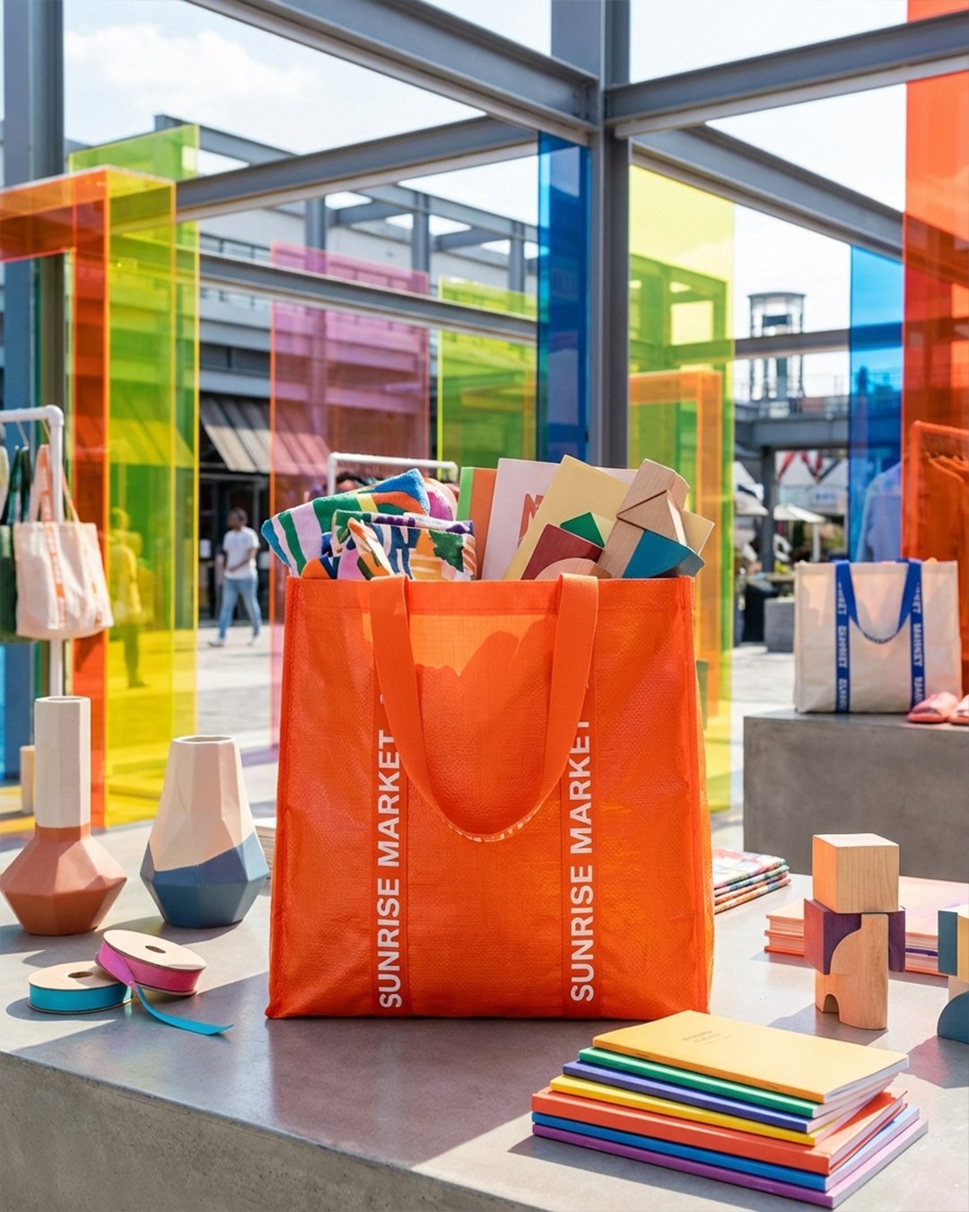
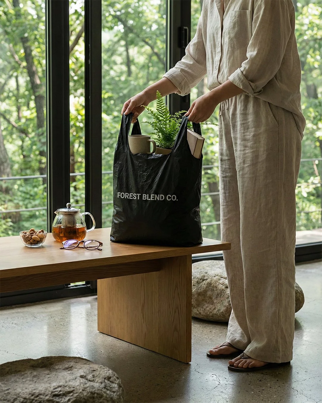
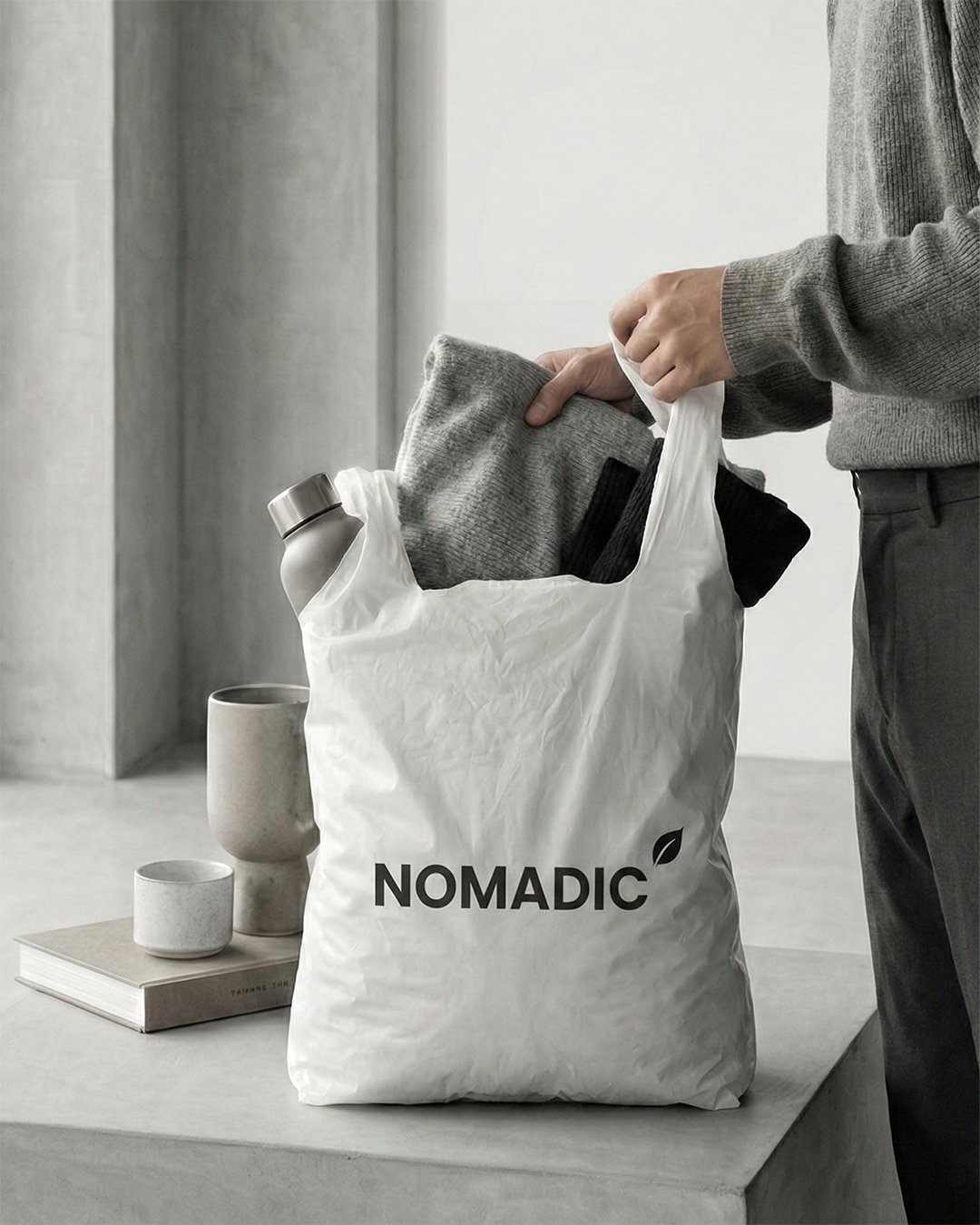
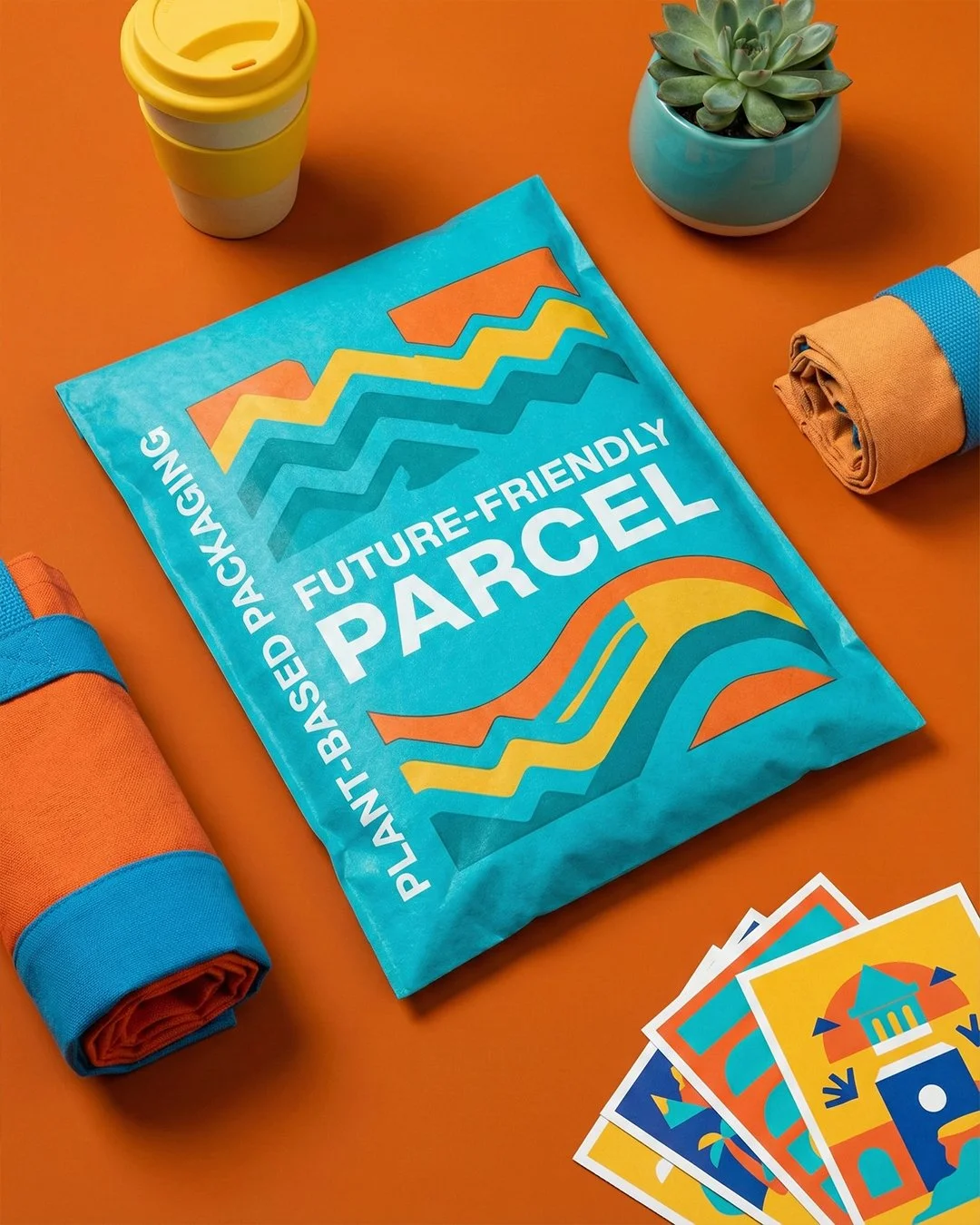
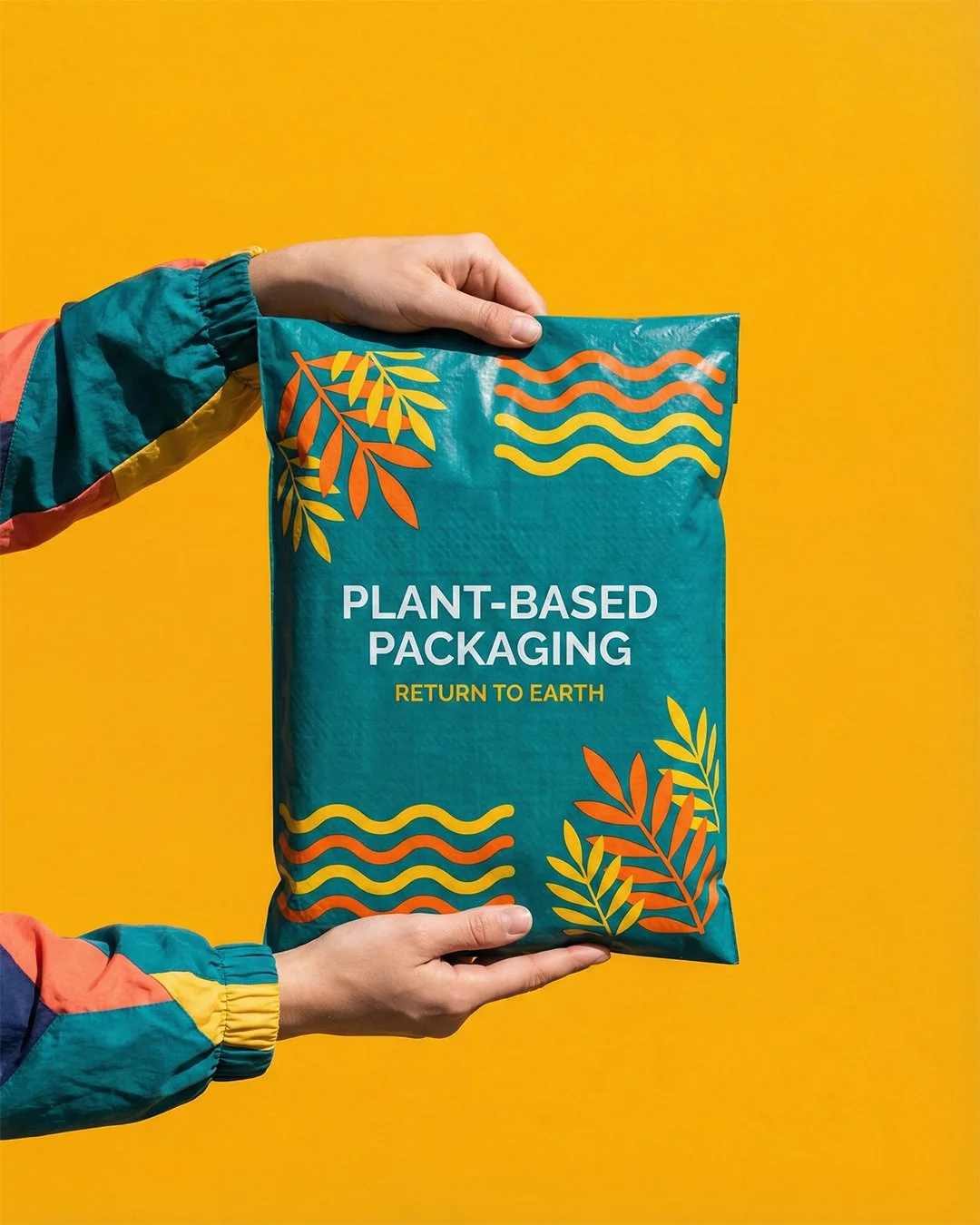
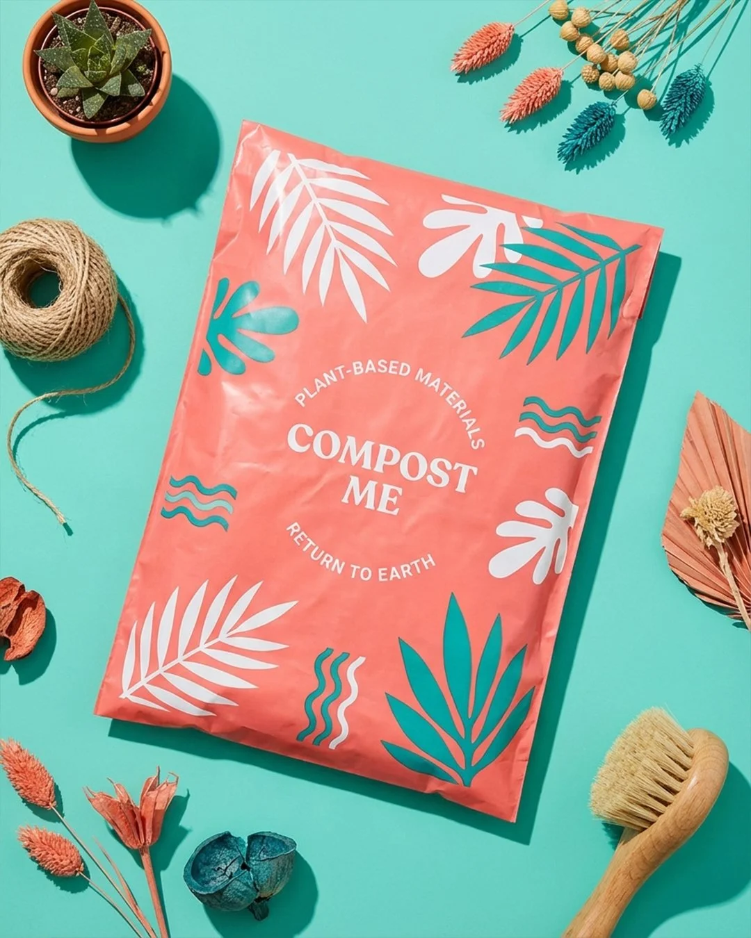
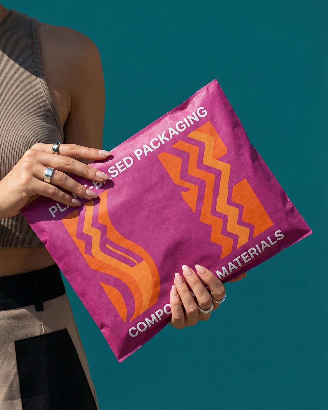
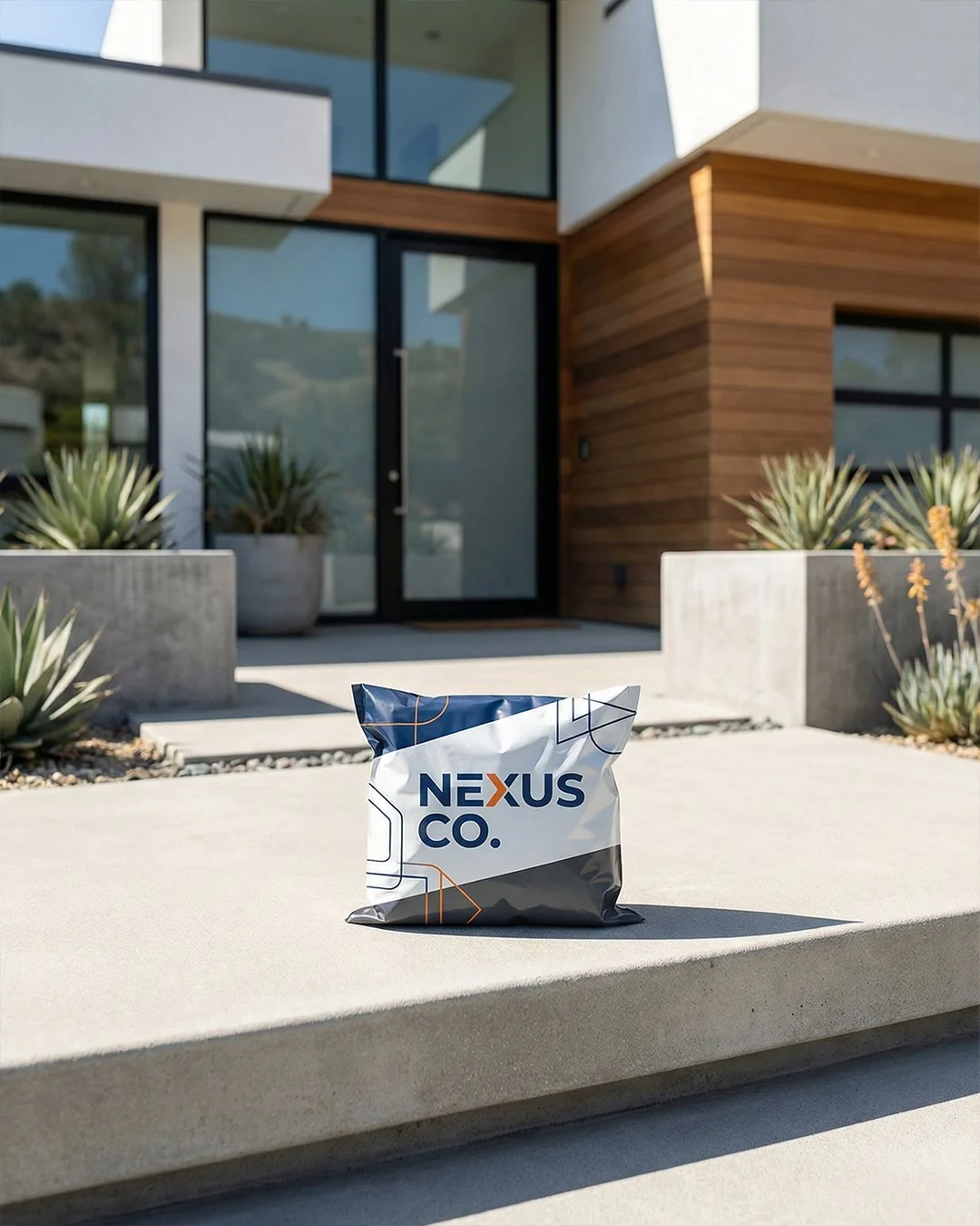
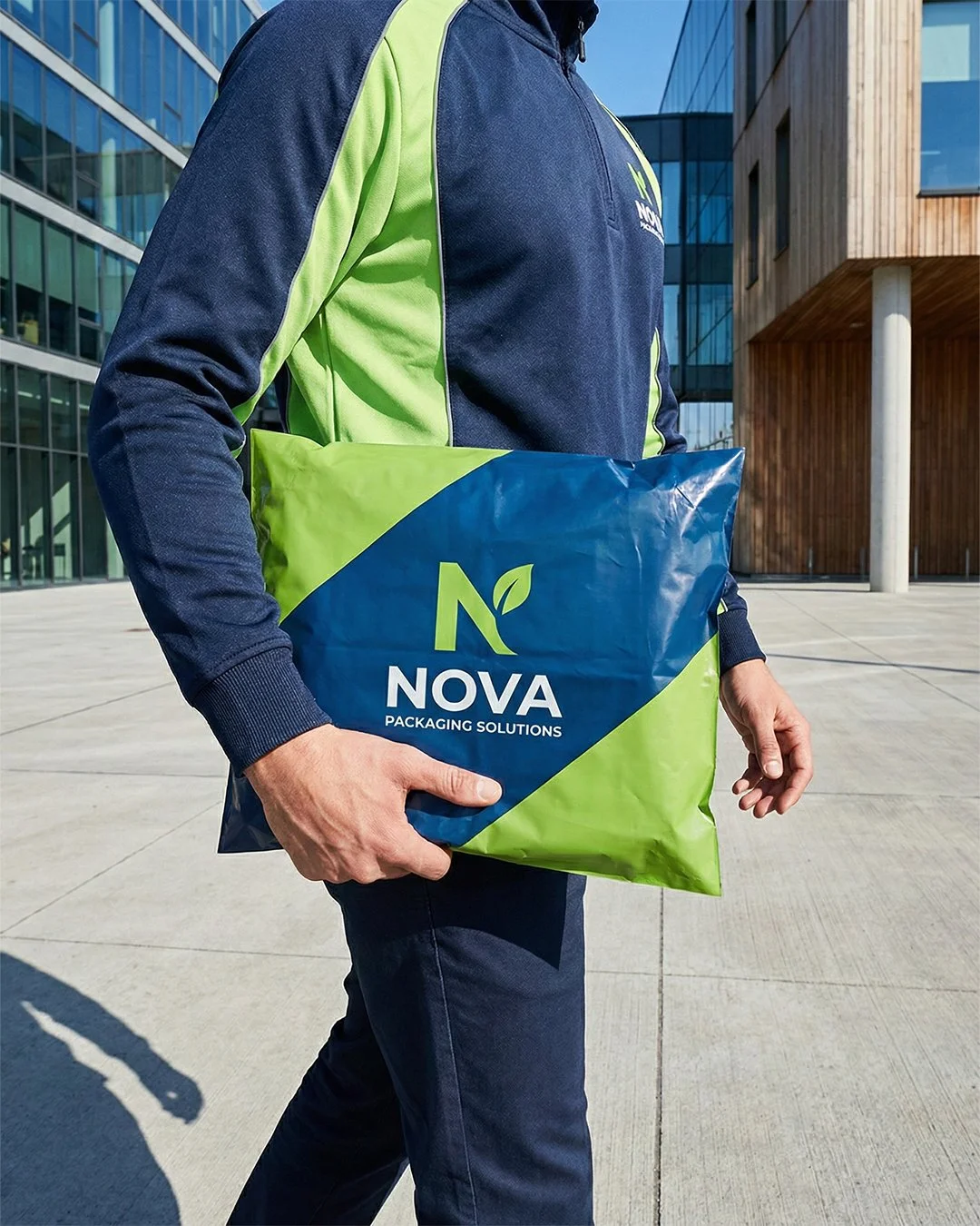
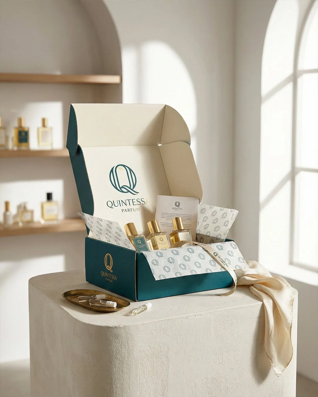
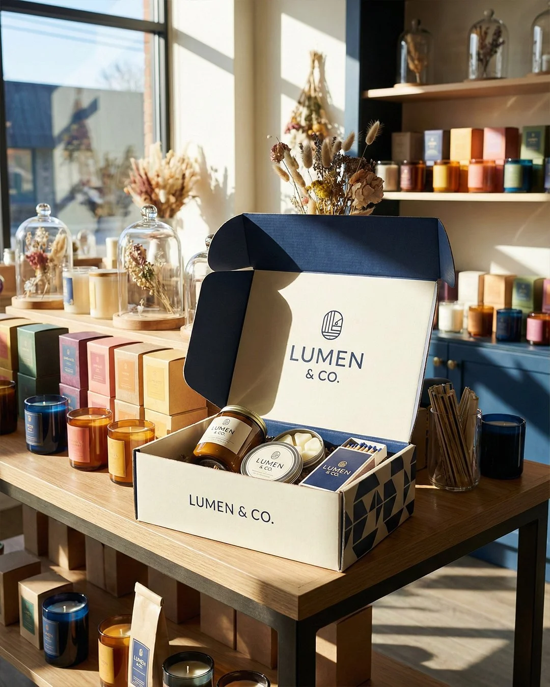
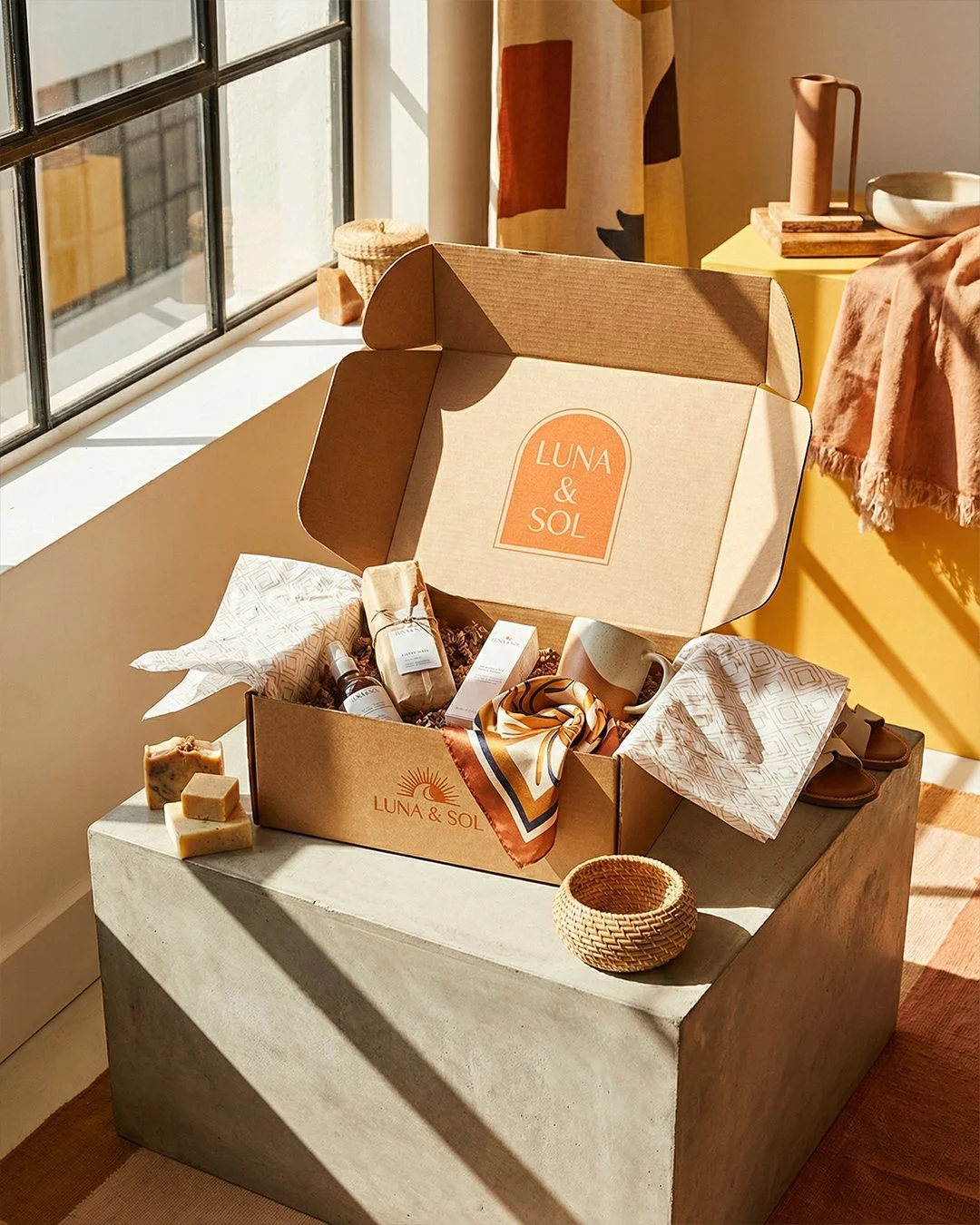
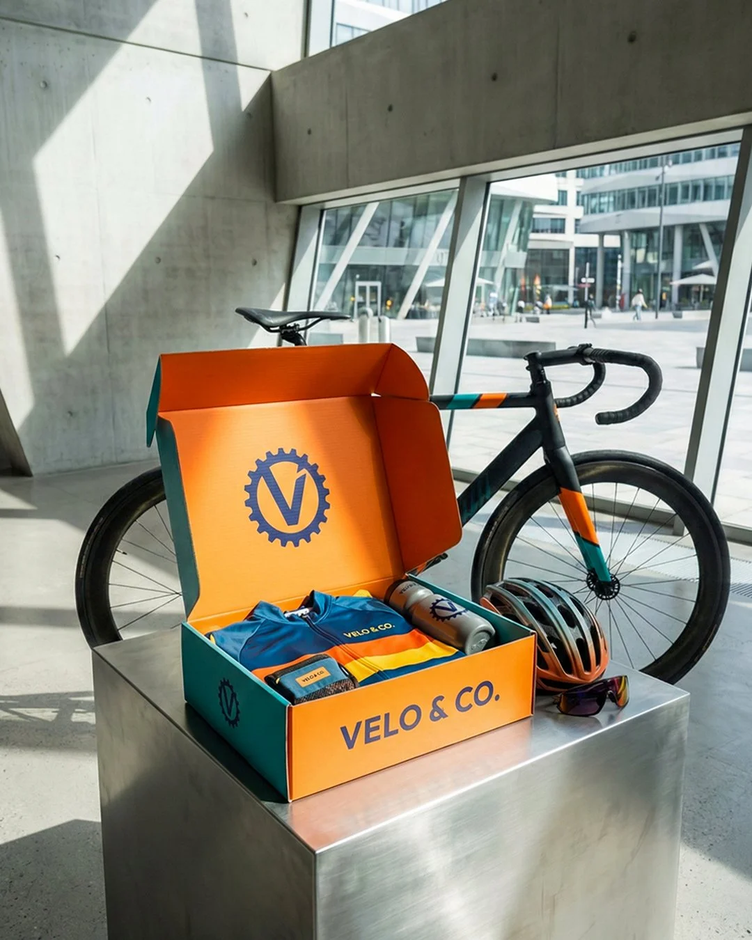
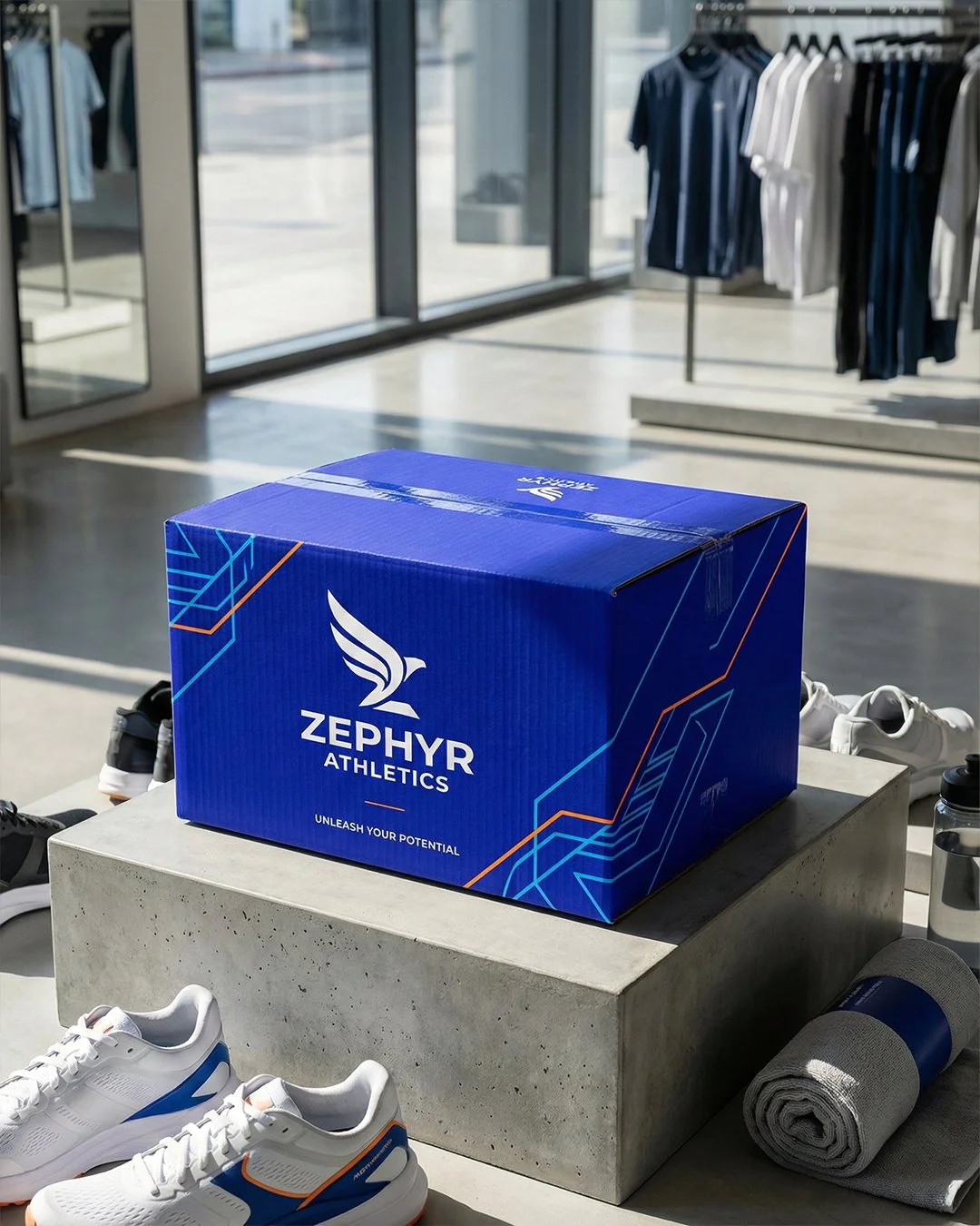
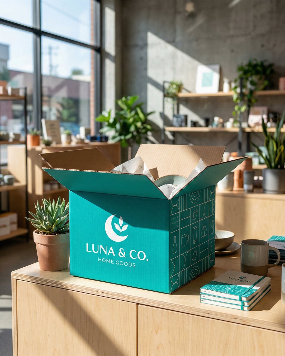
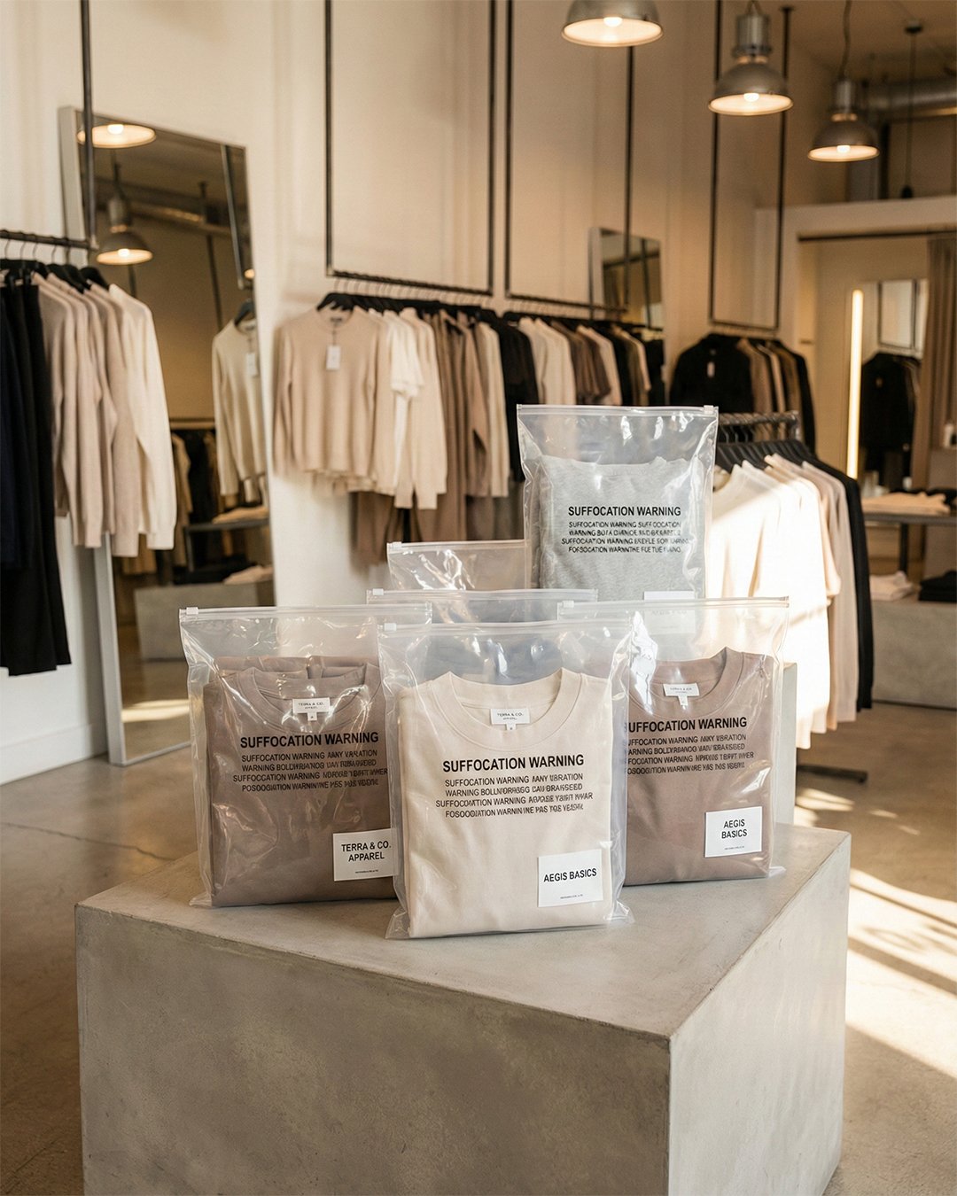
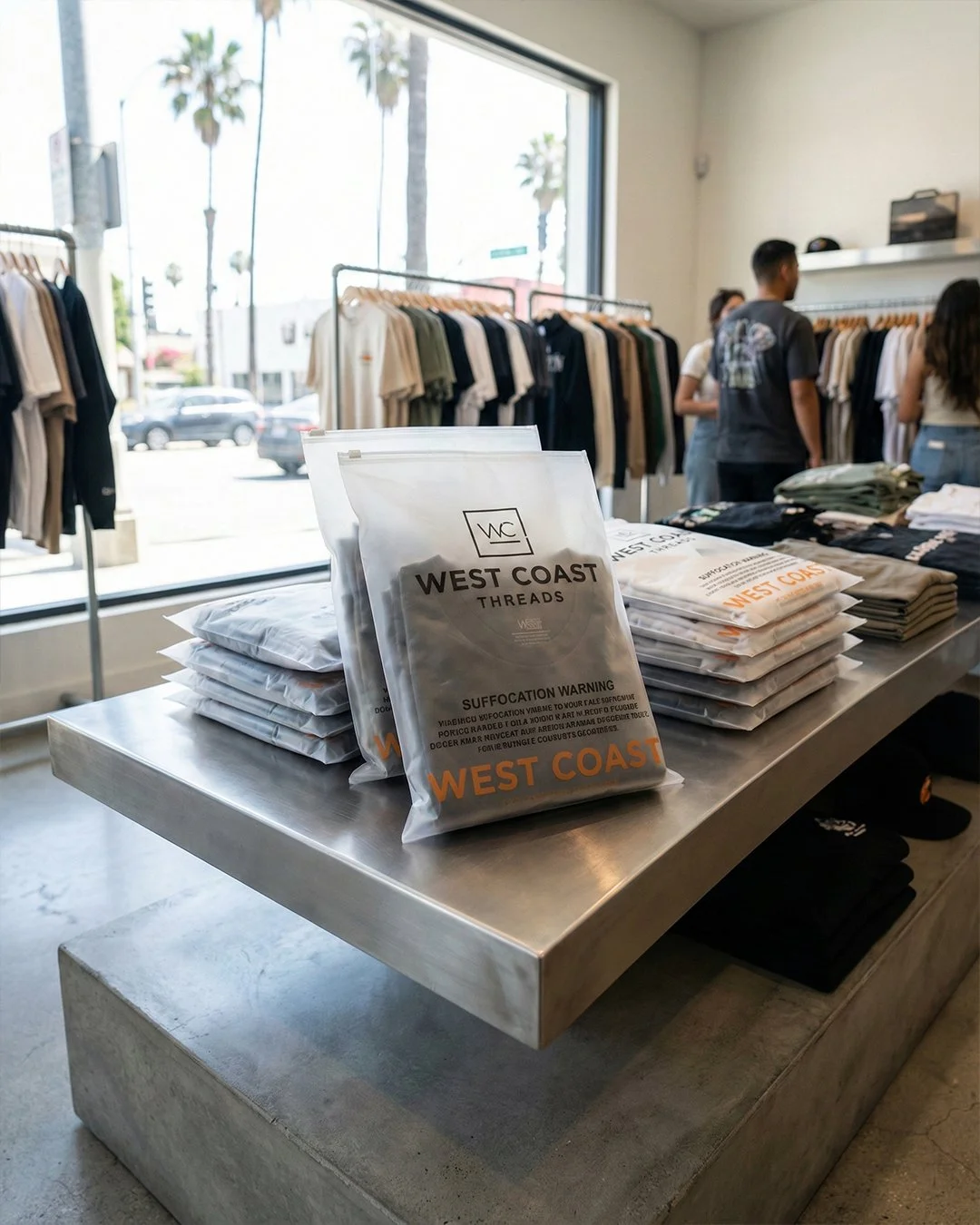
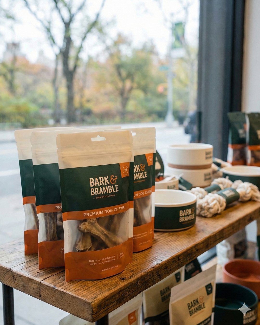
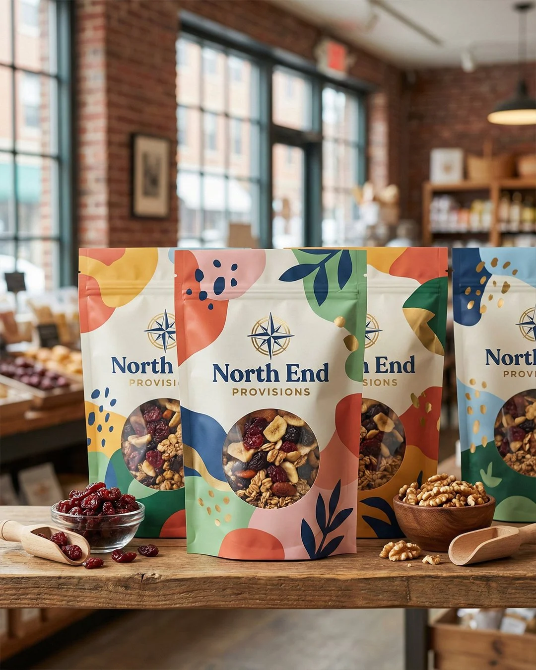
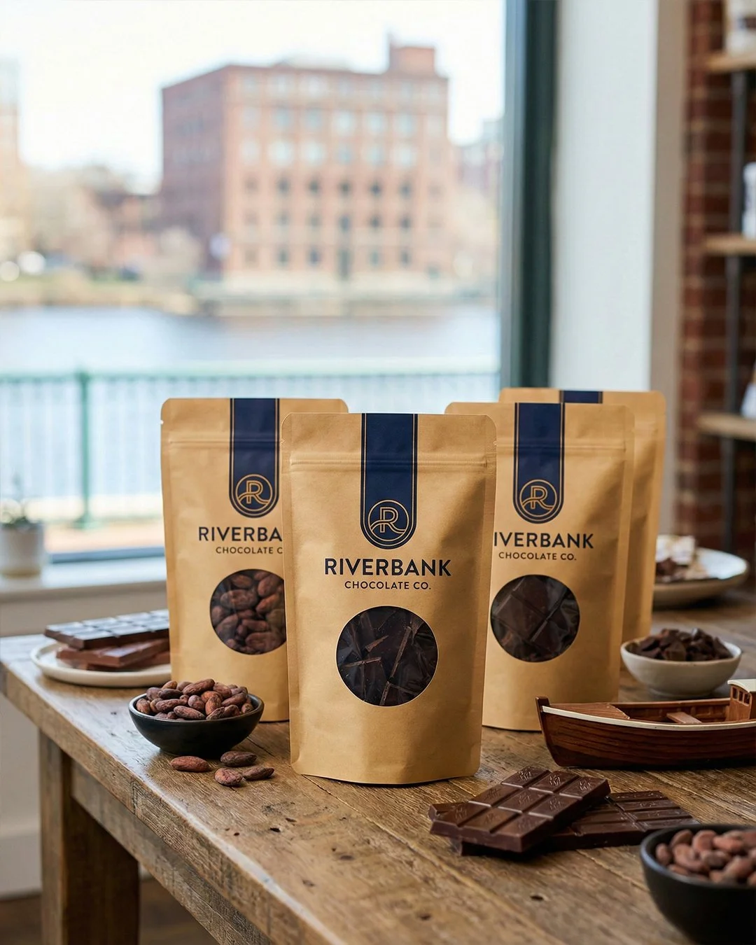
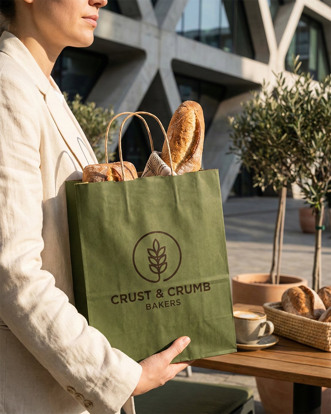
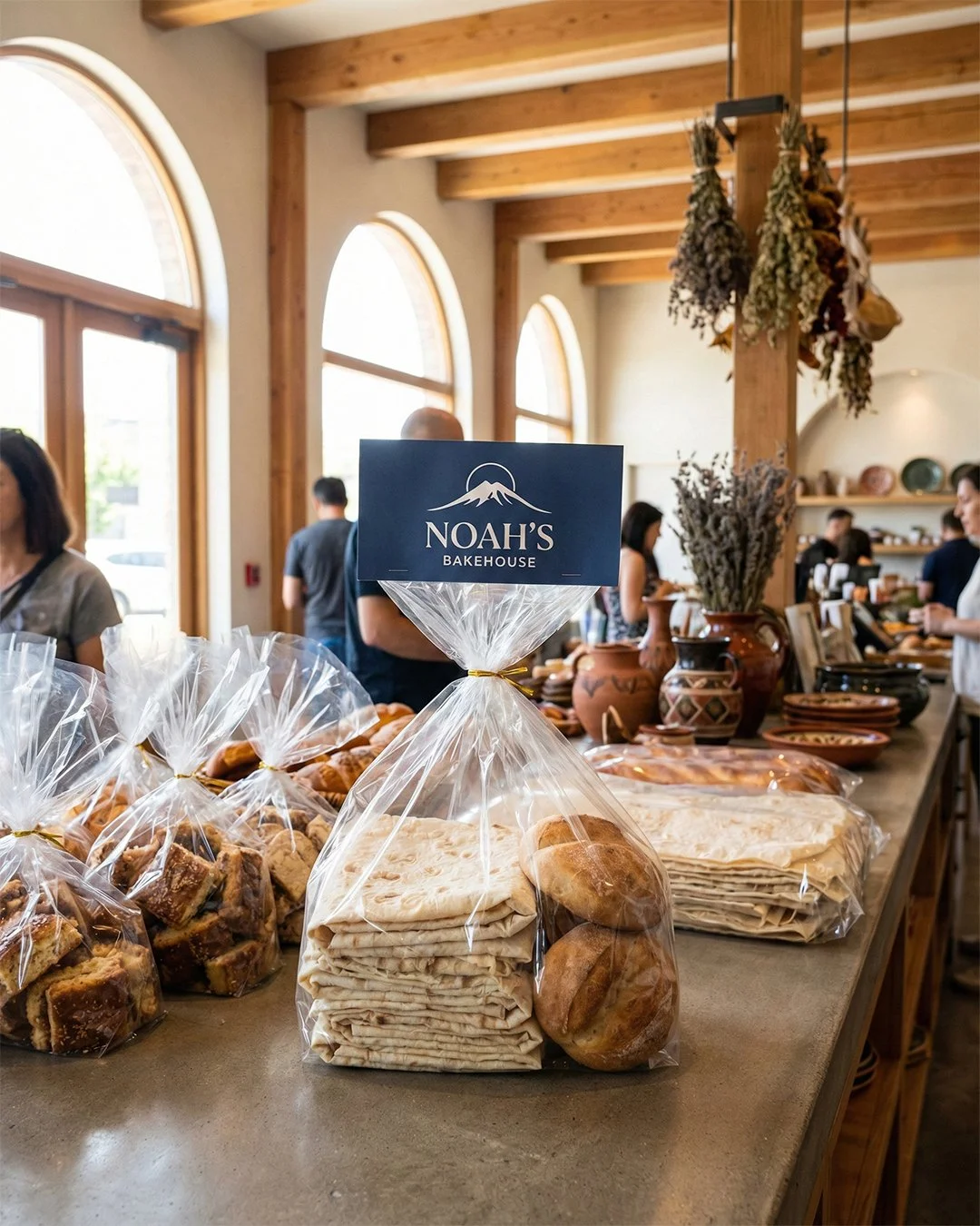
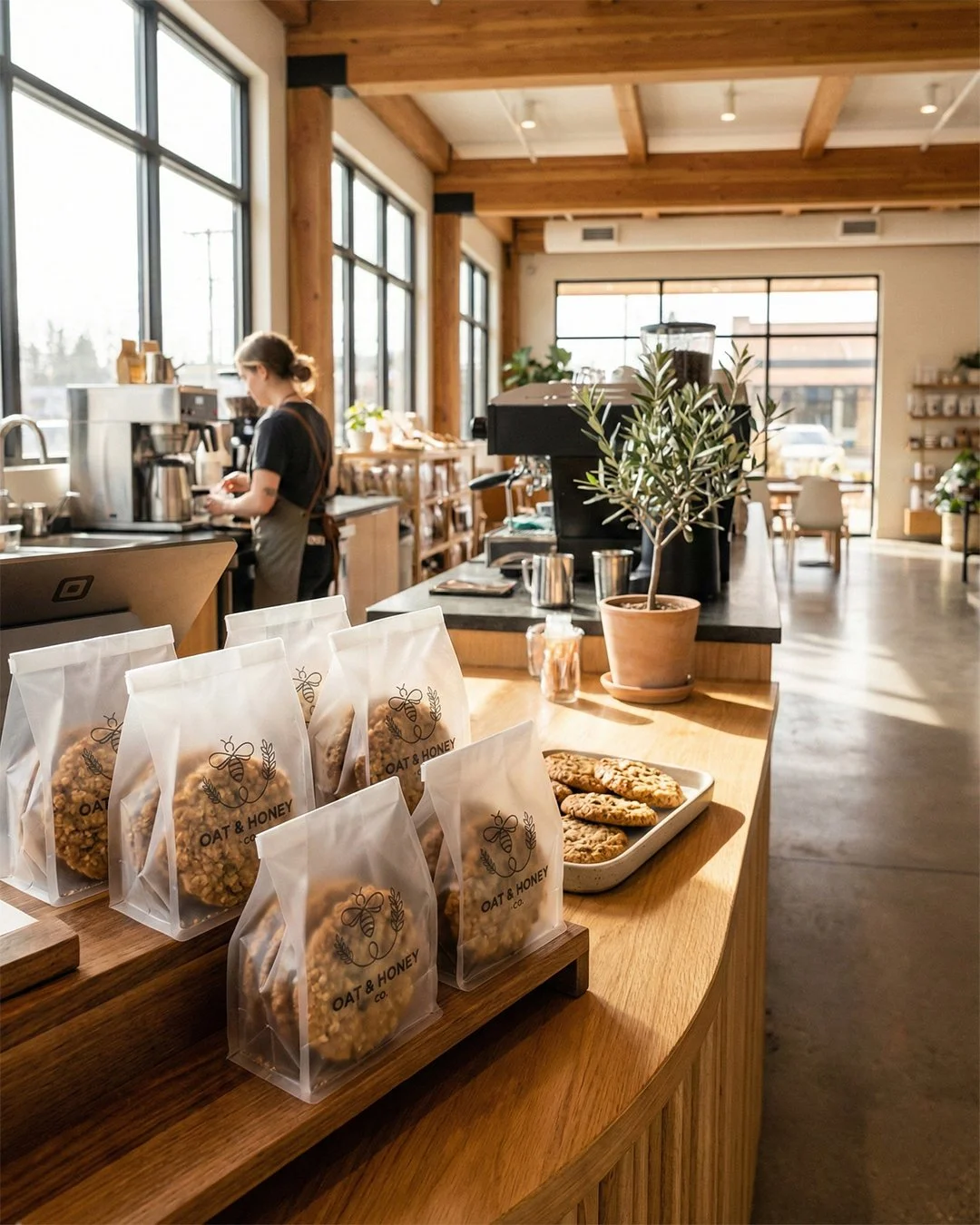
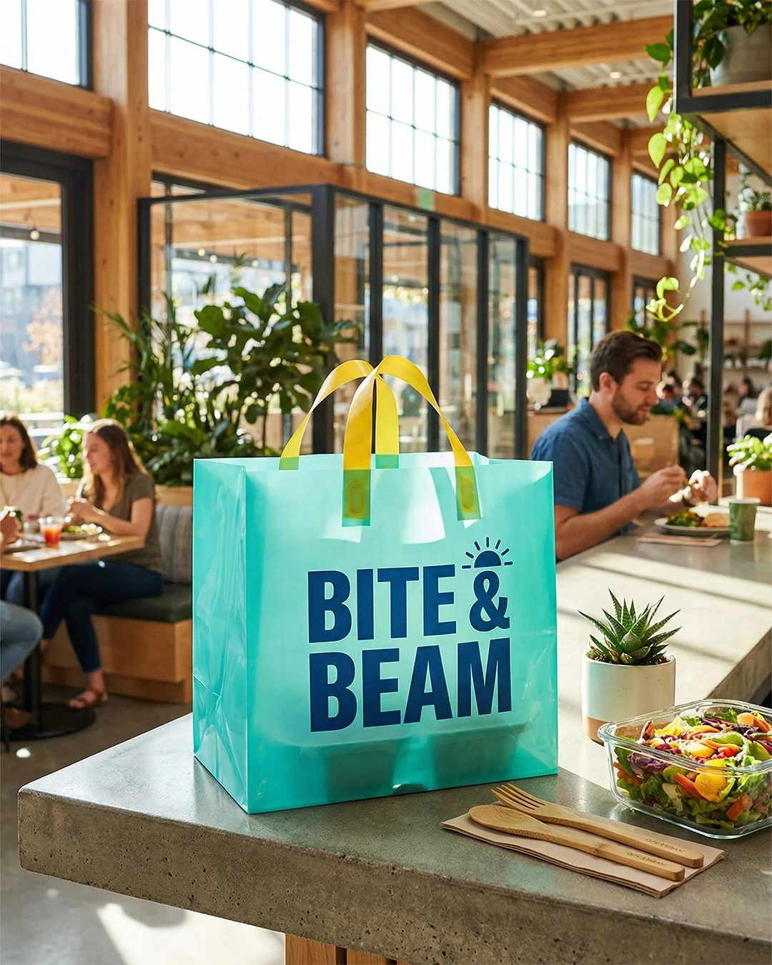
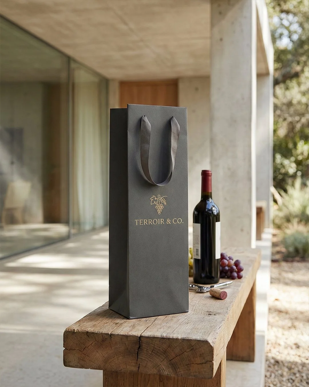
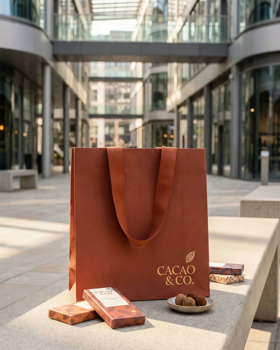
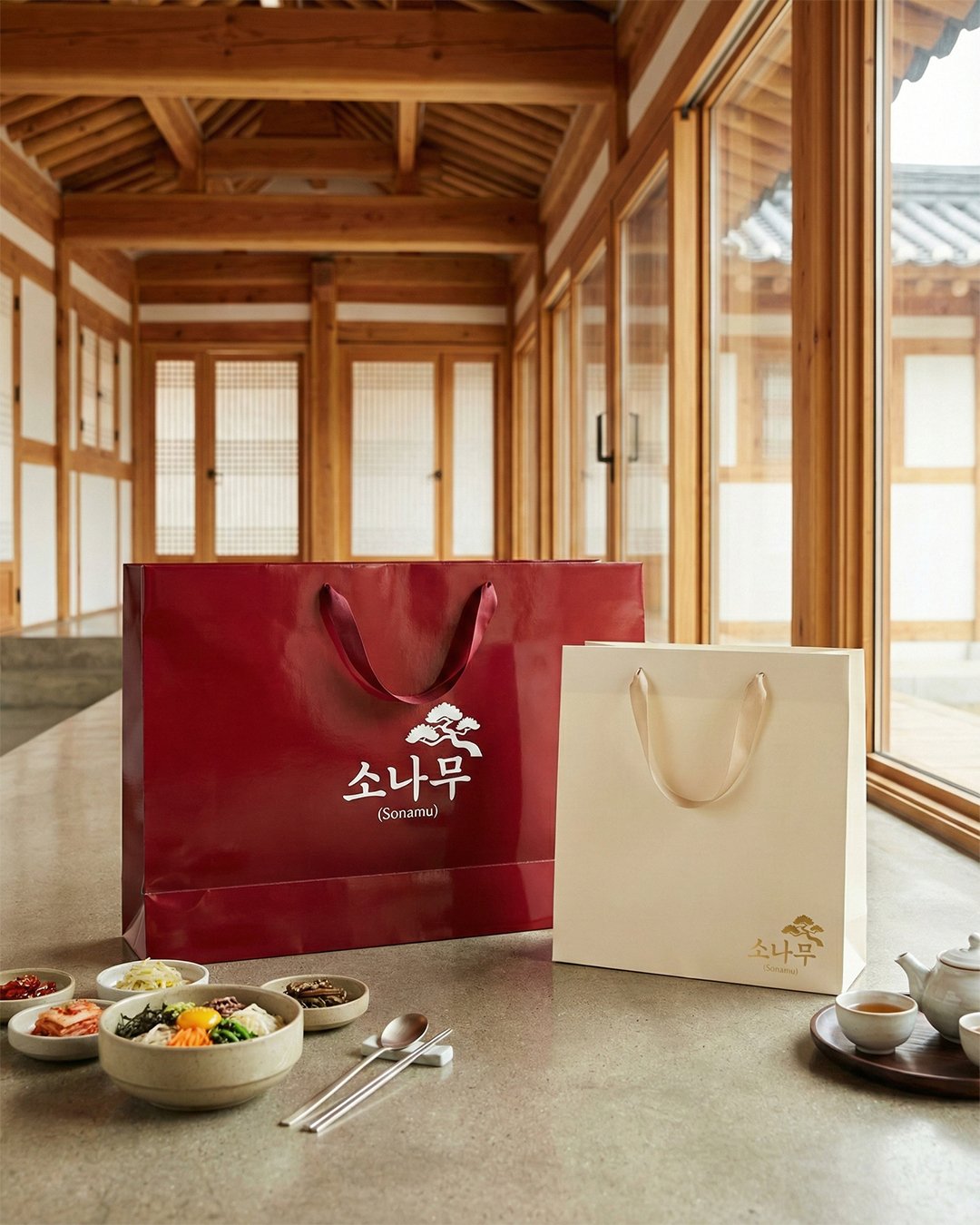
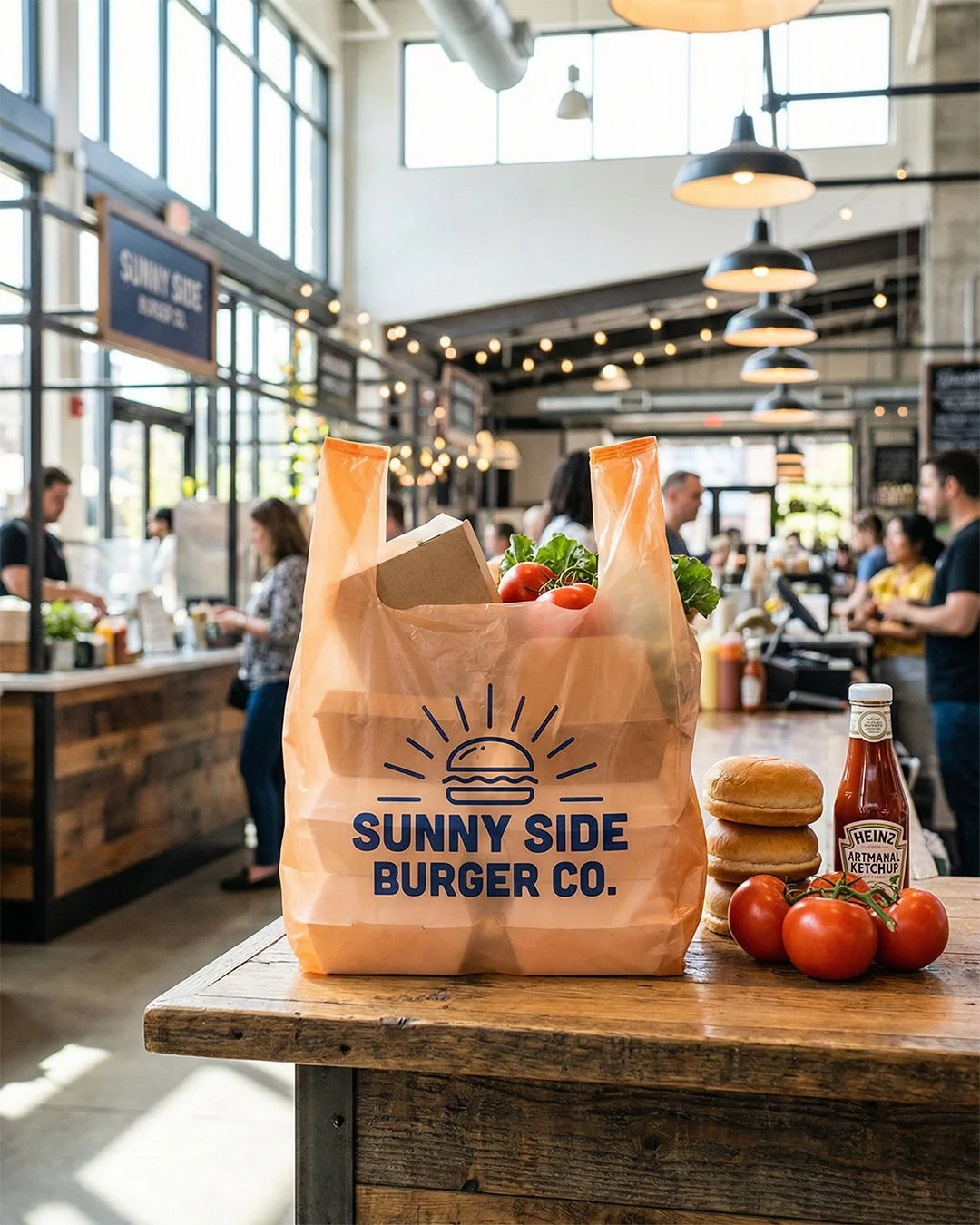
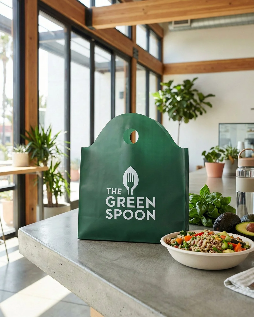
I rebuilt the visual library for credibility — physical lighting behavior, believable surfaces and shadows, materials that read as paper and board rather than as rendering — on the principle that a buyer scrolling the homepage should be evaluating the packaging, not noticing the image. Anything that pulls attention to the picture is attention taken off the product. I widened the range at the same time, so the homepage spread now carries multiple product categories across distinct brand identities and a visitor from any of Co-Pack's segments sees something that belongs to them within the first screen. Alongside that, I worked with Advue's creative director on restructuring the site around who's buying — Retail, Food Service, E-Commerce, Flexible Packaging, Low-Minimum — rather than by product type alone, so a visitor self-identifies in the navigation instead of hunting through a catalog. The Low-Minimum path matters most: it serves small businesses who'd otherwise assume a manufacturer like this is out of reach, and surfacing it as a top-level route makes an entire customer segment visible to itself.
CoPack Inc.
-
Produced the visual content across Co-Pack's live site at copackinc.com and their marketing material
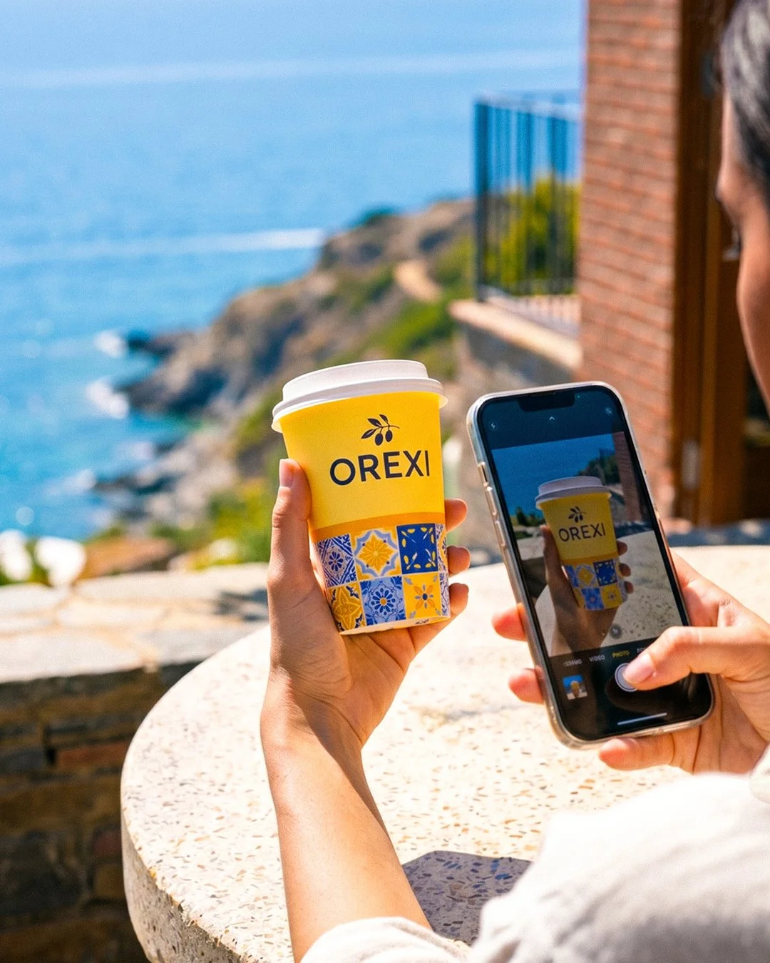
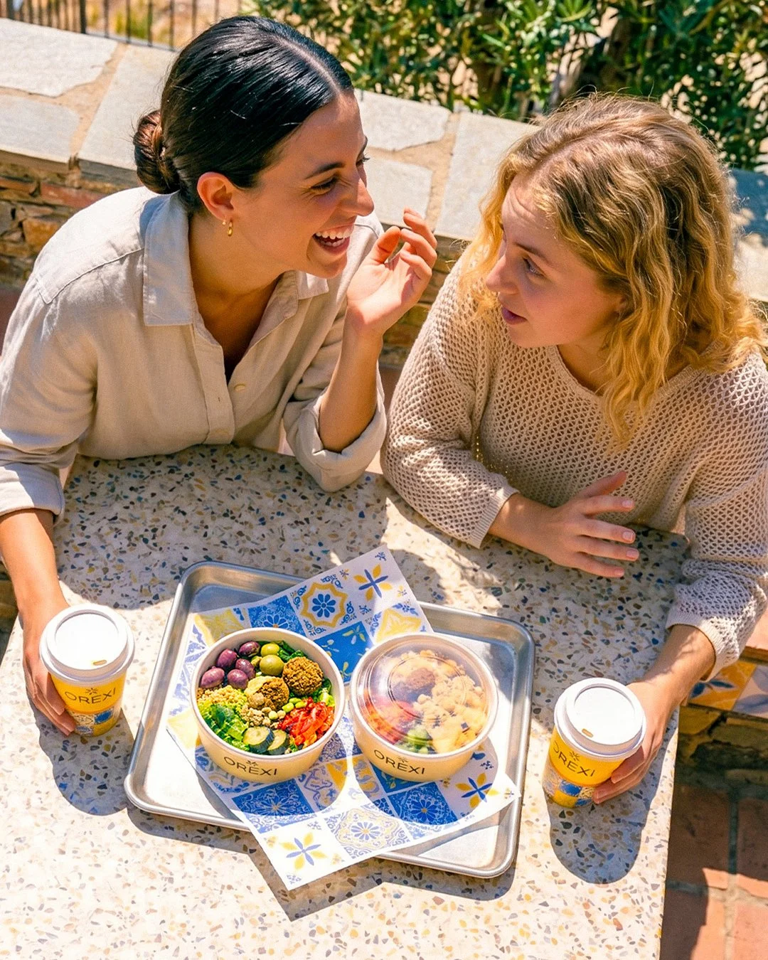
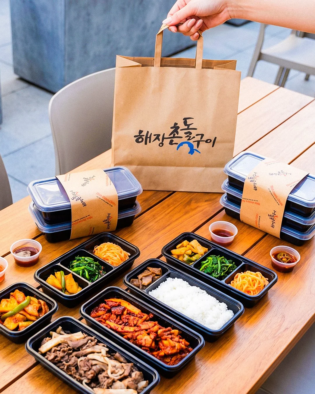
Replaced the existing AI-generated product imagery with realistic staging, rebuilding credibility as the primary design goal
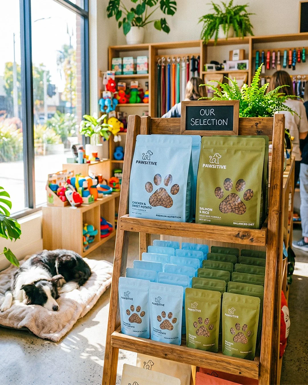
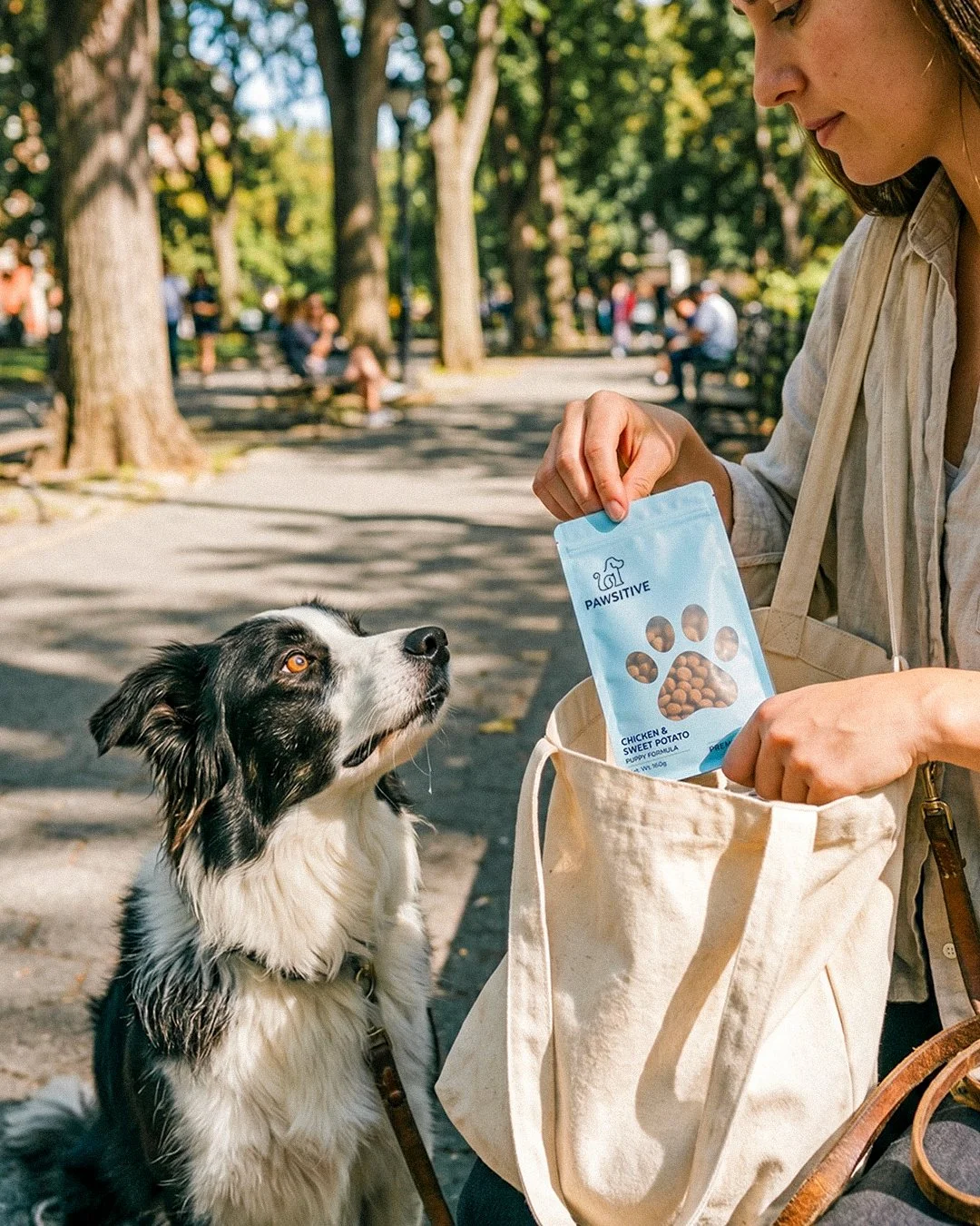
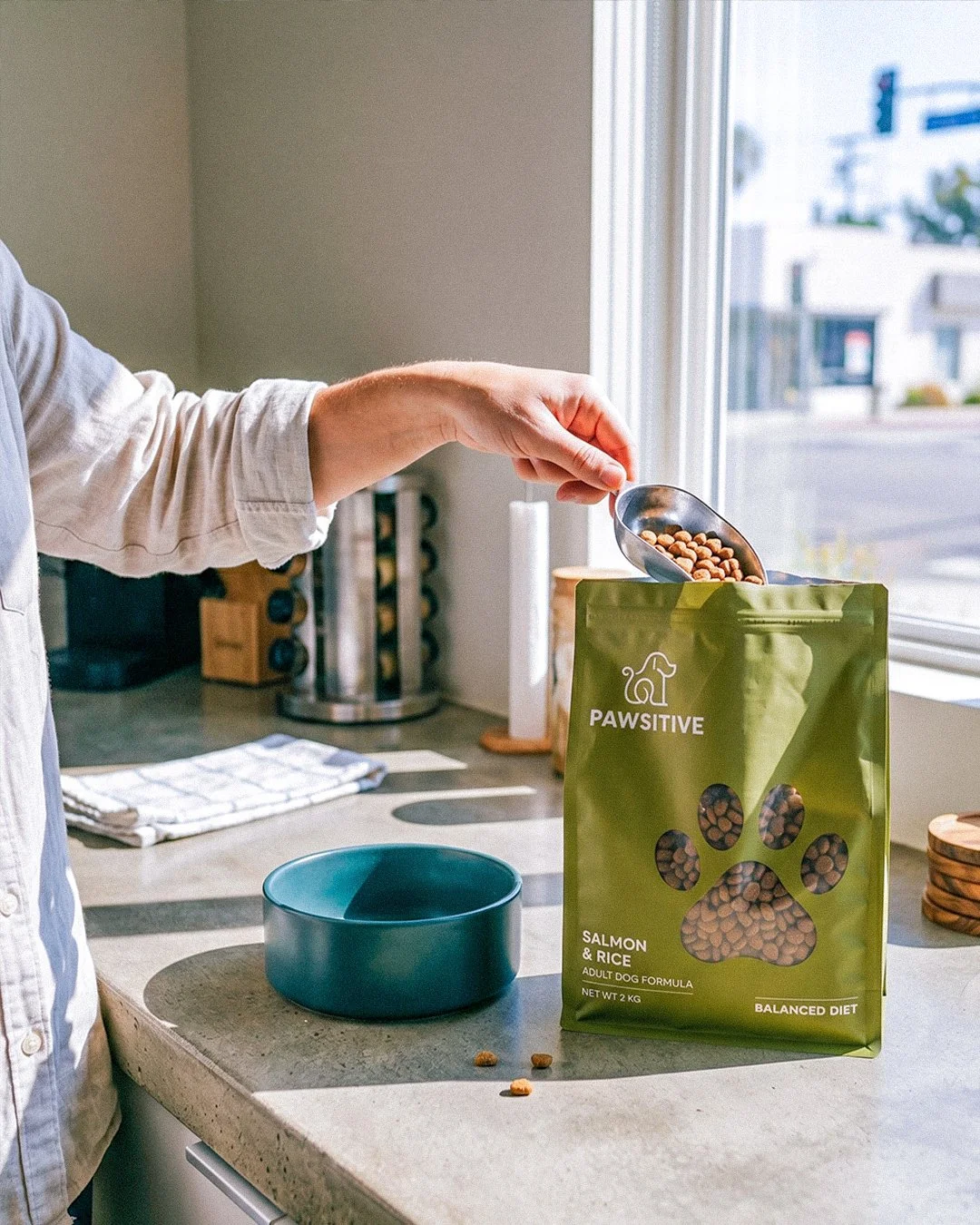
Broadened the visual range to represent all four business segments rather than food service alone
Contributed to the site restructure alongside Advue's creative director, reorganizing navigation around customer segment
Designed recurring Instagram content and email campaigns on an ongoing cadence [N: posts per week, sends per month]
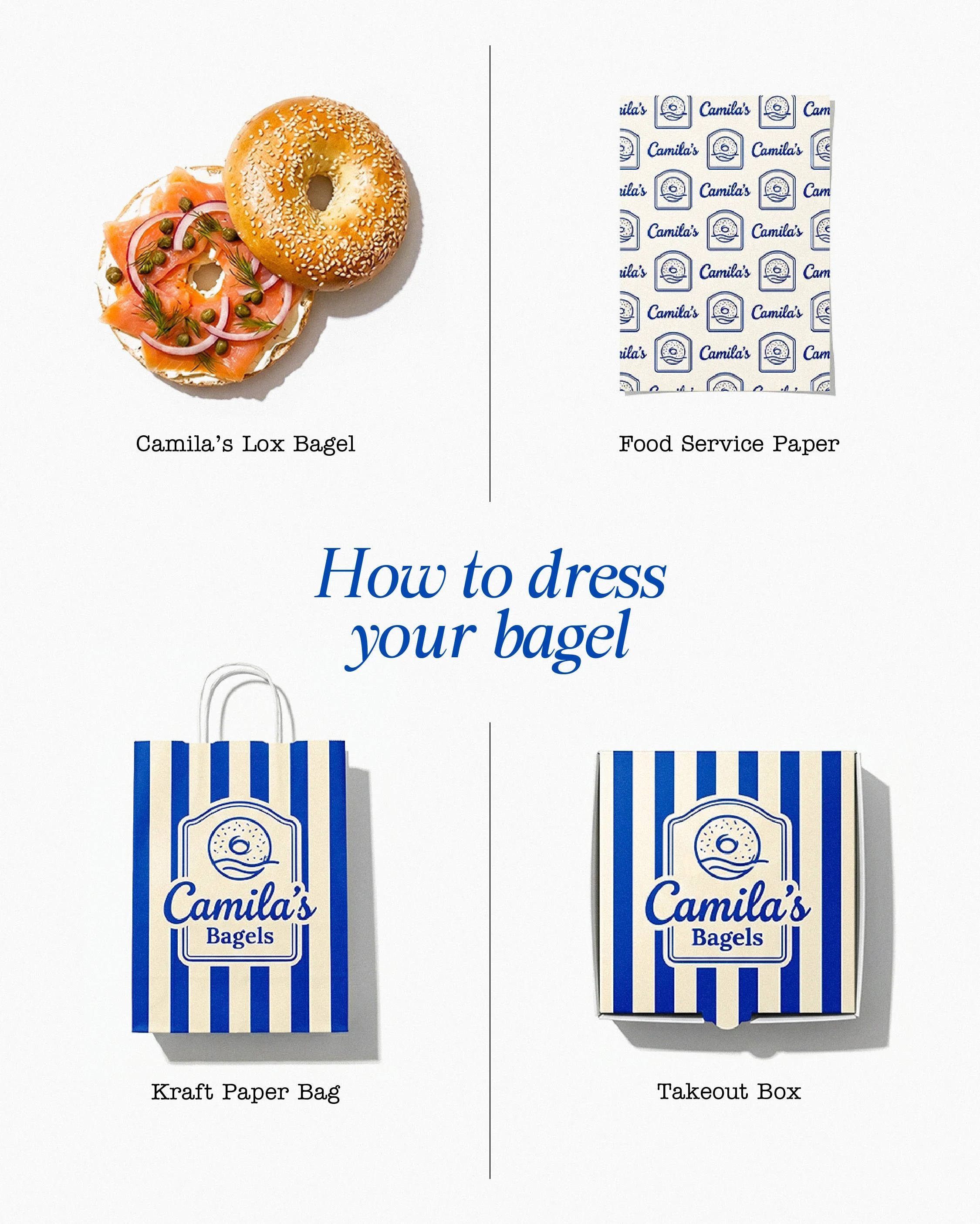
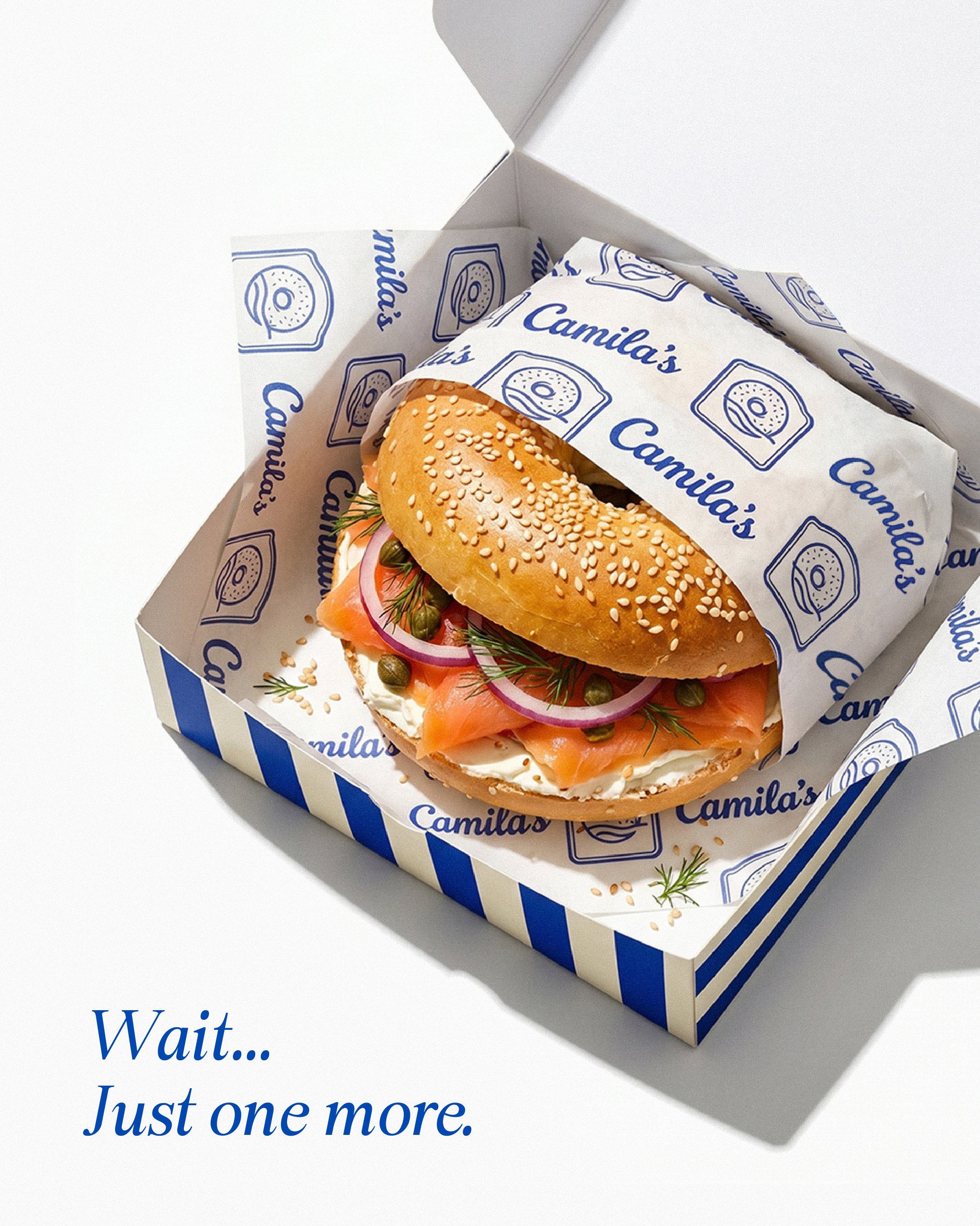
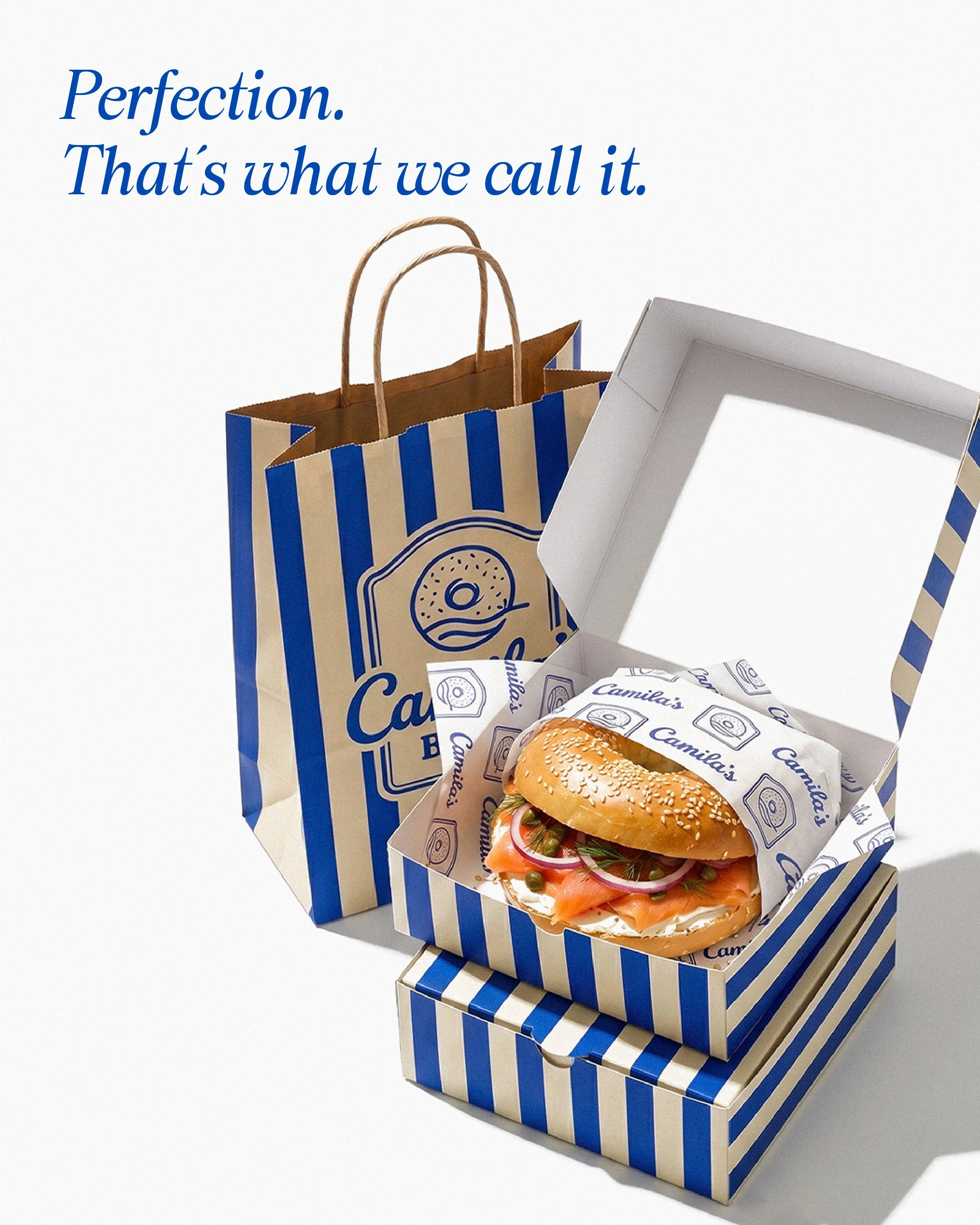
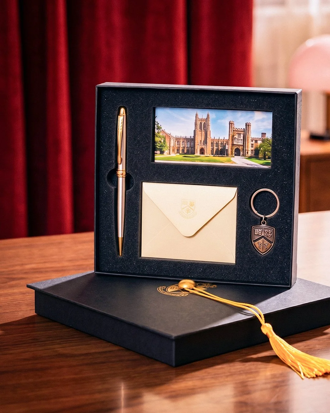
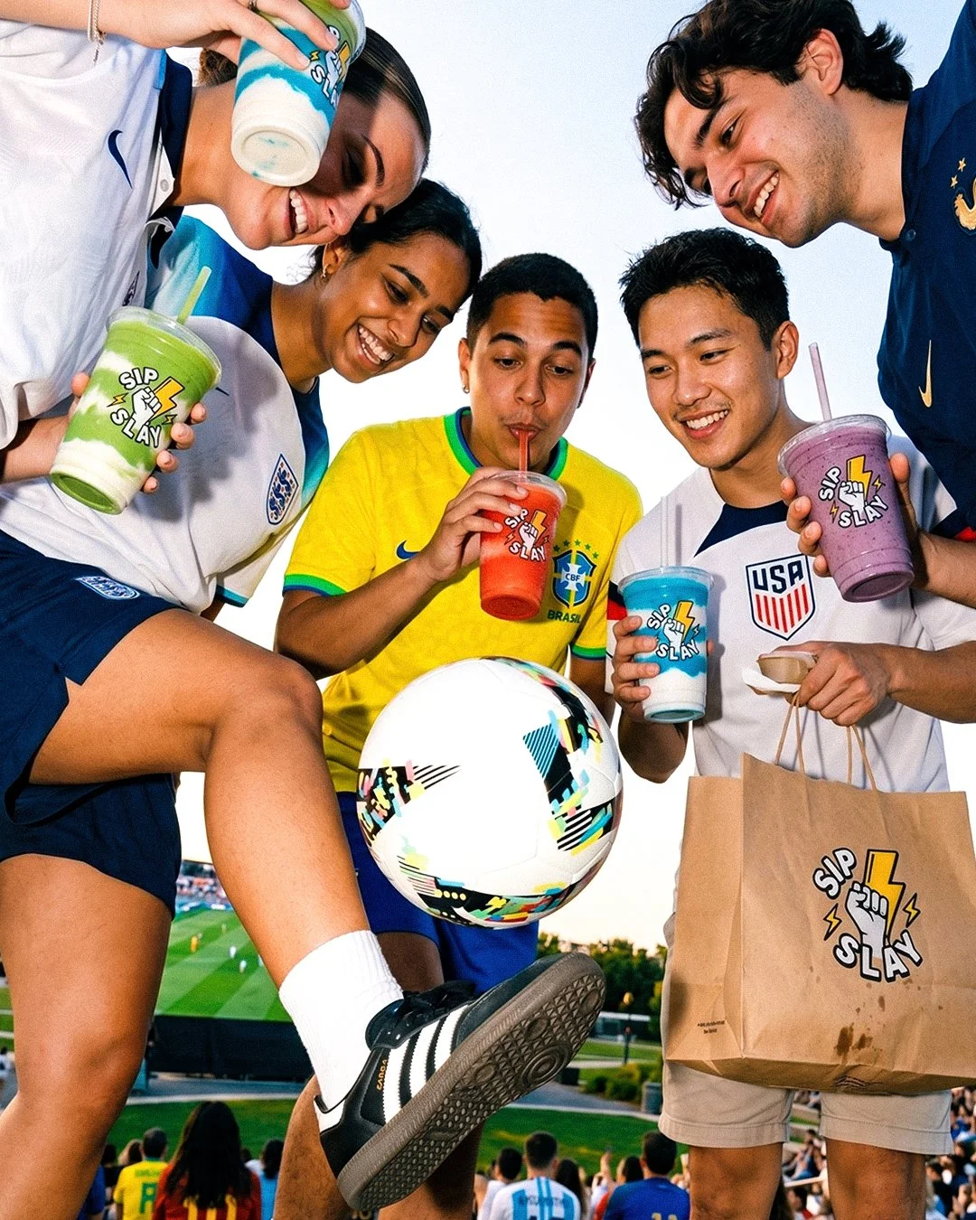
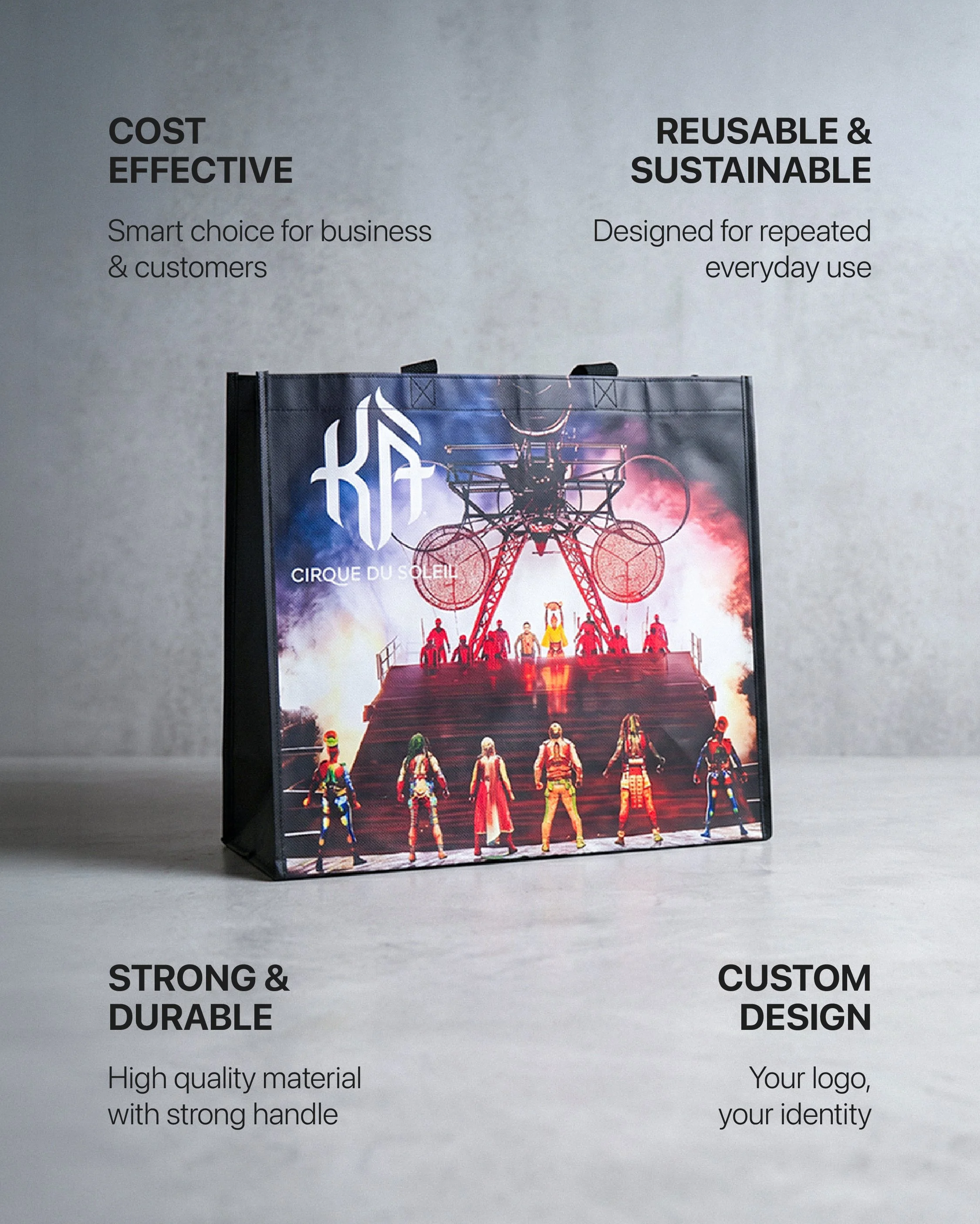
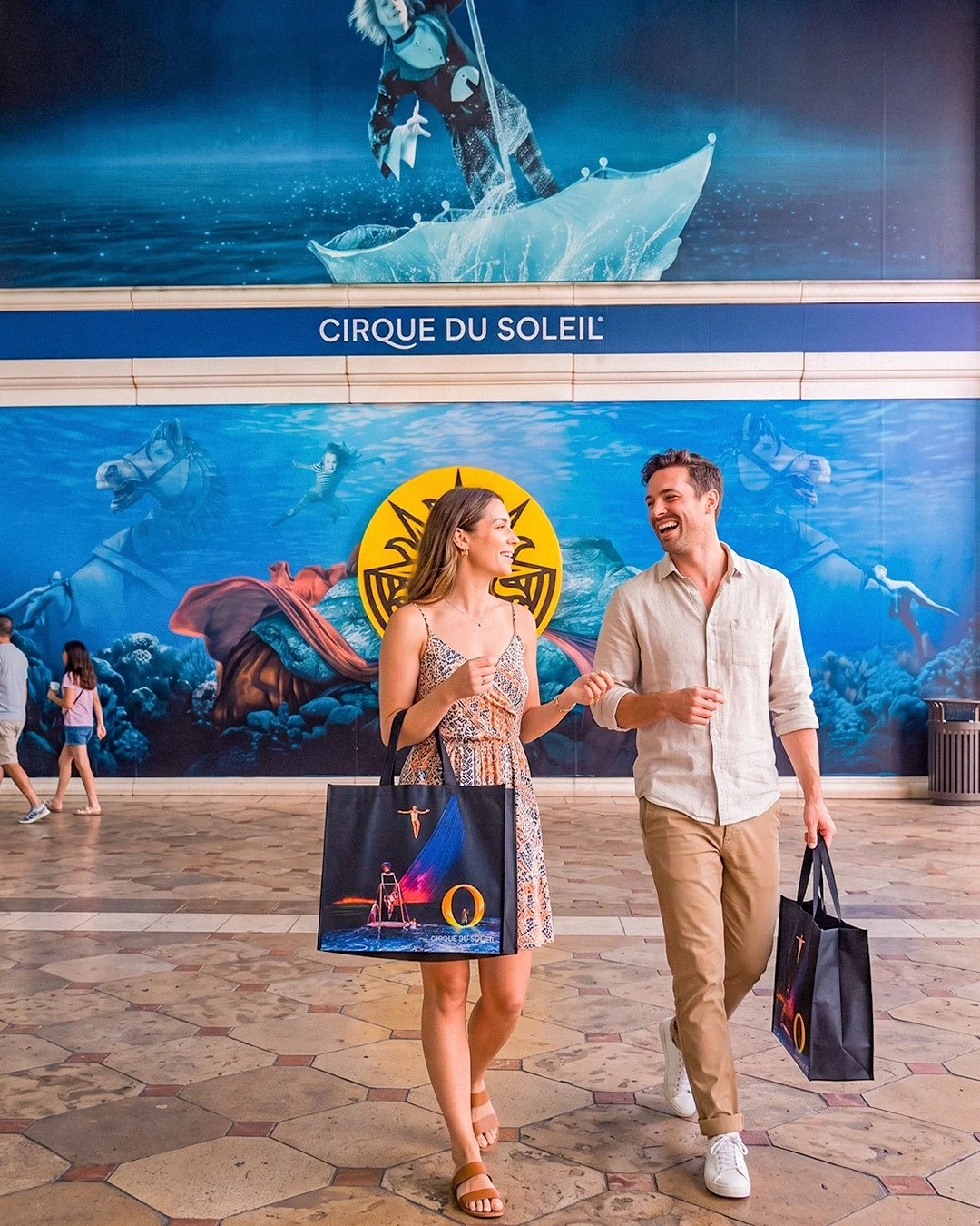
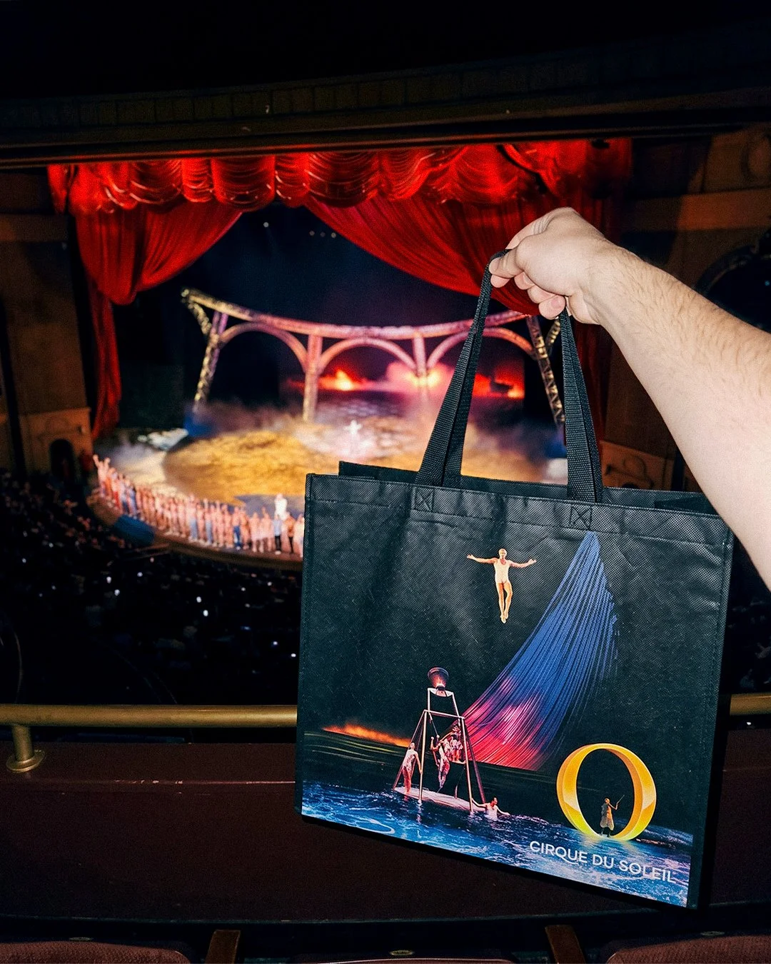
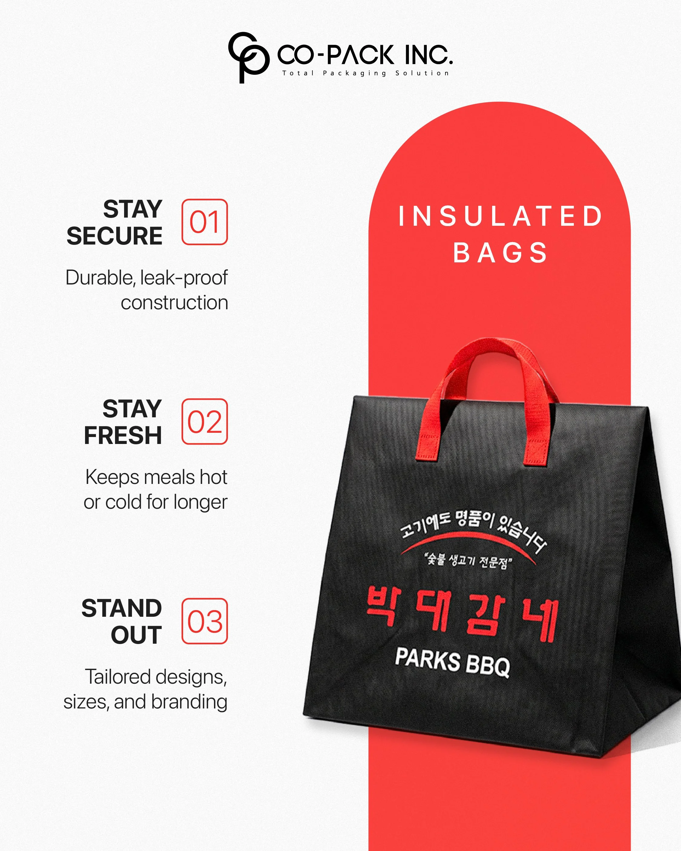
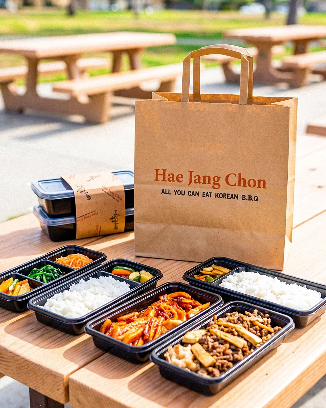
Built packaging system mockups across multiple physical formats — wraps, boxes, deli paper, and carry bags
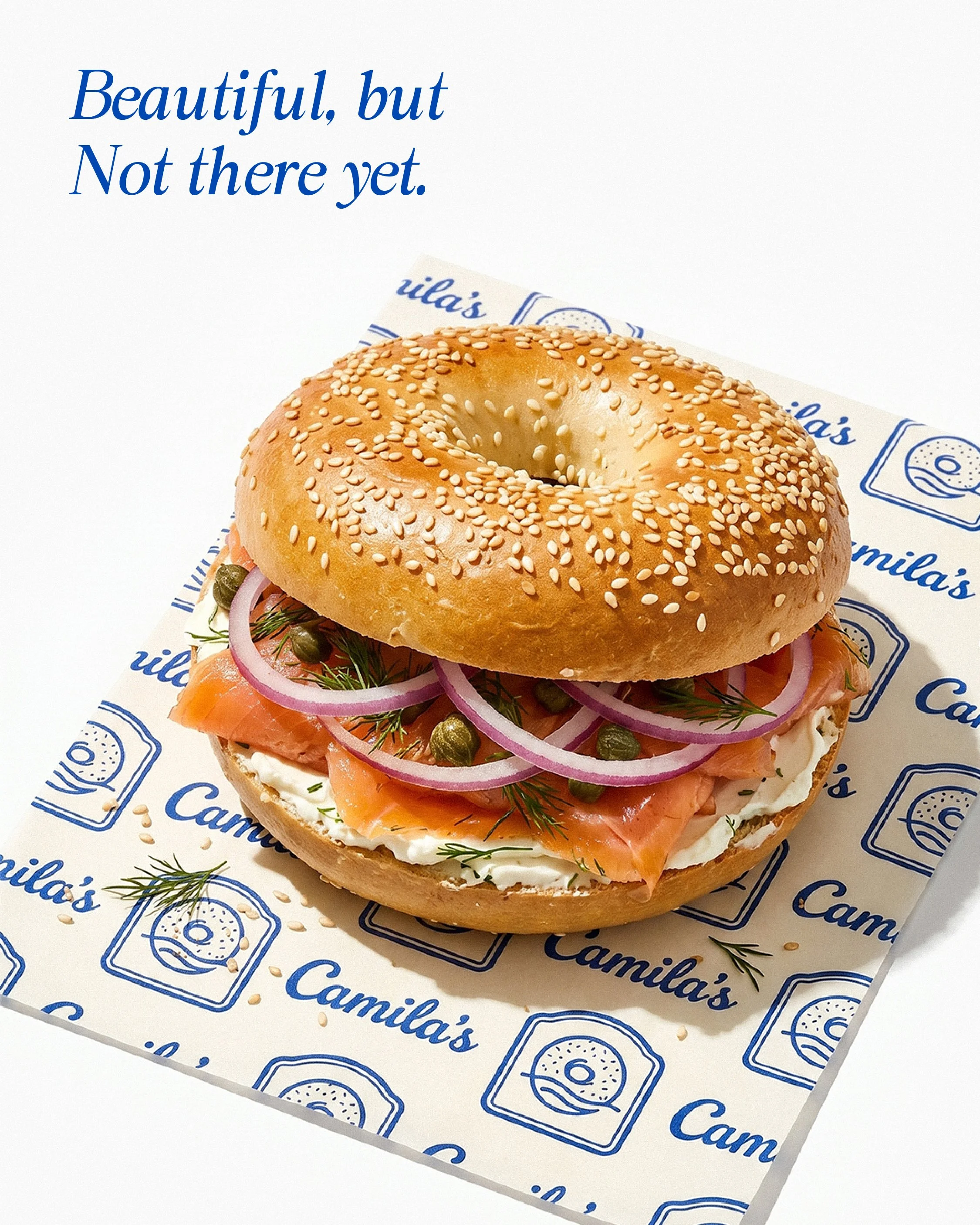
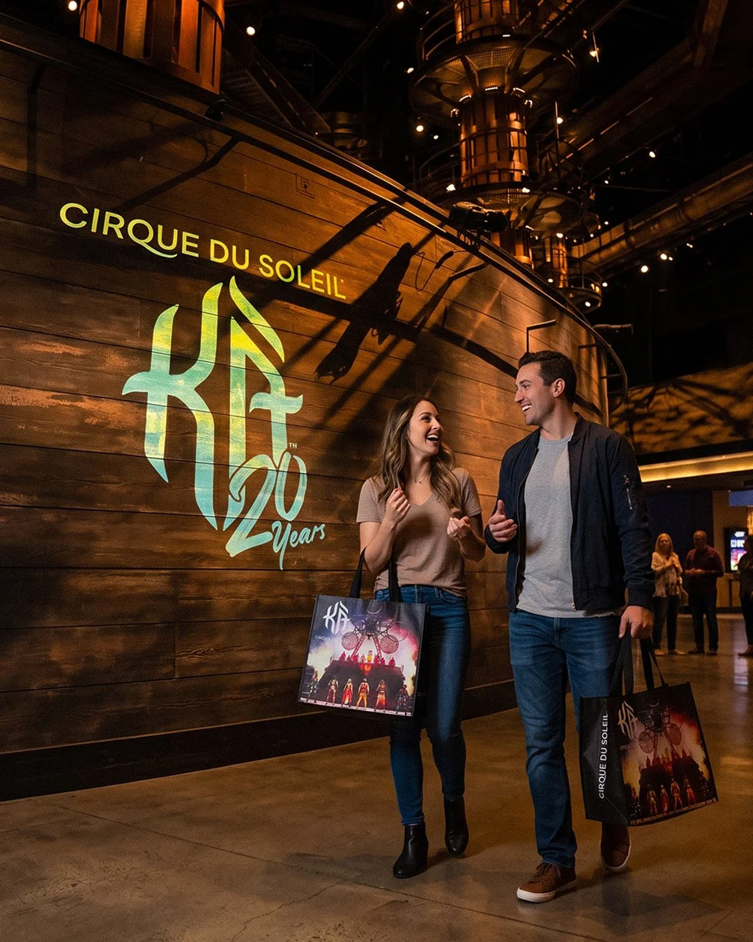
Art-directed product and lifestyle photography, including in-context staging
Designed the instructional piece as a step-by-step visual sequence
-
Diagnosing a trust problem and treating it as a design problem. The brief was imagery; the actual issue was that the site's visuals contradicted its core claim, and no amount of better composition fixes a picture that reads as fake. It also covers the range product work requires — auditing what exists, finding the gap between what a company sells and what its interface communicates, restructuring navigation around customer segments rather than internal categories, and producing to a consistent standard on a recurring schedule. Every visual currently on copackinc.com is mine, which is a claim a reader can verify in a browser tab.