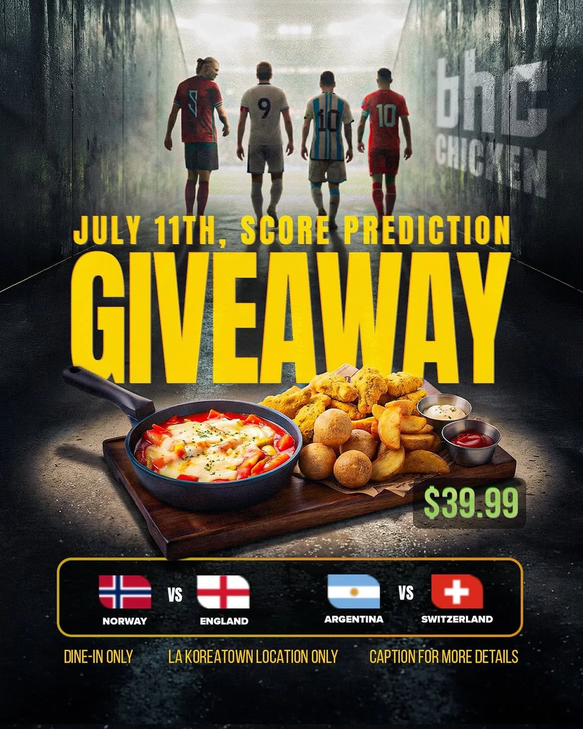
BHC Chicken Client work at Advue Digital In-store posters
ArrivedCombos, prices and a lunch special MadePosters you can decide from in line
BHC is a fried chicken chain. The reader of anything I made for them is standing in a queue, hungry, deciding in a few seconds, often holding a phone. A price that isn’t instantly legible is a price that doesn’t get compared, and a combo that needs a paragraph loses to the one that doesn’t.
What arrived
Three offers, their prices, and a lunch window.
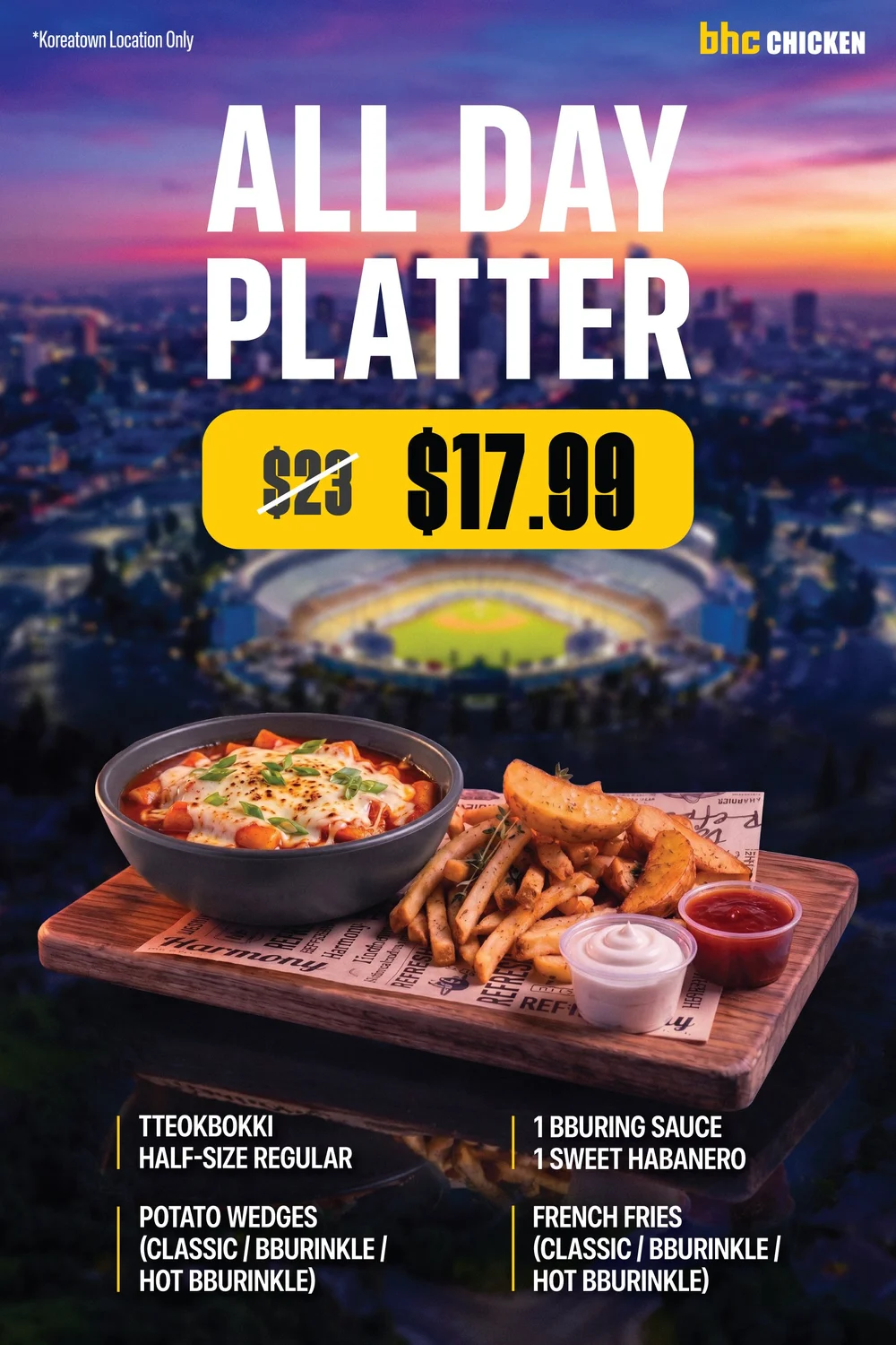
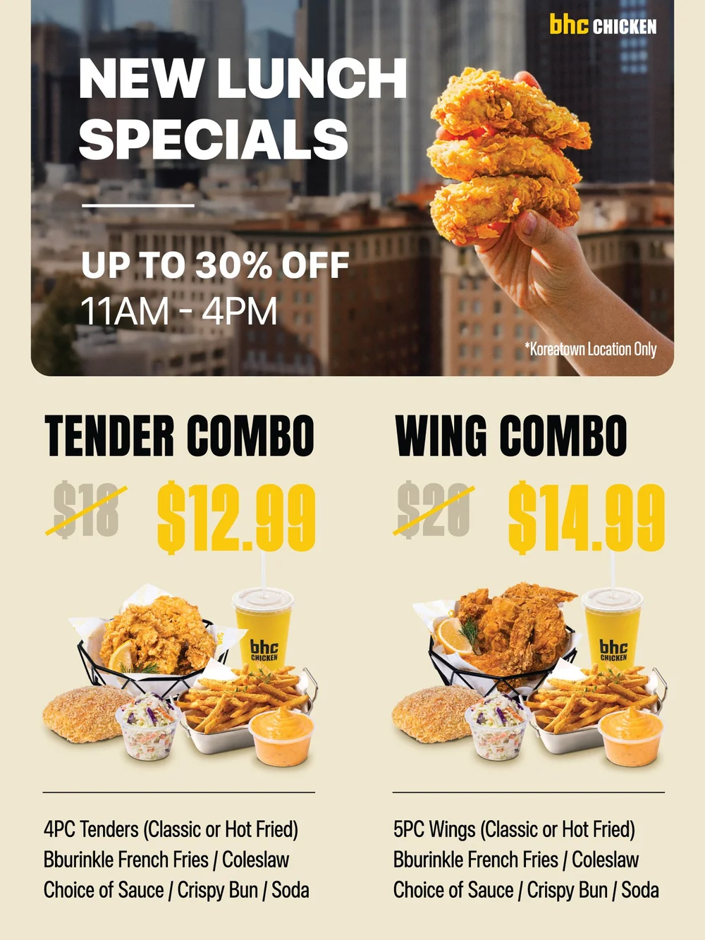
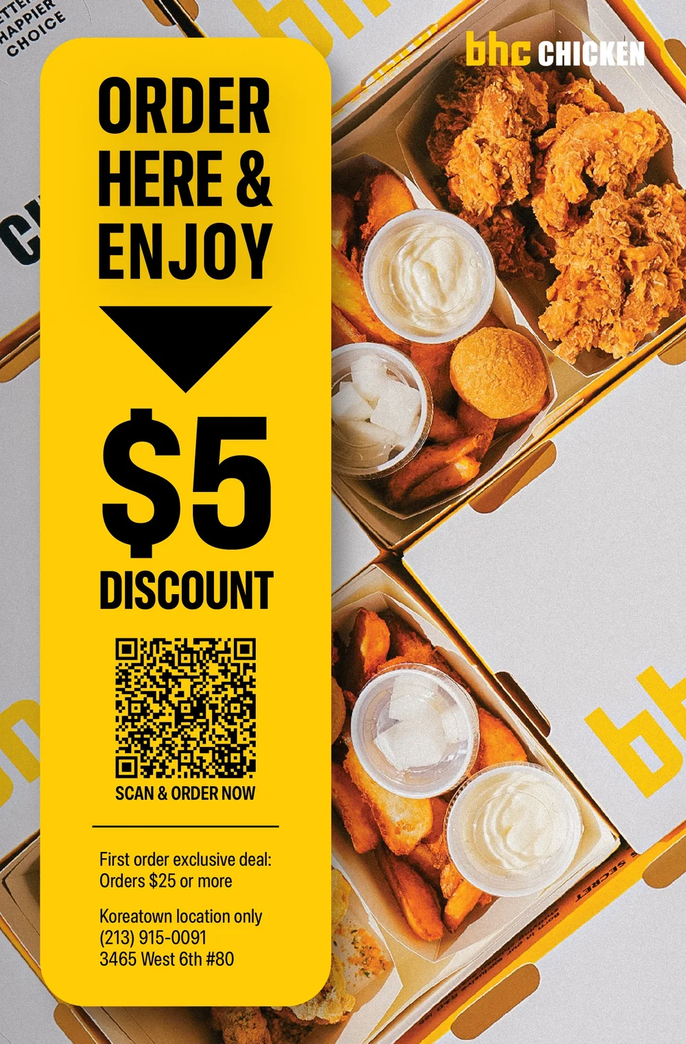
What came in were the offers themselves: an all-day platter marked down from $23, two lunch combos at up to 30% off between 11 and 4, and $5 off a first order placed online. Each one needed a surface a customer could act on without reading.
So the decisions were structural before they were decorative. Each surface got one job, and the layout was built around the few seconds it would get.
What I made
One job per surface.
 1
2
3
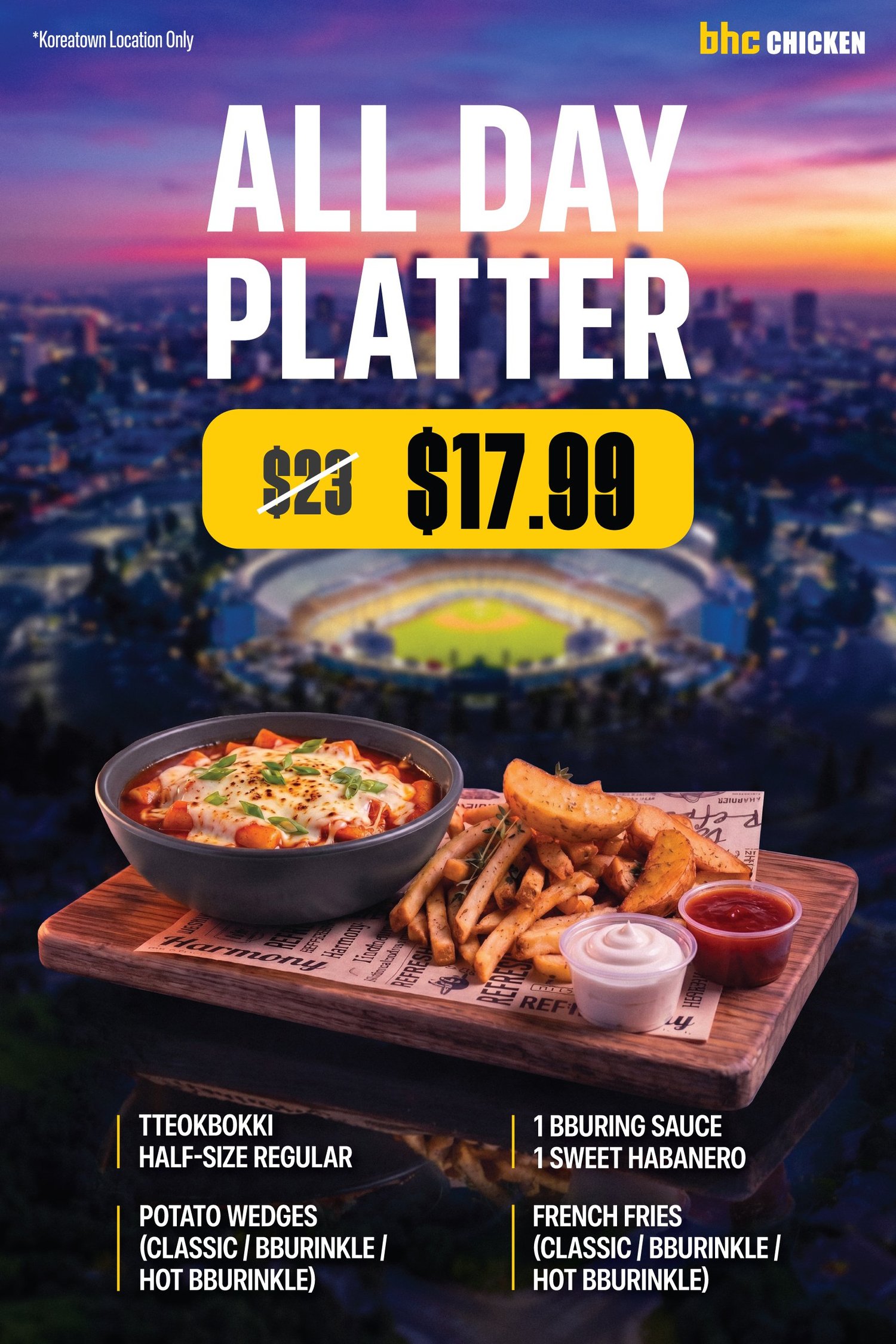
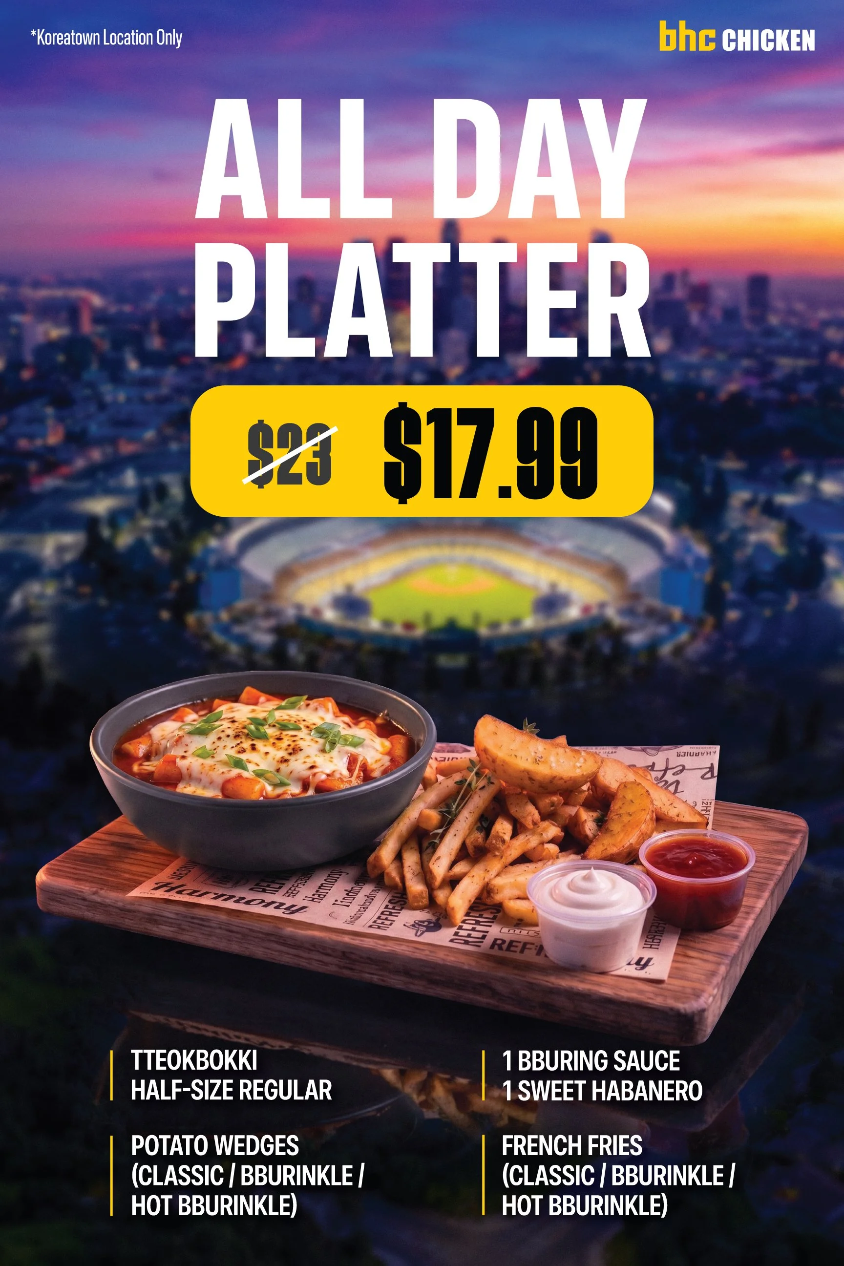
The platter. The comparison is the message.
- 1The offer at the largest size on the page. From across the store it reads as two words.
- 2The crossed-out $23 sits right beside $17.99, so the saving is read, not worked out.
- 3The platter as it’s served, then what’s in it in small type, for the second look.
 1
2
3
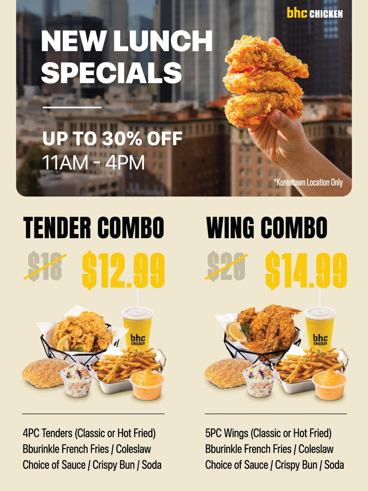
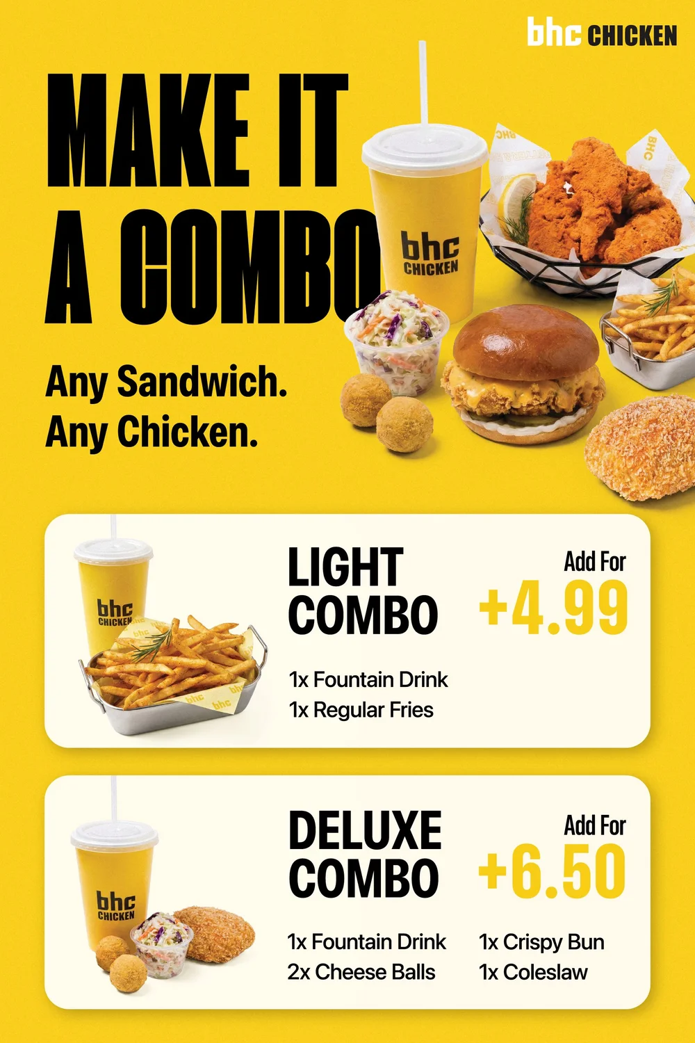
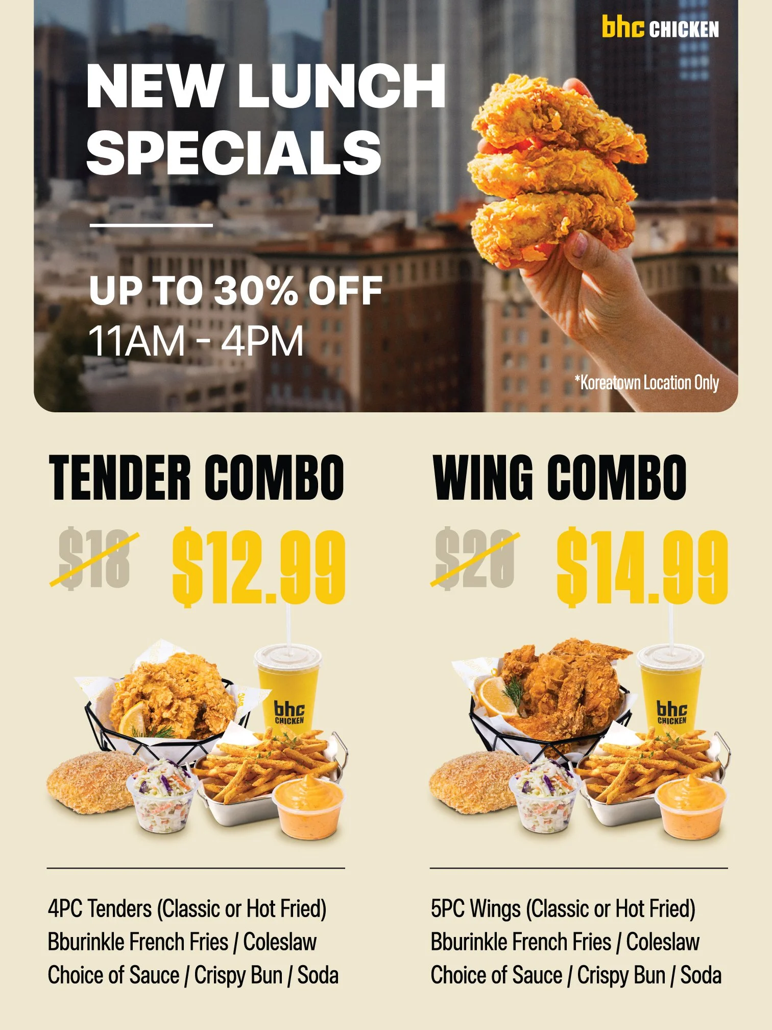
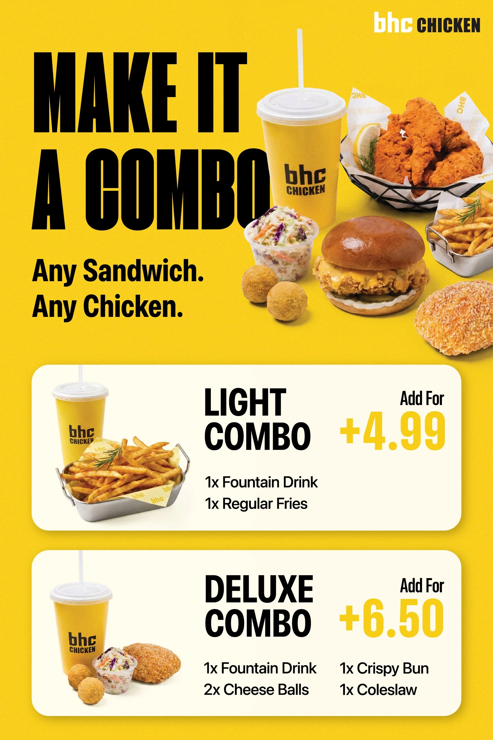
The lunch specials. Two combos, identical modules.
- 1The time window sits in the headline, so someone walking in at three sees it before they read the food.
- 2Same photo treatment, same price position, same list of what’s included. The only variable left to weigh is the one that matters.
- 3“Up to 30% off” is said once. The crossed prices carry the rest of the message.
 1
2
3
4
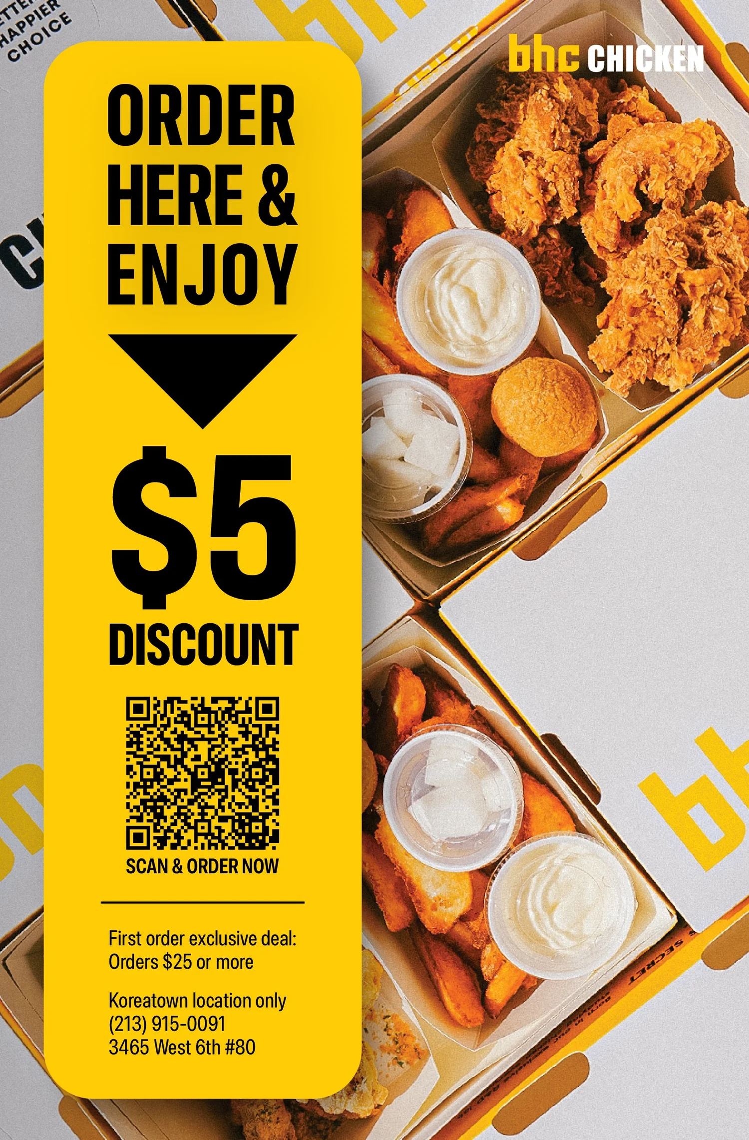
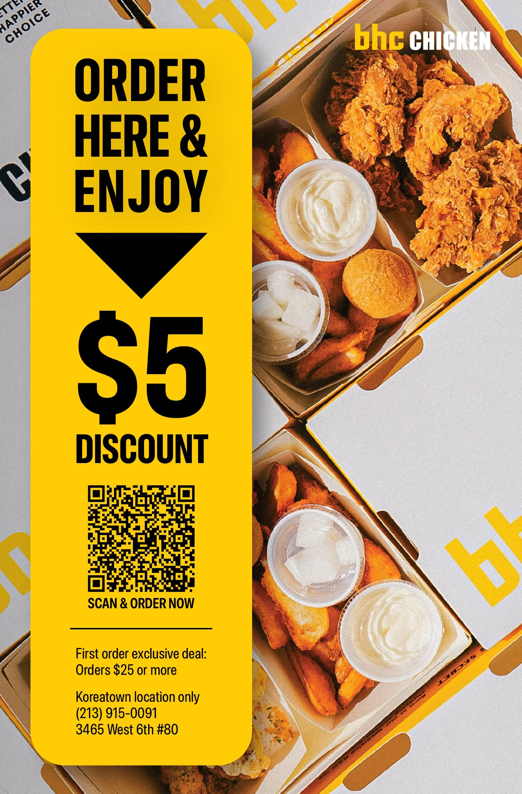
The flyer. From the counter into the app.
- 1A half-letter flyer by the register, with one instruction, “Order here & enjoy”, and an arrow that points at the code.
- 2One incentive, $5, set at the size of a price.
- 3A QR code sized to scan from arm’s length across a counter, not from a phone held up to a screen.
- 4The conditions in small print, where they belong. A handoff like this either works or fails silently.
Also for BHC
The same rules, in store and on Instagram.
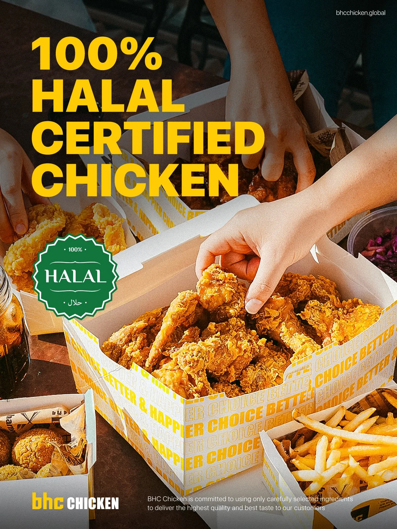
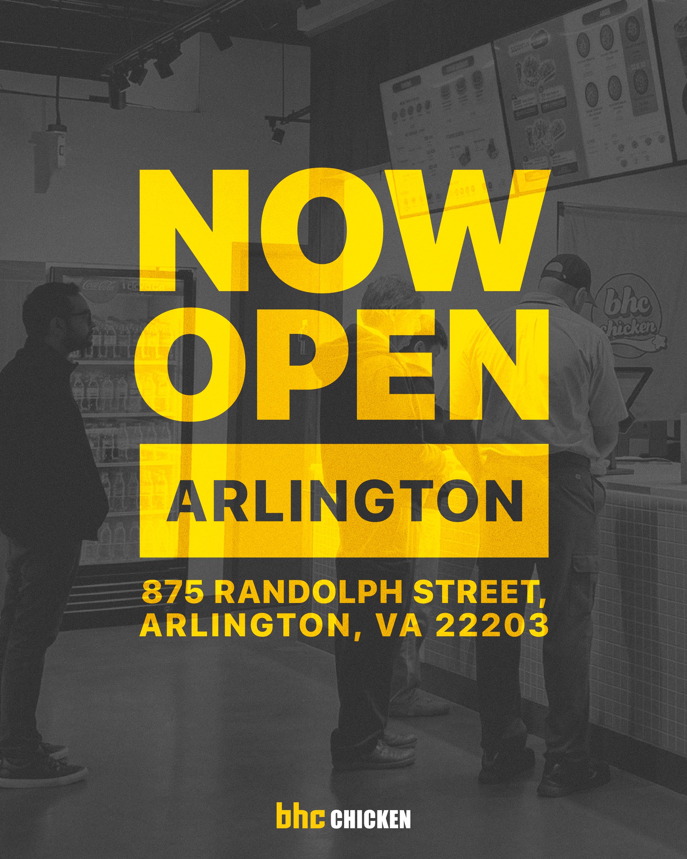
Each piece keeps the brand consistent and changes its layout for the distance it will be read from: a wall, a counter, a phone.
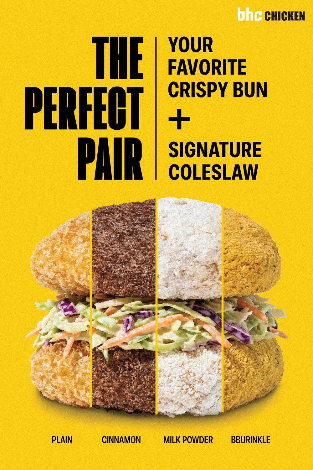
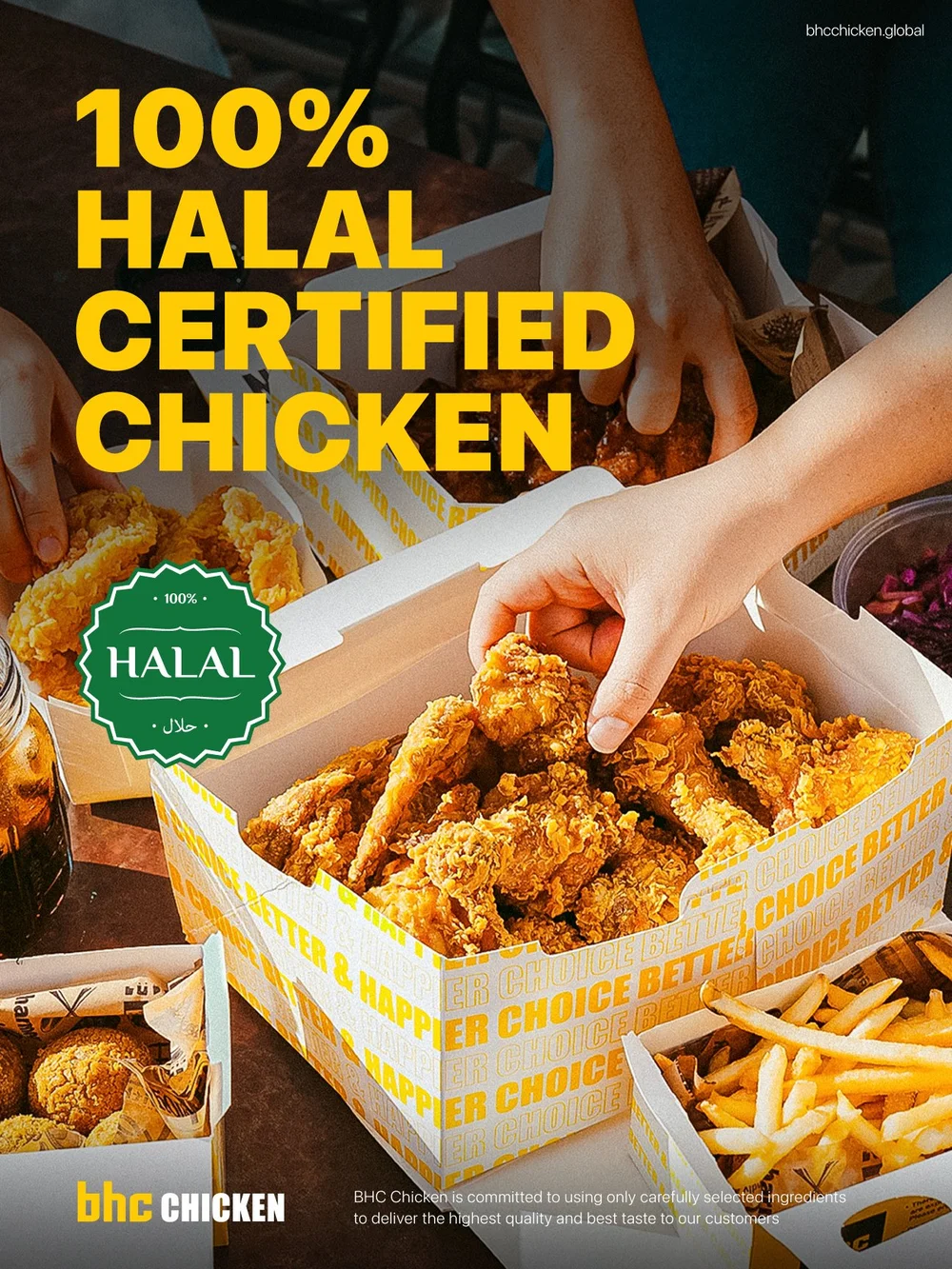
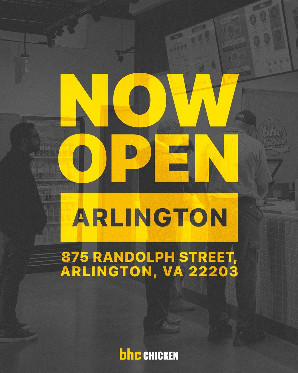

The whole set
All nine pieces, at full size.
Scroll sideways. Each piece opens at full size in a new tab.

What this demonstrates
A poster that doesn’t convert is a funnel with a drop-off.
- Decision architecture under time pressure. What someone reads first is decided for them, in the order they need it.
- Comparison design. Identical modules, so the eye only has to weigh the difference.
- One primary action per surface. A single instruction, a single incentive, one thing to do.
- A physical-to-digital handoff. Sized for the real distance, with the conditions out of the way. The diagnosis is the same as a funnel drop-off.
-
BHC is a fried chicken chain. This work covers in-store and promotional material — the all-day platter, the lunch special window, and the counter piece that moves a customer from the physical store into digital ordering.
The constraint here is the most demanding of any project in this section, and it's genuinely a UX constraint: the reader is standing in a queue, hungry, deciding in a few seconds, often holding a phone. Everything the design does has to survive that. A price that isn't instantly legible is a price that doesn't get compared. A combo that requires reading a paragraph loses to the one that doesn't.
So the decisions were structural before they were decorative. The platter piece leads with the offer at the largest possible size and the crossed-through original price immediately beside it, because the comparison is the message. The lunch special piece sets the two combos side by side in identical modules — same photo treatment, same price position, same inclusions — so the only variable the customer has to weigh is the one that matters, and the time window sits in the headline where a customer walking in at 3pm will see it before they read the food. The counter piece runs a single instruction ("Order here & enjoy"), a single incentive, and a QR code sized to be scanned from arm's length across a counter, not from a phone held to a screen.
BHC Chicken
-
Designed in-store promotional and point-of-sale material for a QSR chain in the United States and Canada
Built the pricing and offer hierarchy across the campaign, including comparison layouts for multi-combo promotions
Designed the physical-to-digital handoff: QR placement, sizing, and surrounding call-to-action
Maintained brand consistency across formats while adapting layout to each viewing distance and reading context
Constructed a half-letter retention flyer aimed at getting existing customers to order again
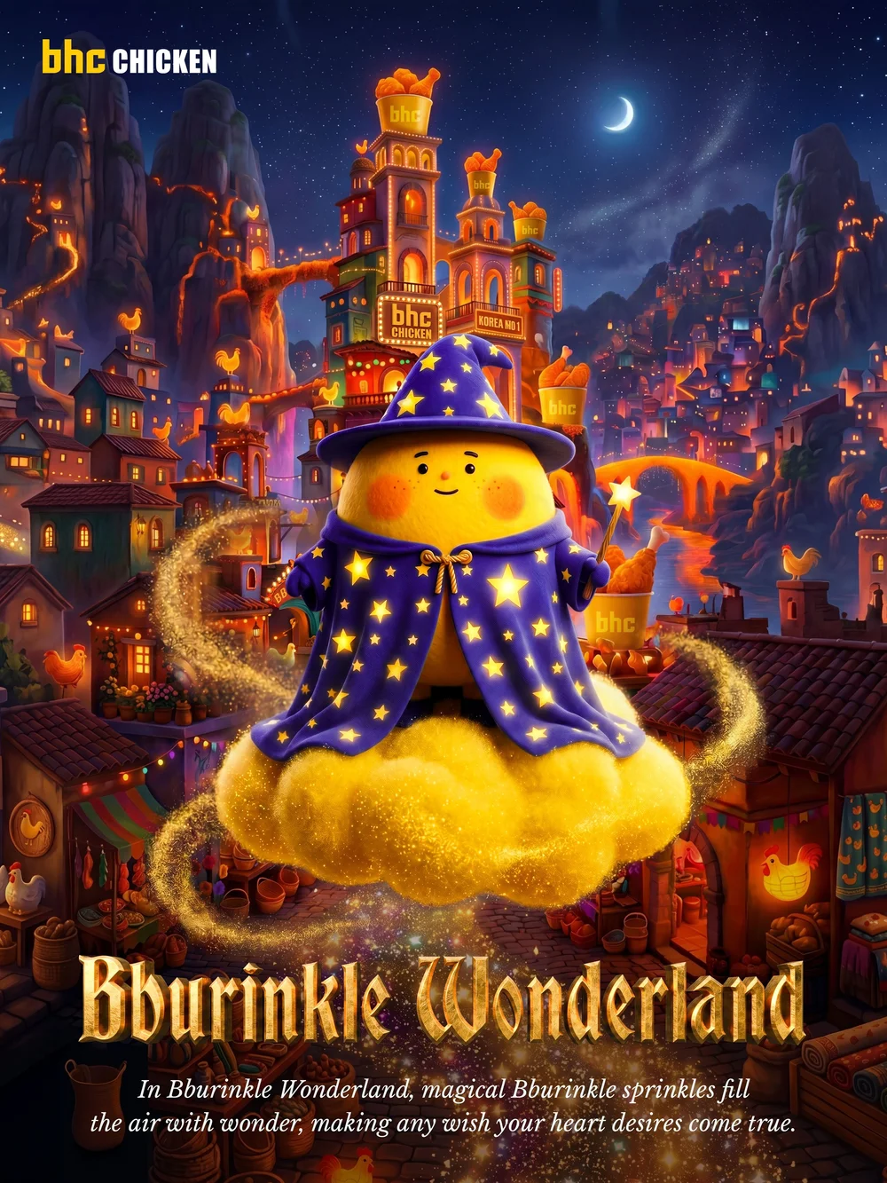
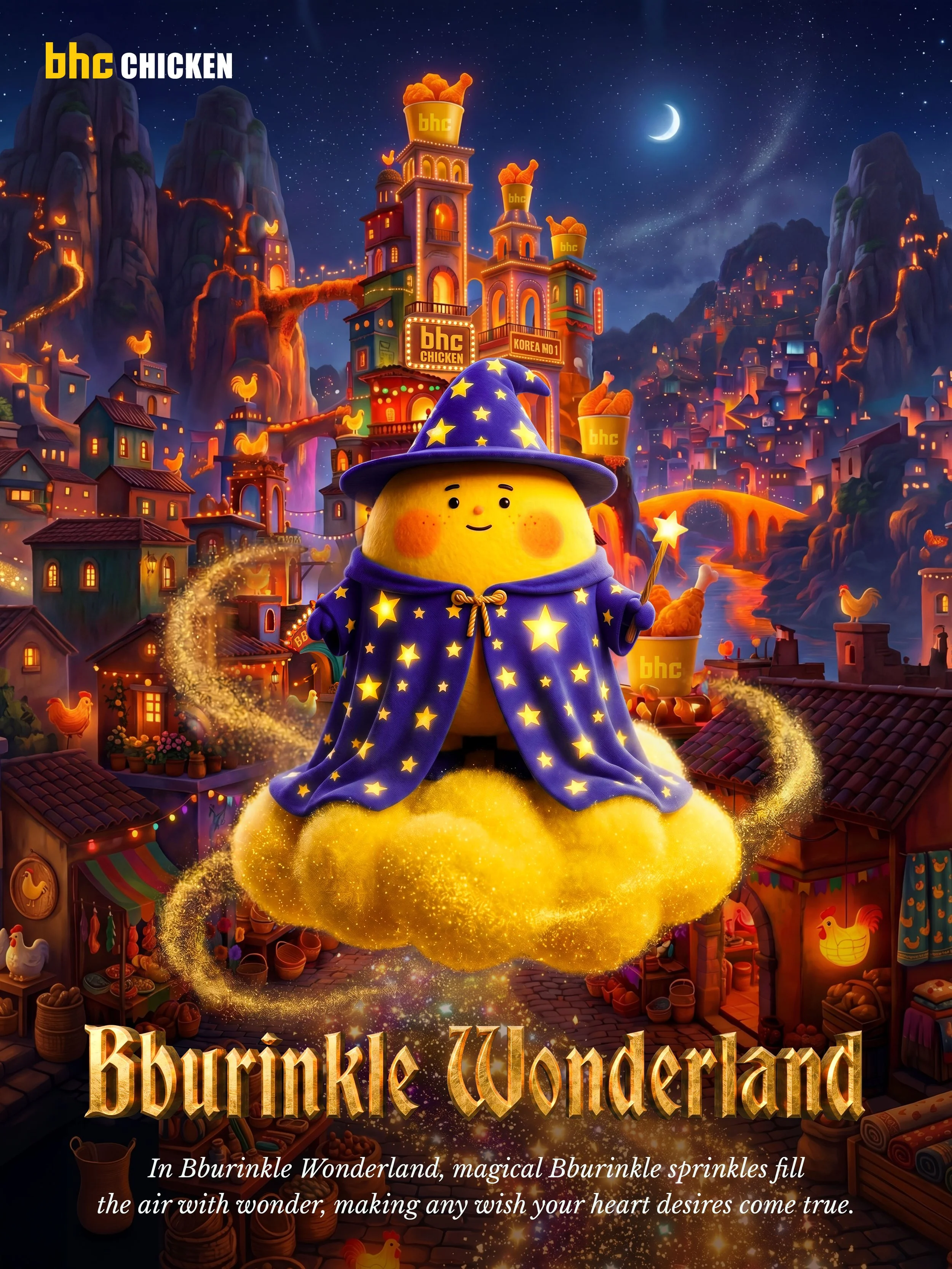
Designed a Bburinkle character illustration — a fantasy/magic-themed brand character for a limited-time campaign
-
The clearest product parallel in this section. Decision architecture under time pressure, comparison design, one primary action per surface, and a physical-to-digital handoff that either works or silently fails. A poster that doesn't convert is a funnel with a drop-off, and the diagnosis is the same.