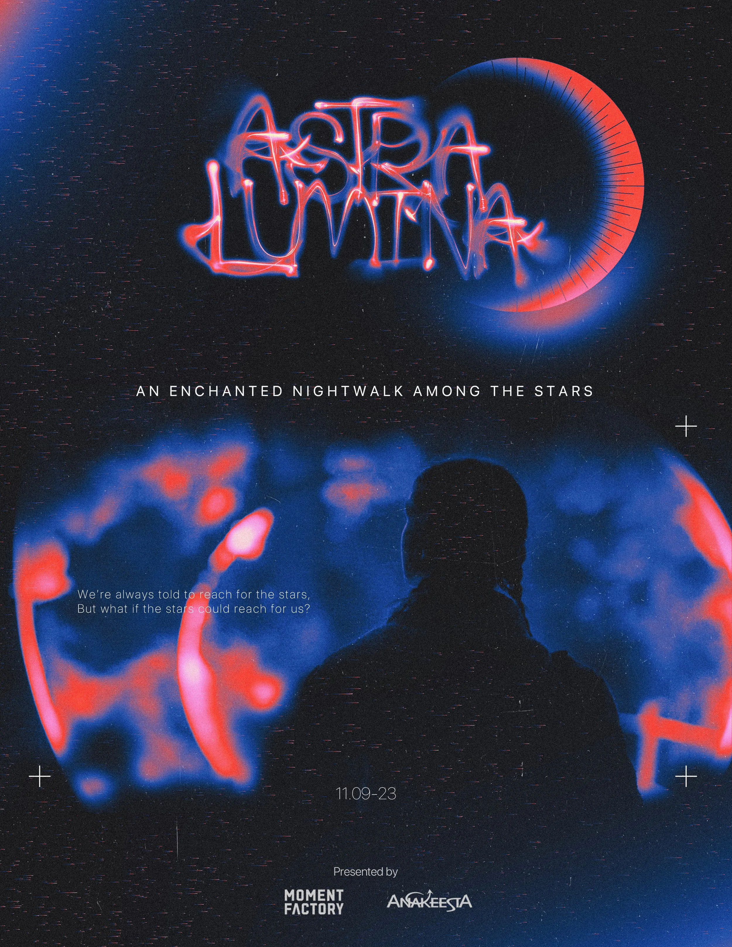
Design Showcase: Astra Lumina
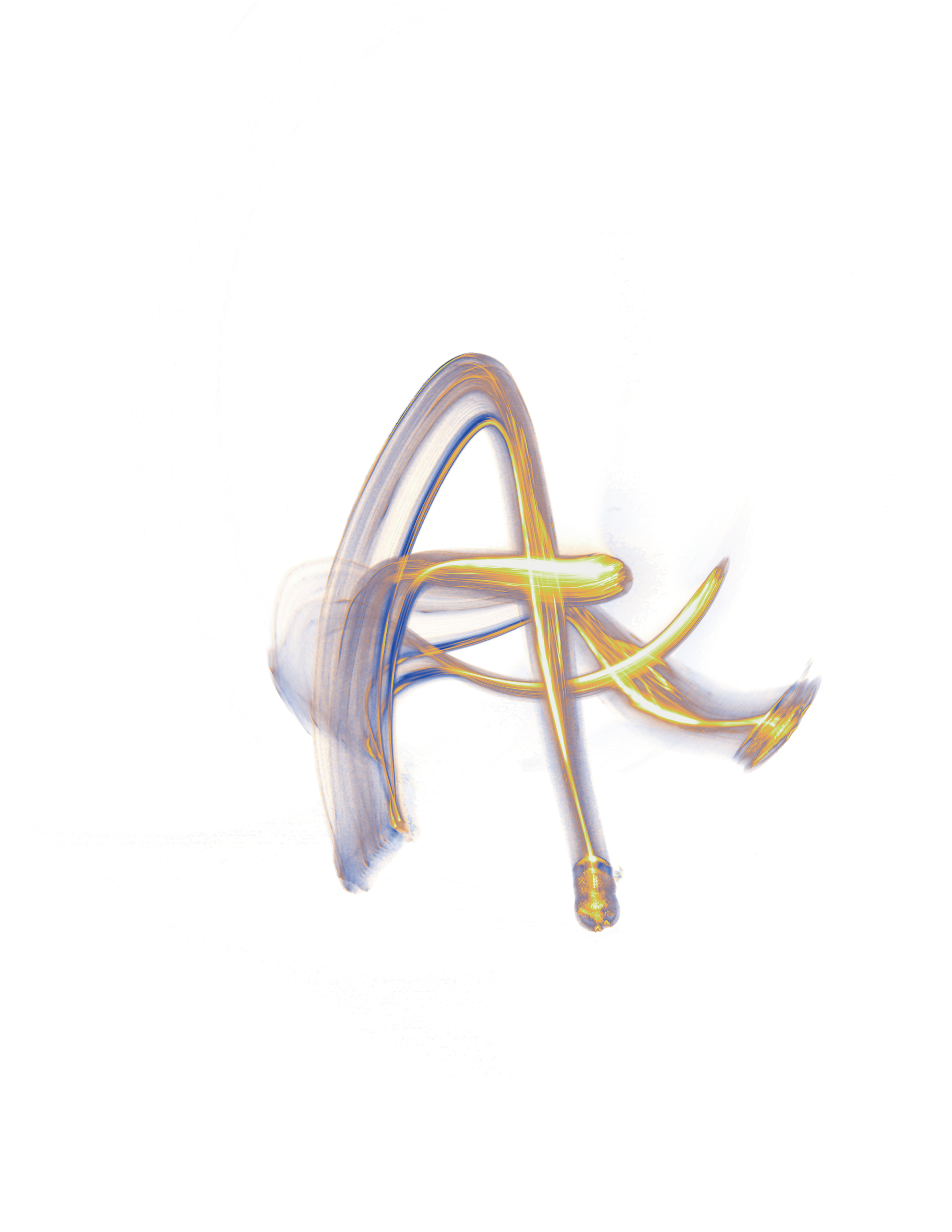
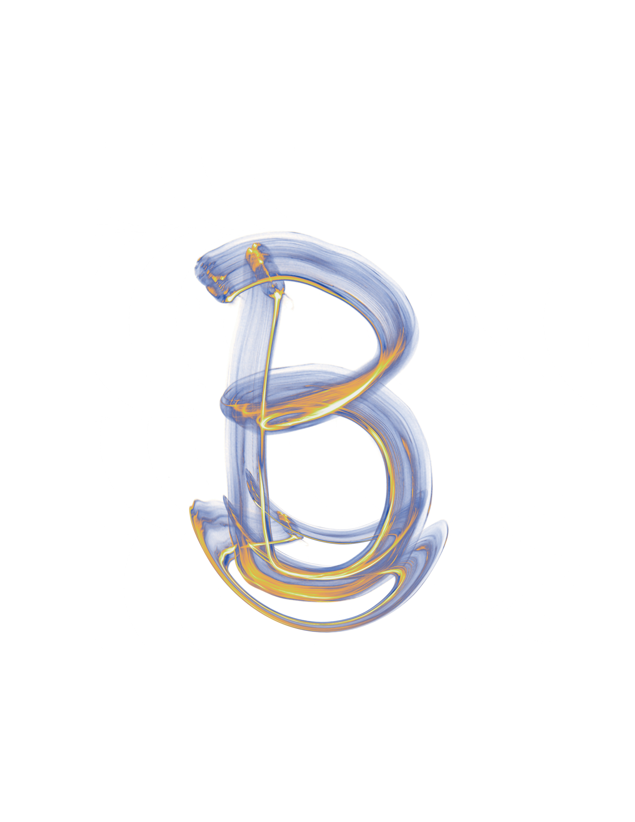
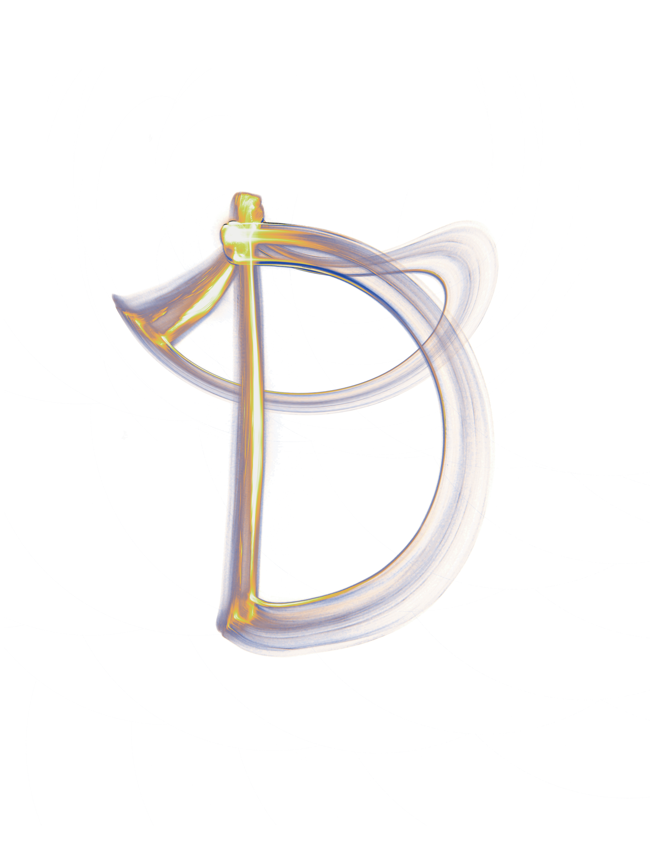
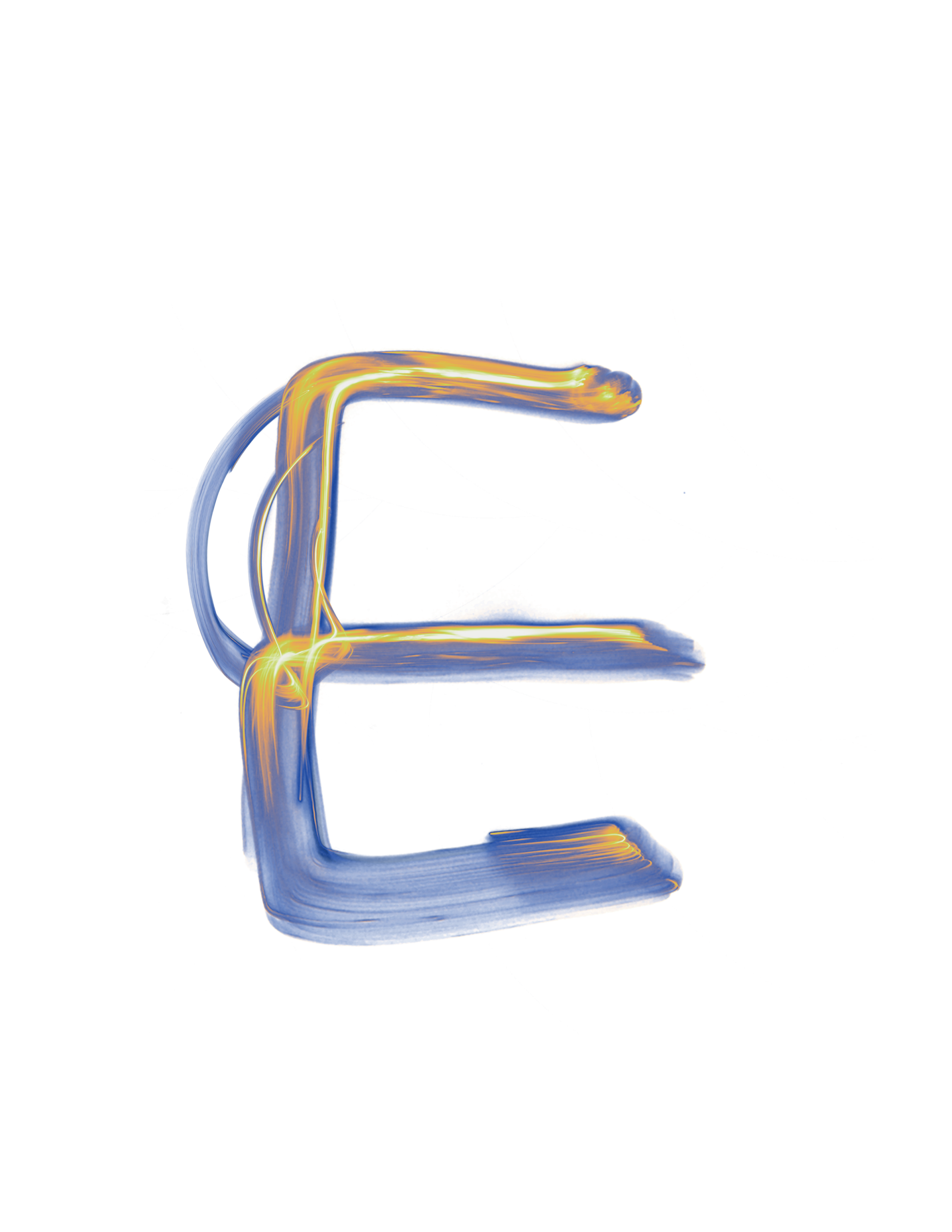
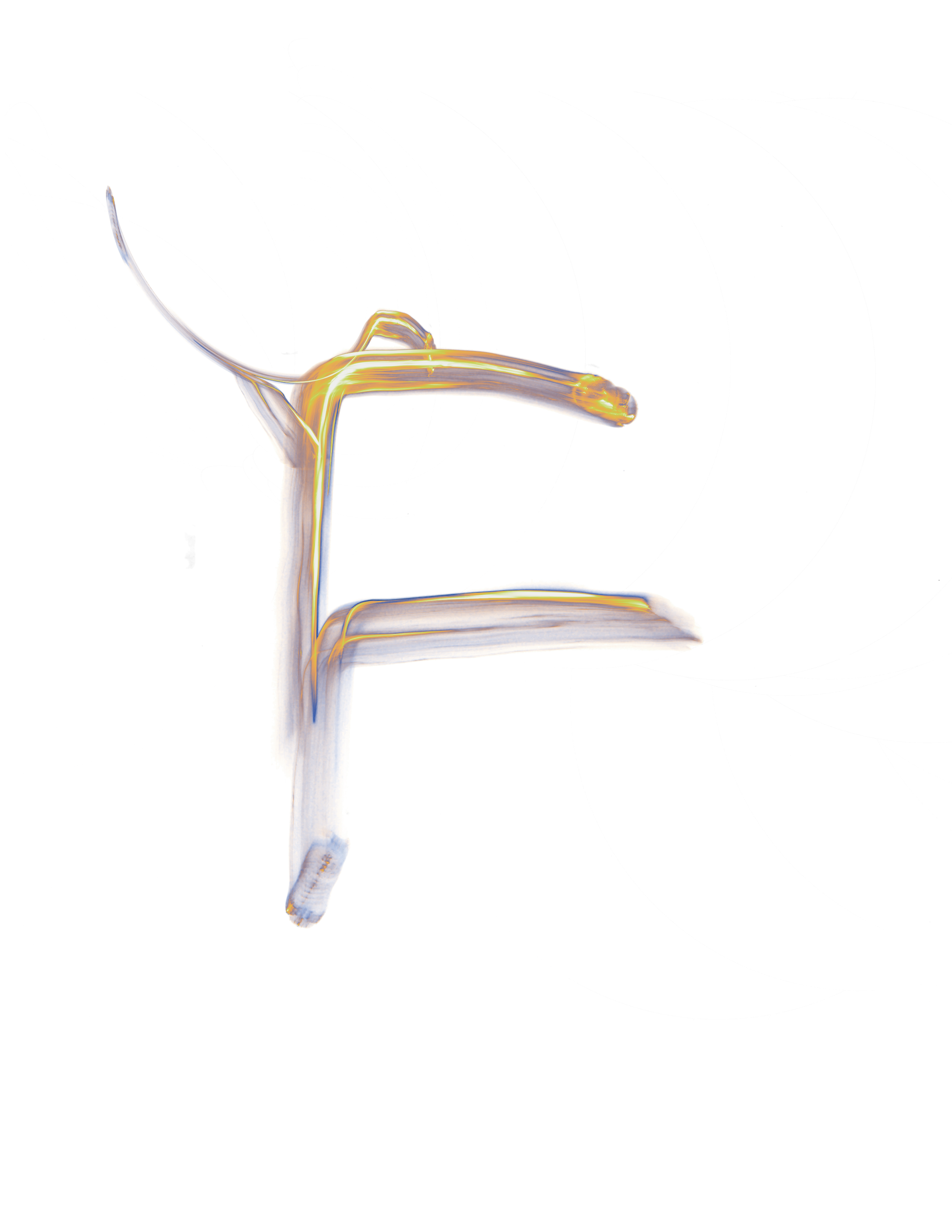
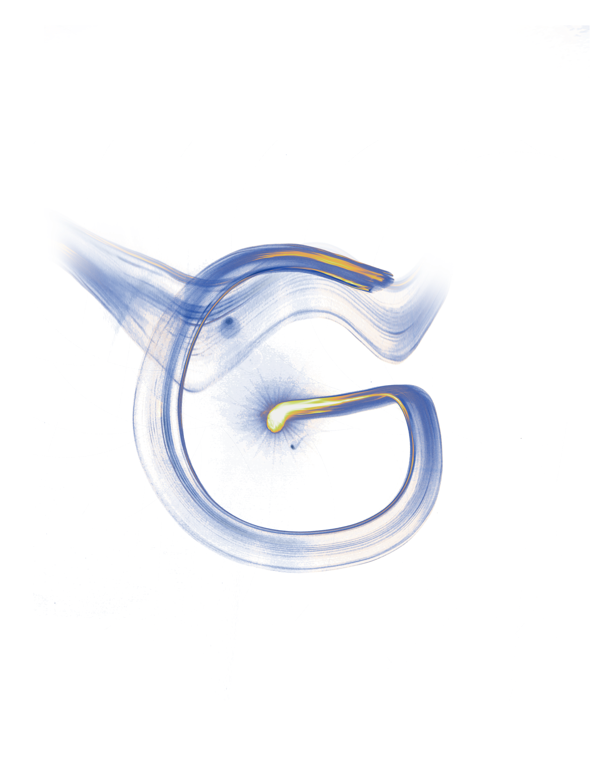
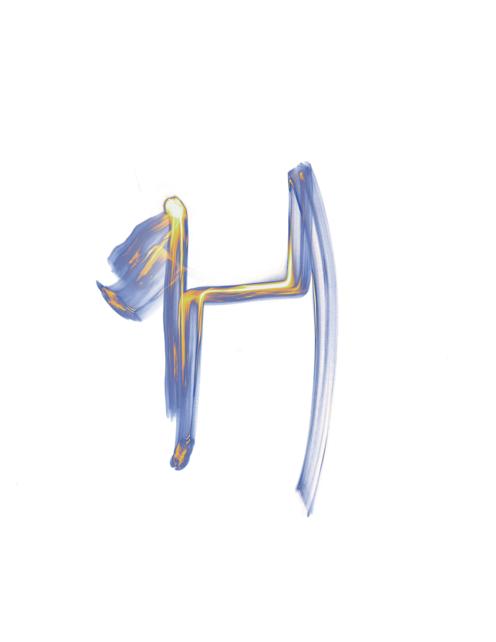
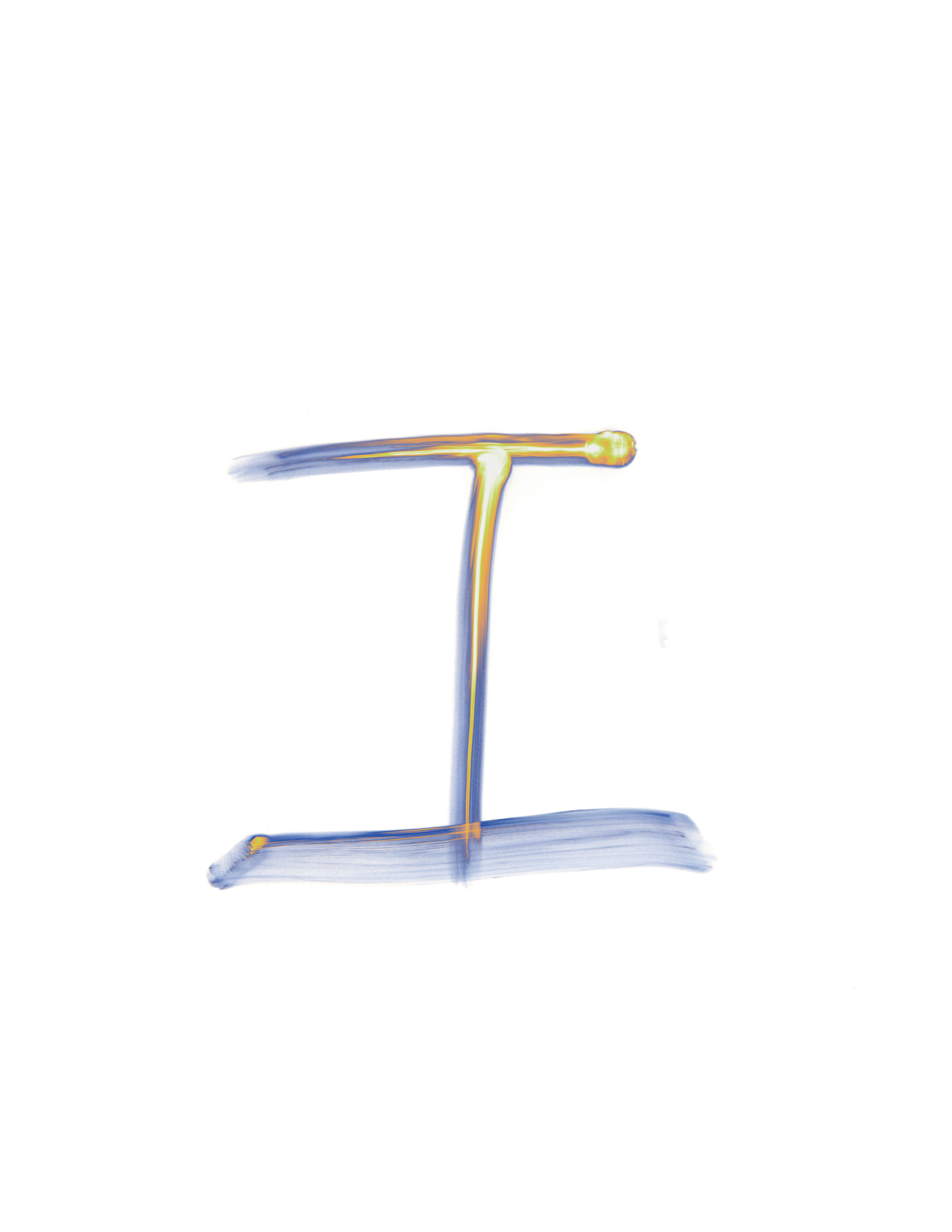
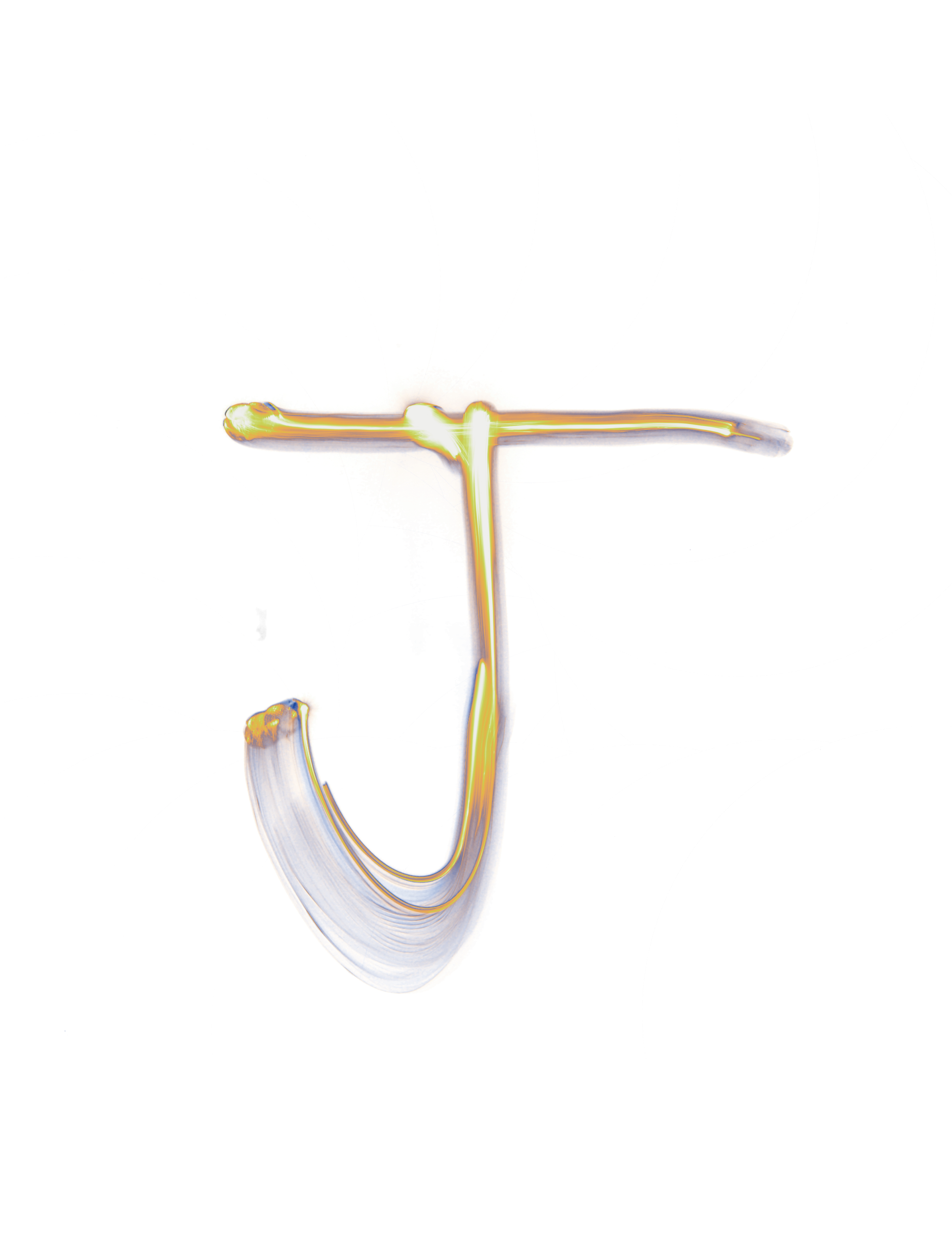
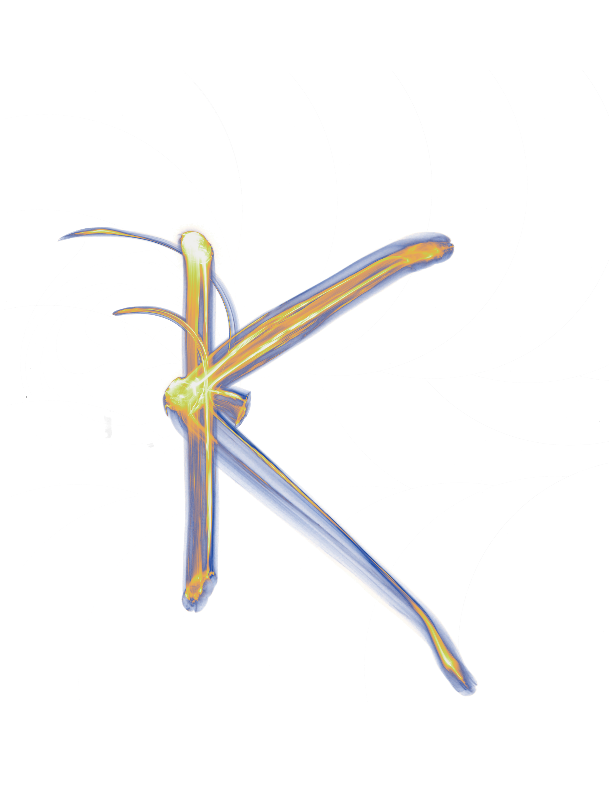
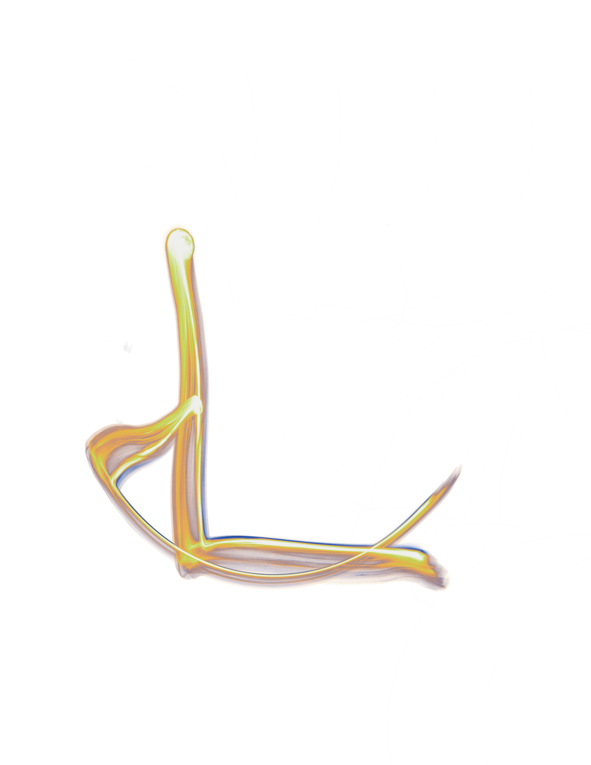
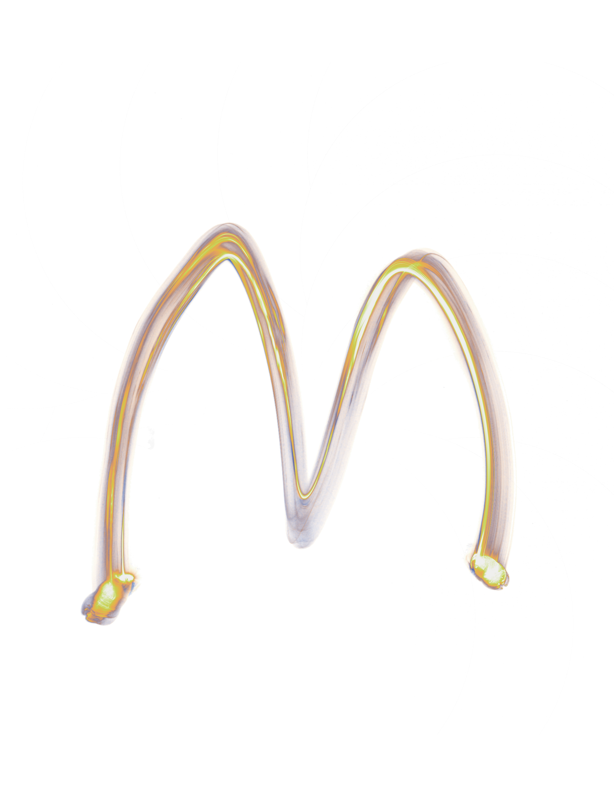
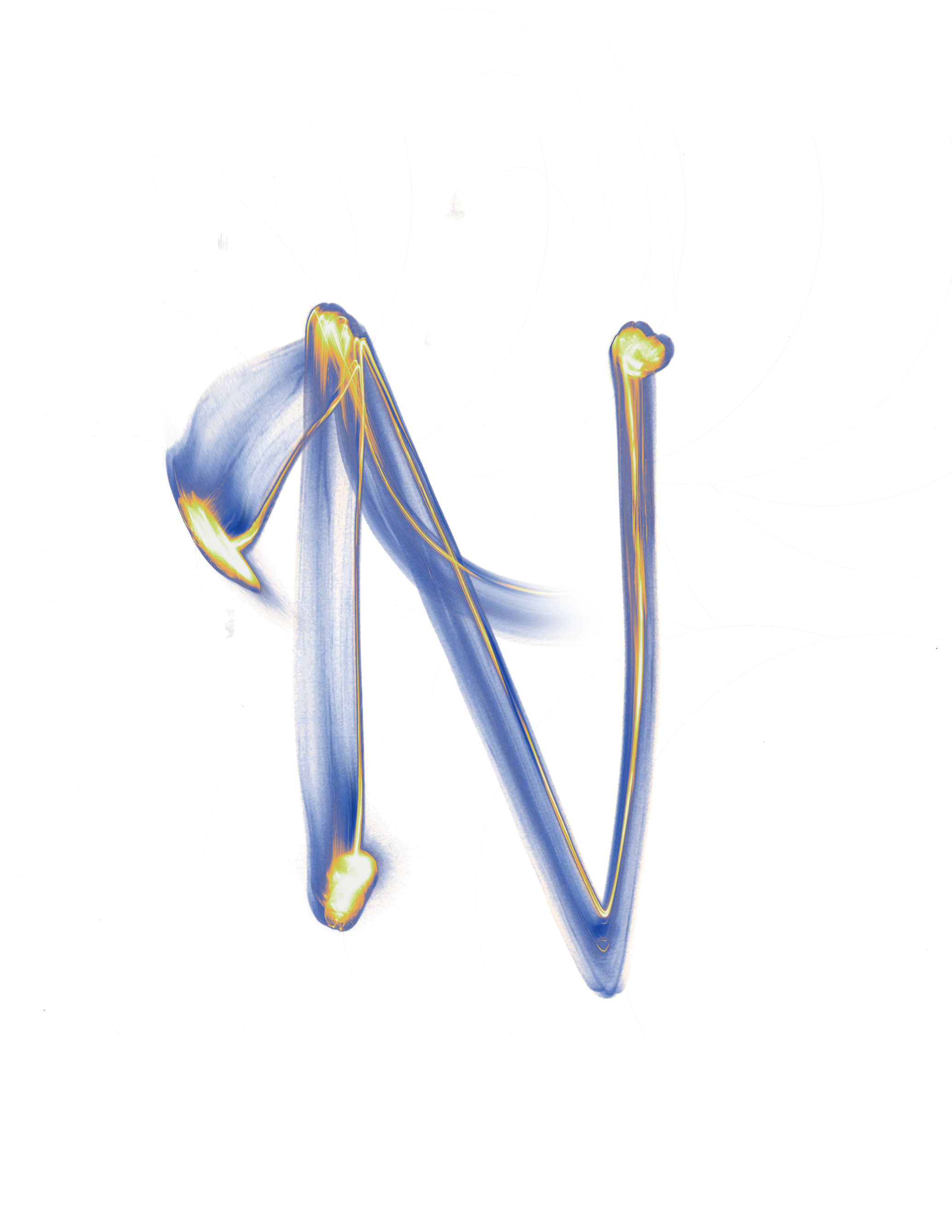
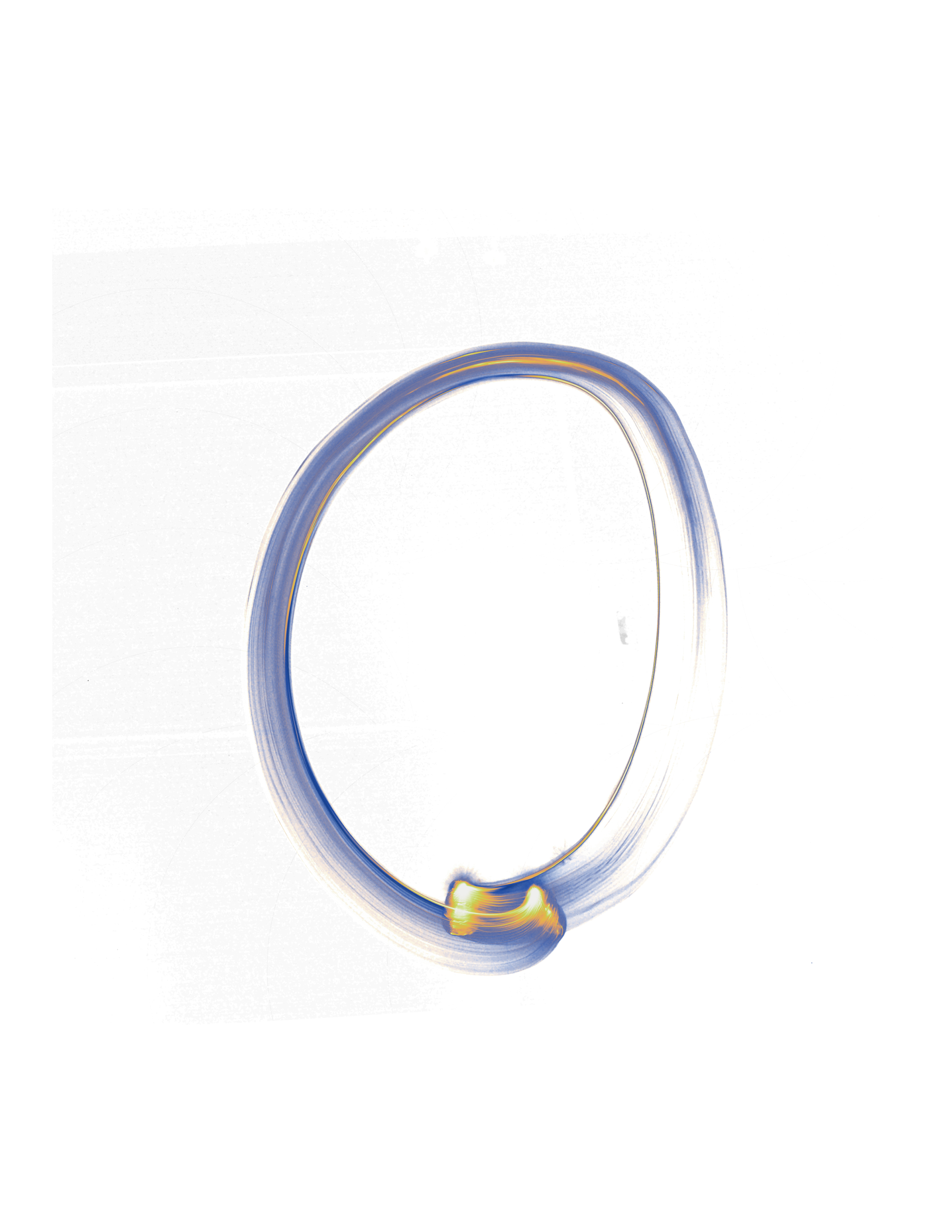
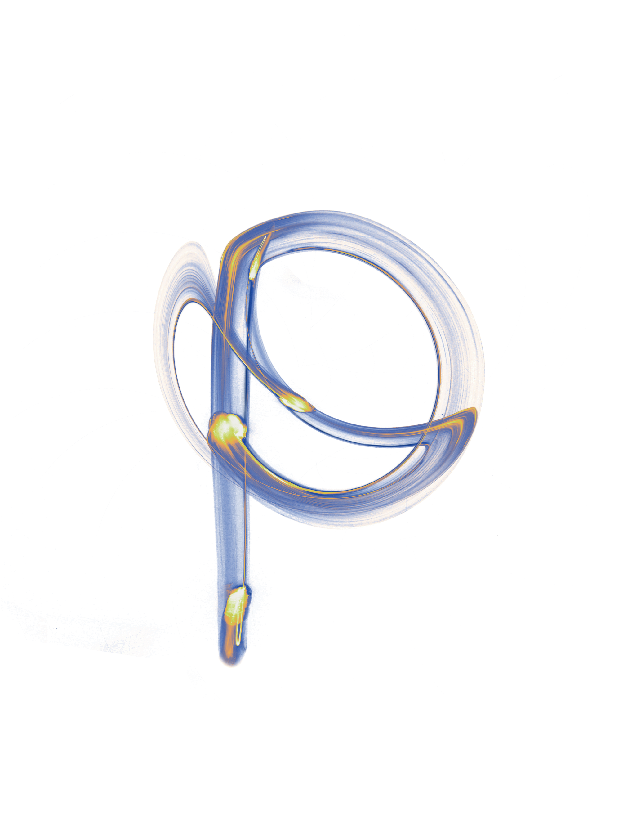
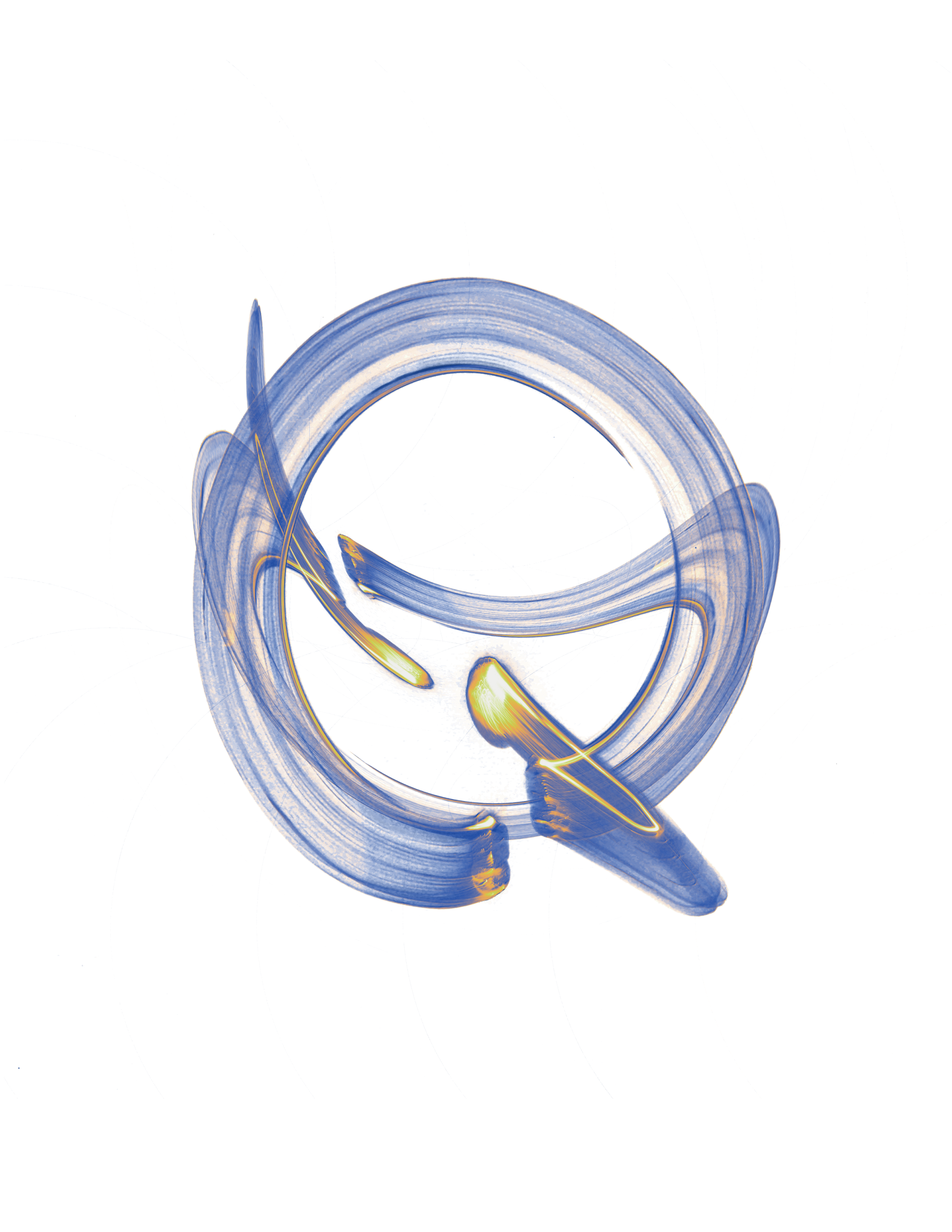
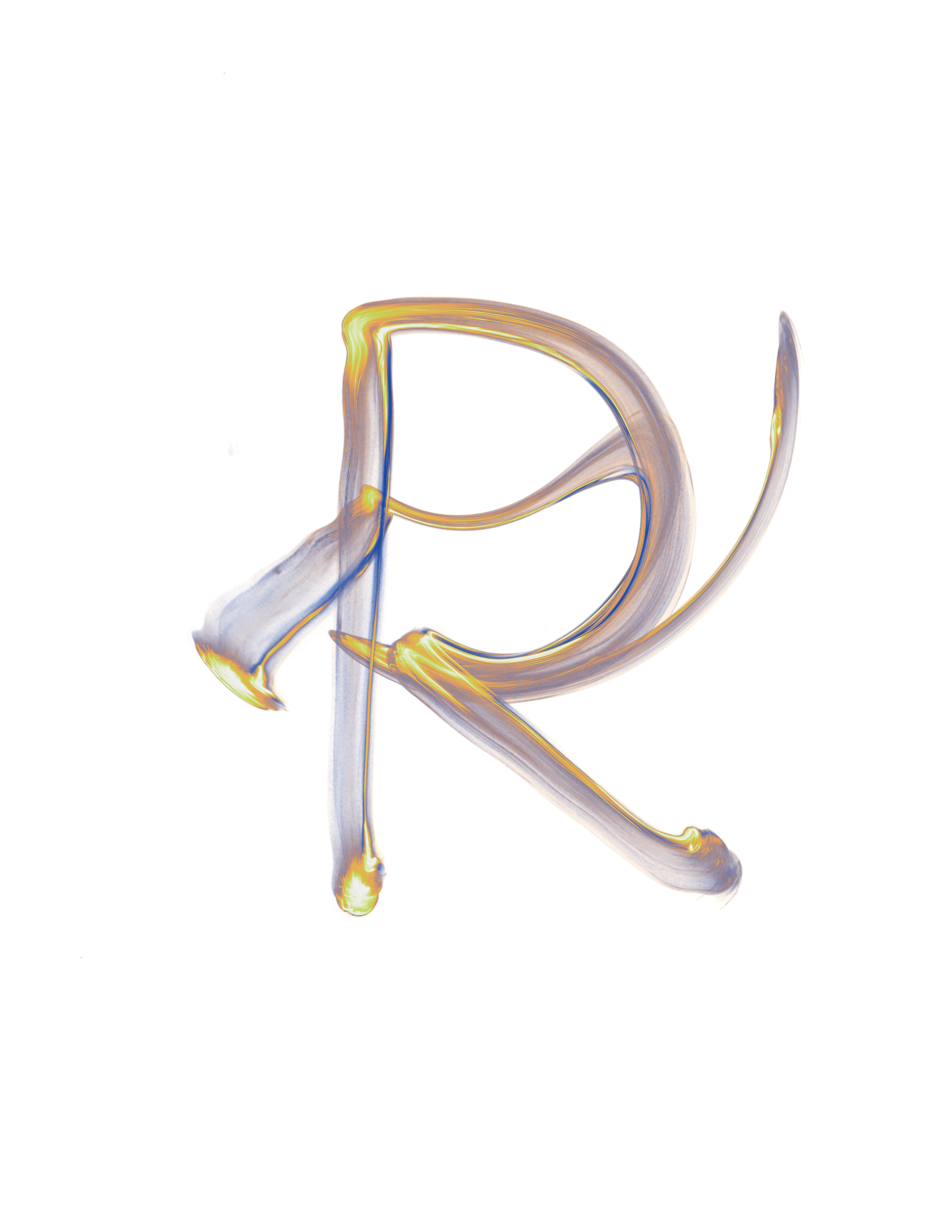
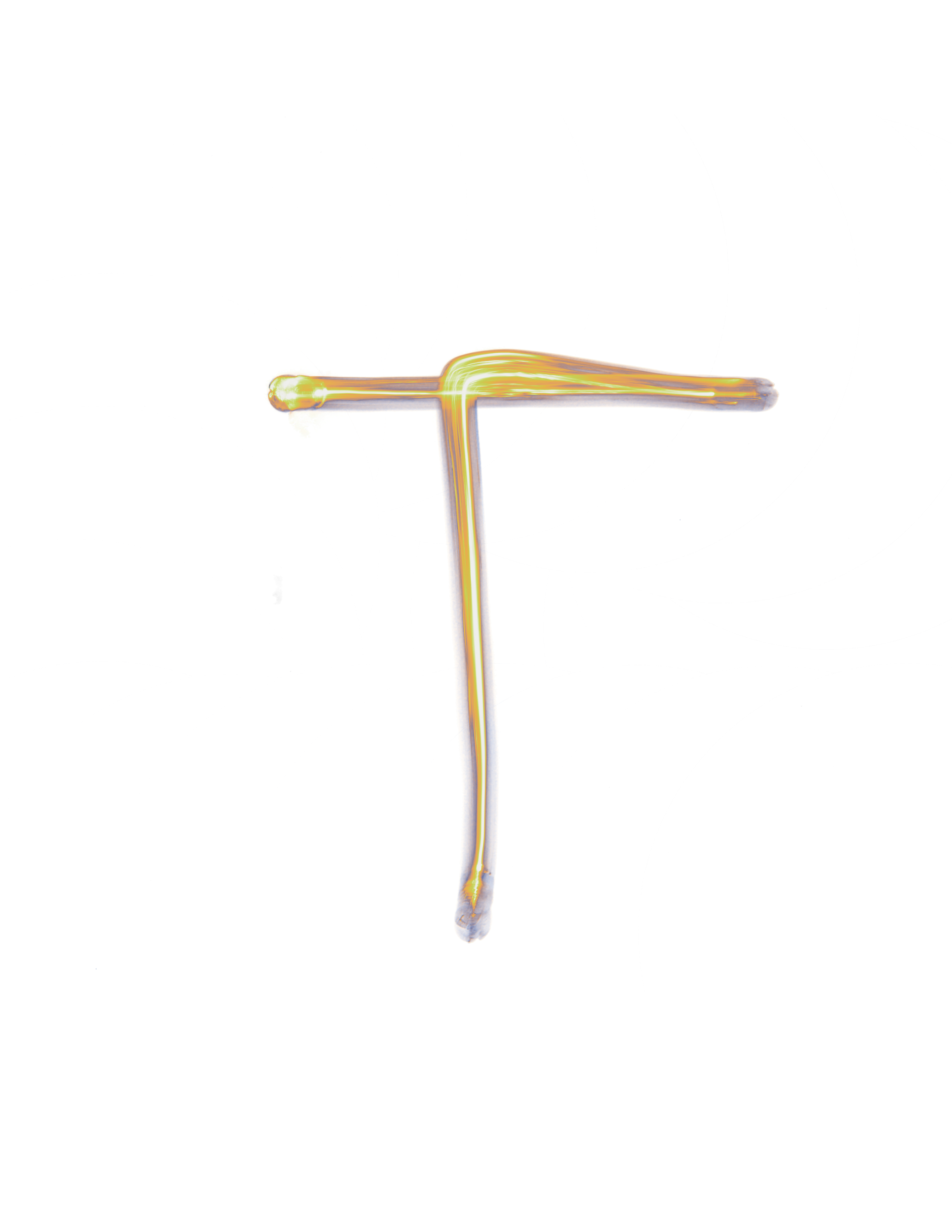
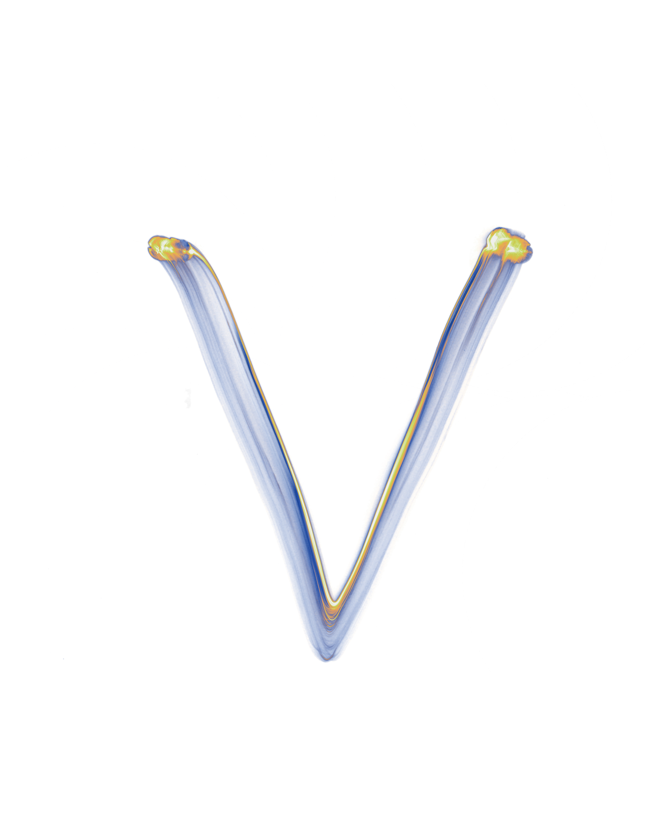
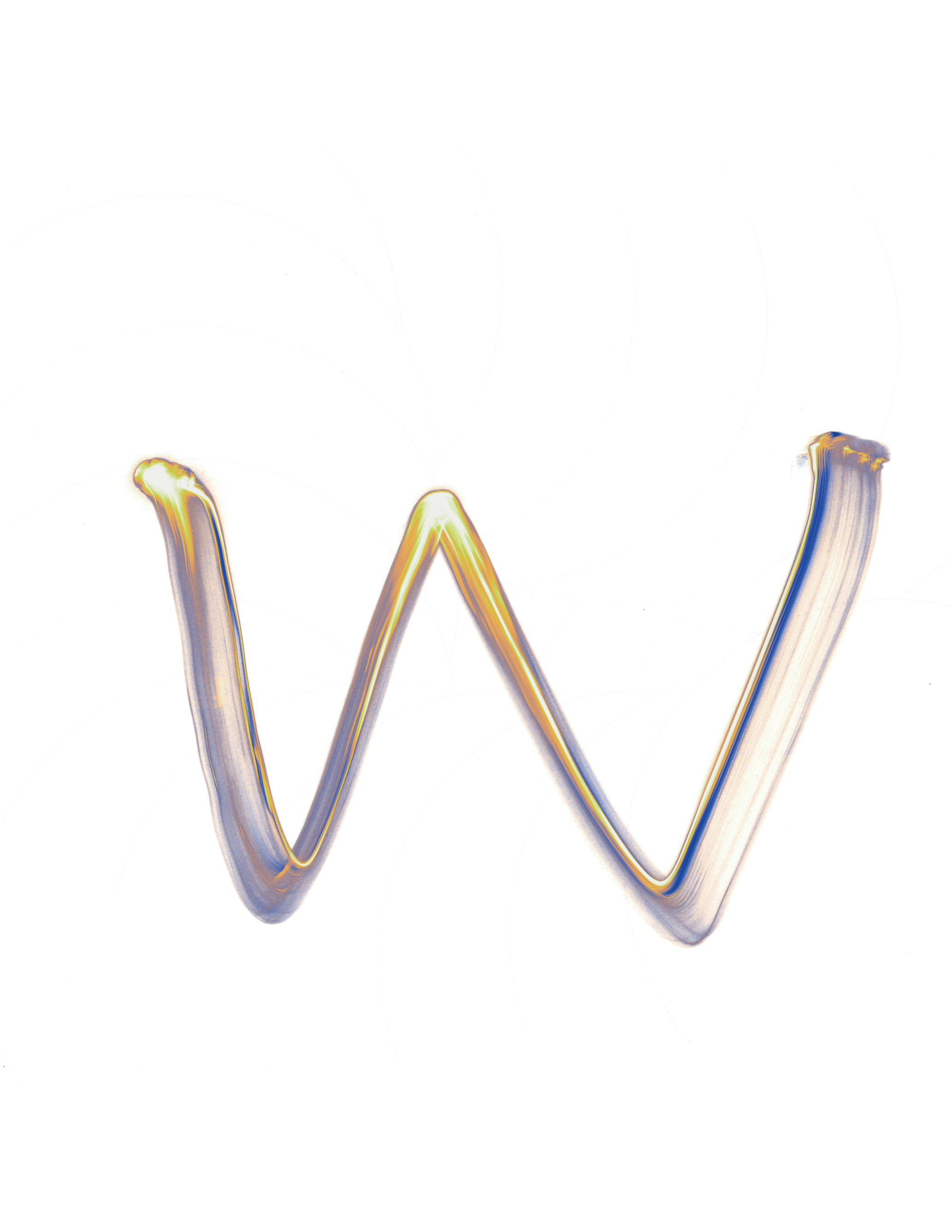
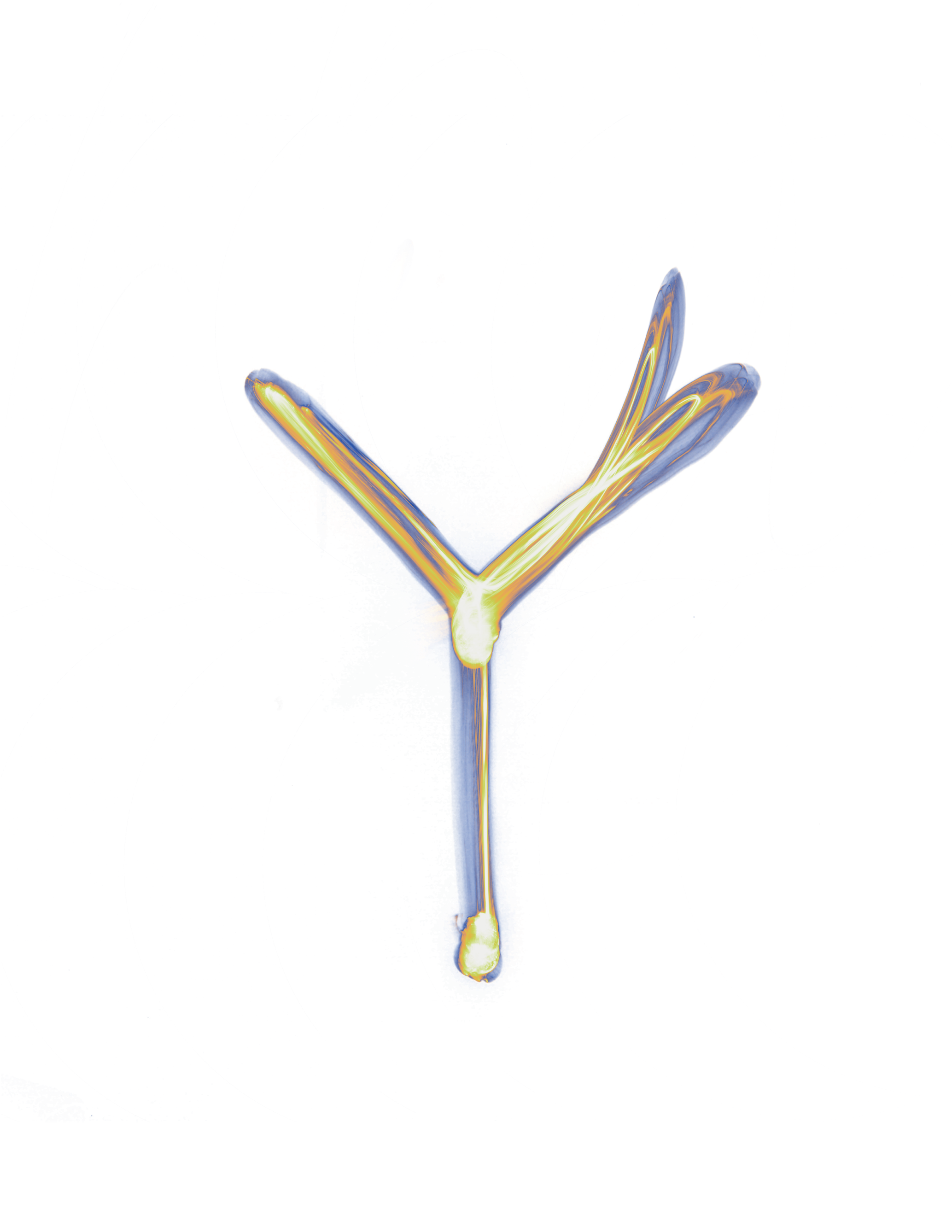
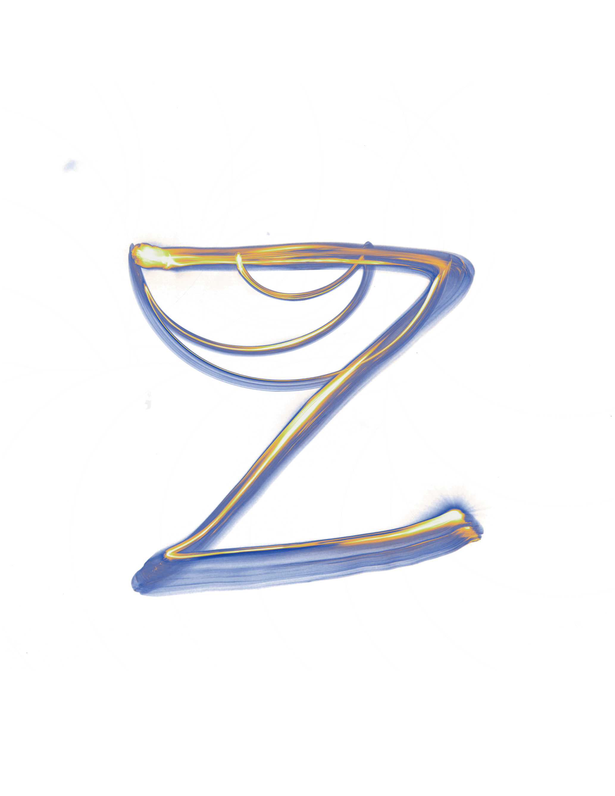
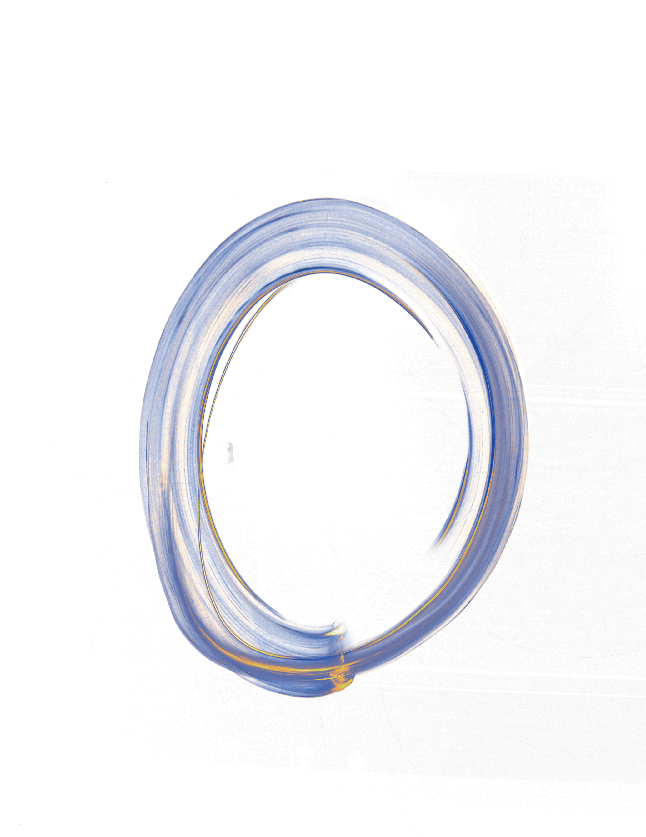
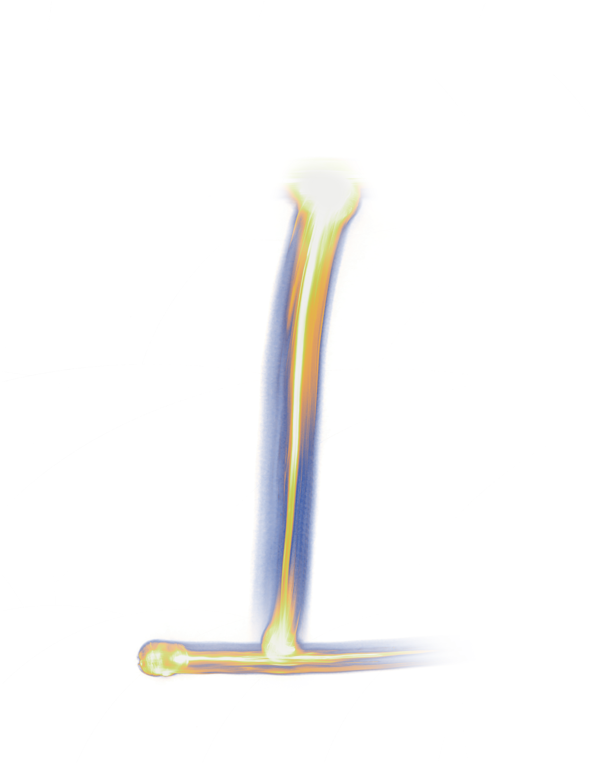
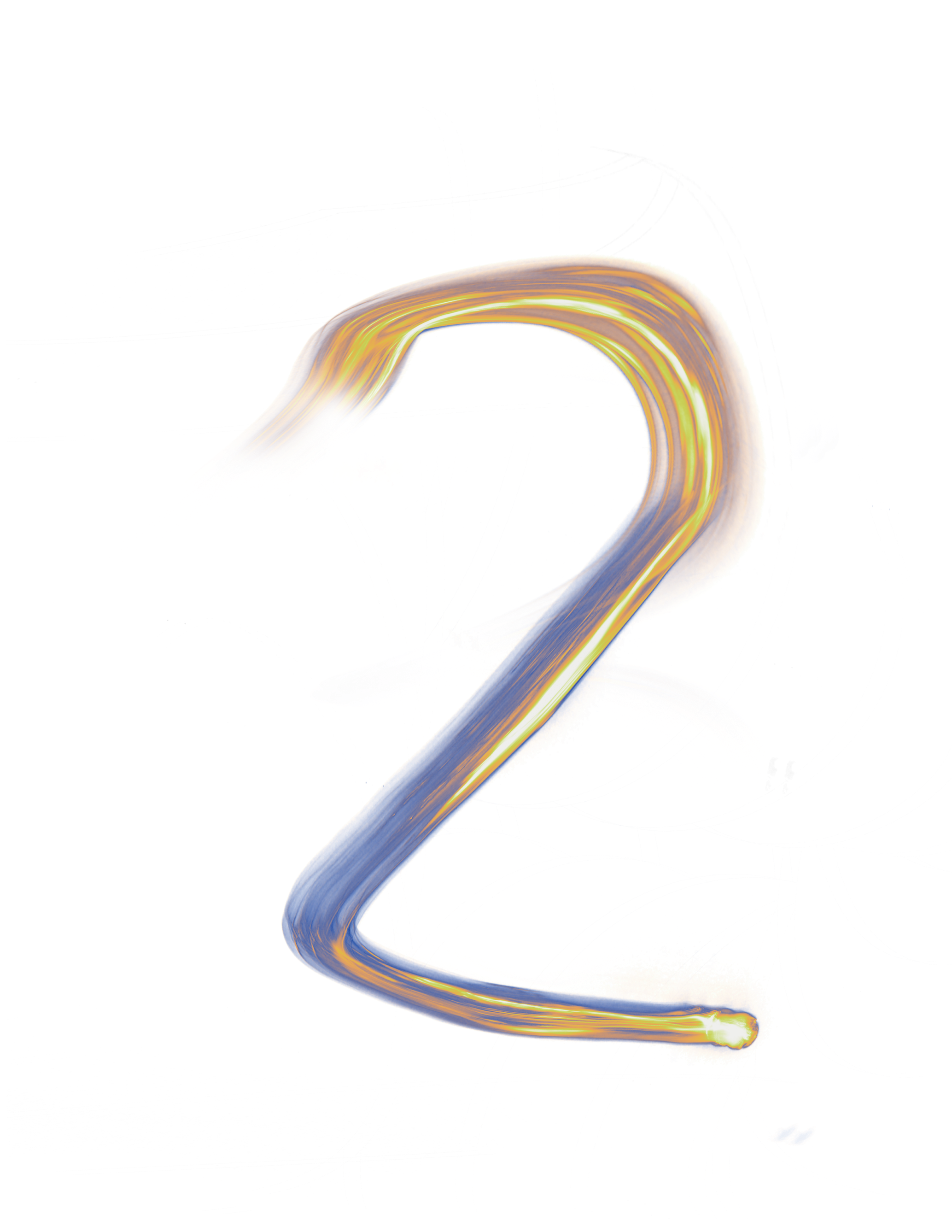
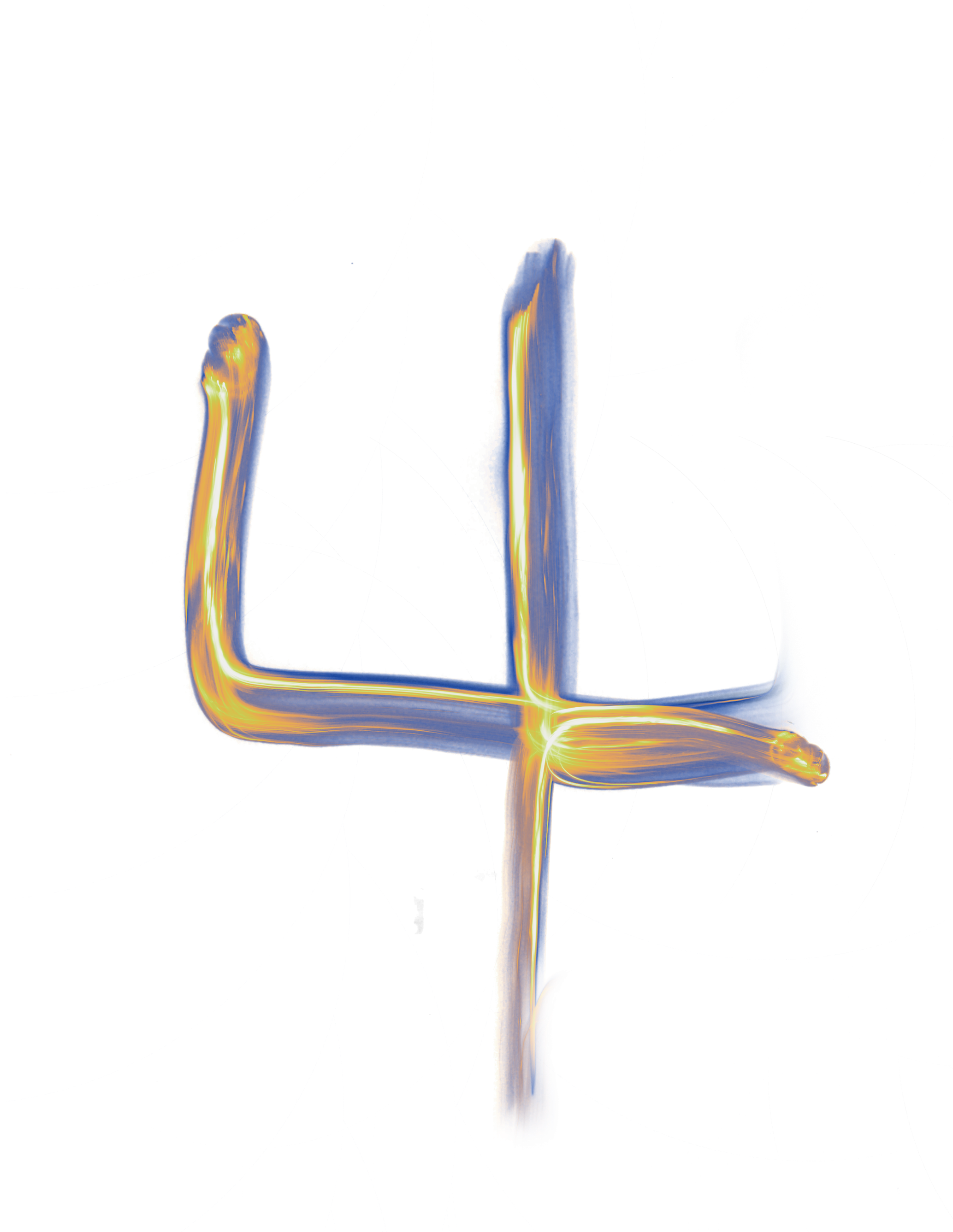
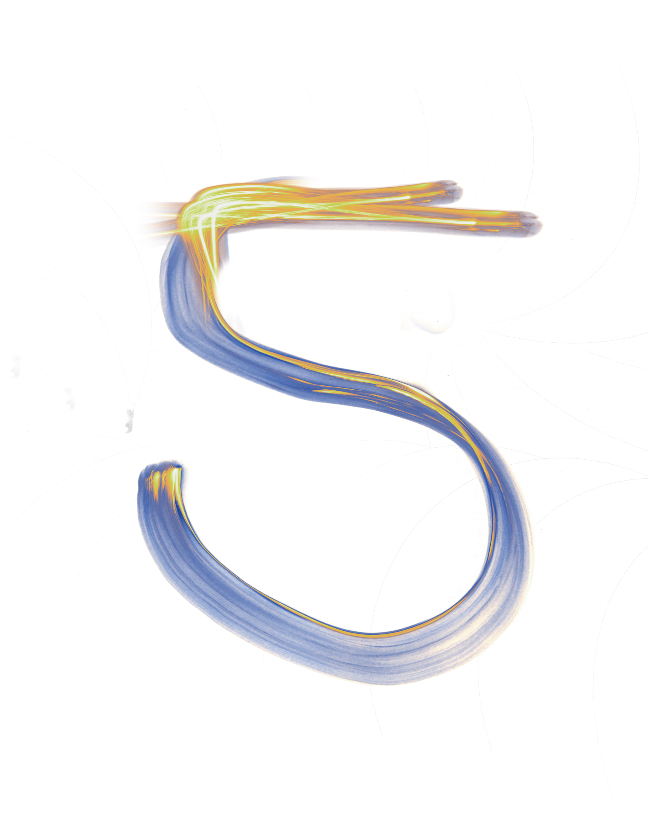
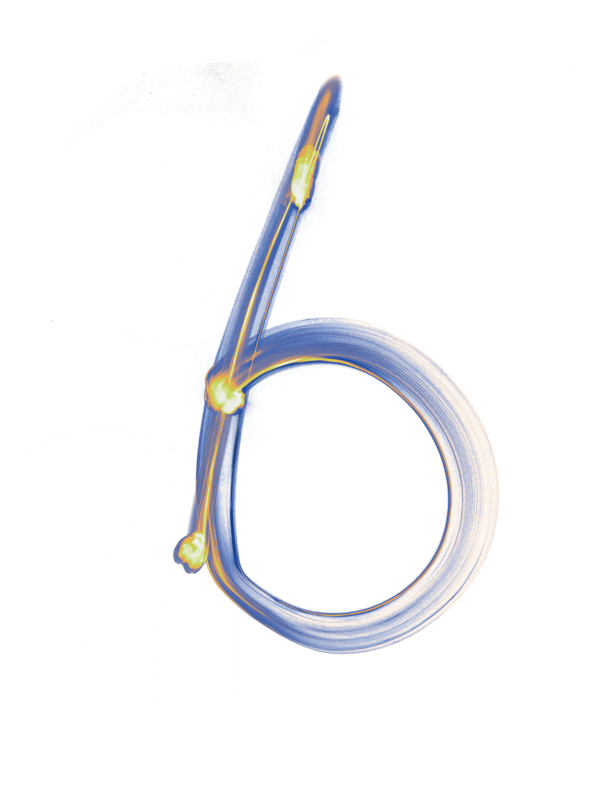
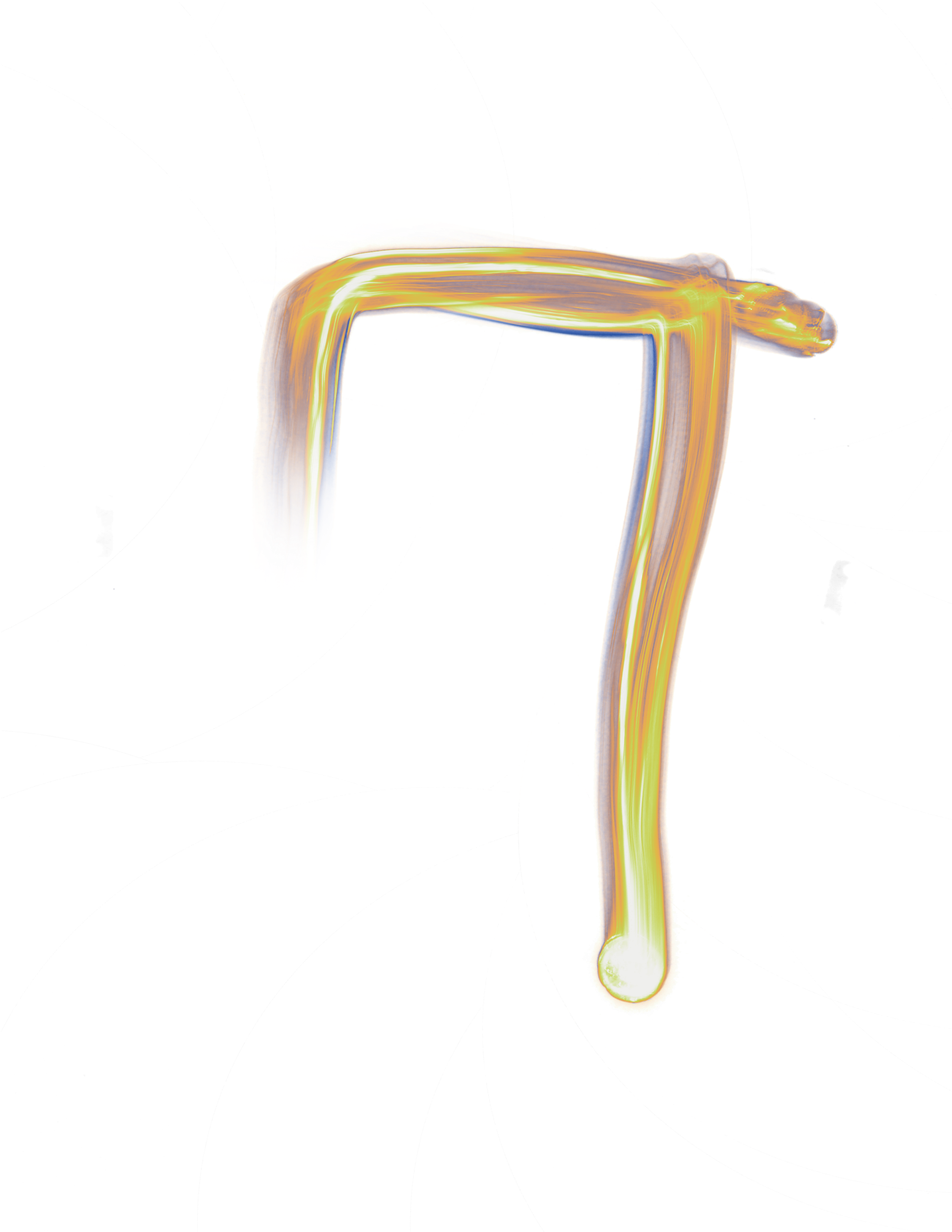
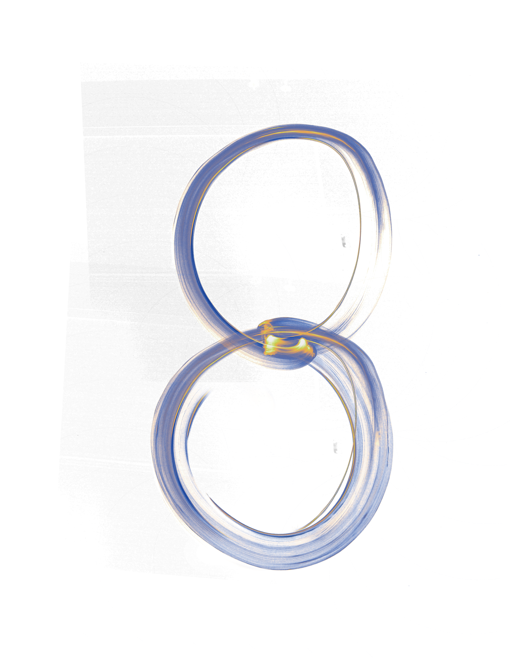
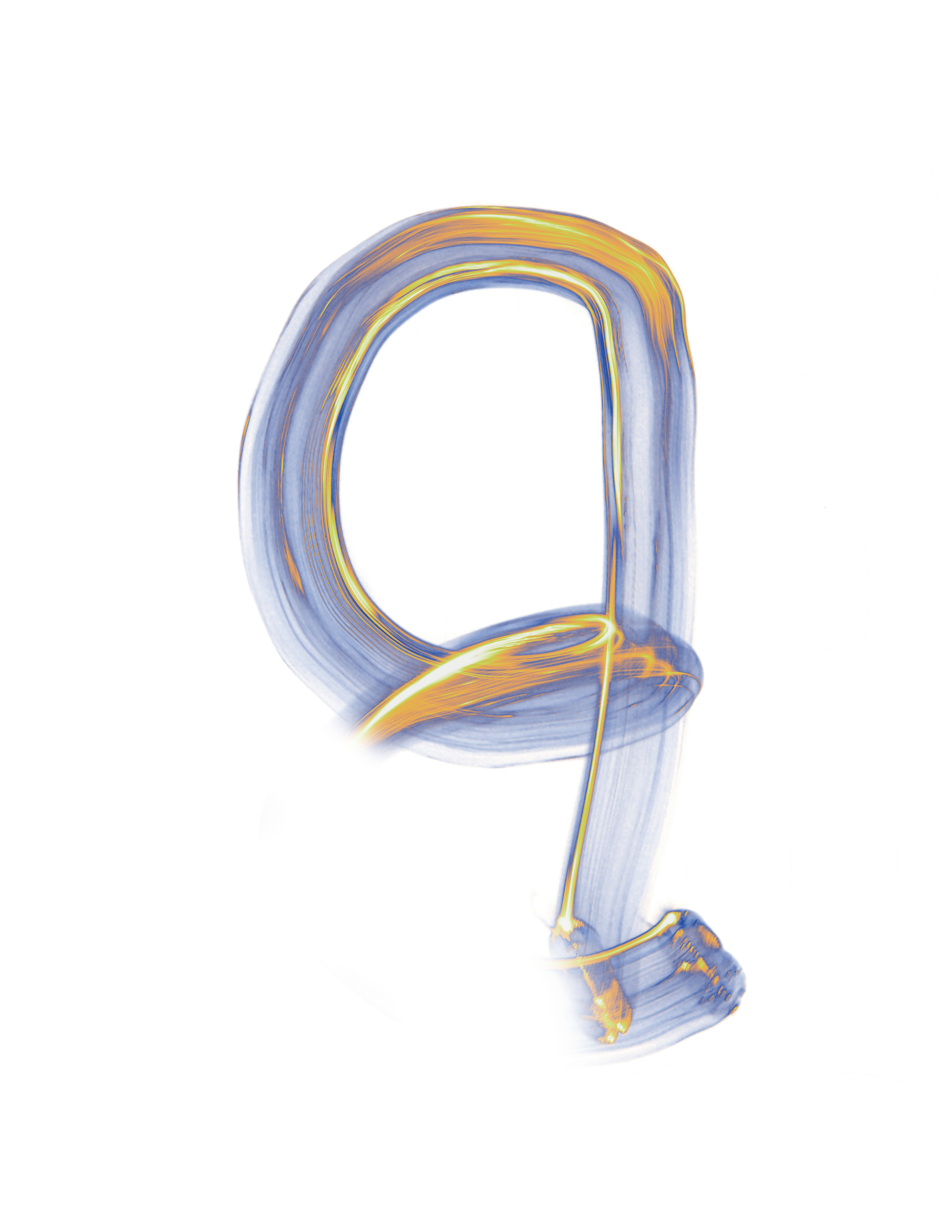
For this project, I utilized a photographic technique known as "Light Painting" to create a unique set of typography. This innovative approach allowed me to capture the fluidity and creativity of light as it interacts with the space, resulting in striking letterforms that convey energy and movement.
The typography formed the foundation for a promotional poster for the Astra Lumina event I attended in Los Angeles. My design captures the essence of the event while highlighting the experimental qualities of the light-painted type. The vibrant colors and dynamic composition reflect the immersive experience that Astra Lumina offers to its audience.
The finalized poster integrates the light-painted typography seamlessly into the overall aesthetic, creating a visually compelling piece that draws attention and invites exploration. This project exemplifies my passion for combining traditional design elements with contemporary techniques to produce innovative visual communication.
Futurism-Inspired Typography Showcase
The font design presented here draws significant inspiration from the Futurism movement, a style that emphasizes dynamic and forward-looking elements. In crafting this typeface, I sought to embody the values of fluidity, speed, and vivacity that characterize Futurist art.
This typography integrates several key design principles, including:
Geometric Shapes: Utilizing straightforward geometric forms to create a sense of rhythm and structure.
Fluid Angles: Incorporated to convey a sense of motion and to challenge traditional norms of typography.
The design primarily serves as a decorative typeface for titles and headlines, aiming to reflect a harmonious blend of modernity and historical artistic influences. Influenced by Avant-Garde artists such as Umberto Boccioni, I focused on developing a typeface that balances aesthetic appeal with practicality.
Through this exploration, I conducted a study on modern typefaces that maintain readability while allowing for artistic expression. This process includes experimenting with how geometric shapes can seamlessly form recognizable letters, ensuring the typeface not only stands out visually but also serves its functional purpose effectively.